
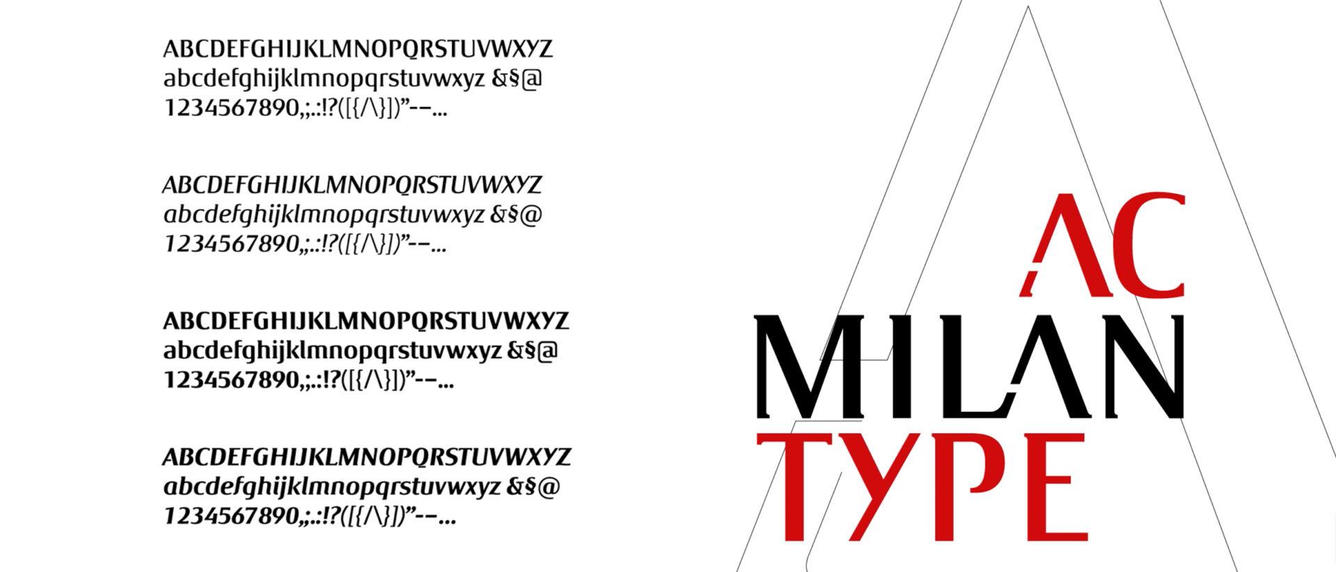
Type design was the first specialist discipline to enter Inarea’s branding practice, around thirty years ago, becoming part of the broader identity-building process and anticipating an approach that is once again central today: designing a proprietary typeface to give form to a brand’s voice. From the renewed importance of the word to the relationship between distinctiveness and legibility, from design methodology to the evolution of digital media, Antonio Pace — type designer and graphic designer, and a long-standing Project Director at Inarea — explains how type design can become an instrument of identity, culture and strategy.
We are witnessing a return to the word, almost a rebalancing after the central role the symbol has assumed in visual communication. Why?
The symbol and its meaning depend heavily on cultural and personal context. In an increasingly fragmented world, the need for contextualisation can become an obstacle to the universality of a message. The word therefore returns as a fundamental vehicle for building shared meaning. Failing to give that vehicle a distinctive character means giving up part of its potential to express identity.
This is why type design is concerned not only with purely optical aspects — font legibility, contrast, performance at different sizes — but also with making a form recognisable. The aim is to ensure that the brand’s visual and value system can be perceived even when the logotype itself is absent: every word can become an expression of the identity.
Why does it make sense for a company to invest in a proprietary typeface?
Beyond the opportunity to strengthen recognition across different applications, there is also a reason related to the digital nature of fonts, which are subject to licensing agreements. For a company, using a purchased type family over many years can mean recurring costs, whereas a proprietary typeface shifts the perspective from cost to investment: the company acquires an asset of its own, consistent with its identity and designed for long-term use.
How is a proprietary typeface actually created?
The process begins with something that already exists. It can be summarised as follows: from the logotype to the alphabet, from the alphabet to the font.
The key formal features of the logotype are identified and tested on a number of significant letterforms. If the principle works, it is gradually extended to the entire alphabet, both uppercase and lowercase, and then to numerals and other glyphs.
At that point, however, the work is only halfway complete. The alphabets need to be harmonised and transformed into a fully functioning font, which means engineering and digitising the typeface. Harmonisation is particularly important because uppercase letters, lowercase letters and numerals are morphologically and conceptually different systems that need to be brought together within a common formal logic.
concettualmente differenti che devono essere ricondotti a una logica formale comune.
Can you give us some examples of proprietary typefaces designed by Inarea?
For the City of Milan, the aim was to transform the name “Milano” itself into a brand capable of expressing a range of associations — fashion, style, Italian identity — without resorting to a stereotypical image of the city. The formal starting point was the Bodoni tradition, quintessentially Italian, which was reinterpreted through a substantial redesign.
For Roma Capitale, the process was different. We began with the history of the capitalis romana, looking at its fifteenth-century typographic reinterpretation by Felice Feliciano (1433–1479), who transferred the forms of lettering from stone to paper, anticipating the new paradigm of print.
For ENI, on the other hand, the typeface needed to support the brand’s repositioning towards a more familiar, approachable identity, closer to people. This led to softer, rounder forms. ENI was set in lowercase, while the proportions of the letters “e” and “n” were echoed throughout the alphabet, making the ENI identity recognisable even in letters that do not appear in the name itself.
In the case of Luiss, finally, we started from the existing logotype, identifying details — such as the serifs of the uppercase S — that could be repeated throughout the system.
In every case, the principle remains the same: each individual element should refer back to the whole and contribute to its recognition.
What role can artificial intelligence play in this process today?
Technological convergence has made it possible to bring together, on a single workstation, activities that once required much more complex production chains and a broader range of specialist skills. Artificial intelligence is advancing particularly in processes involving matching, comparison and programming, but the design of letterforms remains too varied and detailed to be easily replaced.
In this context, how is the role of type design within branding evolving?
Ultimately, the objectives of a brand remain what they have always been: to communicate and create relationships. And the word remains a shared and reliable foundation, capable of adapting to cultural, technological and historical change.
Designing the typographic form of a word means giving it a distinctive voice without taking away from its most fundamental purpose: to remain a shared tool through which human beings interpret the world and build relationships.