
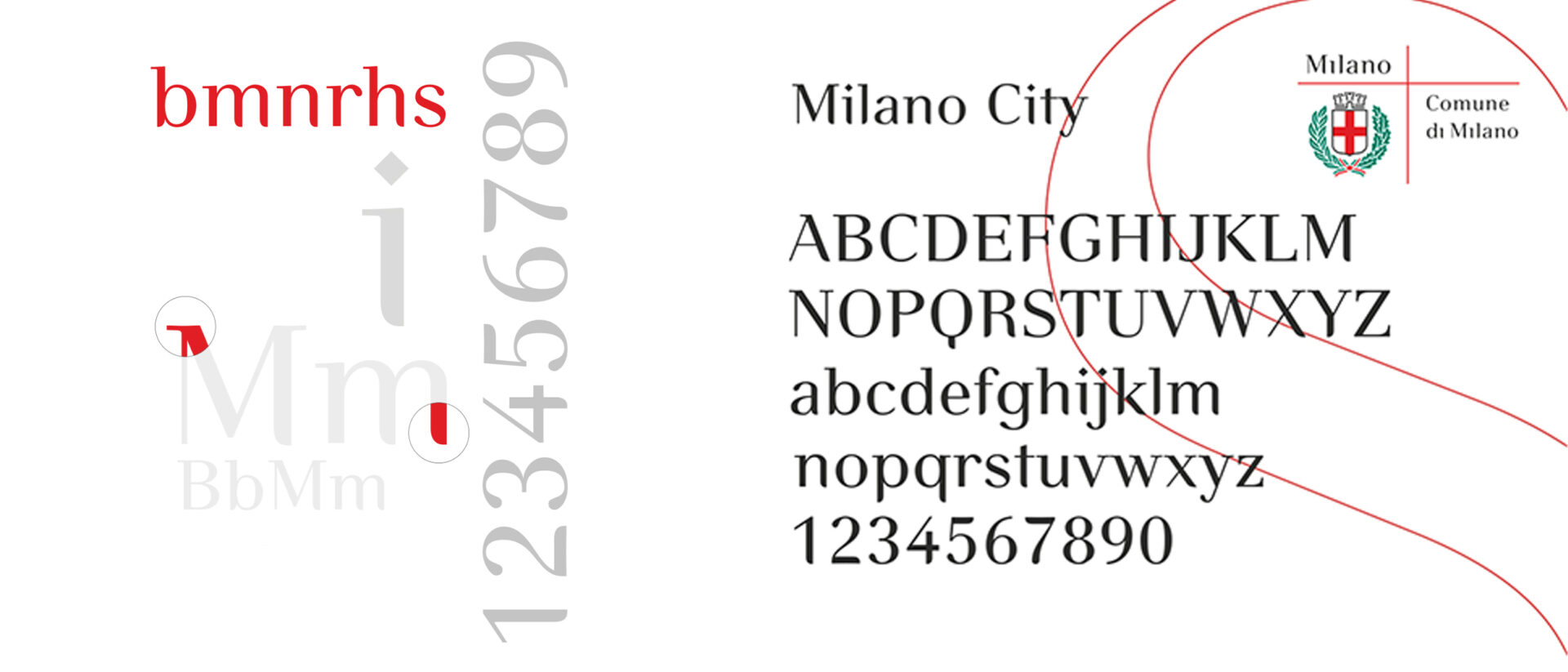
Writing is a way of giving form to thought and, through words, of shaping our identity. From the earliest marks left by human beings to the screen of our smartphones, writing means choosing a sign, a form, a rhythm. And every choice, even when we are unaware of it, says something about who we are.
Western civilisation also grew out of an extraordinary invention: the alphabet. Between the 8th and 6th centuries BC, the Greek alphabet introduced vowels for the first time, capturing the complexity of spoken language and making it possible to record stories, pass them on and multiply them. The Odyssey is perhaps the most powerful embodiment of this dynamic. Odysseus travels through the world, encounters friends and enemies, constantly risks losing himself and, through those very encounters, constructs his own identity. There is one passage I find particularly revealing: shipwrecked, he reaches the land of the Phaeacians, and during a banquet the bard begins to tell his story. Odysseus listens to himself being recounted, covers his face and weeps. Because our identity is not only what we are: it is also what others say about us. And, by extension, as Jeff Bezos observed, your brand is what people say about you when you are not in the room.
With typography, writing, which began as a physical and individual gesture, becomes a shared form: we use codified shapes that belong to a community. Between the 15th and 16th centuries, Venice was where this transformation reached maturity. A crossroads between East and West — a New York or Shanghai of its time — the city became the European capital of printing. It was here that the publisher Aldus Manutius (1449–1515) understood that the future of the book lay not simply in the ability to reproduce it, but in rethinking its form and the way it was used. The “pocket-sized” book emerged in the octavo format: smaller, portable, intended to be read beyond the confines of libraries. Working with Francesco Griffo (1450–1518), Manutius developed italic type, a more compact style that would become known in many languages as Italic.
Typography was therefore no longer simply a means of reproducing words: it began to give them a form, a “character”. And character can mean a letter or symbol, but also a distinctive quality, much as it does when we speak about people. In typography, too, we describe a typeface as joyful, severe, elegant, technical or regular, because the shape of the letters helps define the “personality” of the words. Even when their literal meaning remains unchanged, different typefaces alter the way those words are perceived.
Words carved in stone carry the weight of inevitability, because the material itself gives the message a promise of permanence. Today, the opposite is true. In the digital realm, everything is immediate, replaceable, ephemeral. And precisely because we are surrounded by words — never before in history have we read and produced so many of them — their form becomes decisive once again. We write constantly, yet we rarely choose how we write. The screen becomes the mediator of communication: we type, send, scroll. But we no longer design our own writing: we do not choose the typeface, weight, size or rhythm. In our urgency to say something, we lose awareness of how that thought will be received. And yet form is thought.
Perhaps this is precisely why, in branding today, we are witnessing a renewed focus on the word and the growing use of proprietary typefaces. After an era dominated by the logo, the name and its form are returning to the centre. Not simply as a matter of brand recognition, but because through a proprietary typeface an organisation can build a voice of its own over time. Typography thus becomes an element of distinctiveness and belonging. In an age in which everything seems endlessly modifiable and replicable, it is precisely this ability to give thought a recognisable identity that allows us to tell others who we are.