Designing the Brand Voice

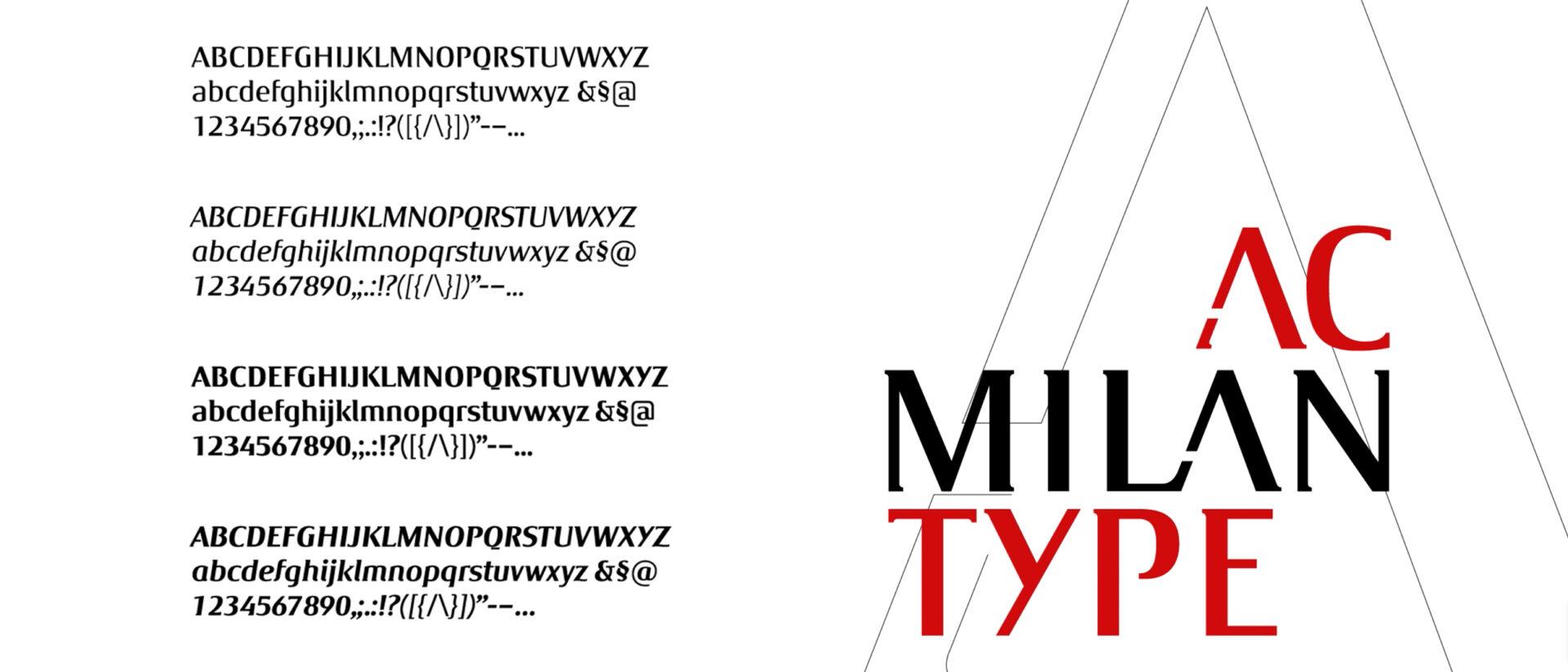
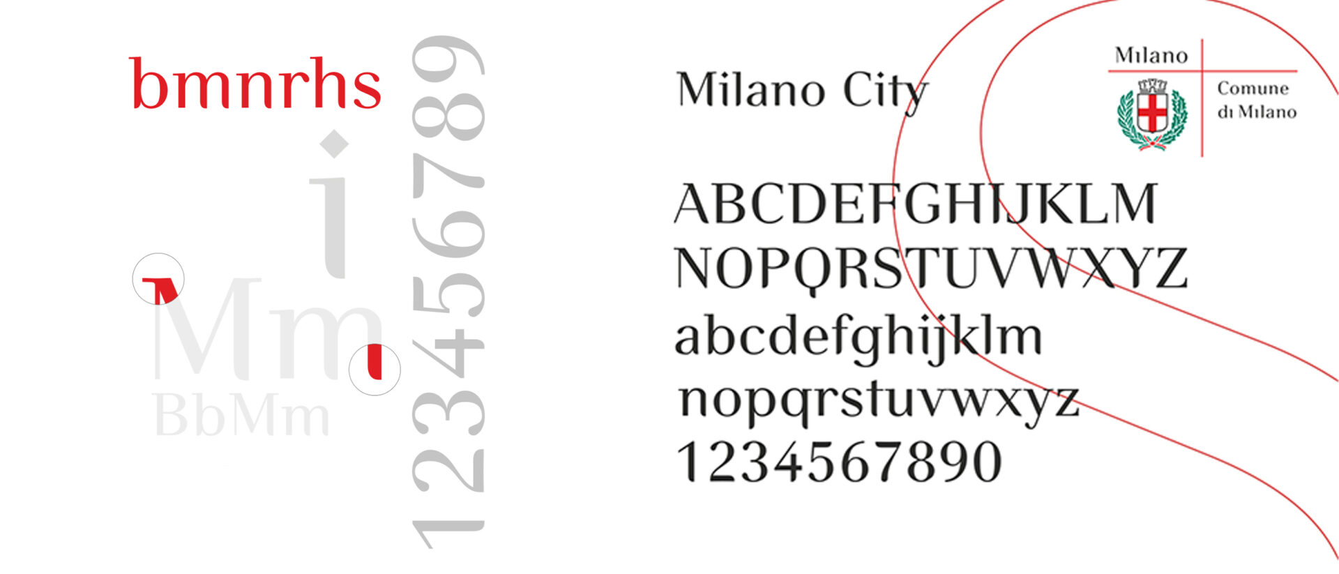
Type design was the first specialist discipline to enter Inarea’s branding practice, around thirty years ago, becoming part of the broader identity-building process and anticipating an approach that is once again central today: designing a proprietary typeface to give form to a brand’s voice. From the renewed importance of the word to the relationship between distinctiveness and legibility, from design methodology to the evolution of digital media, Antonio Pace — type designer and graphic designer, and a long-standing Project Director at Inarea — explains how type design can become an instrument of identity, culture and strategy. We are witnessing a return to the word, almost a rebalancing after the central role the symbol has assumed in visual communication. Why? The symbol and its meaning depend heavily on cultural and personal context. In an increasingly fragmented world, the need for contextualisation can become an obstacle to the universality of a message. The word therefore returns as a fundamental vehicle for building shared meaning. Failing to give that vehicle a distinctive character means giving up part of its potential to express identity. This is why type design is concerned not only with purely optical aspects — font legibility, contrast, performance at different sizes — but also with making a form recognisable. The aim is to ensure that the brand’s visual and value system can be perceived even when the logotype itself is absent: every word can become an expression of the identity. Why does it make sense for a company to invest in a proprietary typeface? Beyond the opportunity to strengthen recognition across different applications, there is also a reason related to the digital nature of fonts, which are subject to licensing agreements. For a company, using a purchased type family over many years can mean recurring costs, whereas a proprietary typeface shifts the perspective from cost to investment: the company acquires an asset of its own, consistent with its identity and designed for long-term use. How is a proprietary typeface actually created? The process begins with something that already exists. It can be summarised as follows: from the logotype to the alphabet, from the alphabet to the font. The key formal features of the logotype are identified and tested on a number of significant letterforms. If the principle works, it is gradually extended to the entire alphabet, both uppercase and lowercase, and then to numerals and other glyphs. At that point, however, the work is only halfway complete. The alphabets need to be harmonised and transformed into a fully functioning font, which means engineering and digitising the typeface. Harmonisation is particularly important because uppercase letters, lowercase letters and numerals are morphologically and conceptually different systems that need to be brought together within a common formal logic. concettualmente differenti che devono essere ricondotti a una logica formale comune. Can you give us some examples of proprietary typefaces designed by Inarea? For the City of Milan, the aim was to transform the name “Milano” itself into a brand capable of expressing a range of associations — fashion, style, Italian identity — without resorting to a stereotypical image of the city. The formal starting point was the Bodoni tradition, quintessentially Italian, which was reinterpreted through a substantial redesign.For Roma Capitale, the process was different. We began with the history of the capitalis romana, looking at its fifteenth-century typographic reinterpretation by Felice Feliciano (1433–1479), who transferred the forms of lettering from stone to paper, anticipating the new paradigm of print.For ENI, on the other hand, the typeface needed to support the brand’s repositioning towards a more familiar, approachable identity, closer to people. This led to softer, rounder forms. ENI was set in lowercase, while the proportions of the letters “e” and “n” were echoed throughout the alphabet, making the ENI identity recognisable even in letters that do not appear in the name itself.In the case of Luiss, finally, we started from the existing logotype, identifying details — such as the serifs of the uppercase S — that could be repeated throughout the system.In every case, the principle remains the same: each individual element should refer back to the whole and contribute to its recognition. What role can artificial intelligence play in this process today? Technological convergence has made it possible to bring together, on a single workstation, activities that once required much more complex production chains and a broader range of specialist skills. Artificial intelligence is advancing particularly in processes involving matching, comparison and programming, but the design of letterforms remains too varied and detailed to be easily replaced. In this context, how is the role of type design within branding evolving? Ultimately, the objectives of a brand remain what they have always been: to communicate and create relationships. And the word remains a shared and reliable foundation, capable of adapting to cultural, technological and historical change.Designing the typographic form of a word means giving it a distinctive voice without taking away from its most fundamental purpose: to remain a shared tool through which human beings interpret the world and build relationships.

Form is Thought

Writing is a way of giving form to thought and, through words, of shaping our identity. From the earliest marks left by human beings to the screen of our smartphones, writing means choosing a sign, a form, a rhythm. And every choice, even when we are unaware of it, says something about who we are. Western civilisation also grew out of an extraordinary invention: the alphabet. Between the 8th and 6th centuries BC, the Greek alphabet introduced vowels for the first time, capturing the complexity of spoken language and making it possible to record stories, pass them on and multiply them. The Odyssey is perhaps the most powerful embodiment of this dynamic. Odysseus travels through the world, encounters friends and enemies, constantly risks losing himself and, through those very encounters, constructs his own identity. There is one passage I find particularly revealing: shipwrecked, he reaches the land of the Phaeacians, and during a banquet the bard begins to tell his story. Odysseus listens to himself being recounted, covers his face and weeps. Because our identity is not only what we are: it is also what others say about us. And, by extension, as Jeff Bezos observed, your brand is what people say about you when you are not in the room. With typography, writing, which began as a physical and individual gesture, becomes a shared form: we use codified shapes that belong to a community. Between the 15th and 16th centuries, Venice was where this transformation reached maturity. A crossroads between East and West — a New York or Shanghai of its time — the city became the European capital of printing. It was here that the publisher Aldus Manutius (1449–1515) understood that the future of the book lay not simply in the ability to reproduce it, but in rethinking its form and the way it was used. The “pocket-sized” book emerged in the octavo format: smaller, portable, intended to be read beyond the confines of libraries. Working with Francesco Griffo (1450–1518), Manutius developed italic type, a more compact style that would become known in many languages as Italic. Typography was therefore no longer simply a means of reproducing words: it began to give them a form, a “character”. And character can mean a letter or symbol, but also a distinctive quality, much as it does when we speak about people. In typography, too, we describe a typeface as joyful, severe, elegant, technical or regular, because the shape of the letters helps define the “personality” of the words. Even when their literal meaning remains unchanged, different typefaces alter the way those words are perceived. Words carved in stone carry the weight of inevitability, because the material itself gives the message a promise of permanence. Today, the opposite is true. In the digital realm, everything is immediate, replaceable, ephemeral. And precisely because we are surrounded by words — never before in history have we read and produced so many of them — their form becomes decisive once again. We write constantly, yet we rarely choose how we write. The screen becomes the mediator of communication: we type, send, scroll. But we no longer design our own writing: we do not choose the typeface, weight, size or rhythm. In our urgency to say something, we lose awareness of how that thought will be received. And yet form is thought. Perhaps this is precisely why, in branding today, we are witnessing a renewed focus on the word and the growing use of proprietary typefaces. After an era dominated by the logo, the name and its form are returning to the centre. Not simply as a matter of brand recognition, but because through a proprietary typeface an organisation can build a voice of its own over time. Typography thus becomes an element of distinctiveness and belonging. In an age in which everything seems endlessly modifiable and replicable, it is precisely this ability to give thought a recognisable identity that allows us to tell others who we are.

The Taste of a Break

Beyond the Holiday The word vacation derives from the Latin vacuum: an empty space, an interval between two moments. Not necessarily an absence of activity, but a time to inhabit through meaningful experiences. The Romans distinguished between these two dimensions through the concepts of otium and negotium. It is what Domenico De Masi describes as the “taste of a break” in The Creative Leisure (1995): a time when well-being, culture, social interaction and discovery become essential to quality of life. This is the context in which the leisure meta-sector emerges, driven by the growth of the so-called quaternary sector and its focus on services, experiences and the value of free time. Food, wellness, culture, mobility, entertainment and hospitality form part of a single ecosystem, responding to an increasingly widespread need: to make time away more meaningful. Leisure and longevity As life expectancy continues to increase, this transformation becomes even more significant. Living longer is no longer enough; the challenge is to live better. The concept of longevity expands the very meaning of leisure, extending it beyond holidays to encompass every stage of life. Wellness centres and preventive healthcare facilities — such as Lucia Magnani Health Clinic — together with services and environments designed for an ageing yet increasingly active population, demonstrate how leisure is becoming a space for care, personal growth and quality of life. For brands, this means designing experiences that respond to new expectations while building lasting relationships with increasingly informed and conscious people. Leisure as a Brand Identity Strategy Leisure provides a particularly fertile ground for brand identity because a brand is more than a visual mark or a coordinated system of touchpoints. It is an ecosystem of values that takes shape through every interaction across space and time. The relationship with a brand unfolds continuously across physical and digital environments. As with Frecciarossa, it begins with searching for and purchasing a ticket online, continues throughout the journey in every detail—from the onboard environment to something as small as a refreshing towel—and extends beyond arrival at the destination. Environments, wayfinding, spatial design, materials, services and digital platforms all contribute to building a coherent narrative. Recognition is not created by the repetition of a visual identity, but by the ability to interpret every context through the experience of the people who engage with it. This perspective goes beyond the conventional notion of place identity. From a destination’s cultural offering to hospitality, from food to mobility and even healthcare, every element contributes to shaping the perception of a place and its identity. Leisure thus becomes a lens through which to understand complex ecosystems, where every experience strengthens—or weakens—the perceived value of both a place and its brands. From Leisure to Lifestyle The evolution of leisure ultimately leads to a broader understanding of lifestyle. At a time when ideological affiliations play a diminishing role, it is everyday behaviours that increasingly define individual identities. People choose brands, places and experiences that reflect the way they aspire to live. As a result, brand identity no longer serves simply to differentiate an offering. It creates desirable worlds that shape behaviours and foster a sense of belonging. It is within this still largely unexplored space that we see one of the most significant opportunities for the future of contemporary branding.

Artificial Intelligence: A User’s Guide

Mario De Caro is one of Italy’s leading scholars in AI ethics. A philosopher and Professor of Moral Philosophy at the University of Rome Tre, where he holds the UNESCO Chair in Ethics of Artificial Intelligence and Practical Wisdom, and a Visiting Professor at Tufts University in the United States, he has long explored the relationship between mind, technology and society. Starting from the origins of the “mechanisation of thought”, he explains how AI has already reshaped our cognitive paradigms, the risks posed by the recent rise of agentic AI, and why collective policies and regulations are needed. When did the idea of mechanising thought first emerge? Philosophers such as Pascal and Leibniz had already envisioned systems capable of carrying out reasoning through mechanical processes. The real turning point came in 1956, at the Dartmouth Conference, where the term “artificial intelligence” was officially coined. The original idea was to represent all human knowledge symbolically and apply logical rules to infer new information. It was a rule-based form of AI, grounded in deductive reasoning. What distinguishes today’s AI from its earliest forms? The difference is profound. Early AI systems followed predefined rules: they started from axioms and produced logical consequences. Today’s systems, by contrast, are data-driven and learn from experience. The decisive shift came in 2017 with the development of new neural network architectures and Large Language Models (LLMs). Rather than operating sequentially, these models process vast amounts of data in parallel, identifying patterns and probabilities. In this sense, AI reasons abductively: it generates the most plausible hypothesis based on the available data. This is a form of reasoning often used in science. Darwin, for example, developed the theory of evolution by connecting phenomena that initially appeared unrelated. Abductive reasoning is powerful because it can generate innovation, but it also carries risks: its conclusions are never certain. Do Large Language Models truly understand language? The most advanced systems display increasingly sophisticated forms of functional understanding. They can generate text, images, music and even creative solutions in ways that are often indistinguishable from those produced by humans. We are no longer dealing with merely advanced calculators. Systems such as AlphaZero have demonstrated remarkable strategic and creative capabilities, learning autonomously through trial and error. Can we speak of conscious artificial intelligence? Scholars remain divided on the issue: some believe it may be possible, while others reject the idea entirely. The crucial point, however, is that AI can be highly powerful—and potentially dangerous—even without consciousness. Today’s systems are inherently indeterministic: we cannot fully predict their behaviour, nor can we always understand how they arrive at a particular decision. Agentic AI goes beyond simply responding to prompts. It can make decisions, plan actions and operate autonomously. This creates enormous opportunities, but also significant risks, as such systems are already being deployed in strategic domains including finance, healthcare, public administration and defence. What are likely to be the next major areas of application? Medicine is likely to be the field where we will see the most significant impact. AI is already accelerating both diagnostics and pharmaceutical research. But its applications extend across virtually every sector: the creative industries, logistics, financial services and education, to name just a few. The challenge is that these systems are often opaque: they work, yet we cannot always explain precisely why they produce certain outcomes. This is the issue of explainability. In a sense, both humans and machines are opaque systems. AI generates solutions through internal processes that are difficult to decipher, just as we do not fully understand the deeper motivations behind our own behaviour, often constructing rational explanations only after the fact. Yet it is precisely from the interaction between these two forms of opacity that some of the most interesting results may emerge. At the same time, significant risks remain, including the erosion of critical autonomy, information manipulation and algorithmic discrimination. AI can amplify dynamics already present in social media, such as polarisation and echo chambers. There is also the problem of “hallucinations” — outputs that are false, yet highly plausible. What impact will AI have on the creative disciplines? Artificial intelligence can generate images, music and texts that are often indistinguishable from those created by humans. There have been instances in which poems produced by ChatGPT were mistaken for the work of renowned authors and were even highly rated by readers. We are not yet talking about the radical creativity of a Shakespeare or a Caravaggio, but rather about a form of “everyday” or “average” creativity that these systems have already demonstrated they can achieve. For this reason, it is essential to study how such systems work in order to develop a critical and genuinely human perspective, grounded in the capacity for judgement—the ability to recognise when something may appear convincing or correct, yet ultimately fails to hold up under closer scrutiny. What will the impact be on the brand identity sector? Where will the value of creative agencies lie? Interaction is the way forward. AI is an extraordinarily powerful tool, but it will not replace creative professionals. The added value of creative agencies will lie in their ability to integrate and harmonise these technologies within organisational processes, acting as a critical interface between artificial systems and the ways they are actually deployed and used. Today, there is growing demand for this kind of strategic guidance. Ultimately, machines can stimulate and enhance creativity, even within corporate decision-making processes. Yet understanding how to make this happen in practice is far from straightforward. What we are facing is an entirely new anthropological and operational paradigm—one that requires not only technological expertise, but also judgement, interpretation and a deep understanding of human behaviour. How can we govern artificial intelligence? Are the current regulations sufficient? No. The European AI Act (Regulation (EU) 2024/1689) is an important first step, but it is not enough. What is needed are international frameworks and, above all, systems designed with intrinsic ethical safeguards—an approach often referred to as “ethics by design”. Most importantly, effective governance … Read more

From Products to People: The Long Journey of Brand Design

Il Sole 24 Ore – Sunday, June 14, 2026 An article by Antonio Romano. Between the late eighteenth and early nineteenth centuries, brands did not yet know they were brands. They were labels displaying the name of the product and its manufacturer. Their primary function was simply to distinguish one product from another. Yet it took only ornate lettering and a few decorative elements to create an unexpected effect: the label became the product’s memory, giving rise to the earliest form of customer loyalty. The evolution of branding has been built upon this premise. The contemporary brand bears little direct resemblance to its original label. Today, it is a promise of value that extends beyond the logo and beyond the act of selling, shaping experiences, building communities, and fostering a sense of belonging. A brand signals something intangible, something that engages and remains connected with its various audiences in order to create its own world. This seems to be its true purpose: shifting the focus from “what we do” to “why we are here.” It is therefore clear that design, in all its forms, is the most effective means of representing a brand’s universe. Whether rational or emotional, design becomes a non-verbal language capable of generating impact and, in turn, fostering empathy, trust, and authority among diverse audiences. All of this happens in a remarkably short span of time, reflecting the limited attention available to twenty-first-century individuals, immersed as they are in an overcrowded communication landscape, both physical and digital. It is precisely this historical context that has shaped some of the defining characteristics of contemporary branding. The internet changed everything. By removing physical and geographical barriers, the web triggered an exponential growth in the number of brands present in our daily lives: today, more than 93 million trademarks are registered worldwide (WIPO, 2024). A glance at Amazon’s homepage or an Instagram feed is enough to understand the scale of this phenomenon. As a result, brands are compelled to pursue greater simplicity in their representation in order to reach audiences instantly. Fewer messages and fewer visual elements are required to communicate more powerfully, especially within the limited space of a smartphone screen. The internet, and social media in particular, has also broken down the barriers between people, creating the illusion of greater proximity and placing individuals at the center of the conversation. The spotlight, once occupied by the product, now belongs to the person. Brands are engaged in a continuous dialogue with their audiences, striving to understand, involve, and persuade them. As a result, community has come to prevail over individuality, with significant implications for the design of brand identity itself. It is no longer enough to endlessly replicate a logo, nor is it useful to mark every asset belonging to an organization. What matters today is making visible the world to which that organization aspires to belong and the values with which it chooses to identify. Another aspect, closely related to this shift, concerns algorithmic systems and artificial intelligence, both of which have restored the primacy of language over the visual dimension that dominated the twentieth century. Before encountering a logo, we now enter a brand’s world through words: the words we use to describe what we seek to search engines and AI systems, and the words that, through a name, identify the entity that responds to that request. In this sense, the brand returns to being a symbol in its original meaning: an object divided into two parts that, once reunited, generates recognition. From this encounter, a story emerges. The symbol becomes a myth—that is, a narrative rich in meaning and values. The brand thus rediscovers the essence of the term mythos: originally meaning “word,” then increasingly “story,” until arriving at its contemporary sense of a “memorable reality.” Another aspect, closely related to this shift, concerns algorithmic systems and artificial intelligence, both of which have restored the primacy of language over the visual dimension that dominated the twentieth century. Before encountering a logo, we now enter a brand’s world through words: the words we use to describe what we seek to search engines and AI systems, and the words that, through a name, identify the entity that responds to that request. In this sense, the brand returns to being a symbol in its original meaning: an object divided into two parts that, once reunited, generates recognition. From this encounter, a story emerges. The symbol becomes a myth—that is, a narrative rich in meaning and values. The brand thus rediscovers the essence of the term mythos: originally meaning “word,” then increasingly “story,” until arriving at its contemporary sense of a “memorable reality.” Ultimately, the contemporary brand brings together the visible and the invisible. Building its representation is no longer solely an act of design; it is the outcome of a process that integrates research, analysis, and strategy to understand what a brand can say and how it can say it authentically. Design itself extends beyond the visual dimension, embracing sound and scent as well, because engagement increasingly unfolds on a multisensory level. The brand experience is no longer confined to what people see, but encompasses what they hear, feel, and remember.

For a Peaceful 1 May

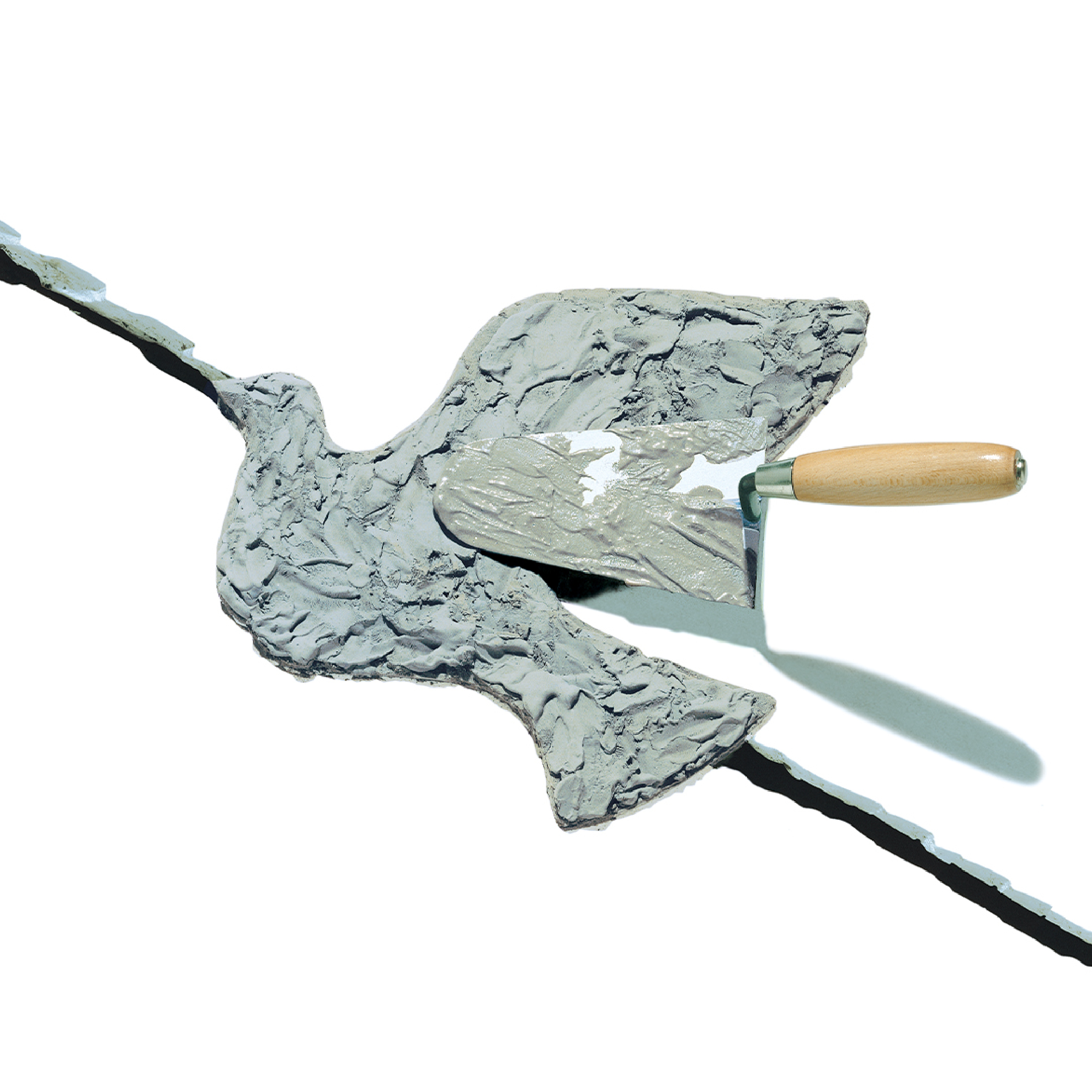
“The Third World War fought in fragments.” This is how the sum of ongoing conflicts has been described—the highest number ever recorded since the end of World War II. There are currently 56 situations of armed conflict, involving 92 countries. They have led to the displacement of over 100 million people, and in 2024 the number of casualties reached a tragic record: more than 230,000 lives lost. It is this discouraging tally that led us to revisit an image we created thirty-two years ago to mark the Peaceful May Day in Sarajevo, a city that became a symbol of the war in the former Yugoslavia. The image was commissioned by the European Trade Union Confederation, which, with the support of the United Nations, had organized the event. The meaning of the celebration is as simple as it is profound: peace and work are inseparable values. The image depicts a bricklayer’s trowel in the act of sealing the crack of a bombed wall, while at the same time giving shape to a dove. The symbol of peace thus becomes a symbol of reconstruction—and therefore of work. Happy 1 May!

Dear Friends,

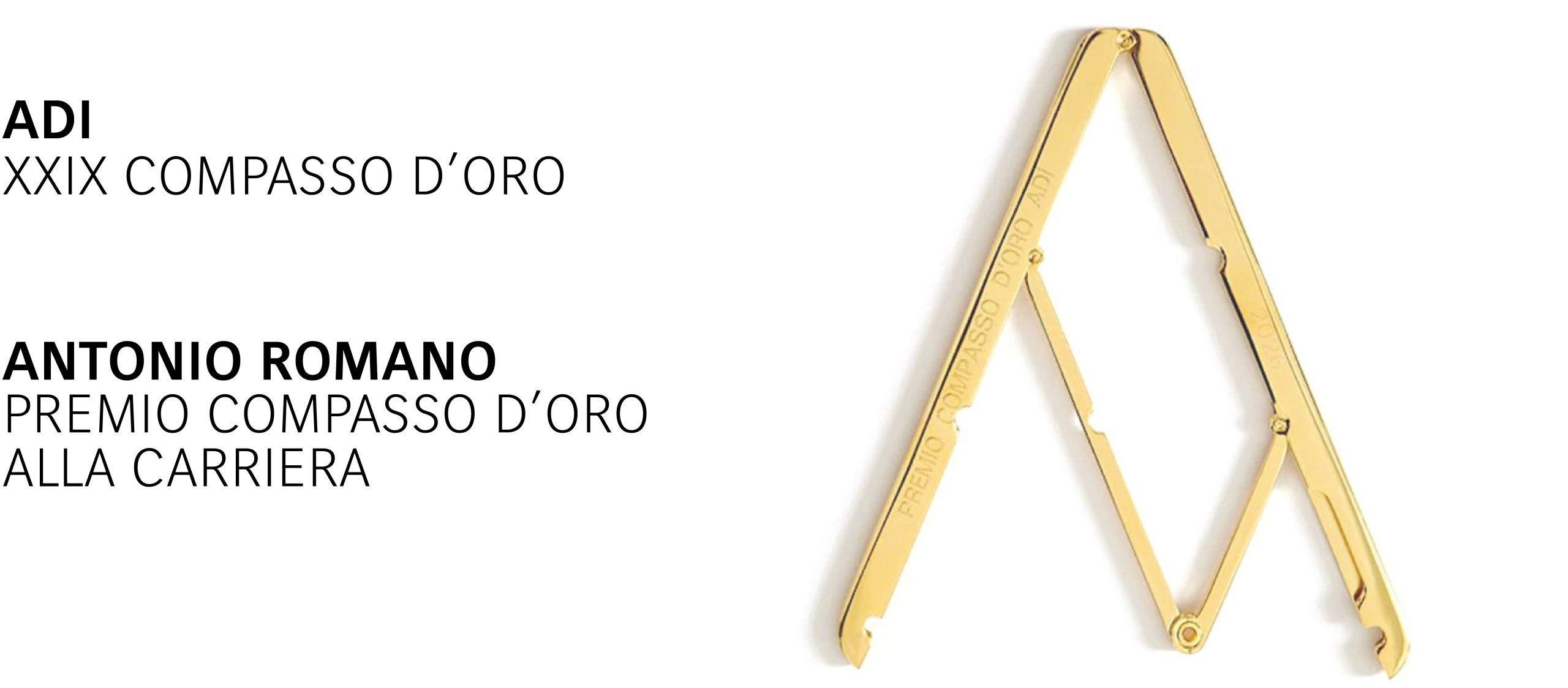
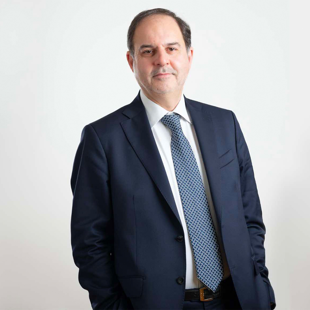
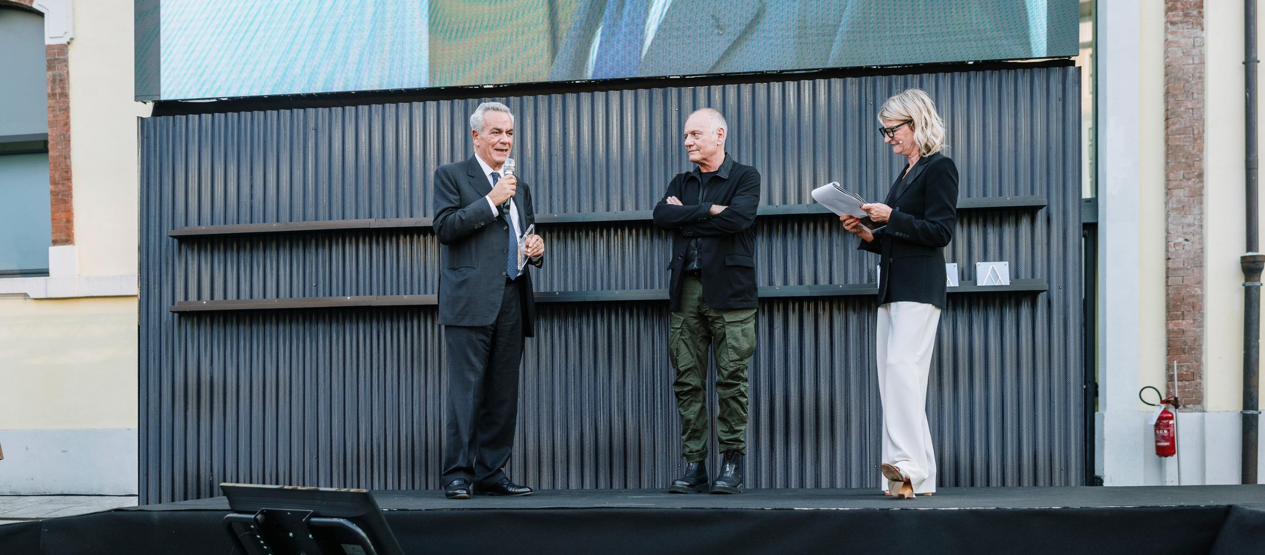
Since 1980, passion for this profession has always been our greatest asset. It is a passion that rewards hard work and, at times, is itself rewarded: I have been honoured with the Compasso d’Oro Career Achievement Award, the highest recognition in Italian design. This award symbolically embraces my entire professional journey and invites me to reflect on fifty years of my life through the brands created for companies, industrial groups and institutions. Many of these projects have become part of our collective memory, yet every one of them is the result of a shared effort. I have always considered Inarea a community before a company, and it is this spirit that has given depth to the relationships built with colleagues, partners, suppliers, clients and friends throughout this long journey. They are the people with whom I wish to share this recognition, and to whom I extend my heartfelt gratitude for their unwavering support. Thank you once again, and my warmest regards. Antonio Romano

The value of consistency

The rebranding of a law firm is a moment of identity synthesis, strategic alignment, and redefinition of its relationship with clients and the market. In the case of Improda, entrusted to Inarea, the process stems from an internal evolution of the firm and develops into a broader reflection on communication, consistency, and trust.We discuss this with Alberto Improda, founder of Improda Studio Legale, a firm active for over thirty years and now structured as a multidisciplinary group serving businesses. What needs led you to the rebranding? The need stemmed from a very concrete step: at the beginning of 2025, we expanded the partnership by bringing in professionals who had been working with us for years. It was a moment of natural growth, but also a symbolic one, and we felt the need to visually represent this new phase. Alongside this, there was a more structural need: over the years, the firm had evolved into a complex group, complementing its legal practice with business advisory services. However, this growth had taken place unevenly, with different visual identities. The rebranding therefore became an opportunity to create a unified and coherent image for entities that, while working together, presented themselves in a misaligned way. Rebranding is a process of synthesis: what did you learn from revisiting your identity? It was far more complex than I had imagined. I initially thought it would be a purely technical intervention, but it turned into a true process of introspection. The dialogue—both internal and with Inarea’s professionals—led us to articulate values and visions that we had never fully clarified before. Differences in perspective also emerged: on one side, more traditional approaches; on the other, more innovative views. The goal was not to find a compromise, but an authentic synthesis. The final outcome—a master brand capable of bringing together legal practice and advisory services—reflects this awareness: we are a single entity, with different yet integrated competencies. How important is it to manage a law firm’s image in a coherent and strategic way? It is essential. The rebranding helped us not only present ourselves more effectively, but also work more efficiently. Previously, when a client required services beyond strictly legal ones, the transition to our advisory company could create uncertainty. Today, thanks to a unified identity, this transition feels natural. At the same time, we chose to rely on professionals for managing our communication, particularly on social media. Here as well, the key word is consistency: gradual growth, without shortcuts, in full respect of the firm’s reputation. What does it mean to build trust in a law firm through branding? Trust is central—it always has been in the legal profession, and today it is also a key element of branding. Trust is built through consistency: if a brand makes a promise, it must uphold it over time. This is what makes a firm credible in the eyes of its clients. Looking at recent cases, it is clear how the perception of consistency—or inconsistency—can make a decisive difference. For a law firm, this means aligning communication, values, and professional conduct. The brand is not a superficial layer; it is the visible expression of what the firm truly is.

An Award for a Design-dreamer

Founded by Antonio Romano in 1980, Inarea reflects the vision of one of the leading figures in Italy’s design culture. Over the years, he has shaped the identities of companies and institutions that have become part of the country’s collective memory. Aci, AC Milan, Anas, Autostrade per l’Italia, The Venice Biennale, Cgil, Cisl, Confcommercio, Confindustria, Coni, Enel, Eni, Frecciarossa, Ilva, Italo, Maxxi, Rai, Snam, Tim, Treccani, Webuild, …to name just a few—spanning decades of economic, technological and social transformation that have redefined the relationship between brands, media and people. The XXIX ADI Compasso d’Oro Career Achievement Award recognises not only the value of his work, but also his ability to interpret design as a cultural tool—one that understands the present, anticipates change and shapes a vision of the future. What does it mean to receive the Compasso d’Oro for lifetime achievement? It is the recognition of a path in which design has always been understood as a means of giving value to things, both material and immaterial: the end is always identity. A better world is also a more beautiful world. When art stopped placing beauty at its centre, design took over that space: first through function, then by creating relationships, empathy, belonging. A career that runs parallel to the evolution of contemporary brand identity. In the Seventies, advertising opened up a new world for products. In the Eighties came the idea of relationality: we understood that everything that exists communicates. At the time, companies were multiplying their marks — a brand for every product. We worked in the opposite direction, towards a single identity reference capable of representing many elements, however different from one another. With CGIL, for example, that red square became a container able to hold together very different stories. It was a cultural shift: not celebrating what belongs to us, but what we belong to. Today, in the age of social media and online communities, this question of belonging seems even more central. Certainly. A brand’s success depends on how many people feel it as their own. People want to belong to worlds in which they recognise themselves, and algorithms now amplify that dynamic continuously. This is why the “purpose” underlying a brand identity has become decisive: what counts is not only what you do, but why you do it. What were the turning points in Inarea’s history? After CGIL came Finmeccanica, Enichem and ILVA, which gave us credibility. The RAI rebranding was then a decisive step, because that project entered people’s homes. You only had to say “the butterfly people” and everyone knew who we were. But I could just as well name CartaSì, equally fixed in everyone’s memory, because we turned “Servizi Interbancari” into a simple, familiar name, suited to a society in which digital payments were becoming part of everyday life; or La Biennale di Venezia: an almost provocative project, an unorthodox and disruptive identity for a historic institution. That RAI mark is still alive in the collective imagination, even though it was replaced more than fifteen years ago. Why? Because it was a polysemic form: a mark able to generate several readings and several meanings at once. From a distance you saw a butterfly; then you discovered two profiles facing each other — the symbol of dialogue and of moving beyond broadcast television. In those years we had already sensed that the “one to many” model would come to an end, and that digital would turn everything into a more interactive relationship, moving to one to one and many to many. Which crises most changed the way a brand is represented? The economic crisis, which in Italy was compounded by the political one of Tangentopoli, hit us hard: we were an independent firm and we went through extremely difficult years, yet we managed not to lay off a single person. Later, the Lehman Brothers crisis radically changed the global market. Until then, the internet had opened enormous possibilities even to independent practices like ours: we received enquiries from all over the world, particularly from emerging markets that saw one of our projects online and contacted us directly. We had also built an international network of partners, but the financial collapse made those flows vanish, and the market concentrated around the large multinationals of branding and strategic consulting. Meanwhile, digital was already changing the very language of the brand: a change that happened almost in silence, like a snowfall you notice only when you open the door and find the whole landscape transformed. Touchpoints became immaterial, increasing the weight of words and of the interface. In the digital world, changing an identity no longer means replacing signs, physical materials or sales networks, but updating interfaces, applications and online environments. Big Tech set a new rhythm of change, and the life cycle of brands has shortened dramatically. Which historical events contributed just as much to redefining the representation of the brand? The 11th of September 2001 shattered the happy illusion of globalisation that had followed the fall of the Berlin Wall in 1989, carrying us into today’s post-globalisation. In that passage, the promise of linear integration and of a single world market collided with the reality of a profound geopolitical fragmentation and the return of economic and cultural barriers. Identity moved from being a concept of belonging rooted in shared values to an expression of otherness and radicalisation, shifting progressively towards the culture of the body and of pure aesthetic representation. In brand identity, this scenario marked the decline of the static “heraldic” symbol in favour of the new rules of “liquid” branding: one no longer guards rigid, specific values, but governs flexible languages and narratives, adapted to different audiences. Today artificial intelligence can create a logo in a matter of seconds. What is left of the designer’s craft? AI is a magnificent instrument, provided we do not put a gun in the hands of children. Artificial intelligence opens up enormous possibilities: it lets us save time and reach explorations that, by traditional … Read more

Law Firm: the silent revolution

The evolution of law firms is unfolding rapidly and profoundly through the integration of new organizational models, technological innovation, and increasingly complex market dynamics. In this context, branding becomes a strategic tool to redefine the identity and positioning of law firms. We discuss this with Mario Suglia, for a cross-disciplinary perspective spanning law and the design of relationships. What have law firms evolved into today? Today, lawyers are increasingly acting as advisors—proactive figures able to anticipate scenarios and guide clients through strategic legal decisions. This shift in role is accompanied by a decisive factor: technology. Through the systematic integration of tools such as artificial intelligence, law firms are becoming “service platforms” where people and technologies coexist, reshaping processes and capabilities. At the same time, multidisciplinarity is growing. Lawyers are no longer “isolated” professionals; depending on the area of work, they engage and collaborate with other disciplines—from tax to business advisory. This hybridization naturally leads to aggregation: firms tend to merge and evolve into complex organizations, often structured as corporate entities (STAs—lawyer companies), in order to respond to increasing market complexity. Today, it is difficult to imagine a solo practitioner remaining competitive. The collective dimension becomes a strategic asset, enabling integrated expertise and greater organizational strength. How does this evolution connect with branding dynamics? The key shift is from the individual—where each professional now has their own personal brand—to the group, the firm, and therefore corporate branding. Traditionally, the focus has been on the individual lawyer. Today, especially in corporate contexts, the emphasis is increasingly on the firm itself. This reflects a change in client expectations: not so much a search for individual excellence, but for structures capable of managing complexity. A law firm’s brand thus becomes the synthesis of a promise: the ability to be reliable, competent, and consistent over time. In this phase of significant transition, it is essential to define the right balance between the master brand—the firm—and the surnames of the individual lawyers who compose it. It is the primary, collective brand that generates trust and builds reputation. This marks a deep cultural shift, still unfolding but ultimately irreversible. How important is naming for a law firm today? This aspect, too, is undergoing a crucial shift, marking—also symbolically—the move beyond the traditional model tied to the founders’ surnames. Increasingly, firms are choosing names or acronyms that are independent from individuals and capable of expressing a distinct, enduring identity. This does not mean diminishing the value of founders or individuals, but rather redefining their role within a broader system. The name thus becomes an element of synthesis and vision: it must be recognizable, distinctive, and aligned with the firm’s positioning. It is a delicate balance, especially in this transitional phase where elements of personal and corporate branding still coexist. What are the tools of brand identity for law firms today? Branding now has a multidimensional nature. It is no longer limited to the logo or visual identity, but extends across multiple sensory and relational levels. The visual dimension—and its expression in digital environments, from the website to online communication—remains fundamental, yet new sensory languages are emerging.For example, olfactory branding is becoming increasingly relevant for law firms, shaping physical spaces as a distinctive element of brand recognition. Similarly, brand languages translated into interior design contribute to building a coherent experience. In addition, firms can leverage sound—through sonic logos and musical themes—as a distinctive marker.More broadly, branding takes form through consistent moments of interaction that build relationships and reinforce the perception of the law firm.In essence, design helps make the law more usable, useful, and understandable. Law firms, as active players in its application, are becoming increasingly aware of this in the way they build relationships with their clients.