Designing the Brand Voice

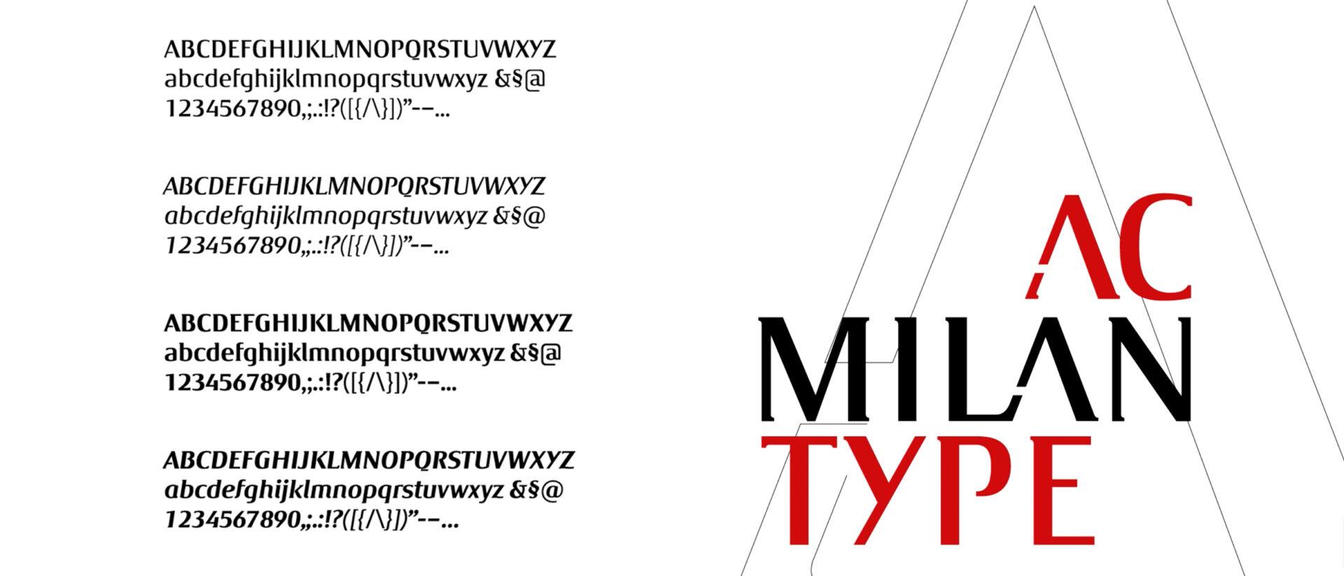
Type design was the first specialist discipline to enter Inarea’s branding practice, around thirty years ago, becoming part of the broader identity-building process and anticipating an approach that is once again central today: designing a proprietary typeface to give form to a brand’s voice. From the renewed importance of the word to the relationship between distinctiveness and legibility, from design methodology to the evolution of digital media, Antonio Pace — type designer and graphic designer, and a long-standing Project Director at Inarea — explains how type design can become an instrument of identity, culture and strategy. We are witnessing a return to the word, almost a rebalancing after the central role the symbol has assumed in visual communication. Why? The symbol and its meaning depend heavily on cultural and personal context. In an increasingly fragmented world, the need for contextualisation can become an obstacle to the universality of a message. The word therefore returns as a fundamental vehicle for building shared meaning. Failing to give that vehicle a distinctive character means giving up part of its potential to express identity. This is why type design is concerned not only with purely optical aspects — font legibility, contrast, performance at different sizes — but also with making a form recognisable. The aim is to ensure that the brand’s visual and value system can be perceived even when the logotype itself is absent: every word can become an expression of the identity. Why does it make sense for a company to invest in a proprietary typeface? Beyond the opportunity to strengthen recognition across different applications, there is also a reason related to the digital nature of fonts, which are subject to licensing agreements. For a company, using a purchased type family over many years can mean recurring costs, whereas a proprietary typeface shifts the perspective from cost to investment: the company acquires an asset of its own, consistent with its identity and designed for long-term use. How is a proprietary typeface actually created? The process begins with something that already exists. It can be summarised as follows: from the logotype to the alphabet, from the alphabet to the font. The key formal features of the logotype are identified and tested on a number of significant letterforms. If the principle works, it is gradually extended to the entire alphabet, both uppercase and lowercase, and then to numerals and other glyphs. At that point, however, the work is only halfway complete. The alphabets need to be harmonised and transformed into a fully functioning font, which means engineering and digitising the typeface. Harmonisation is particularly important because uppercase letters, lowercase letters and numerals are morphologically and conceptually different systems that need to be brought together within a common formal logic. concettualmente differenti che devono essere ricondotti a una logica formale comune. Can you give us some examples of proprietary typefaces designed by Inarea? For the City of Milan, the aim was to transform the name “Milano” itself into a brand capable of expressing a range of associations — fashion, style, Italian identity — without resorting to a stereotypical image of the city. The formal starting point was the Bodoni tradition, quintessentially Italian, which was reinterpreted through a substantial redesign.For Roma Capitale, the process was different. We began with the history of the capitalis romana, looking at its fifteenth-century typographic reinterpretation by Felice Feliciano (1433–1479), who transferred the forms of lettering from stone to paper, anticipating the new paradigm of print.For ENI, on the other hand, the typeface needed to support the brand’s repositioning towards a more familiar, approachable identity, closer to people. This led to softer, rounder forms. ENI was set in lowercase, while the proportions of the letters “e” and “n” were echoed throughout the alphabet, making the ENI identity recognisable even in letters that do not appear in the name itself.In the case of Luiss, finally, we started from the existing logotype, identifying details — such as the serifs of the uppercase S — that could be repeated throughout the system.In every case, the principle remains the same: each individual element should refer back to the whole and contribute to its recognition. What role can artificial intelligence play in this process today? Technological convergence has made it possible to bring together, on a single workstation, activities that once required much more complex production chains and a broader range of specialist skills. Artificial intelligence is advancing particularly in processes involving matching, comparison and programming, but the design of letterforms remains too varied and detailed to be easily replaced. In this context, how is the role of type design within branding evolving? Ultimately, the objectives of a brand remain what they have always been: to communicate and create relationships. And the word remains a shared and reliable foundation, capable of adapting to cultural, technological and historical change.Designing the typographic form of a word means giving it a distinctive voice without taking away from its most fundamental purpose: to remain a shared tool through which human beings interpret the world and build relationships.
For a Peaceful 1 May

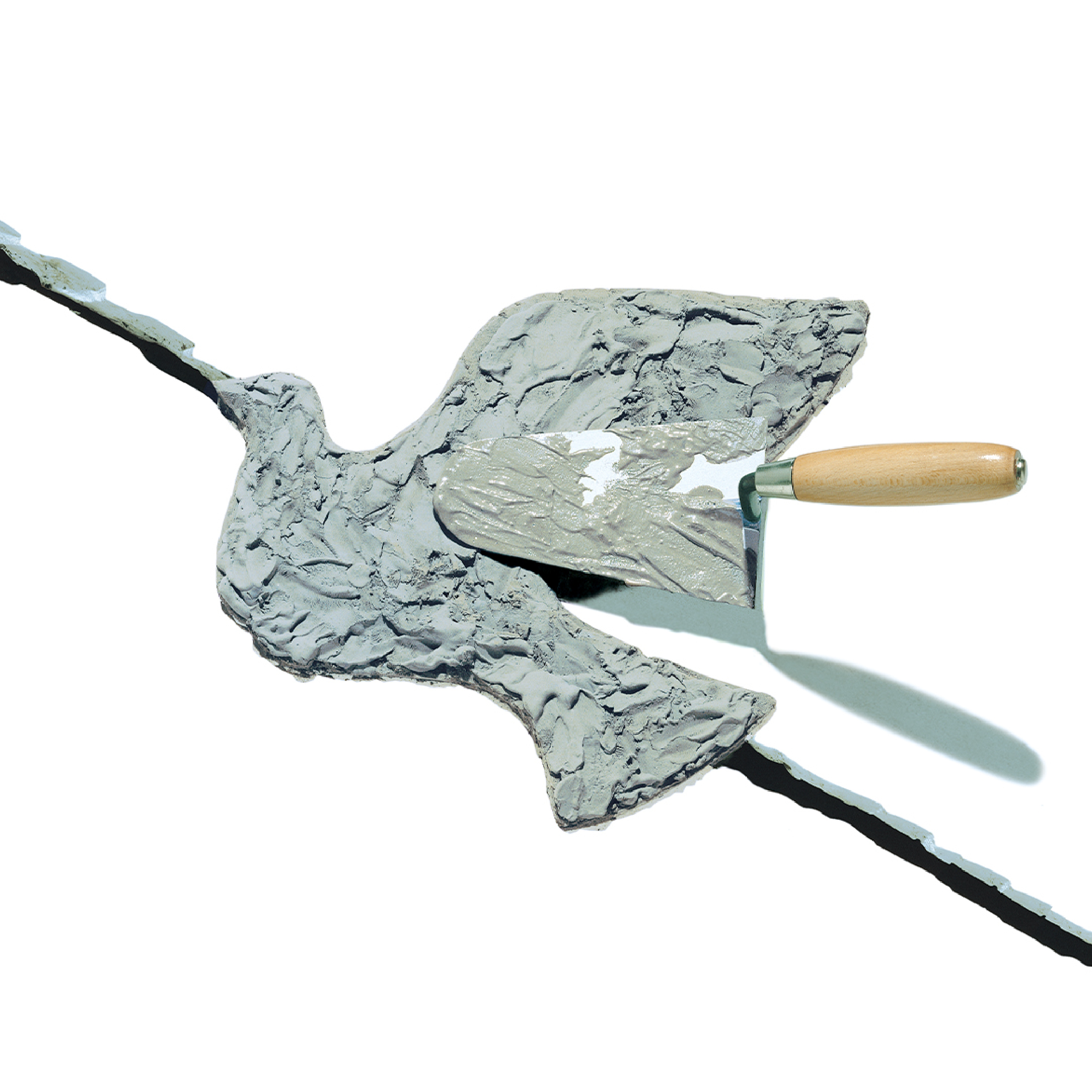
“The Third World War fought in fragments.” This is how the sum of ongoing conflicts has been described—the highest number ever recorded since the end of World War II. There are currently 56 situations of armed conflict, involving 92 countries. They have led to the displacement of over 100 million people, and in 2024 the number of casualties reached a tragic record: more than 230,000 lives lost. It is this discouraging tally that led us to revisit an image we created thirty-two years ago to mark the Peaceful May Day in Sarajevo, a city that became a symbol of the war in the former Yugoslavia. The image was commissioned by the European Trade Union Confederation, which, with the support of the United Nations, had organized the event. The meaning of the celebration is as simple as it is profound: peace and work are inseparable values. The image depicts a bricklayer’s trowel in the act of sealing the crack of a bombed wall, while at the same time giving shape to a dove. The symbol of peace thus becomes a symbol of reconstruction—and therefore of work. Happy 1 May!

Telling the story of a university: coherence and identity in a connected world

Immagine evidenza Articolo Luglio

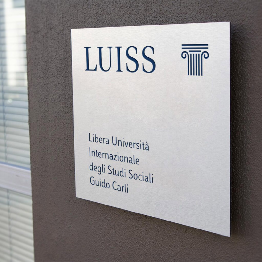
A university is not just an institution that teaches. It’s a world that tells its own story, that engages those who choose it, and that projects the future it promises. And in an increasingly connected, emotional, and competitive world, it’s the story that truly makes the difference. Today, a university communicates across many channels, which makes consistency — both online and offline — essential. Websites, social media, physical spaces, events, and materials all need to speak the same language. The digital experience, in particular, must be clear and accessible: it’s often the first real point of contact with the university and can strongly influence how its identity and credibility are perceived. A university’s brand identity is what makes it instantly recognizable — but also what speaks through the messages it conveys. It’s not just a logo, and even less a crest: it’s a mix. From the name to the colors, from the website to open days, every detail — signs, tone, style — tells the story of who you are and why someone should choose you. Case Studies Conservatorio di Milano A dynamic logotype combines different typefaces to represent musical plurality. The graphic movement creates a visual mark in constant transformation, while the spatial reference remains stable, grounding history and identity. Sapienza A brand identity and brand architecture project that streamlined the complexity of a large university by simplifying its naming, redesigning historical symbols, and introducing a custom typeface. Opit A project that communicates innovation, flexibility, and social impact in the field of digital education. A visual identity built on binary symbols, modern typography, and a dynamic color palette to stand out in the online education landscape. Case Studies A brand identity that brings together academic culture and the business world, using a clear and straightforward language. The constellation symbol evokes the idea of the future, while the blue color conveys stability and reliability. LUISS A project that conveys an idea of education as continuous growth, symbolized by a column transforming into a capital. A consistent visual and typographic language reinforces a sense of belonging and openness to knowledge. Intercultura The brand design reinforces autonomy by emphasizing the name as the central element of the logo. The reference to AFS remains in the background, acknowledging the origins while highlighting a more evolved and independent vision.

BAPS, the bank that speaks the language of its roots

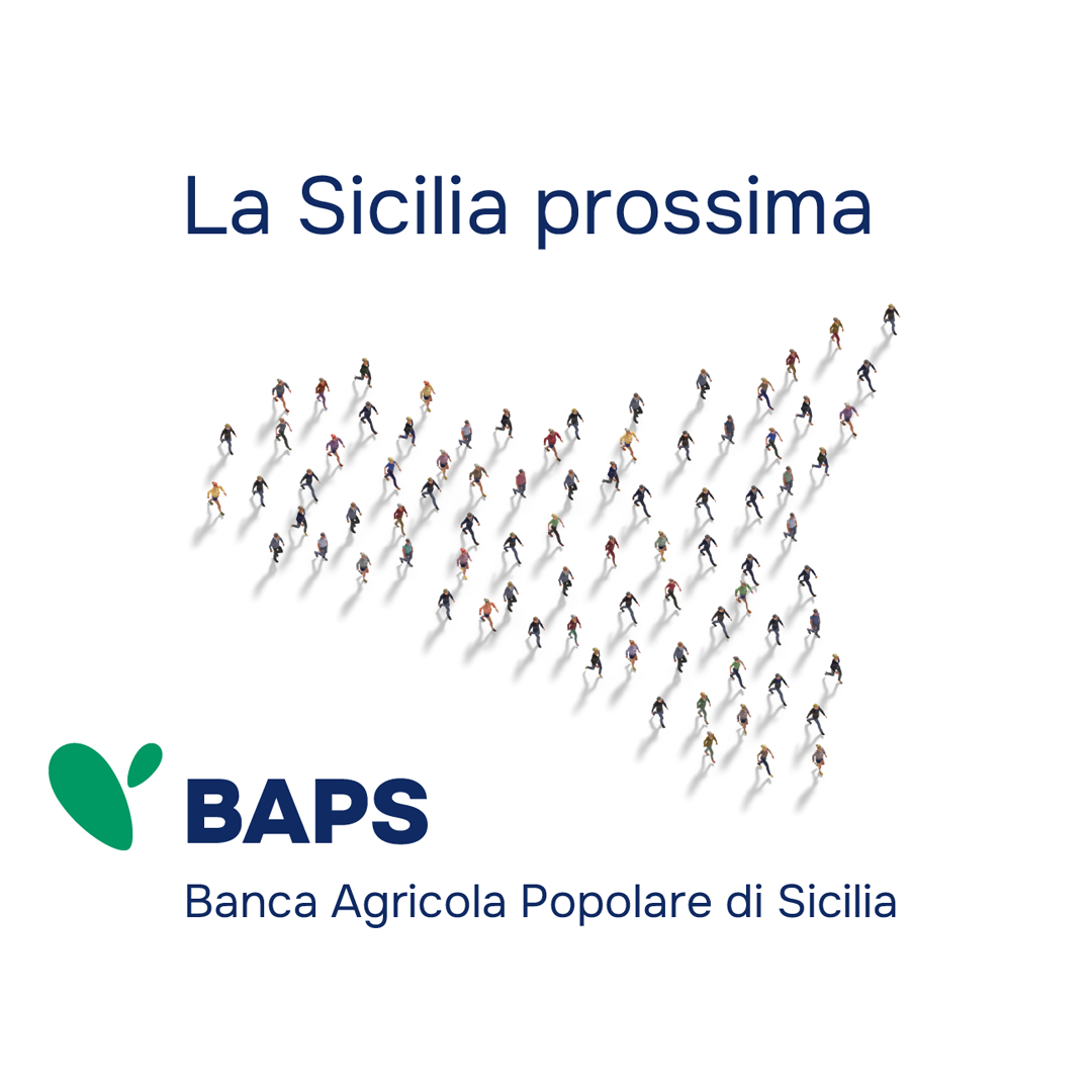
A clear trend is emerging in banking communication: a move toward simplification and the adoption of a tone that is both authoritative and relational. Financial institutions are working to build trust through a sober, direct tone of voice, paired with a clean, essential visual style. The goal is twofold: to convey institutional solidity and to strengthen brand identity in an increasingly digital market.“In this context,” says Emanuela Camera Roda, Project Director at Inarea, who led the brand identity project for BAPS (Banca Agricola Popolare di Sicilia), “we’re seeing a progressive shift in communication toward the master brand rather than promoting individual products. This approach supports consistency, clarity, and recognizability across all touchpoints—both physical and digital.”This was precisely the case with BAPS, whose brand identity project was driven by a deep need: to redefine the identity of a historic bank without betraying its territorial roots. BAPS is, in fact, the only major financial institution operating across the entire region that is authentically Sicilian. It is a cooperative joint-stock bank, and its shareholders—often employees themselves—live and work on the island. The new narrative set out from this uniqueness, drawing on the historical roots of the cooperative movements which, between the 19th century and the early decades of the 20th, gave rise to organized forms aimed at restoring dignity to disadvantaged segments of the population—those traditionally excluded from access to credit. The symbols of those movements were often linked to the agricultural world: the wheat ear, the rose, the reaper, the bee, and so on.In this context, and to underscore its distinctly Sicilian character, the new logo adopts a stylized prickly pear paddle—a plant found throughout the Mediterranean, but deeply rooted in the island’s landscape. This choice is meant to evoke, in a simple, iconic, and subtly ironic way, the ability to withstand extreme conditions while continuing to grow and thrive. At the same time, it visually expresses the strong bond that connects BAPS to its territory, moving beyond the ‘traditional’ and typically conservative imagery of the banking sector. The color green, now a key element of the logo, directly recalls the meaning of the word “agricola” in the bank’s name and implicitly conveys a message of sustainability. At the same time, BAPS’s historic blue is retained in the typography to preserve its institutional tone and maintain continuity with the past. The result is a color identity that balances nature and authority, tradition and innovation. A consistent system from physical to digital The project involved a systemic reorganization of the product brands, eliminating unnecessary logos and symbols and bringing everything back under the visual umbrella of the BAPS master brand. This “brand concentration” extended to every aspect of communication—from physical signage, sensitively adapted to specific local contexts, to digital platforms. Formal consistency across all channels became essential to strengthen the sense of belonging to the BAPS universe, making every touchpoint a recognizable and reassuring element. Territorial and local presence Even in the digital age, BAPS has chosen not to reduce its physical presence. On the contrary, it has expanded by acquiring new branches across Sicily—reaffirming that, especially for a cooperative and local bank, human connection remains essential. Branches serve as trusted touchpoints, particularly in small towns, helping to preserve strong ties with local communities. The result is a new identity that is strong, cohesive, and contemporary, yet deeply rooted in the bank’s history and values.

Metropolitana Milanese: Iconic Signage and Wayfinding

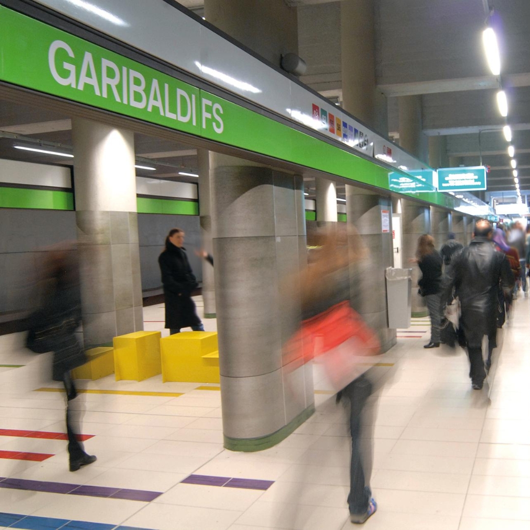
The design of Milan’s Metro Lines 1 and 2 is a milestone in the history of Italian design. This project earned ATM, Franco Albini, Franca Helg, and Bob Noorda the prestigious Compasso d’Oro award in 1964 and introduced the concepts of coordinated image and standardization.One of its most recognizable elements is the continuous perimeter band in the stations, where the station name is repeated every five meters to ensure readability from a moving train. For the signage, Noorda redesigned Helvetica, creating a custom typeface that now bears his name. The expansion of stations and lines over time, along with the need to comply with safety regulations and introduce new services, led ATM to initiate a comprehensive signage and wayfinding refresh starting in the mid-2000s.“Inarea began with the design of Garibaldi Station. It was both stimulating and rewarding to engage with a project like the Milan Metro, which we approached with respect and historical accuracy,” explains Niccolò Desii, Design Director and Partner at Inarea, who has been overseeing the collaboration with ATM for the past twenty years. Signage and Type Design: Interpreting an Icon “We found an interview with Bob Noorda in which he stated that he had wanted to create a lowercase typeface for the Milan Metro. Newer stations with longer names, as well as simple directional messages such as ‘to trains’ or ‘exit,’ required a lowercase typeface for better readability.We developed a font, Metro Type, based on Noorda’s original design, to be used for textual elements on panels, informational signs, and station regulations—essentially, a tool that would allow ATM to communicate in a consistent and cohesive manner.We also undertook a complex update of the signage manual to better integrate the early Metro lines with Line M3, which had introduced discontinuities in elements such as sign architecture and lighting. During that period, the Noorda studio was brought back in to work on updating the typeface.As a result, ATM ended up with two typefaces: Noorda’s original font for station signage and Inarea’s Metro Type for other textual information. However, both coexist harmoniously, as Metro Type was developed as a faithful evolution of the iconic 1964 design.” Rules and Wayfinding for a Timeless Design “After working on the signage and wayfinding for Garibaldi Station, we went on to design the systems for ten more Metro stations. Over time, we have continued to update signage, vehicle liveries, and surface transport elements, culminating in our work on Line M4, where we created the updated mobility map.We developed a set of simple rules and algorithms to ensure the coherent, uniform, and functional distribution of signage within each station. This approach prevents an overload of information in narrow or high-traffic areas while ensuring that signs are strategically placed at key junctions—or, when distances are significant, as confirmation markers along the route.For major interchange stations where multiple lines intersect, we established general guidelines. The handbook outlines key specifications, such as luminescence levels and whether signs should be positioned orthogonally or laterally to entry points.Additionally, we redesigned the pictograms and more technical regulatory signage, making it easier for those managing the system to categorize information and plan the future distribution of signs within station spaces.”