
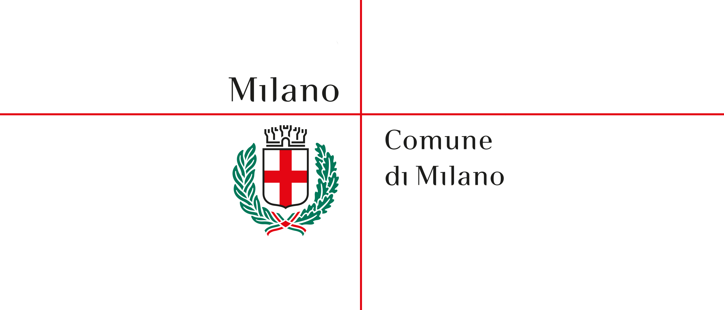
City of Milan
From Institution to Brand
The coat of arms of the City of Milan dates back to 1045, when the red emblem of the nobility and the white emblem of the people were combined into a quartered shield. Following the Battle of Legnano, it became a symbol of the city’s autonomy and prestige. Over the centuries, it was enriched with crowns, wreaths, and several historical variations, including the Visconti, Napoleonic, and Austrian versions. Twentieth-century regulations ultimately standardized the design as a Samnite shield bearing a red cross, framed by laurel and oak branches.
Brand Identity: The Evolution of a Coat of Arms
In 1999, Inarea won the competition to redesign the City of Milan’s coat of arms and its visual identity system. The objective of the new brand identity was to transform the city from an administrative institution into a distinctive, recognizable brand. The name “Milano” thus became a symbol of values, reputation, and innovation, anticipating the concept of place branding. The bespoke Milano City typeface further reinforced this identity, giving the city’s institutional communications a unique visual voice while strengthening the connection between tradition and modernity.

Brand Architecture and Brand Design: Roots and System
The project renewed the coat of arms while respecting the principles of heraldic tradition, emphasizing its defining elements: the Samnite shield bearing a red cross on a white field, the eight-towered civic crown, and the laurel and oak branches tied with the Italian tricolour ribbon. The coat of arms, combined with the Milano logotype, was integrated into a flexible identity system based on movable Cartesian axes. The system includes both full-colour and monochrome versions, with vertical and horizontal layouts optimized for different applications. Its institutional colour palette highlights red, white, and black, with green used as an accent. The identity harmoniously combines the coat of arms and logotype to ensure consistency across all communication materials. The brand architecture also enables the City of Milan’s autonomous departments and institutions to adopt the same visual system, preserving the master brand—composed of the coat of arms and the Milano logotype—while adapting each entity’s name within the lower-right quadrant.


Type Design: Creating a Distinctive Typeface
The logotype is set in Milano City, a proprietary typeface inspired by the renowned Bodoni while incorporating functional refinements. Its lower serifs were rounded to improve legibility and performance at small sizes. The typeface became a distinctive element of the visual identity system, serving as the foundation for the Milano and Comune di Milano logotypes. It was also designed to be extended to other civic institutions, ensuring visual consistency and a coherent shared identity across the city’s communications.

New Naming: Less Bureaucracy, More Dialogue
As part of the urban identity project, the names of municipal departments and public offices were also redefined according to principles of simplification and clarity. Communication with citizens becomes more effective when institutions reduce the weight of bureaucracy, adopting a more direct, accessible, and user-oriented approach.
Communication Design, Signage & Wayfinding: Spaces of Identity
The City of Milan’s brand identity extends across the urban environment and every physical and digital touchpoint, including signage, forms, posters, websites, and institutional materials. The coordinated use of the coat of arms, logotype, and proprietary typeface strengthens the presence of the Milano brand in public space, making it immediately recognizable through the system’s consistency, scalability, and visual coherence.