We use technical cookies to remember your choice and, so that we can prove it, we record on our own server the date, your choice and a shortened version of your IP address. Only if you accept do we also use Google Analytics, to measure visits to the site in aggregate form. If you decline we install no analytics cookie and send no data to Google. You can change your mind at any time from "Cookie preferences" at the bottom of the page. Cookie PolicyPrivacy Policy
ILVA was established at the end of the 1980s following the reorganization of the Italian state-owned steel industry, after the liquidation of Finsider.
Brand Identity & Brand Architecture: A Single Brand
Inarea’s intervention began in 1988 and concluded with its full implementation in 1992. The goal of the brand identity was to build a unified identity for a highly complex group composed of different entities and brands: to rationalize communication and visual systems, bringing all companies under a single, coherent, and recognizable “umbrella identity”.
Naming & Brand Design: A Logo Between History and the Future
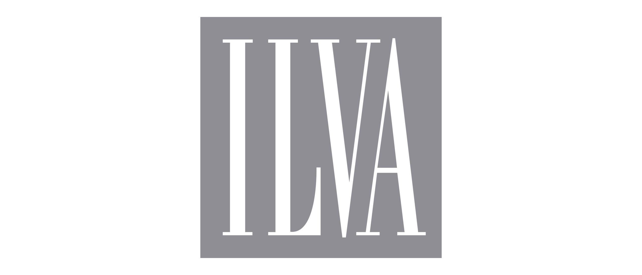
The name ILVA traces back to the Latin designation for the Isle of Elba, famous for its iron mines. The logo design anticipated a trend that was rare at the time: the logotype completely replaces the traditional symbol. The mark is built using a custom-designed typeface derived from Bodoni, featuring elongated letters inscribed within a square composition. The grey (Pantone 495) of the logo evokes the color of pig iron and, consequently, steel, becoming the chromotype of the entire identity system. The final result evokes a heraldic and historical aesthetic while simultaneously imprinting the new name into memory.
Communication Design, Signage & Wayfinding: Capillarity and Safety
The ILVA brand was systematically applied across all physical touchpoints: from institutional environments to means of transport, from staff uniforms to production environments, up to operational materials. Central was the signage project inside the steelworks, where clarity and visibility were essential for safety at work.
In 2017, a new intervention by Inarea for an update of the brand identity through the use of a more articulated and lively color palette and a new graphic-typographic organization of the system.