We use technical cookies to remember your choice and, so that we can prove it, we record on our own server the date, your choice and a shortened version of your IP address. Only if you accept do we also use Google Analytics, to measure visits to the site in aggregate form. If you decline we install no analytics cookie and send no data to Google. You can change your mind at any time from "Cookie preferences" at the bottom of the page. Cookie PolicyPrivacy Policy
With 85 years of experience in the development and management of natural gas infrastructure, Snam is one of Europe’s leading operators in the fields of transportation, storage and regasification. Through an extensive network in Italy and abroad, the company ensures security of supply and contributes to energy integration across different systems, supporting business competitiveness and regional development.
This content is hosted by Vimeo. By loading it, Vimeo receives your IP address and may set cookies.
Brand identity. The evolution of the brand
Snam is an infrastructure operator overseeing a complex system of networks, flows and energy relationships. Over time, its role evolved from a gas infrastructure company into a platform for the energy transition. An open system in which energy, innovation and sustainability converge within a future-oriented vision. Snam’s identity has developed through a process of continuous evolution, guided over time by Inarea, which supported each transformation by interpreting the company’s changing role within the energy sector.
Brand architecture and brand design. The sign of the network from 2011 to 2021
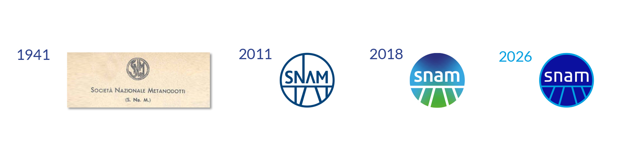
In 2011, Snam was separated from Eni and regained its own identity. The new brand referenced the original logo and was built around a symbolic sign: a circle crossed by lines evoking networks and distribution. The result was a concise and recognizable identity, visually expressing the system of connections at the core of the company’s activities.
In 2018, the rebranding project introduced a new visual language: the brand opened up to color and a more narrative dimension. Green was added alongside blue, representing the shift toward sustainable energy, while the symbol became more dynamic, expressing the relationship between infrastructure, territory and environment. The identity evolved into a complete system.
In 2026, the evolution further strengthened the systemic nature of the brand. The logo became simpler and more distinctive, while the symbol evolved into a generative device: an element capable of producing images, languages and applications. It represents the identity of an open energy platform, extending its role toward new models and scenarios embodied in the concept of the “Energy House.”
Communication and Retail design. The Energy House
An “Energy House” where infrastructure, expertise and vision come together to enable the future of energy. Derived from the flash element of the logo, as well as from the shifted volumes of Snam’s new headquarters in San Donato Milanese, a graphic pattern was created to express a journey of dynamism and transformation, enriching both physical spaces and digital touchpoints. A sign that does not simply represent, but enables. A house where energy takes shape and becomes a project for the future.