We use technical cookies to remember your choice and, so that we can prove it, we record on our own server the date, your choice and a shortened version of your IP address. Only if you accept do we also use Google Analytics, to measure visits to the site in aggregate form. If you decline we install no analytics cookie and send no data to Google. You can change your mind at any time from "Cookie preferences" at the bottom of the page. Cookie PolicyPrivacy Policy
Resense, evolution of Regusto, connects companies, third-sector entities and public administrations to generate value thanks to the circular economy. Through a network developed on proprietary technologies and solid know-how, it connects supply and demand to transform surpluses and unused materials into new resources. In this way, it designs virtuous cycles that give new meaning to resources, generating value and impact.
Brand identity and Naming. From recovery to meaning
The transition from Regusto to Resense reflects the expansion of the platform’s areas of intervention and a broader vision of its mission. The new name maintains the prefix “re”, which recalls the concepts of recovery, restitution, regeneration and renewal, and replaces “gusto” with “sense”, a term that extends the areas of activity and evokes perception, awareness and orientation. It is a new culture: that of cyclical value.
Brand design. The sign of circularity
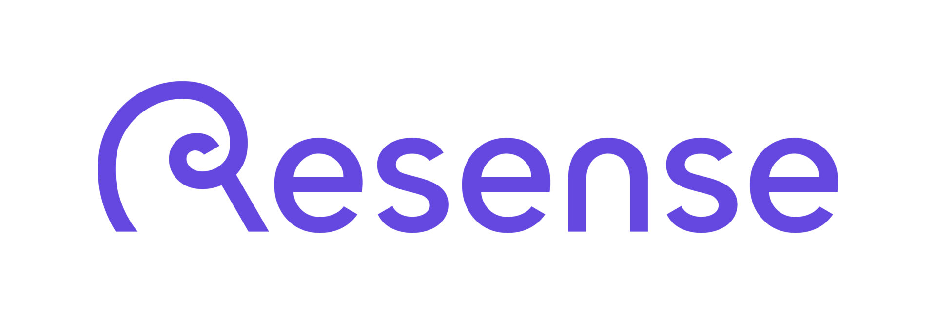
The visual identity originates from an “R” designed as a continuous and curvilinear sign, which recalls the nautilus spiral and the golden ratio, symbols of balance and regeneration. Starting from this element, the proportions of the logotype were defined, with letters designed ad hoc and characterized by distinctive 30° inclined cuts, which give the sign dynamism and contemporaneity. The letters develop through soft shapes and continuous lines, capable of evoking the concepts of circularity and connection. The “R” constitutes the generating element of the system: from its proportions and curves derive the formal language and visual rhythm of the other letters, generating a harmonious and recognizable whole. The main color of the visual identity is purple, accompanied by bright and vivid secondary colors and by a darker shade of purple, which gives authority and institutionality to the palette, favoring the creation of interesting chromatic contrasts.
Communication design. The “re-generative” R
The brand language develops the concepts of circularity, continuity and transformation through the “R” as a generating element of patterns, signs and compositions with the prevalence of the color purple as a reference to the concepts of energy and depth. Graphics and photography, characterized by essential and contemporary images and by palettes that harmonize with the brand colors, interact coherently across physical touchpoints and digital touchpoints. From this emerges a recognizable and dynamic visual system, for a project with an ethical and cultural dimension that “gives back” meaning to resources.