
“There is a symbiotic relationship between the Venice Biennale and the city itself,” explains Antonio Romano on the eve of the 19th International Architecture Exhibition, titled “Foreigners Everywhere”.
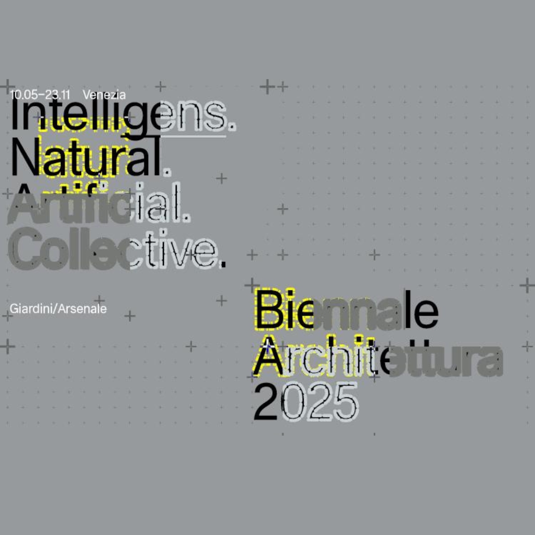
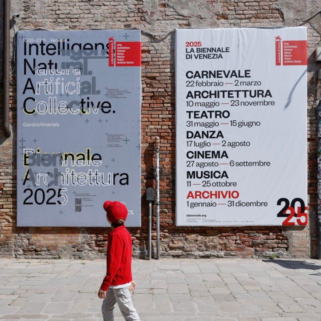
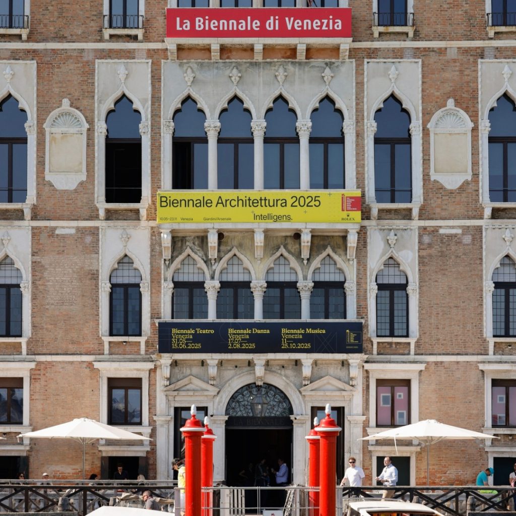
In 2001, Inarea designed the brand identity for the institution—an identity that is still in use today. Inspired by the iconic column in Piazza San Marco, the logo transforms the column’s shaft into a bold red field, a color deeply rooted in the culture and history of the Serenissima. This red frame highlights the name in white, while the stylized lion reinterprets the original bronze winged sculpture—once a chimera, later given wings.
The logo features a strong vertical layout, balanced by a red square next to the column. This square serves to frame and emphasize the content it represents: a system of cultural and artistic events—Art, Architecture, Cinema, Dance, Music, Theatre, and the Historical Archive. This broad scope makes the Biennale a global point of reference and a powerful reason to return to Venice throughout the year.

Why has this brand identity lasted so long?
“Because it’s simple. It acts like a frame that highlights the content and the cultural structure of the institution. It becomes a system of symbols—a coherent and recognizable design that extends across all the various events and exhibitions. It serves as a kind of umbrella, unifying not only the cultural program, the institutional exhibition, and the pavilions of the participating nations, but also the signage and public communication throughout the city. Credit goes to the Institution for having implemented this system effectively and without disrupting the urban fabric.
If the brand identity has helped make the Biennale recognizable, the Institution has made Venice more attractive by ensuring quality, enriching the visitor experience, and offering a new relationship with the city itself—transforming it into a destination not only for tourism, but also for cultural events. There exists a bond between the Biennale and the city, in which one is part of the other. And the Biennale becomes an all-encompassing entity: although there are many biennials around the world, the term immediately brings to mind the one in Venice.”
What are the foundations of place marketing through cultural initiatives?
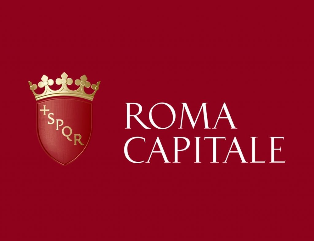
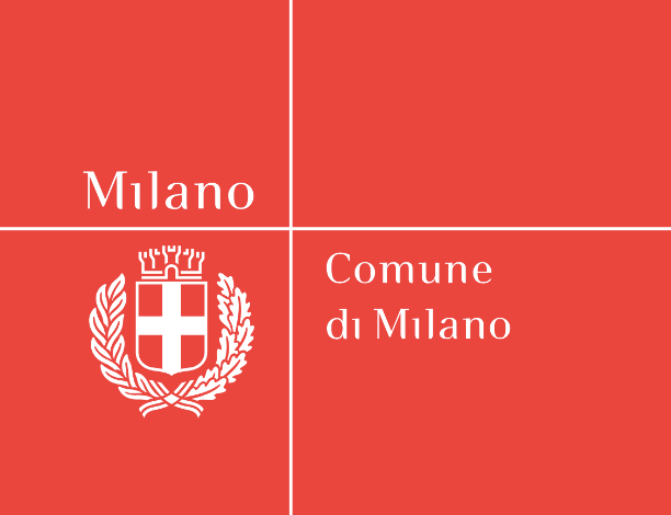
“At the core lies the recognition of a system of values and symbols embedded in the territory. Place marketing begins with a process of simplification: the more the result is a synthesis of elements that can be linked—even implicitly—to a specific place, the more effective it becomes. Over the decades, we have developed various city branding projects: from Roma Capitale, where the famous acronym SPQR and the red and yellow colors (a transposition of imperial gold) have become so deeply rooted in the collective imagination that they serve as its emblem—see also the later brand identity project for Sapienza, University of Rome, which replaced the institution’s traditional blue with red—to the city of Milan [see also “Milan, City of the Spotlight”], where the rigor of the cross from the heraldic symbol becomes an organizing element capable of coordinating communication.”

“Also worth mentioning are the cases of New Administrative Cairo Capital – City of Arts and Culture, and Pompeii.”. Although the latter is no longer a living city, the project of brand identity and the signage & wayfinding project for the archaeological site includes elements that resemble the organization and information accessibility of a ‘living’ urban environment. Faced with the need for simplified mapping, international usability, visual clarity, and durability of signage elements, the project follows the same principles of attractiveness, user experience, and ease of use that underpin urban place marketing.
Similarly, for the new City of Arts and Culture in Cairo, we created a brand that combines international references to the pyramids with the wings of Saladin’s eagle, a national symbol of Egypt. We then developed a complex wayfinding system with pedestrian and vehicular routes that extend from the external world into the interior spaces, unified through a common signage language.
It is a newly founded city, intended to host over six million inhabitants, in which I would hope to see a symbiotic relationship with the urban fabric—similar to the case of the Venice Biennale.