Mobility between experience and identity
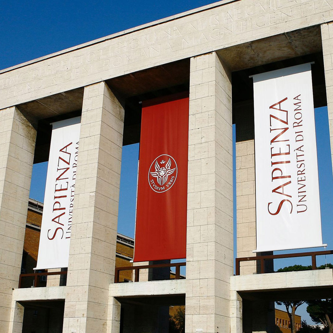
Mobility is not just a technical function, but an integral part of everyday life — a universal need that spans work, leisure, and social interaction, shaping our very perception of freedom and accessibility. A recent study by ANIASA and Bain & Company highlights how the car remains at the heart of Italian mobility: 8 out of 10 people still use it for their daily commutes. However, the ways of accessing cars are changing: new purchases are declining due to rising costs, while alternatives such as rentals or used vehicles are gaining ground, making travel more affordable and sustainable. In this context, the use of infrastructure is not merely a technical issue but reflects broader social and economic dynamics — from the need to democratize access to transportation to the ability of networks and services to meet collective needs for continuity, safety, and proximity. Mobility as Brand Identity:relationship, language, and deeper meaning Approaching mobility as brand identity means going beyond infrastructure and products to focus on the relationship with the user. “A brand in this sector,” explains Antonio Romano, “is not just a graphic symbol but a system capable of guiding, reassuring, and building trust. Mobility thus becomes a shared language that reduces the sense of disorientation in physical space and provides tangible points of reference in both space and time.In this view, the relationship is no longer a secondary effect of the service, but the very essence of mobility: what matters is not just the road taken or the vehicle used, but how the brand succeeds in creating emotional and social connections. This is where the concept of embodiment comes into play: the brand becomes a container of multiple meanings, capable of embodying values, experiences, and promises that go beyond the product itself. The clearer and more concise a brand is in expressing its values, the more it acts as a symbolic ‘umbrella’ that unites diverse realities, making it pervasive and instantly recognizable. Designing a “monolithic” brand, in particular, means creating the tool that best fulfills this need: its consistency allows heterogeneous entities to speak the same language, capturing attention and giving the user a unified vision. In this perspective, mobility takes on a deeper meaning: no longer just a geographical connection, but a relational experience that brings together people, stories, and communities, offering a broader value horizon in which the brand becomes a guarantee of continuity and belonging. The brand as synthesis: emblematic cases Inarea has repeatedly explored the theme of brand identity in the mobility meta-sector, taking on various forms. It is an ecosystem that can be interpreted as signage, as in the case of ATM, or as an identity design project, as seen in the cases of Anas Atac, Autostrade per l’Italia, Cotral, Italo, or Webuild (and even Ferrovie dello Stato, more than twenty-five years ago); or more broadly, experience within the transportation and infrastructure sectors. These concrete cases confirm the complexity and multidimensional nature of the issue. Autostrade per l’Italia, following a change in ownership and management, launched a virtuous renewal process that prioritized securing the network, also through the introduction of digital technologies. The rebranding, presented on the occasion of the sixtieth anniversary of the opening of the Autostrada del Sole, highlighted the company’s role as a social actor committed to territorial cohesion.While the company and Group name remained unchanged, the new positioning introduced fresh meaning. The role of “partner of the country” was expressed by assigning “Autostrade” the task of conveying what it does and “per l’Italia” the task of conveying why it does it—the very purpose behind its actions. The rebranding of Anas coincided with the modernization of the road and motorway network, with the new logo serving as both a signage and symbolic element, representing the systemic renewal that had been set in motion. Shifting to a different context, Italo’s elegance and lightness have had a strong impact and been warmly received by a wide range of audiences. From the color palette to the clean design of the train liveries, from the silhouette of the hare to the typography of the logo, every element works together to create empathy — and, as a result, a genuine connection. A similar approach was taken in developing the Cotral brand, the public transport company of the Lazio Region, which manages both bus and rail services: a playful logo and liveries with bold, impactful colors have earned high approval from commuters and users in gener. For Atm (Azienda Trasporti Milanesi), which manages public transport services for an area with over 3.3 million residents (Milan and 95 municipalities in Lombardy), saw the development of a signage system for the metro network. The project, inspired by the one created by Bob Noorda in the 1960s, redefined typography and pictograms, standardizing and significantly improving the user experience. A similar intervention was developed for theAtac in Rome, where, in addition to the signage for the new metro stations, the liveries for trains and surface vehicles were also defined. The project also included the creation of a custom display typeface family (named “Urbs”) and the redesign of all pictograms used in the signage system. Nell’ambito delle attività di brand management e brand advisory per Webuild, inoltre, sono stati realizzati degli interventi di valorizzazione delle aree di cantiere, legate alle grandi opere: dalla linea 4 della Metropolitana di Milano alla prosecuzione della linea C di quella di Roma, dalla ricostruzione del Ponte Morandi a Genova alle nuove tratte dell’alta velocità ferroviaria. What emerges from this unique mosaic is that projects and realities that are very different from one another converge in the concept of mobility — a concept that goes beyond the mere dimension of movement and becomes an experience rooted in place and, even more importantly, in relationship. After all, the ultimate goal is reachability: bringing people and goods closer together.