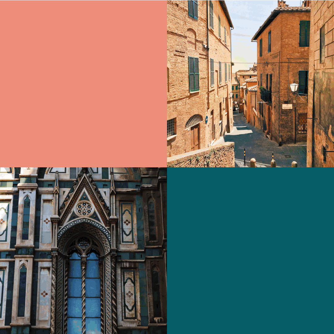
Regione Toscana promotes revival of local quality enterprise through a guarantee of authenticity. Tuscany is one of the most desired destinations in the world. Tuscan “feel” embraces products and places, making for a great competitive advantage that must be protected in order to guarantee local business and quash the risk of counterfeits.
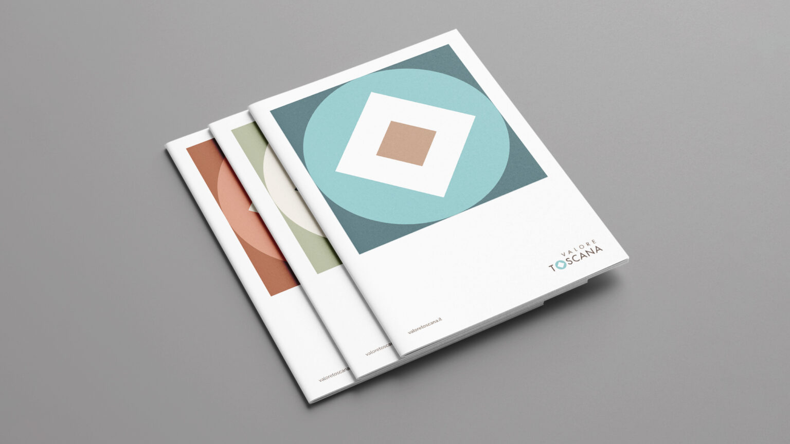
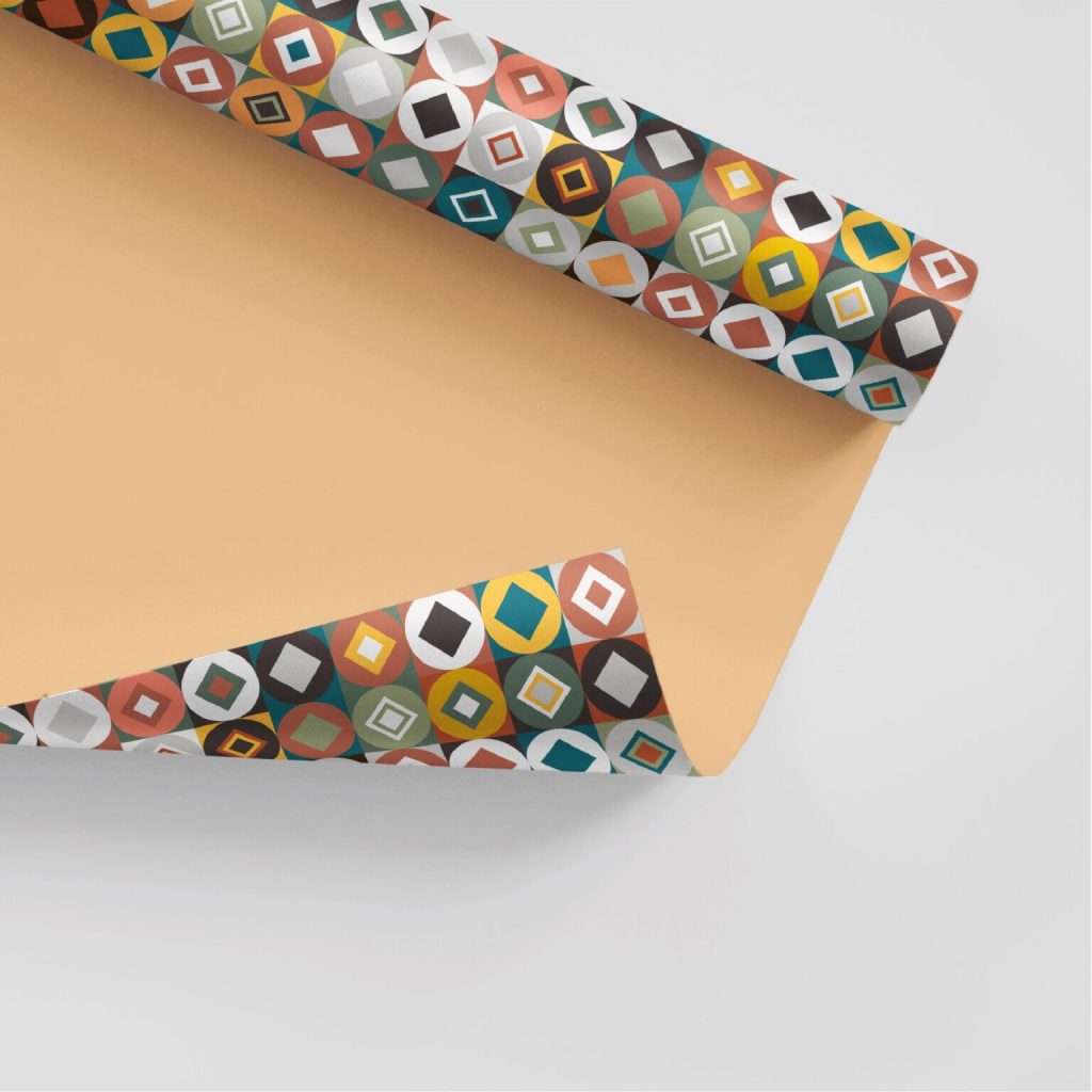
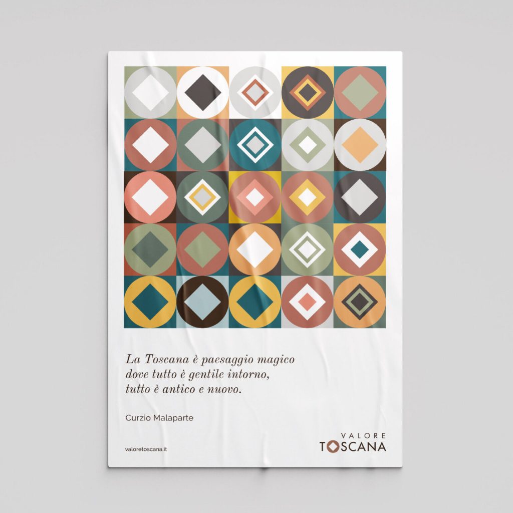
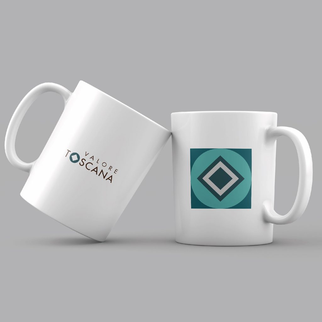
From a universal Tuscan symbol, the reference to Leonardo da Vinci’s Vitruvian Man, the two elements of the square and the circle have been dynamically extrapolated and recomposed. They are expressions of perfection and beauty, present in the architectural decorations of every Tuscan town and city.
San serif, a streamlined contemporary font, was chosen in harmony with the sign and to ensure maximum readability even when print is small, responding effectively to the demands of digital interface.
Brand colours were inspired by those found in nature, in the Region, but also by Renaissance polychrome marbles. Colours and signs define an original, fresh, flexible, contemporary brand language.
The compositional simplicity of the logo was dictated by the need to use it in association with those of the companies that will adopt the brand. Used in three industry sectors (enterprise, crafts, services), it complies with regulations and protocols.