The Enciclopedia Italiana di scienze, lettere ed arti, commonly known as La Treccani, is the most famous encyclopedia in the Italian language. It is published by the Istituto dell’Enciclopedia Italiana, which was founded in Rome on February 18, 1925, by Giovanni Treccani and Giovanni Gentile. Even today, it continues to fulfill the essential role of filtering and validating information, which is the highest duty of a publishing house and also represents a strategic priority for the culture of the third millennium.
For us Italians, “it says so in the Treccani” means that there can be no doubt about a statement because it is “certified” by the country’s most important cultural institution. The Treccani brand is therefore recognized, loved, respected, remembered, and, as a result, chosen. In short, it is a brand. And it requires actions that enhance its contemporary relevance.
Brand architecture and brand design. The encyclopedia in the digital age.
The new logo retains the meanings of the previous one (created by Inarea), preserving references to the book, the source, and the tree. However, it adopts a design that more effectively meets the needs dictated by digital interfaces. In this sense, even the typography of the logo uses a sans-serif font instead of the previous serifed one.
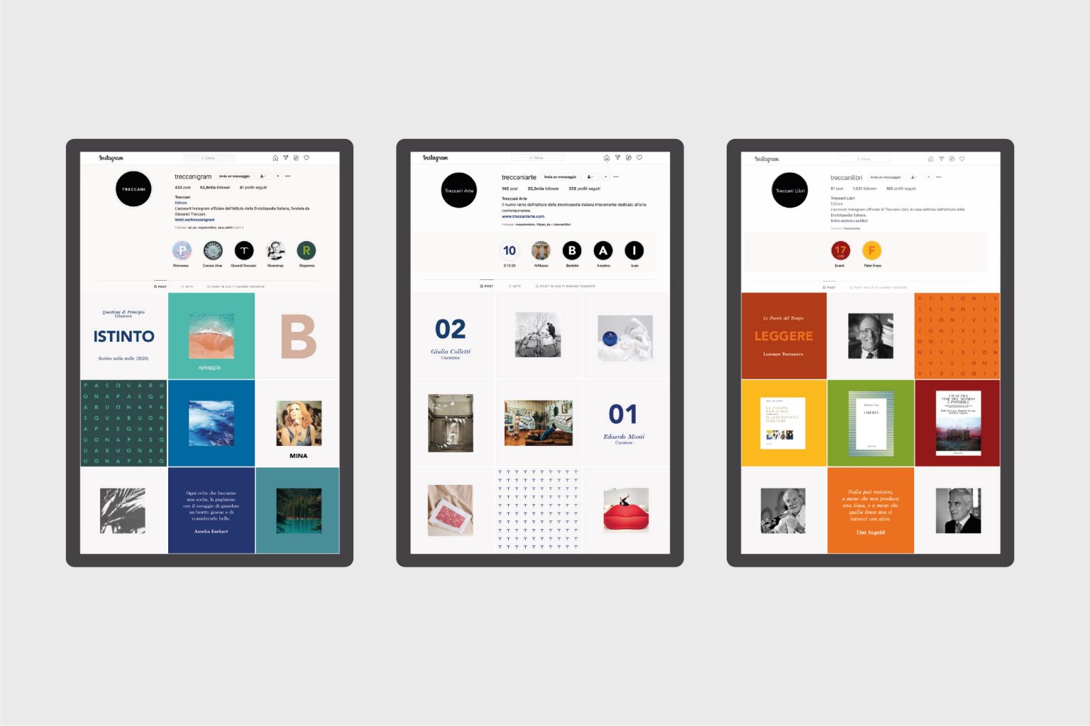
The new brand identity focuses on a single logo, capable of representing even very different areas (Treccani Reti, Treccani Scuola, Treccani Arte, Treccani Libri, Bottega Treccani, etc.), which, however, serve an organizational function, distant from the public’s interest. The public’s priority, instead, is to be part of the Treccani world, regardless of the choice of a specific product or service.
Communication and editorial design: A frame as a window to the world
From the frame that encloses Italian culture to the window opening onto the contemporary world and the future of knowledge.
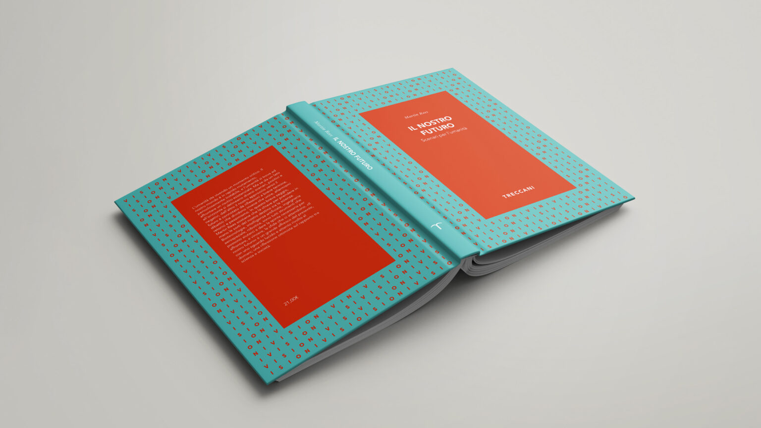
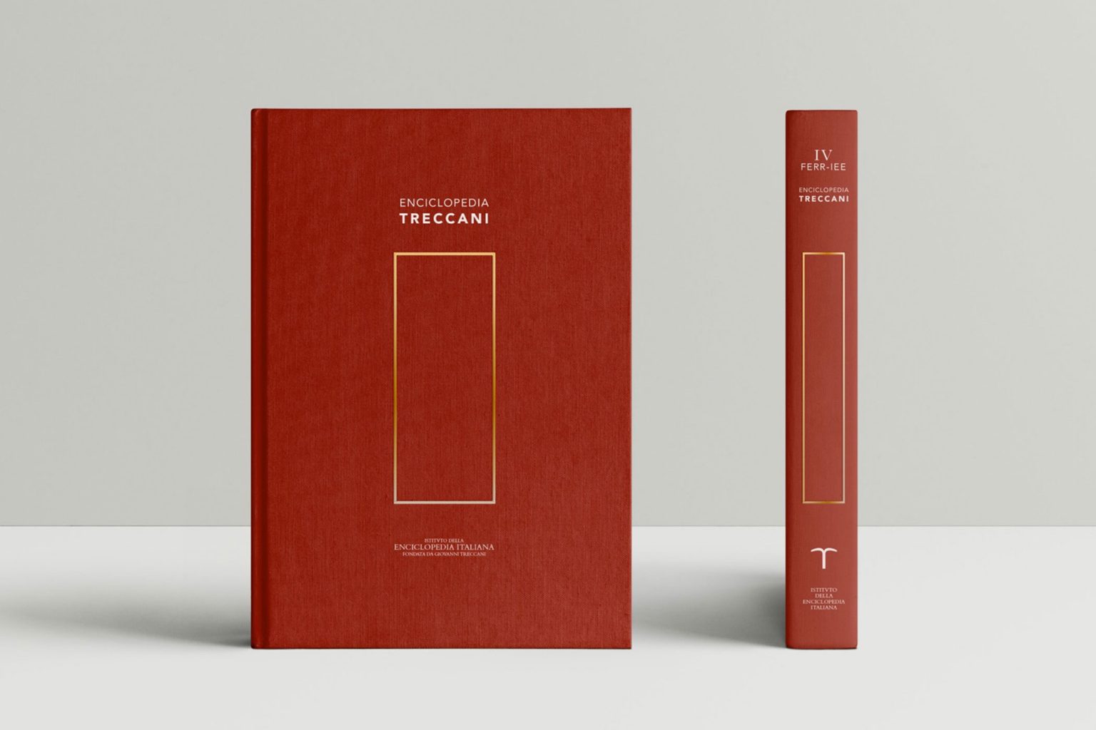
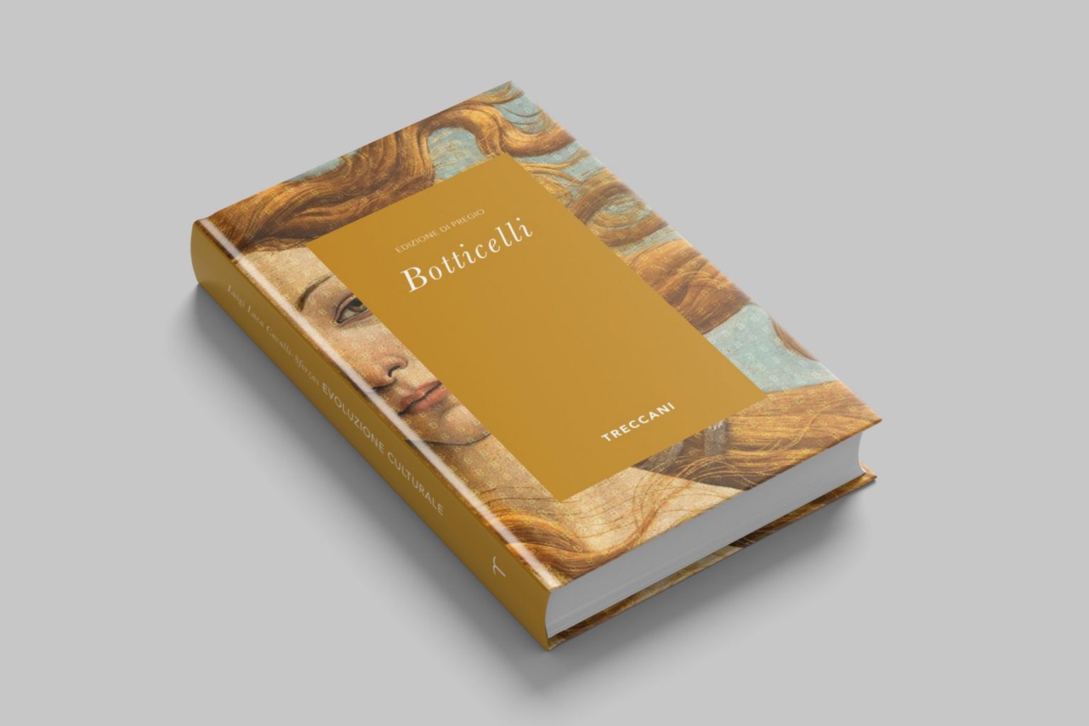
The rebranding drew heavily from the Institute’s history. All the volumes of the great works share a common feature on their covers and spines: frames, almost always embossed and gold. This almost constant element has sparked an association of ideas, summarized in the concept “Treccani, the frame that encloses Italian culture.”
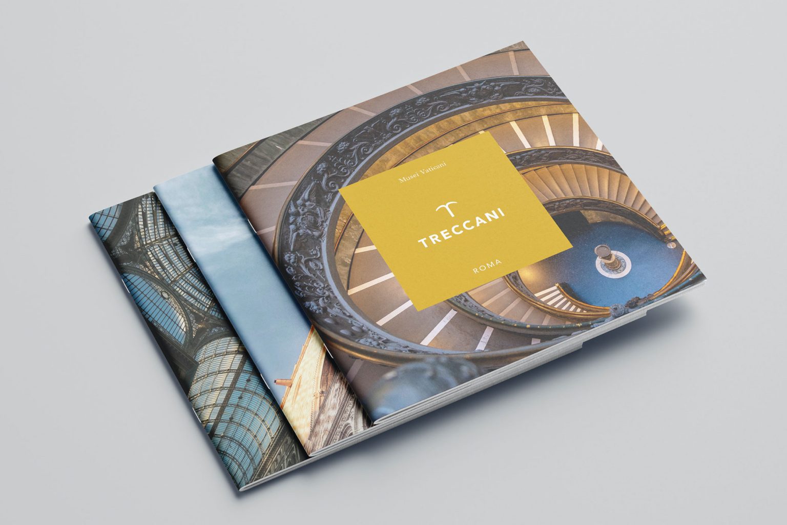
A format was therefore developed to accommodate any message. Since it is no longer just the book that conveys content, the concept of the frame has been extended to that of a “window onto contemporary reality and the future of knowledge”: a portrayal that closely aligns with the “new” Treccani, which is called to engage with the complexities of this era.
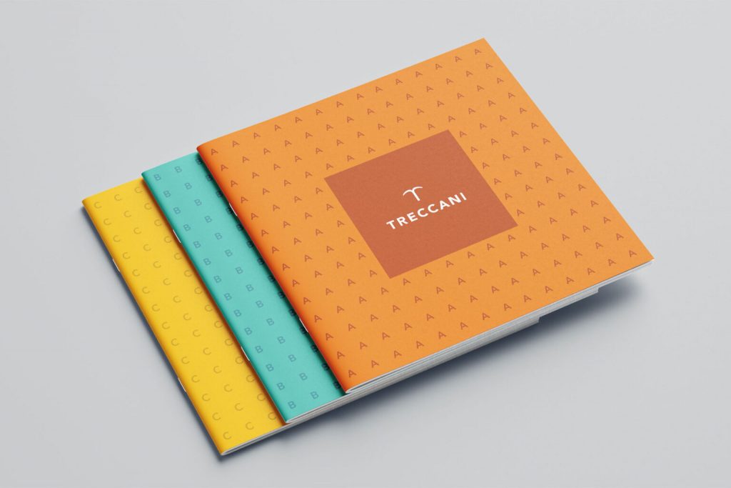
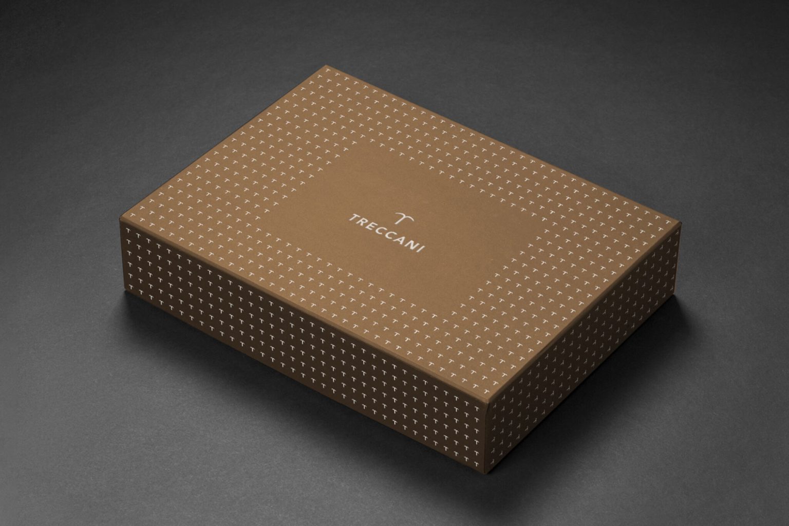
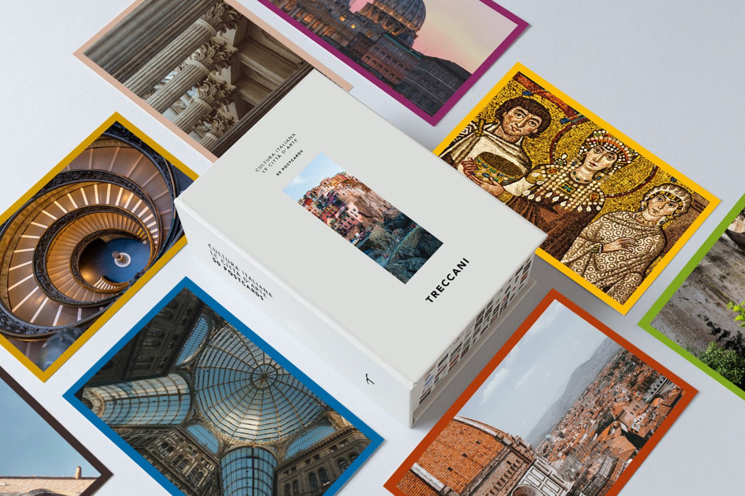
To ensure variety in the compositional scheme, a detailed palette was created, consisting of sixteen colors plus black (the quintessential typographic color). This allows for an extraordinary range of combinations, both of different colors and of colors and images (photographs and illustrations).
Video & Motion Design: The origins of Treccani in an animated font
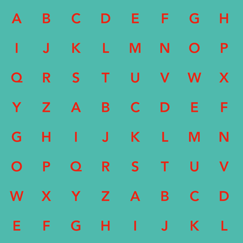
One final distinctive linguistic element is the use of alphabet letters arranged in a pattern: a tribute to typography as a reference to the original Treccani, the custodian of “written” culture. The combination of animated letters and the color palette creates linguistically distinct elements that are, however, tied to the same underlying principle.