We use a technical cookie to remember your choice. Only if you accept do we also use Google Analytics, to measure visits to the site in aggregate form. If you decline we install no analytics cookie and send no data to Google. You can change your mind at any time from "Cookie preferences" at the bottom of the page. Cookie Policy
Founded in 1958 by Count Ernesto Bocca, Sina Hotels is Italy’s longest-established family-owned collection of luxury hotels, now led by Bernabò and Matilde Bocca. The group includes properties in destinations such as Capri, Florence, Milan, Parma, Perugia, Rome, Turin, Venice and Viareggio. This long-standing tradition has evolved into a high-end hospitality model designed to meet the needs of both cultural tourism and business travel.
Brand Identity and Brand Architecture. Unity and Reputation
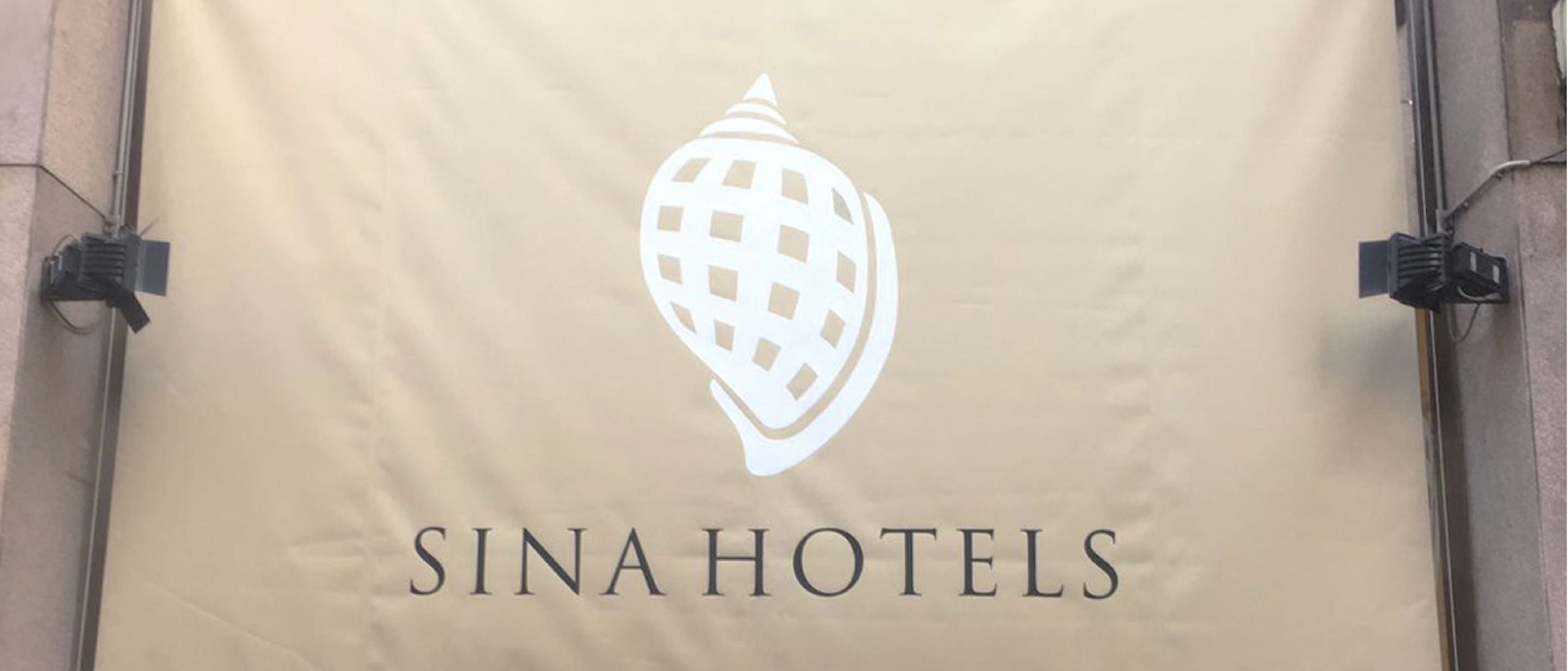
The brand identity project redefines the brand architecture at both the corporate and individual property levels, organising the way the group presents itself and building a strong, recognisable and prestigious brand. Under the shell symbol, the brand architecture defines a unified and simplified system. This connection brings each hotel closer to the Sina family, creating a virtuous circle in which the reputation of the group and that of its properties reinforce one another.
Brand Design. The Shell as a Metaphor
The brand combines the ingenuity of architecture with the natural form of the shell, a symbol of hospitality and the golden ratio. The logotype uses the elegant Trajan serif typeface to express harmony and historical solidity. The colour palette evokes the group’s values: slate for formal elegance, and shades of grey, silver and taupe for an authentic, understated and welcoming luxury.
Communication and Retail Design. The Brand Across Physical and Digital Spaces
The brand languages are expressed with restraint across every touchpoint. In the digital environment, websites and clean interfaces reflect a tailored approach to hospitality. In physical spaces, the identity becomes tangible: from discreet signage and refined stationery to the application of the brand through interior design, tactile textures, exclusive signature fragrances and warm atmospheres that envelop guests in a multisensory experience of style and well-being.