We use technical cookies to remember your choice and, so that we can prove it, we record on our own server the date, your choice and a shortened version of your IP address. Only if you accept do we also use Google Analytics, to measure visits to the site in aggregate form. If you decline we install no analytics cookie and send no data to Google. You can change your mind at any time from "Cookie preferences" at the bottom of the page. Cookie PolicyPrivacy Policy
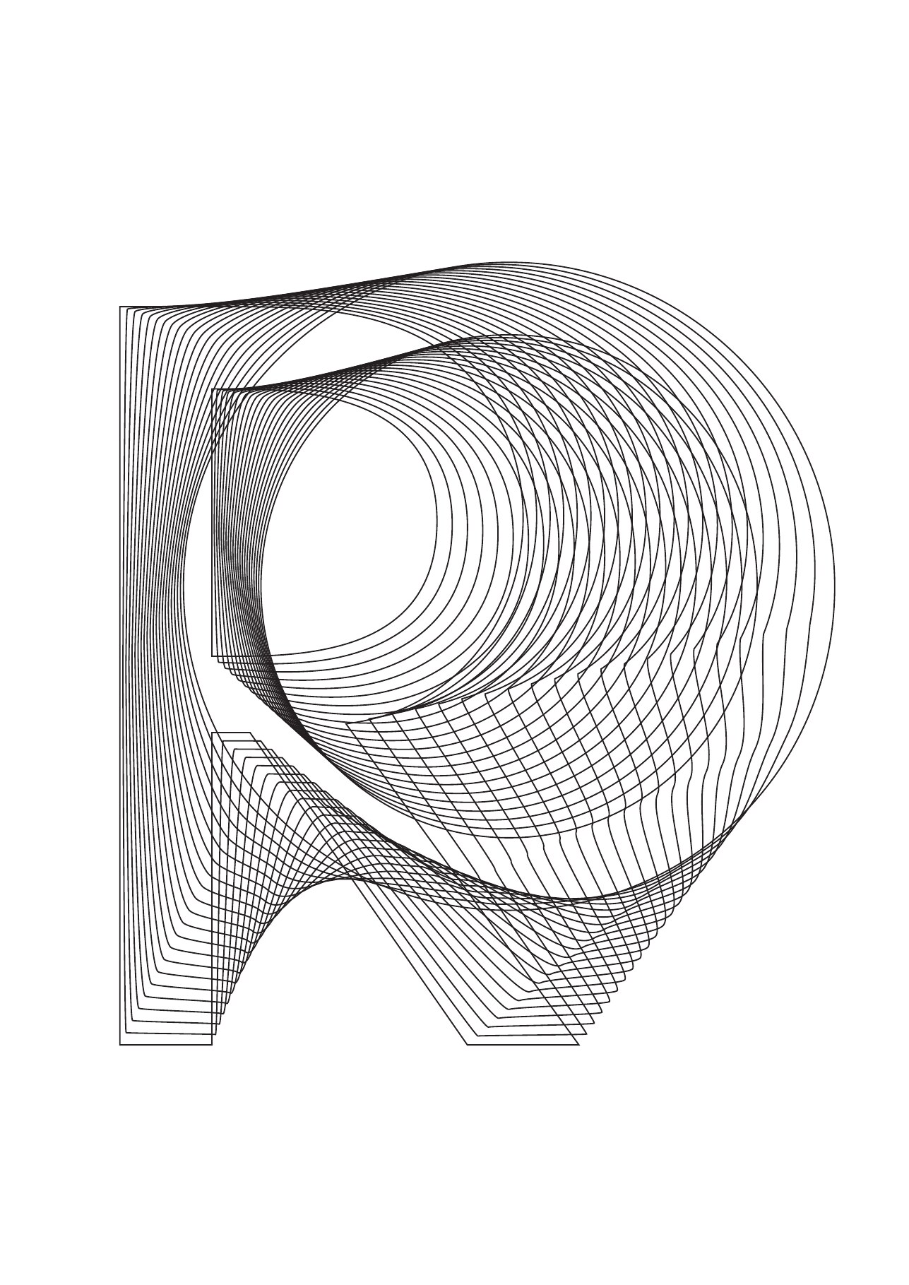
Proxigas, whose naming was developed by Inarea for the new positioning, expresses the desire to guide the sector towards the energy transition. Therefore, the visual identity, rather than an abstract logo, favors “content oriented” languages in which the initials of keywords become symbolic figures to tell the story of “a sustainable future”. The lettering becomes graphics in aerial grids that create an iconic alphabet, in which the fusion of sign-letter-word generates an empathetic and recognizable stylistic identity. To emphasize the affiliation with Confindustria, the famous logo with the eagle appears, an emblem of strength and independence.
Brand identity, naming and brand design. The alphabet of the future
Proxigas, whose name was created by Inarea for the new positioning, expresses the will to lead the sector towards the energy transition. Rather than an abstract logo, the visual identity therefore favours “content-oriented” elements in which letters become symbolic figures that tell the story of “a sustainable future”. The lettering turns into graphics of airy lattices that form an iconic alphabet, where the fusion of sign, letter and word creates an empathetic, recognisable stylistic signature. To underline the affiliation with Confindustria, the well-known eagle logo appears, an emblem of strength and independence.
Communication design and video animation. Storytelling in motion
The combination of signs and words becomes a fluid narrative that comes to life across physical and digital touchpoints. From web and social channels to printed publications and events, this visual alphabet roots messages about the future of energy in the minds of every audience member.