The most famous archaeological site in the world can be transformed into a vibrant city. The intervention carried out on behalf of the Pompeii Superintendency has managed to restore to the myth a contemporary vitality: Pompeii is not a dead city, buried by the volcanic ash of Vesuvius, but a place of eternal life, captured in a snapshot of eternity.
Brand architecture, naming, and brand design. An ancient yet international name
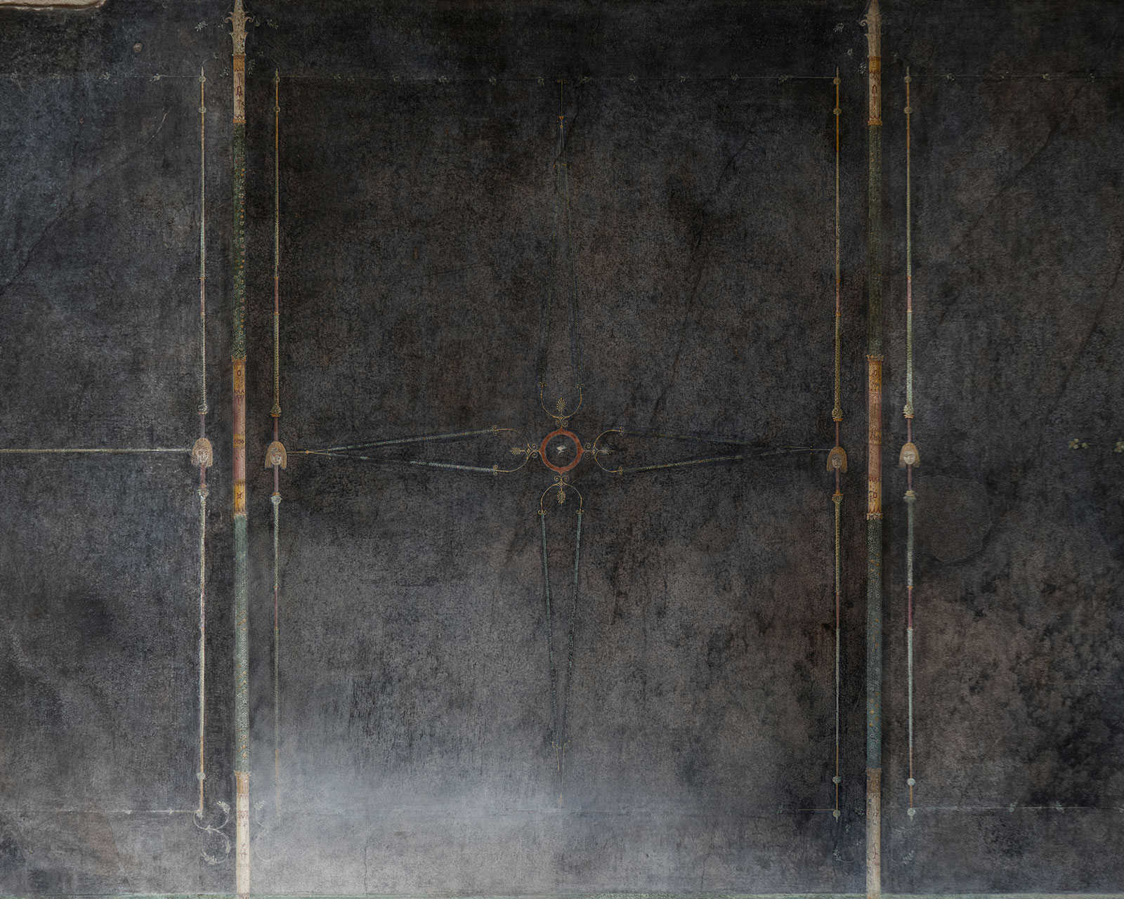
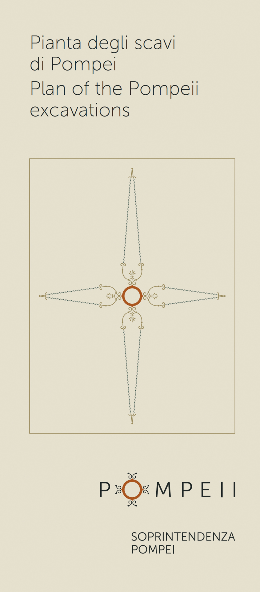
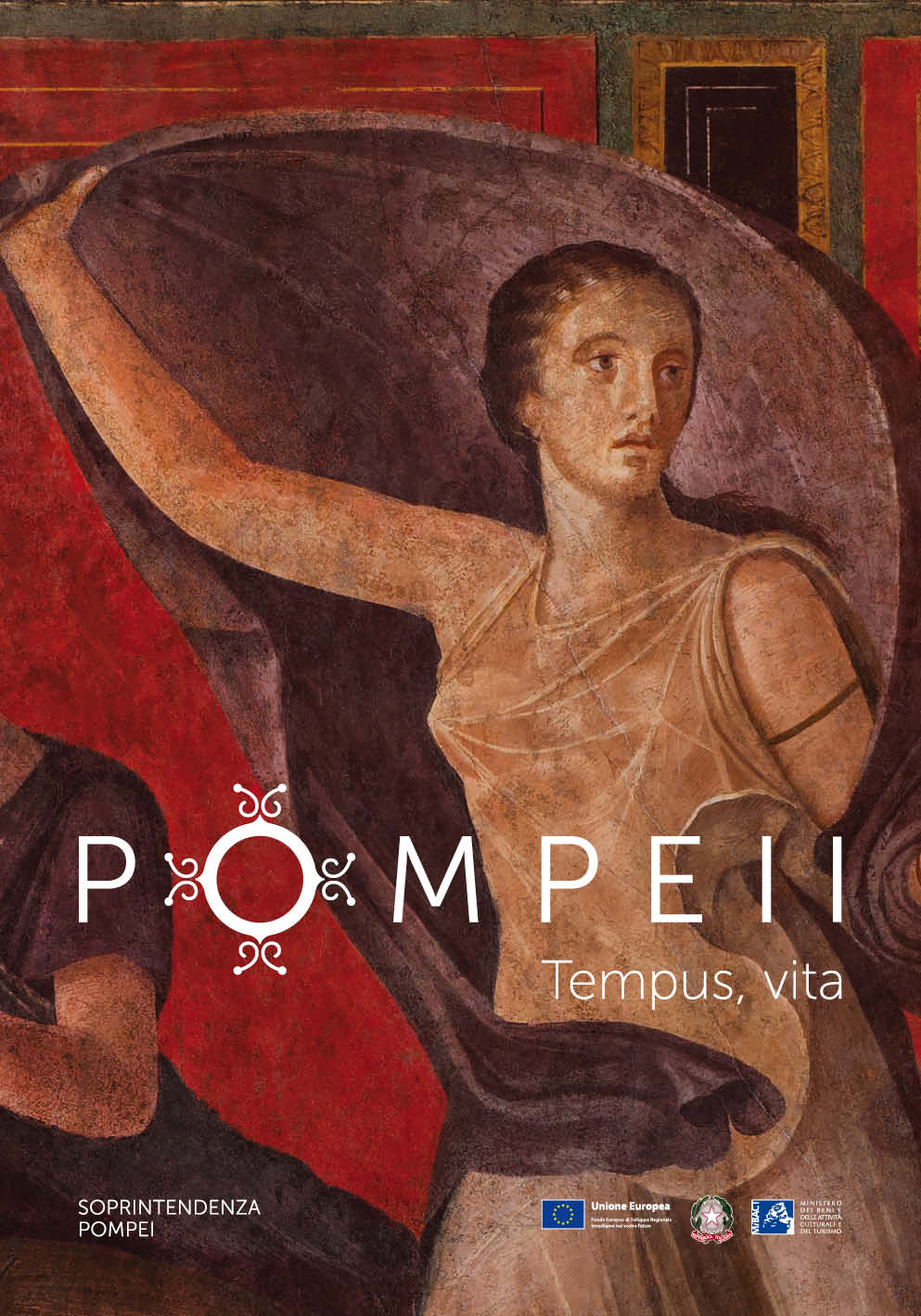
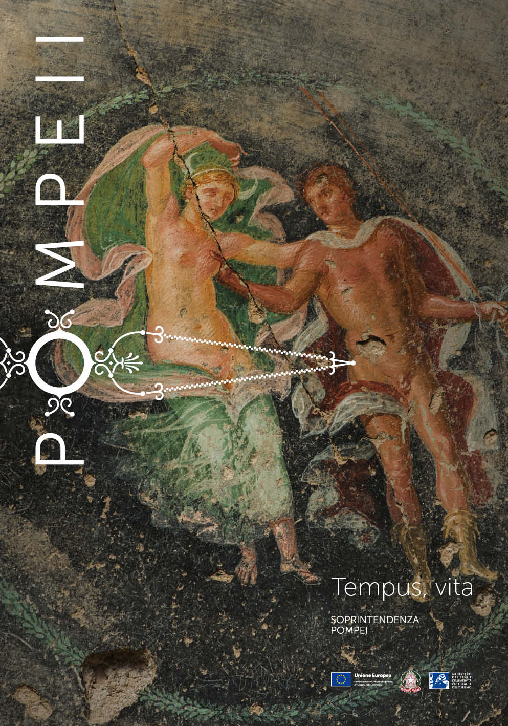
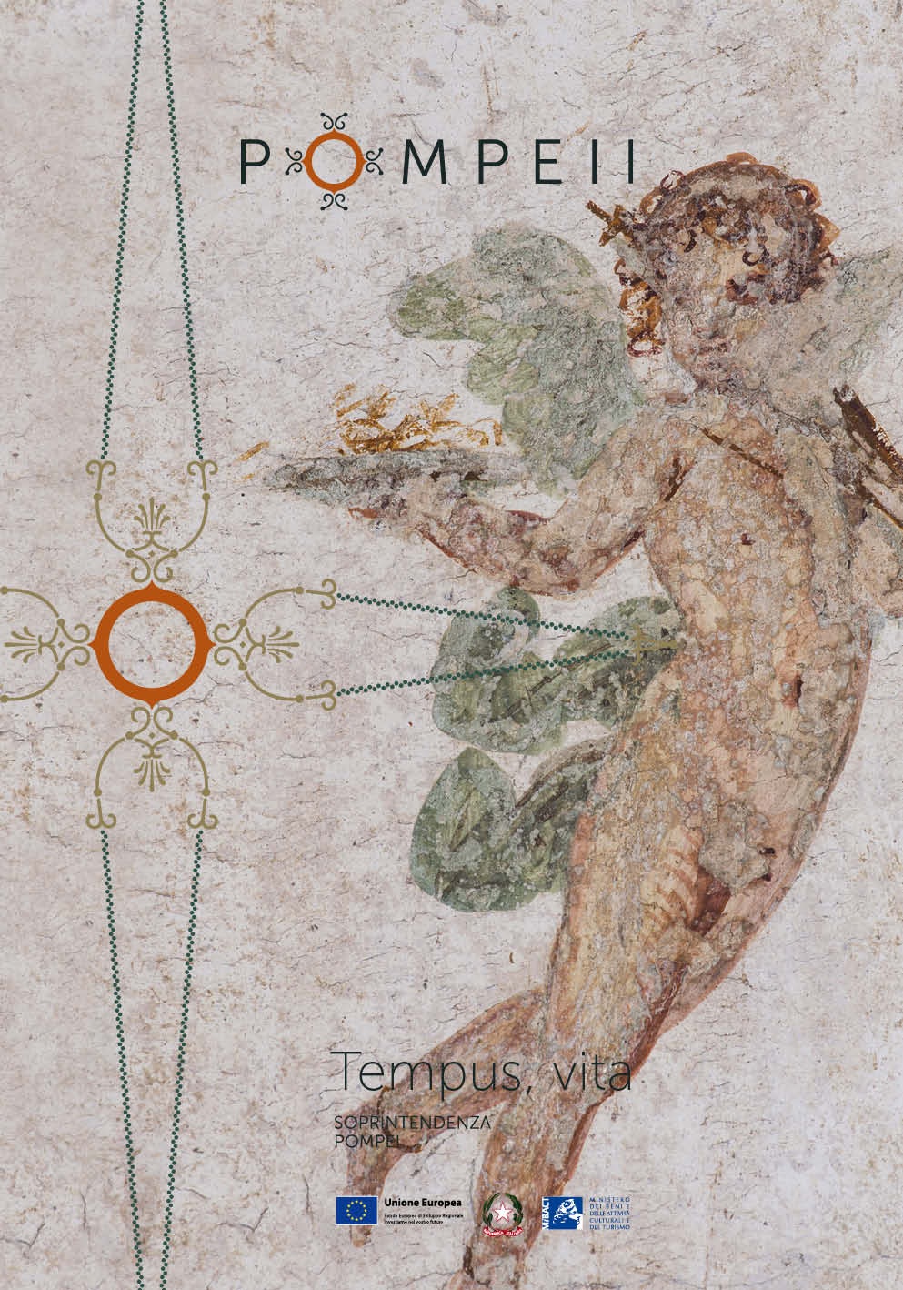
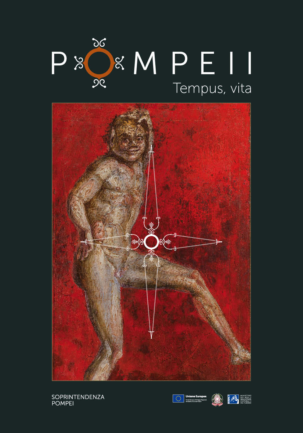
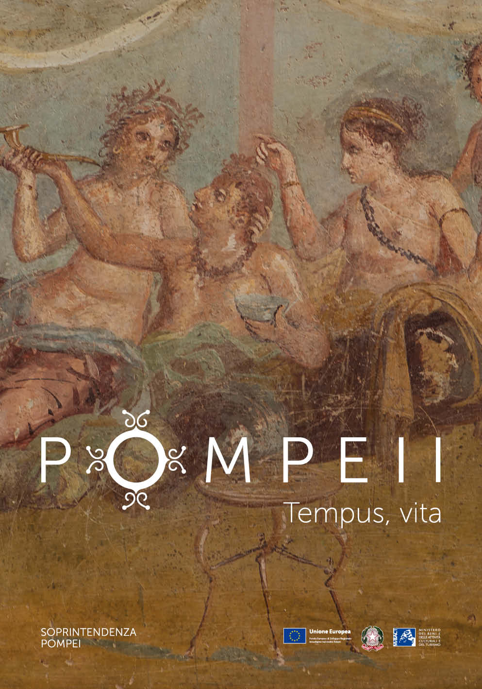
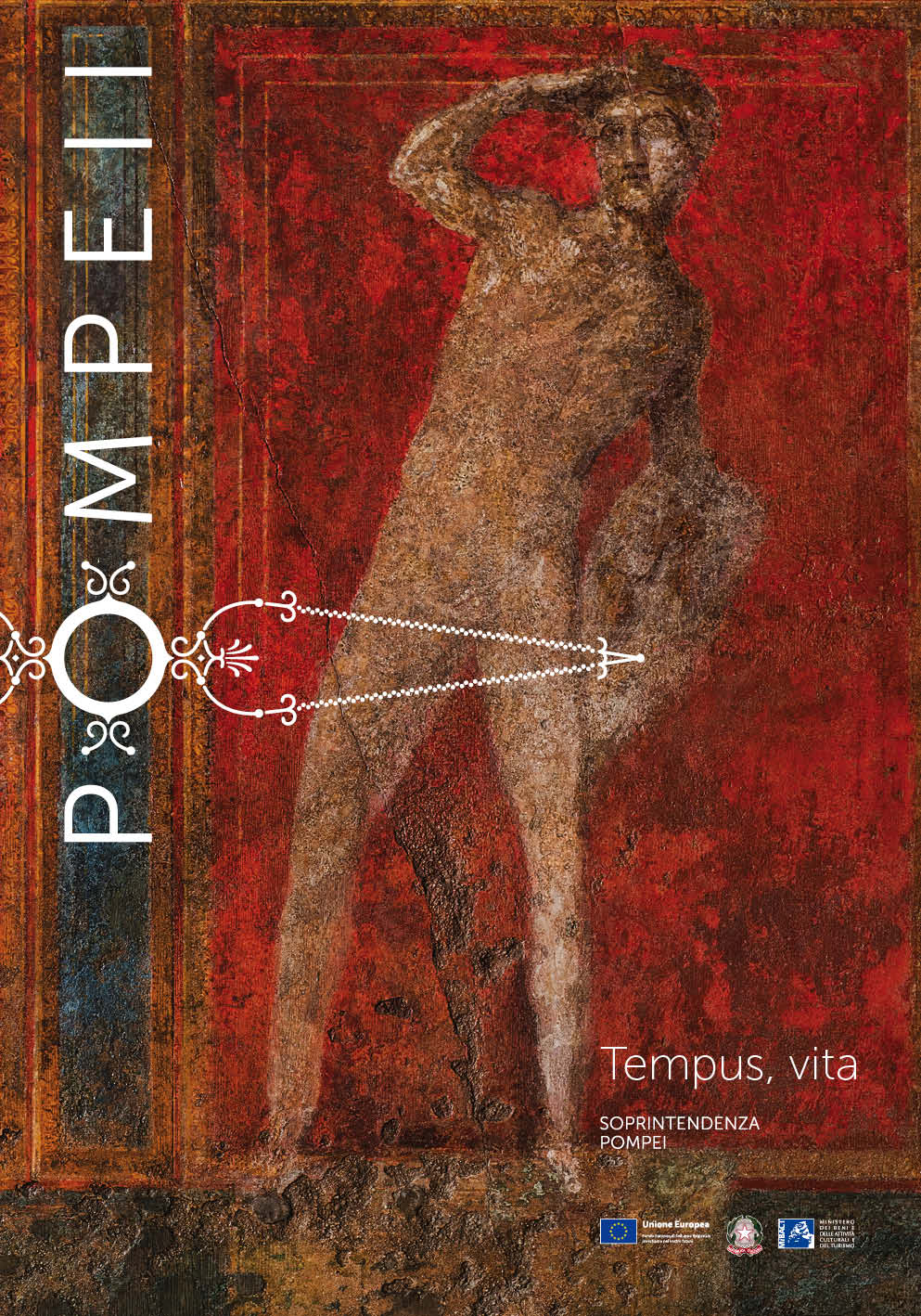
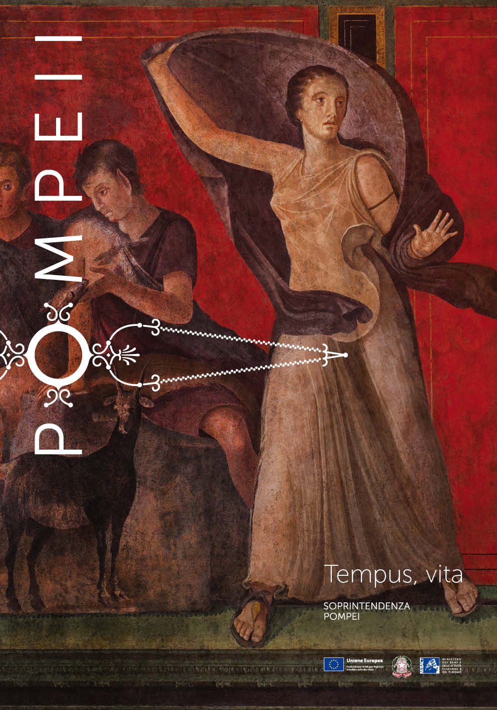
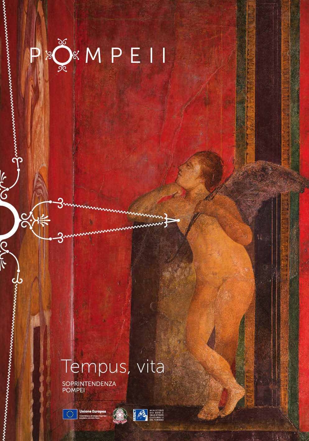
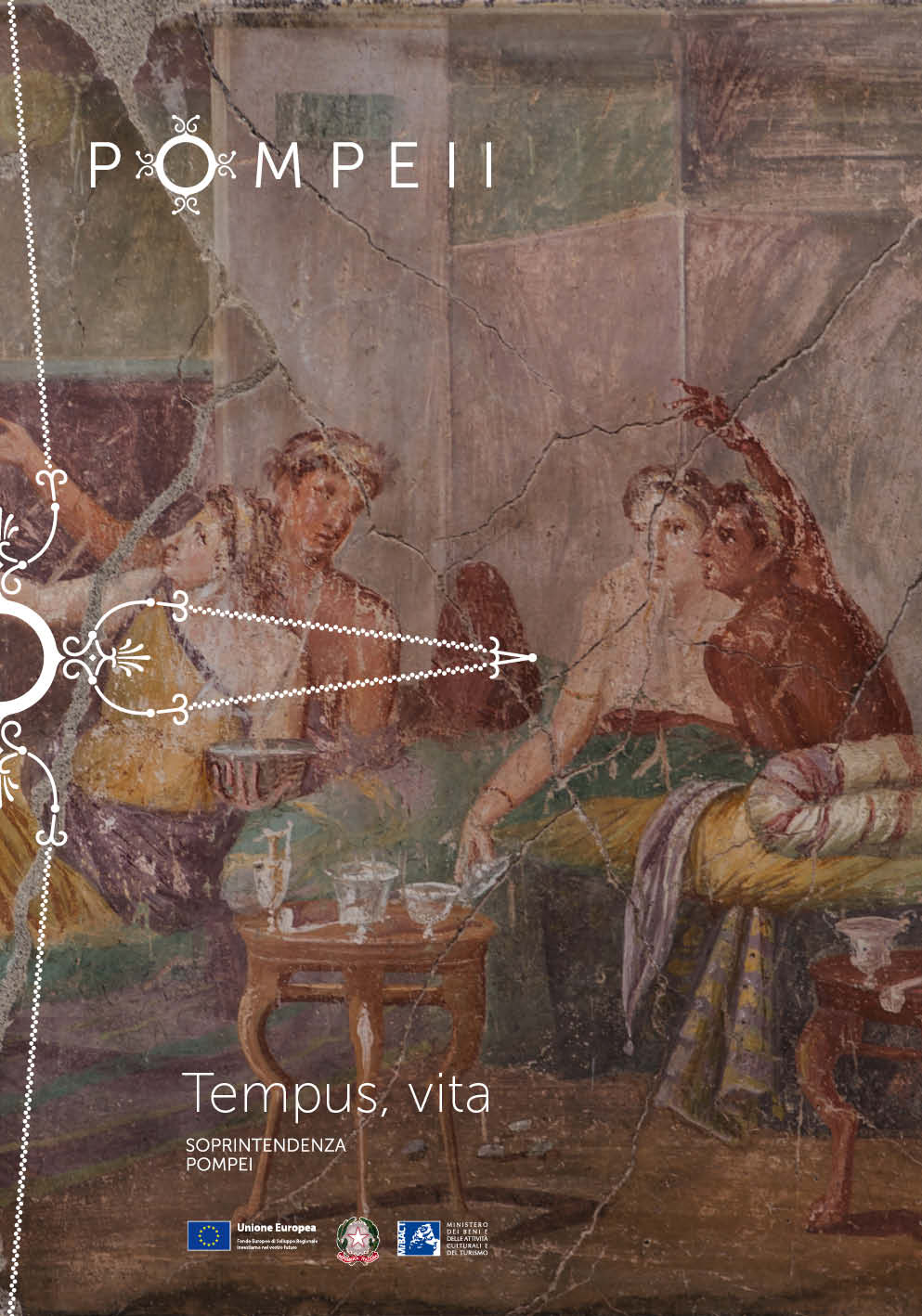
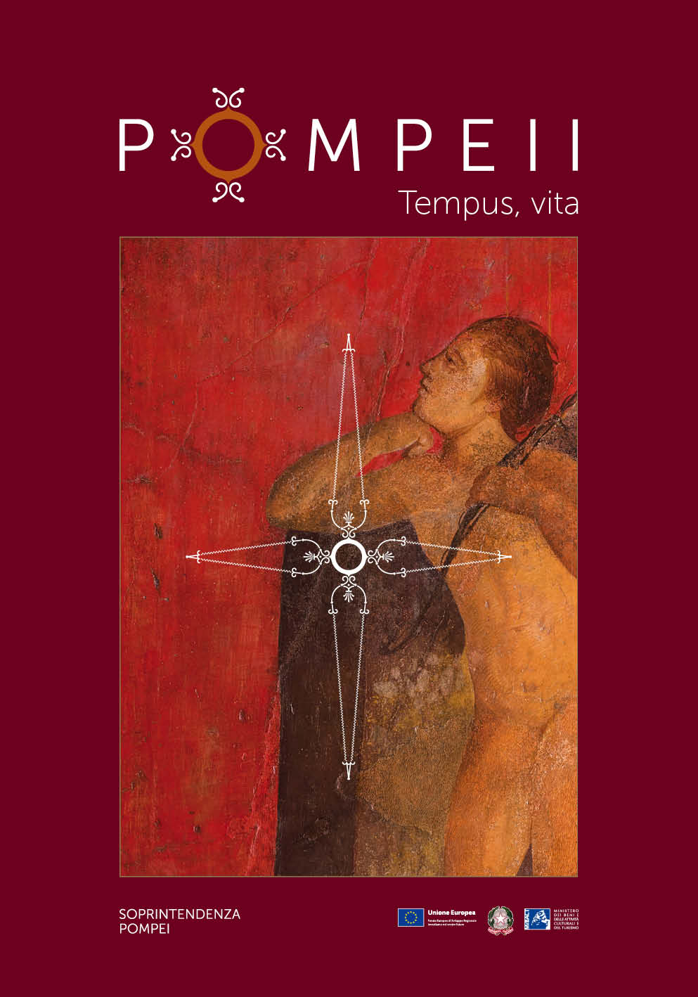
Inarea chooses to reclaim the name of the ancient city, Pompeii (with two ‘i’s), to distinguish it from the name of the modern urban settlement, and to make it eternal (with the claim ‘Tempus, Vita’). This also acknowledges its international identity: in English, Pompeii has always been ‘Pompeii.” Thanks to its notoriety, ‘Pompeii’ also becomes the brand for all the sites (Herculaneum, Stabiae, Oplontis, and Boscoreale) under the Superintendency, creating a more cohesive and recognizable overall image, thus also enhancing the lesser-known locations. Il nuovo marchio prende spunto dalle caratteristiche formali e cromatiche delle decorazioni nel “terzo stile” presenti nel tablinum della famosa Villa dei Misteri.
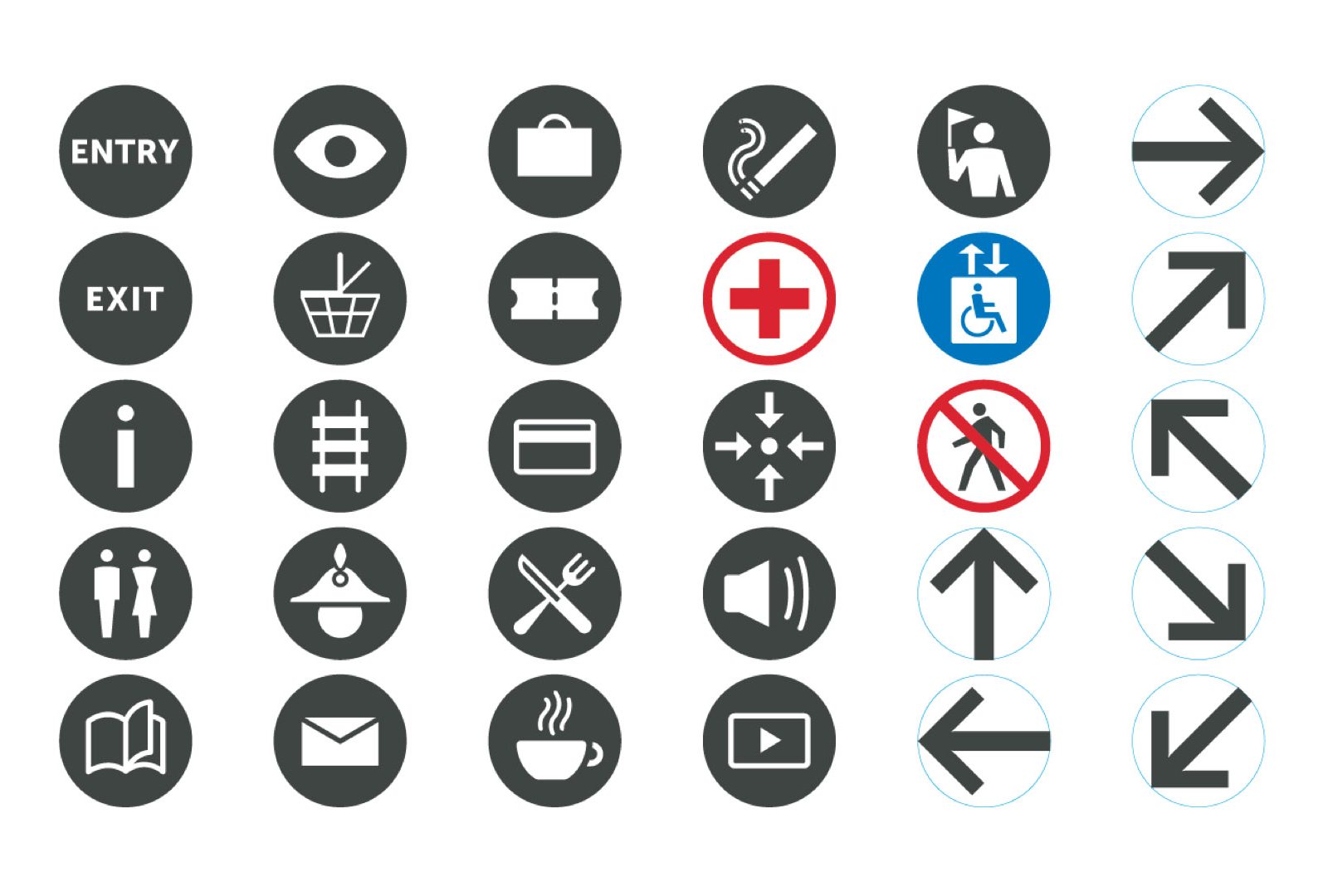
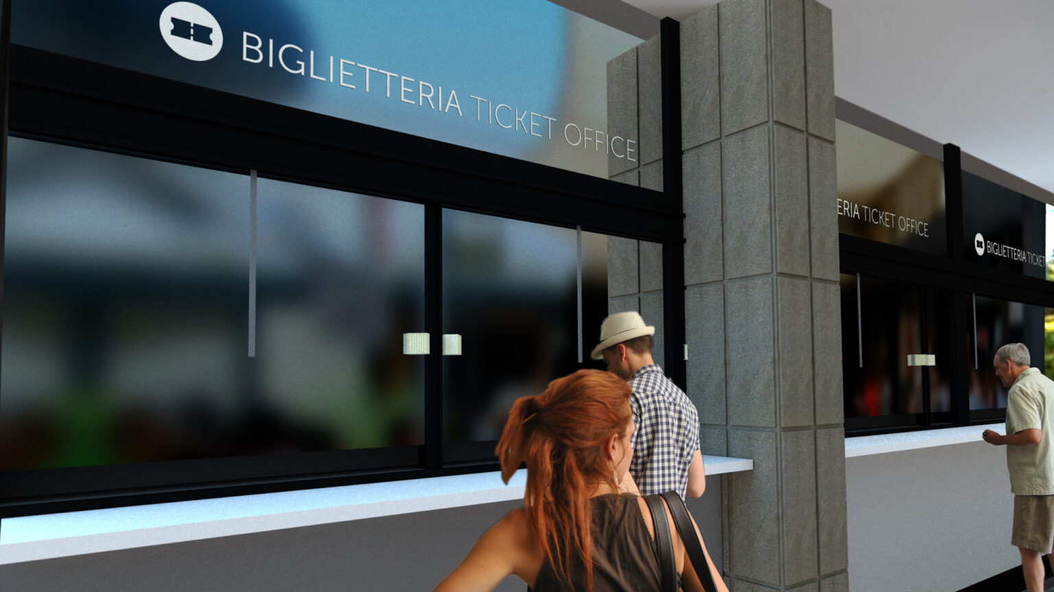
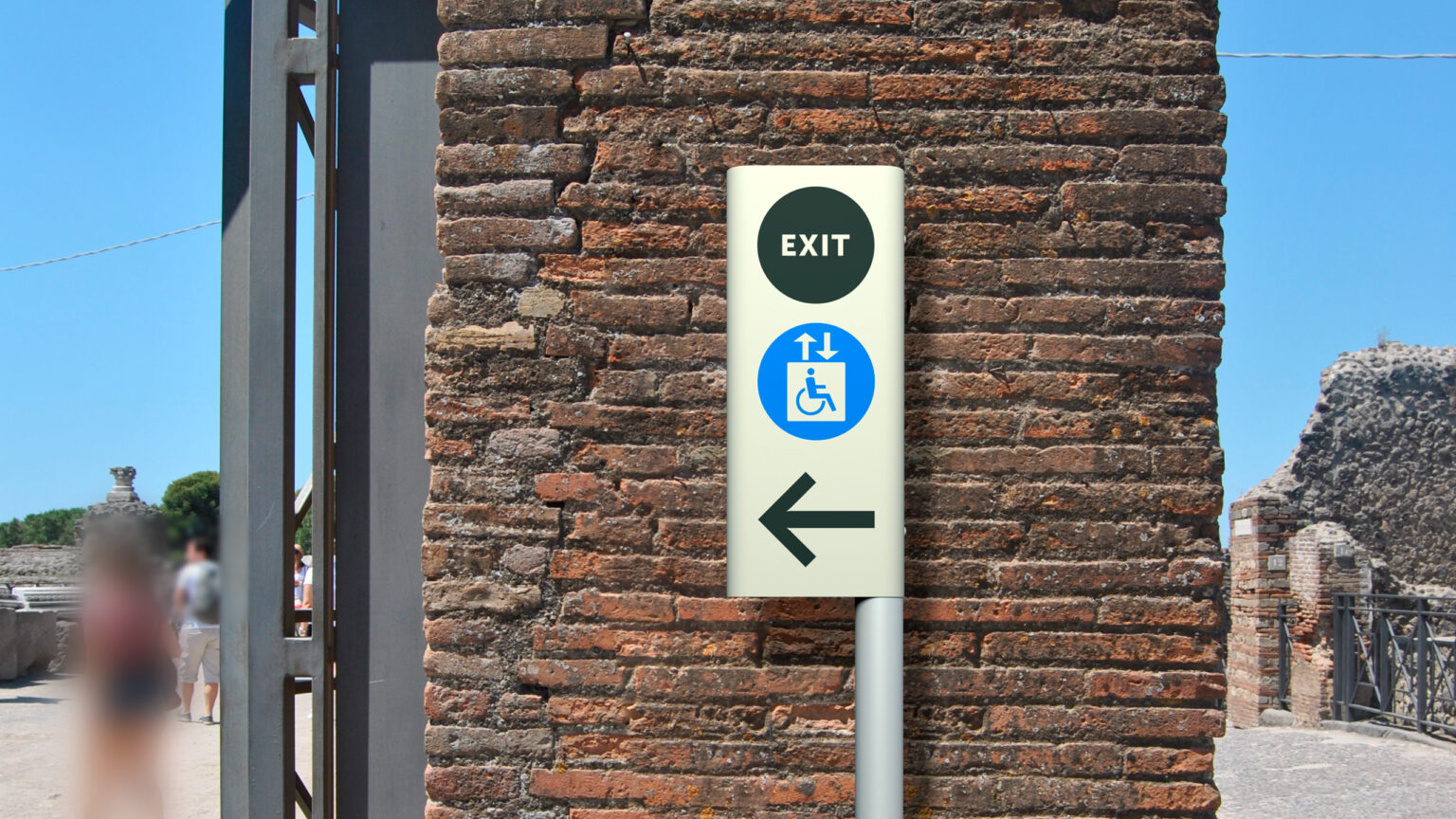
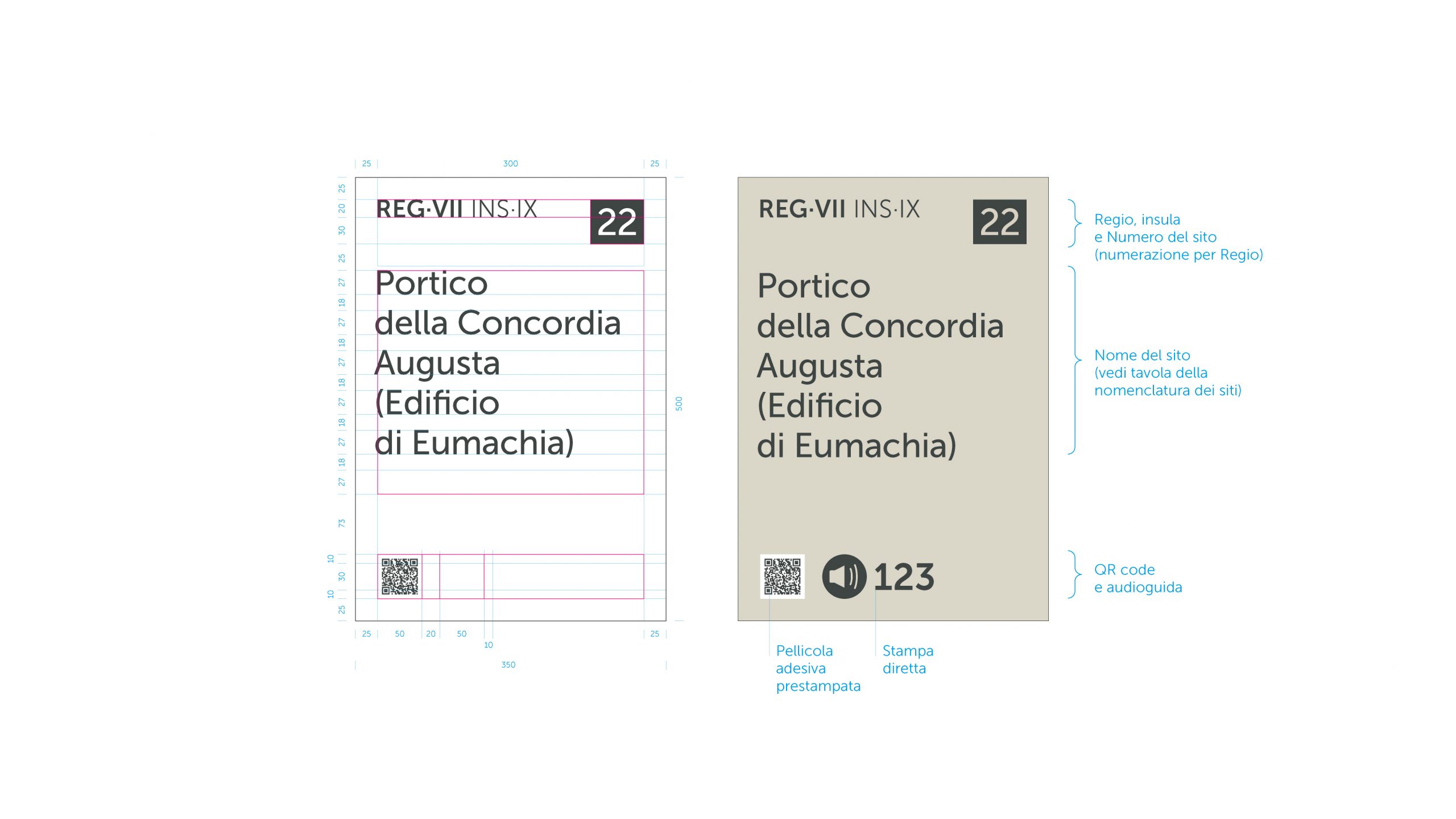
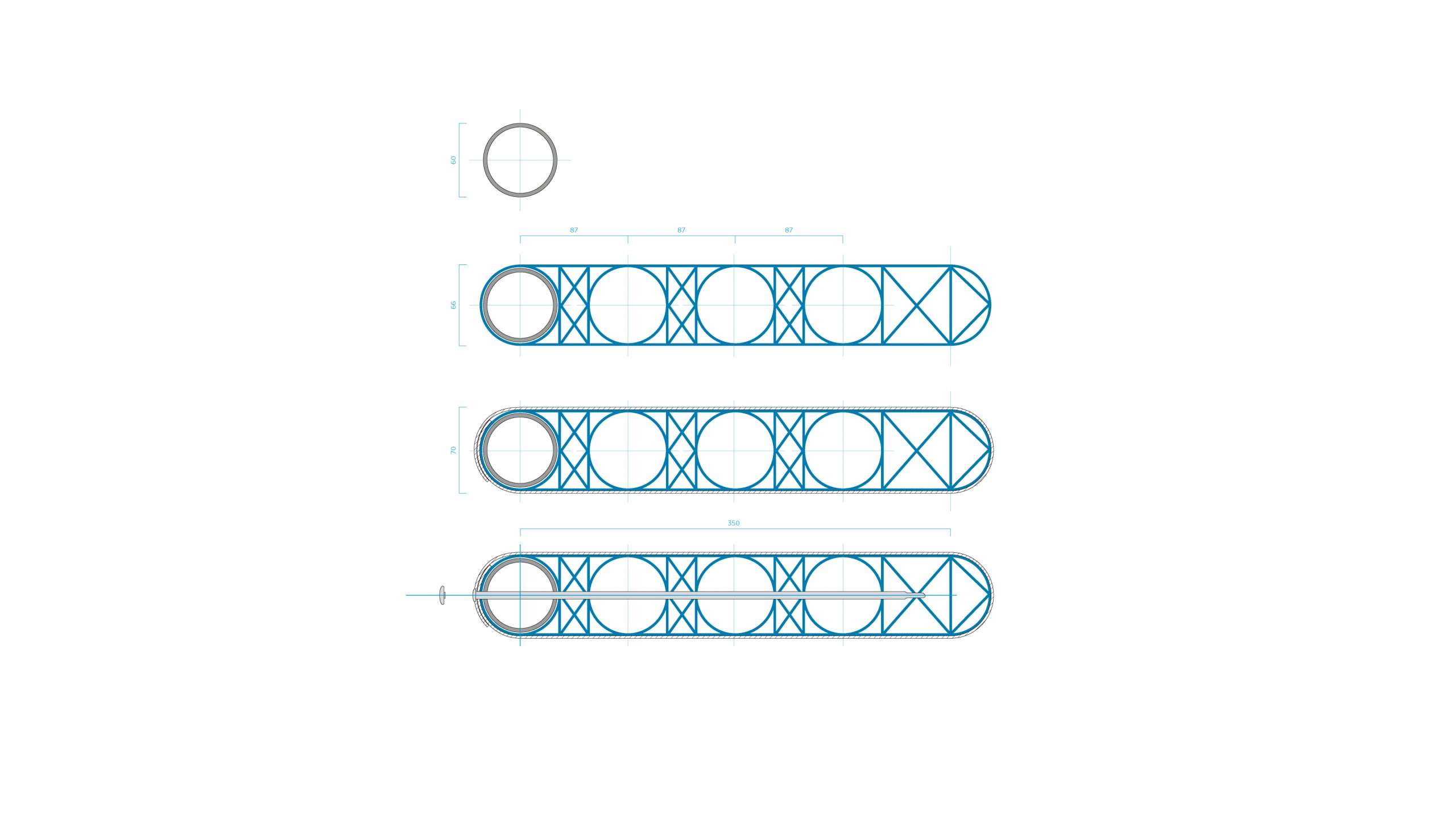
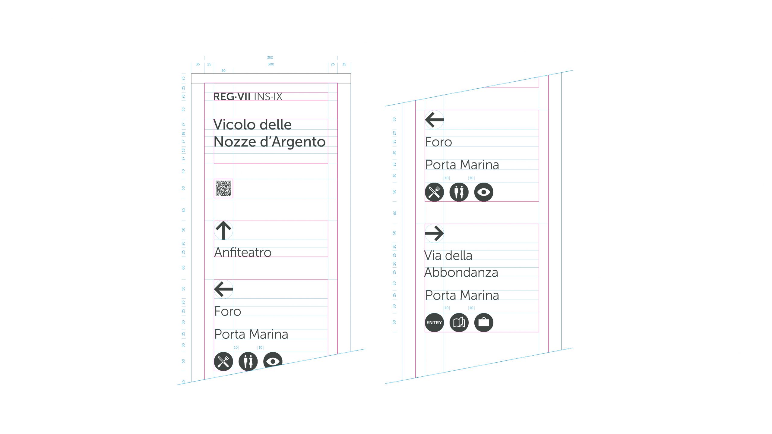
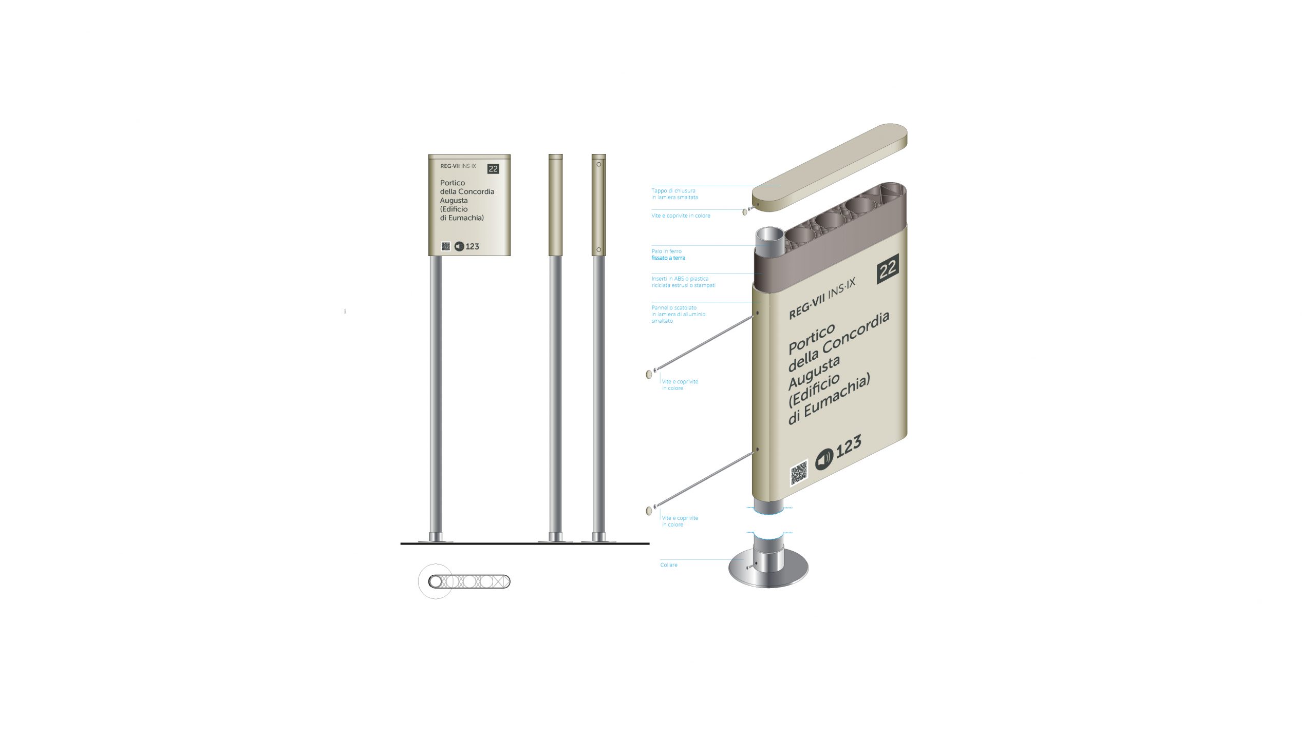
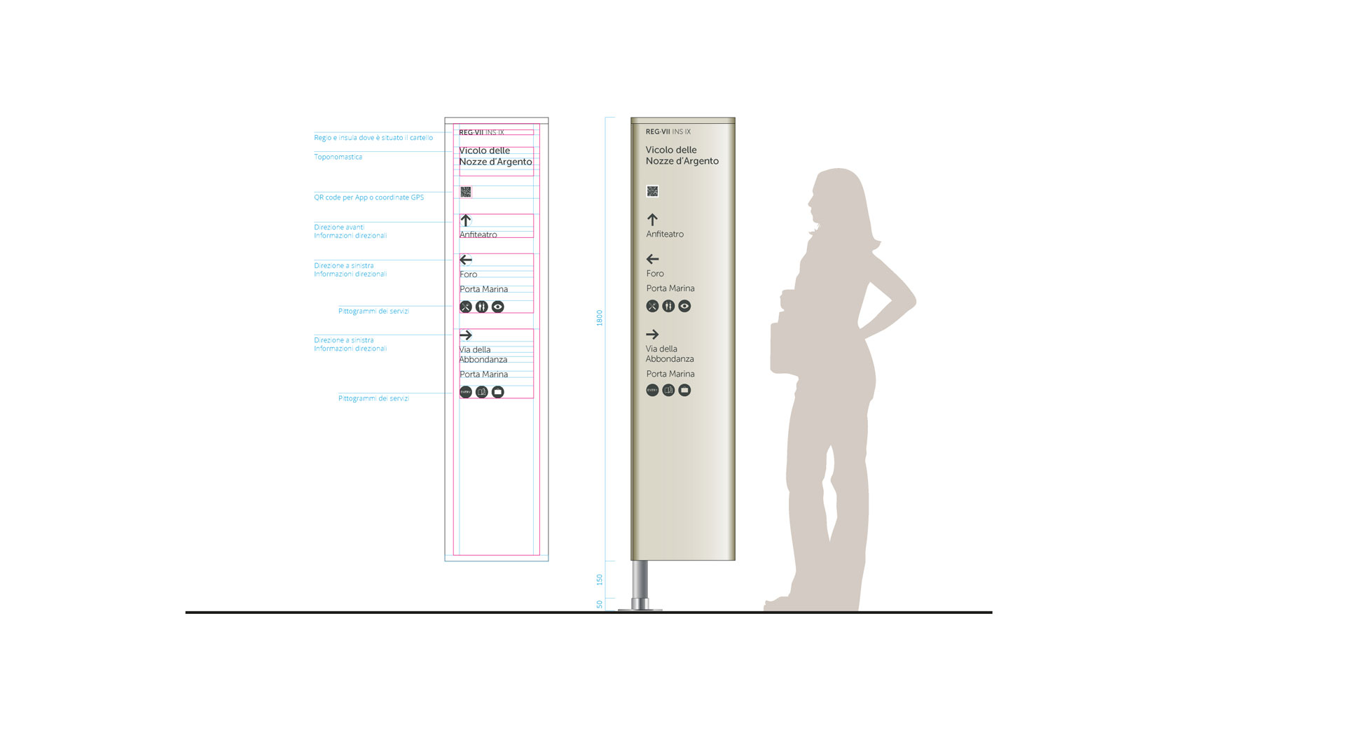
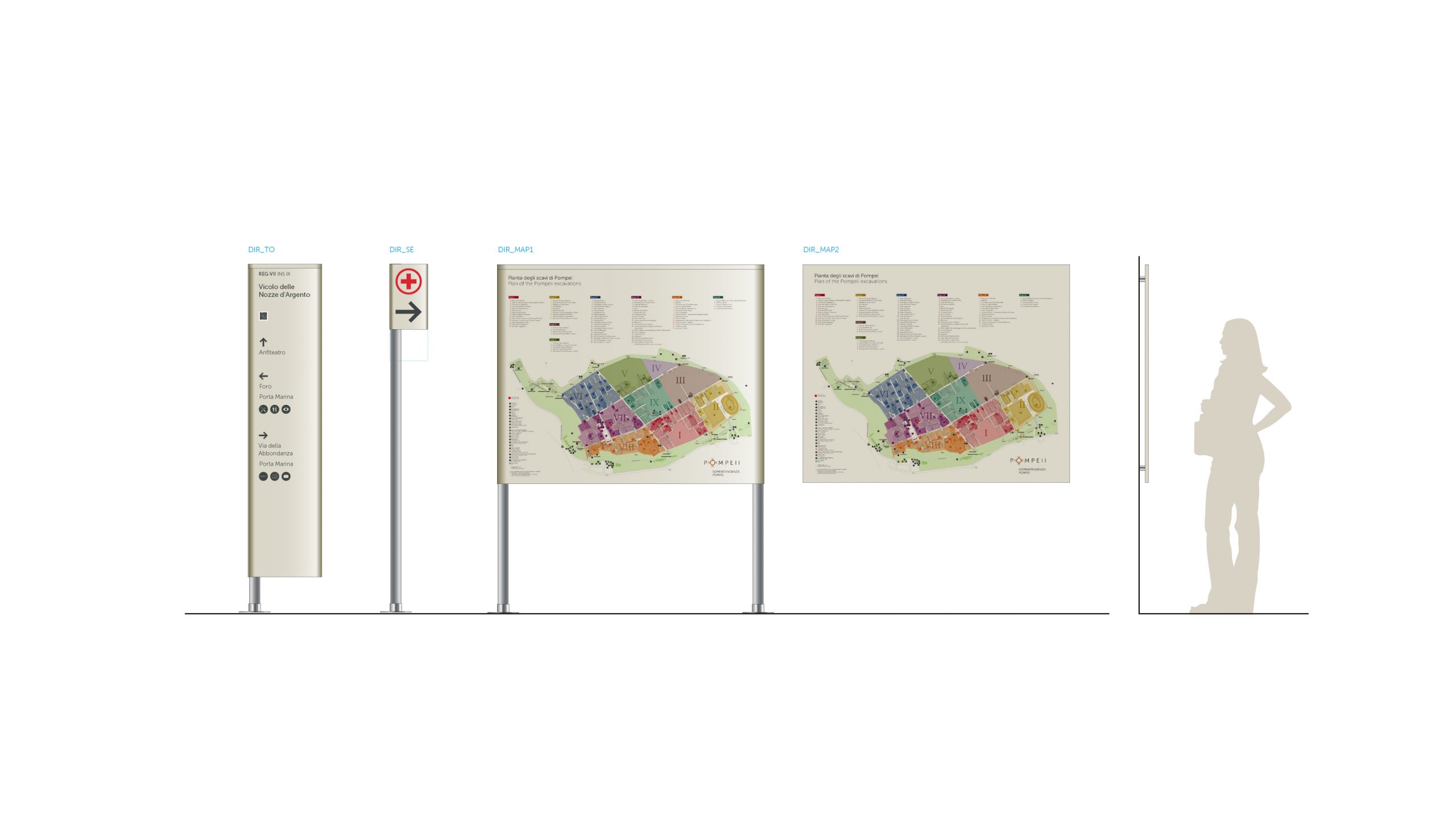
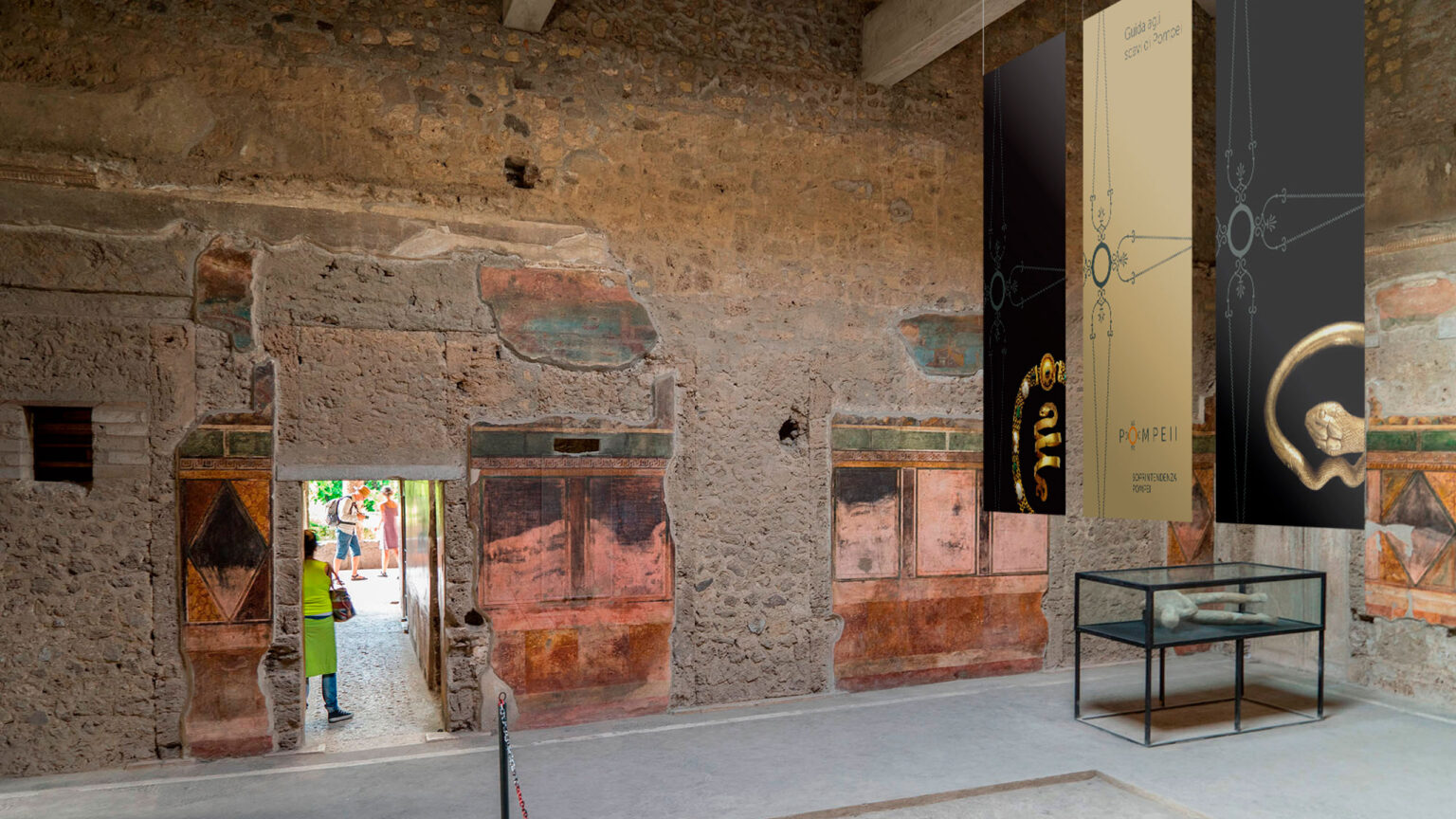
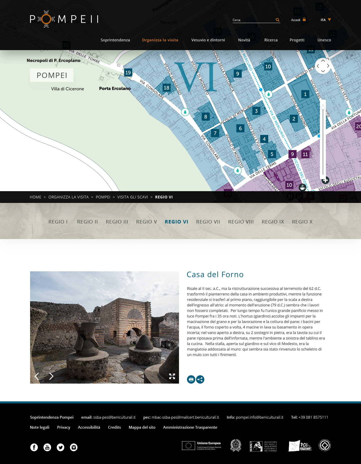
Communication design, signage, and wayfinding for an integrated identification system
The interventions outlined in the Communication Plan designed by Inarea for the Pompeii Superintendency have considered all levels of communication.
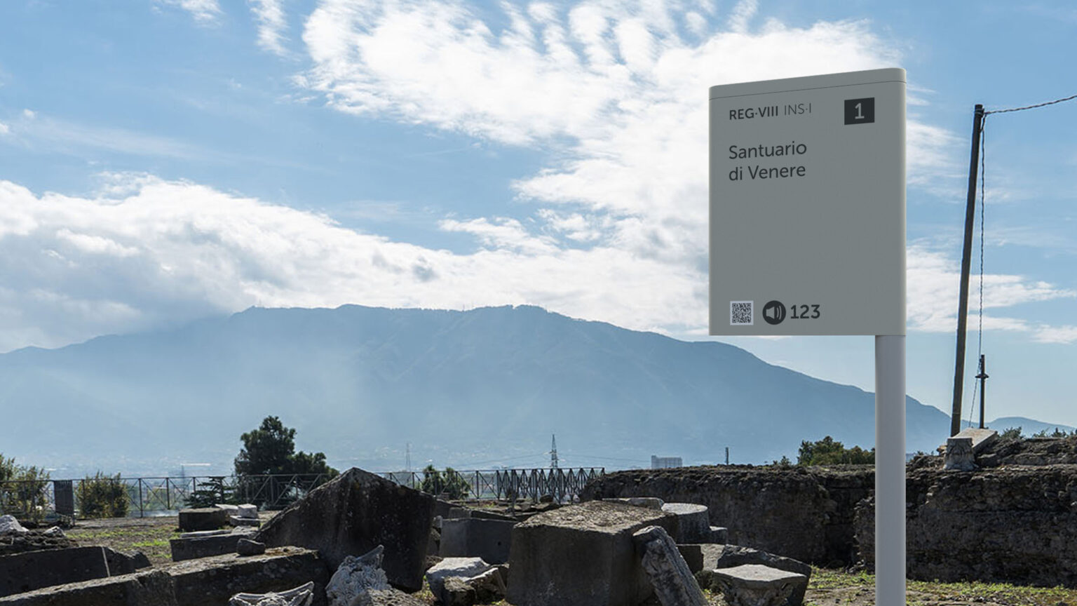
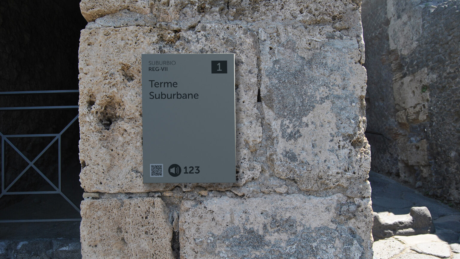
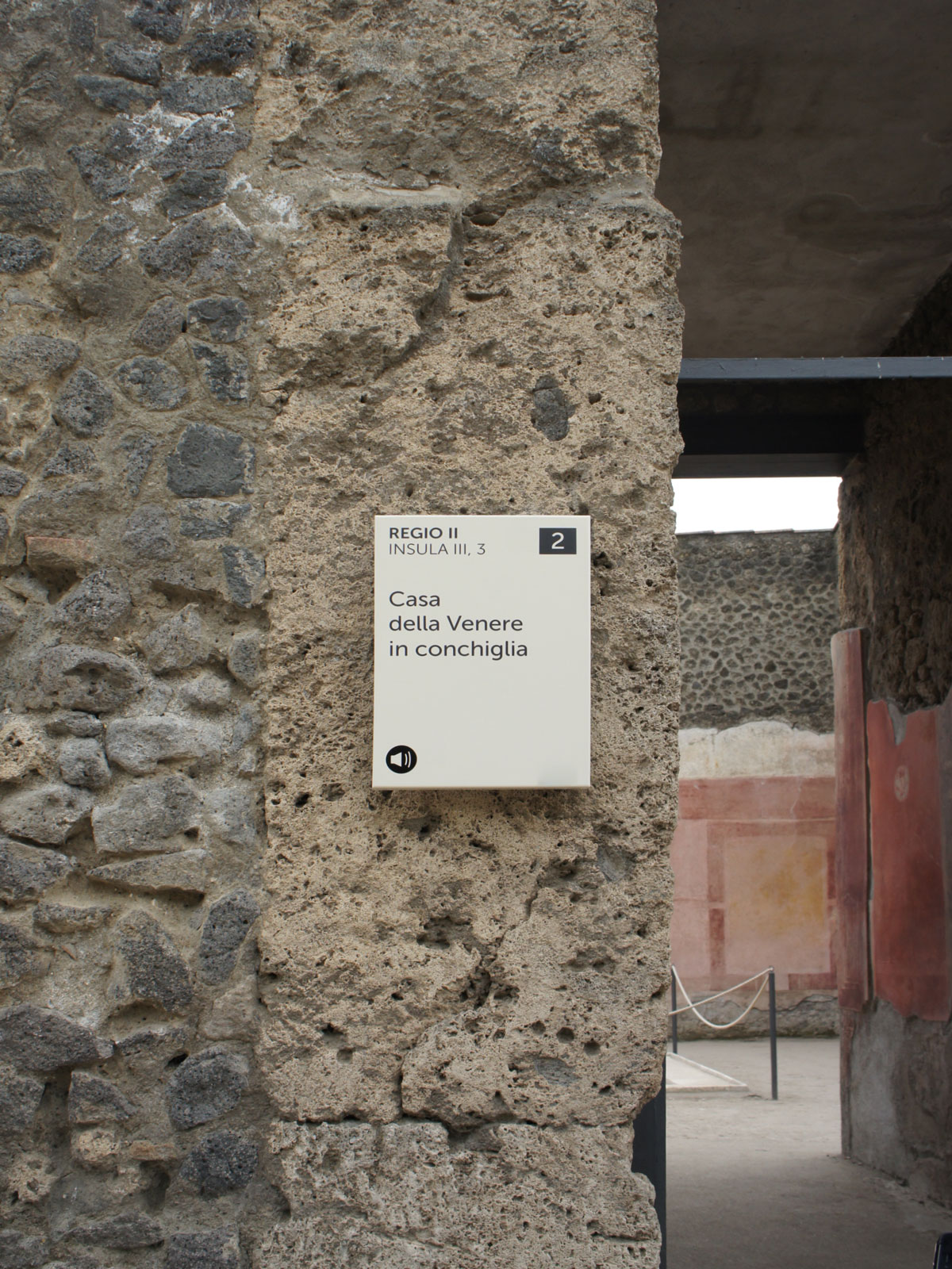
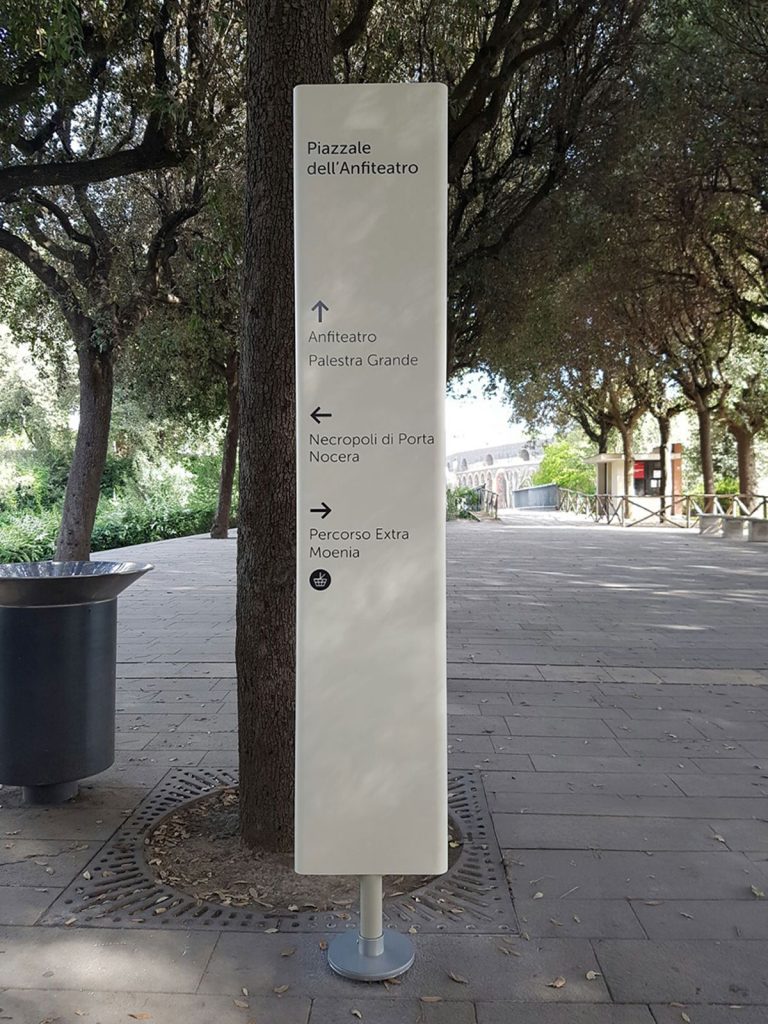
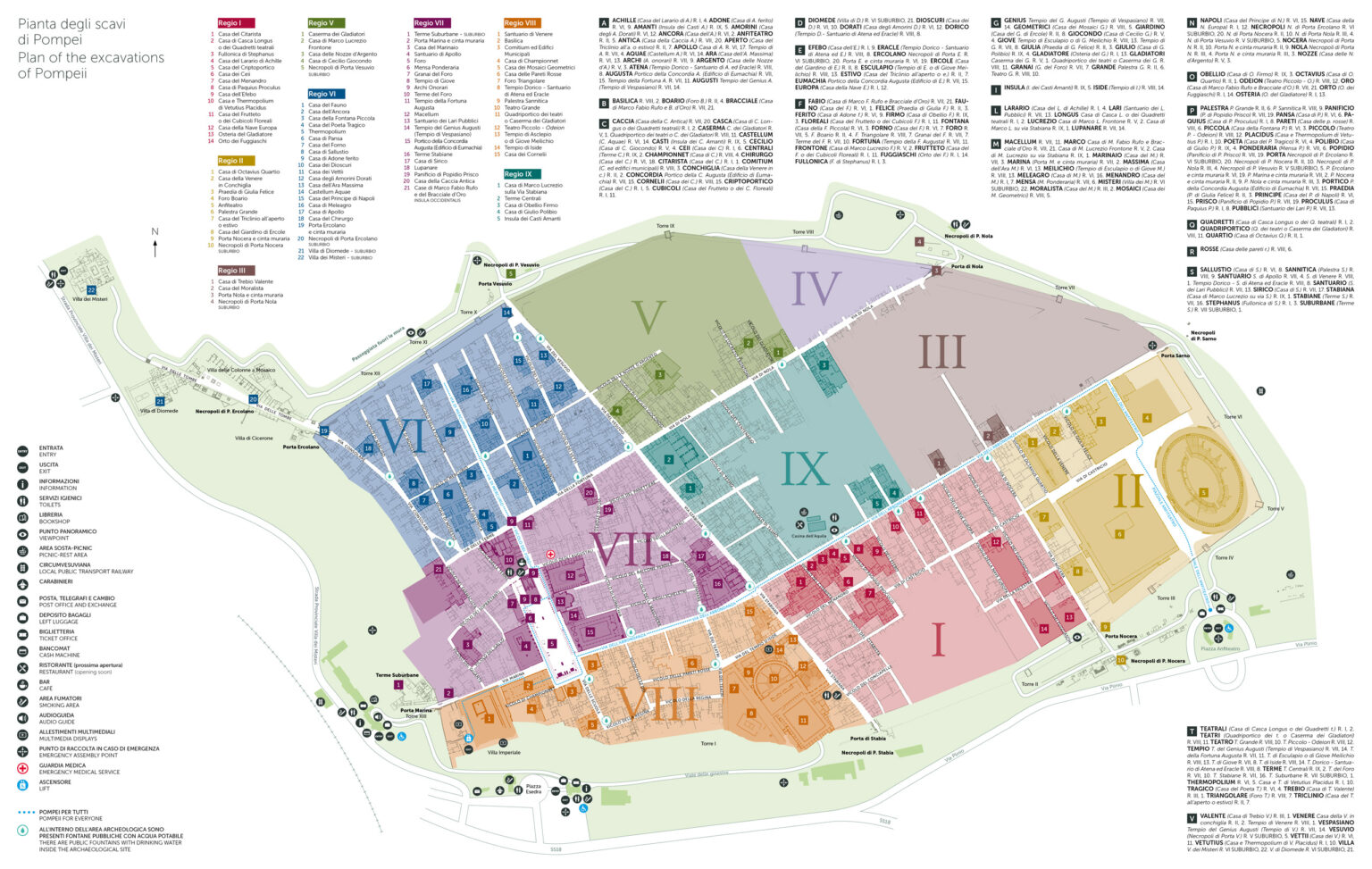
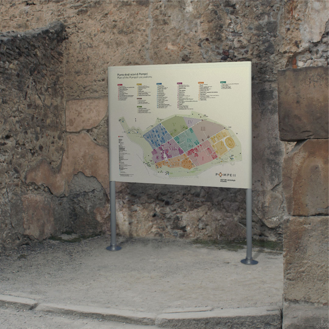
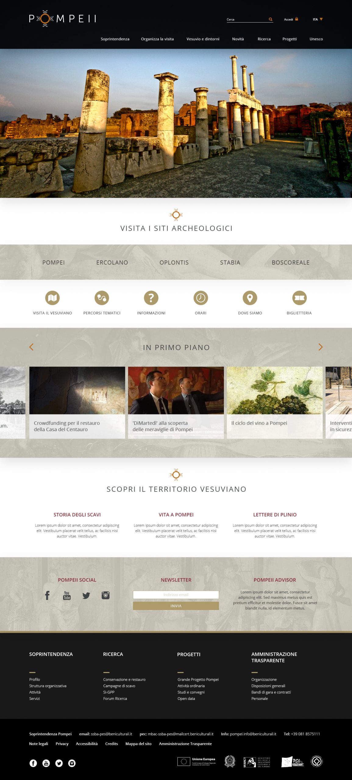
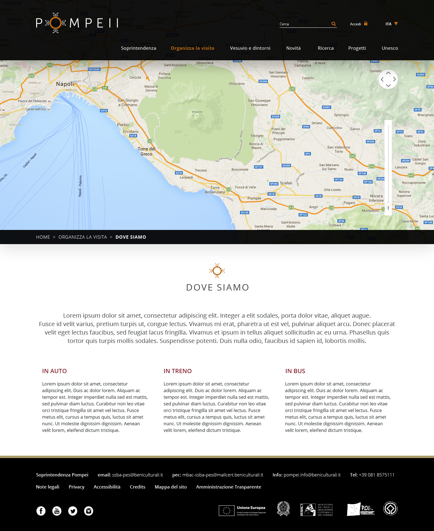
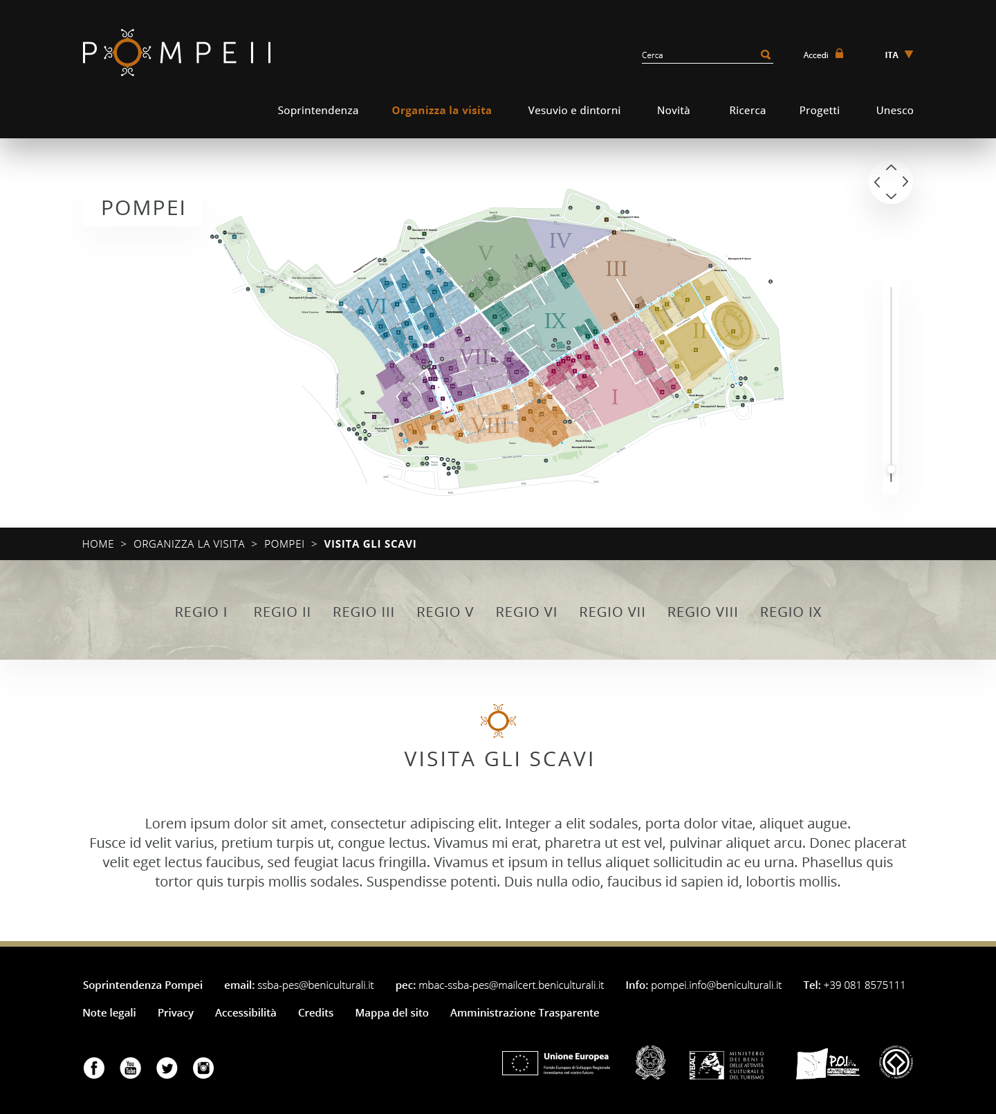
The new signage helps the three million visitors who fill the streets each year, acting as non-resident citizens, with a new identification system that makes it easier to enter and exit the archaeological city.
Digital and editorial design: video & motion design for an integrated vision across touchpoints
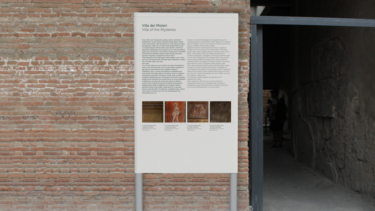
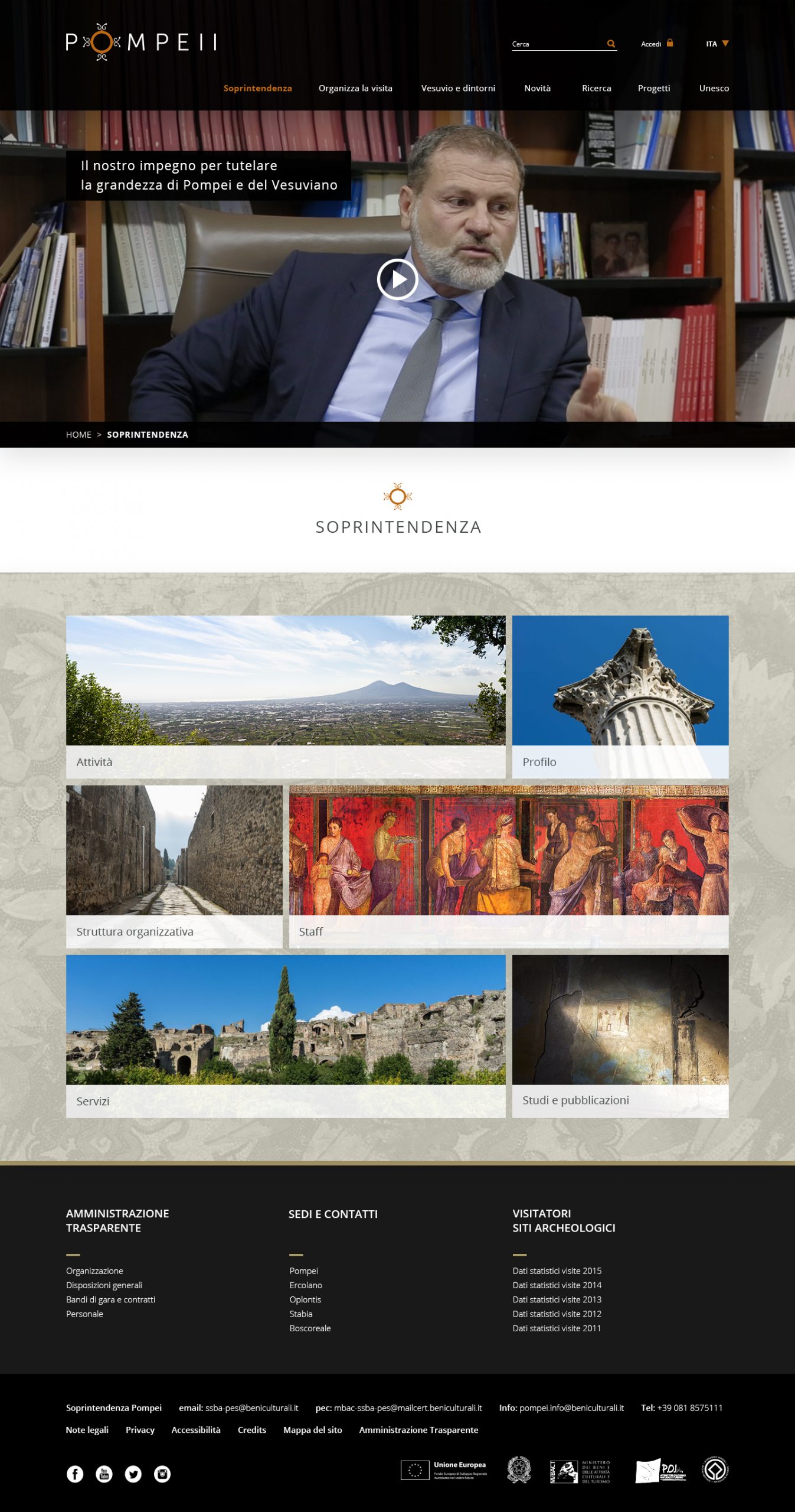
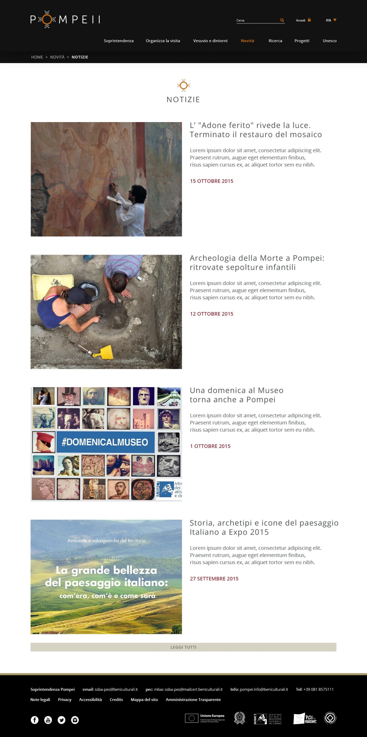
Inarea has created new maps, revised the existing guides, and developed a new website. To highlight the educational aspect of the identity system, Inarea coordinated the production of videos that show the public both scenes of life from two thousand years ago and the restoration work taking place at the site.