Vinitaly, the international wine and spirits trade fair, is an undeniable success, with more than four thousand exhibitors, one hundred and thirty thousand visitors, over four hundred events in four days. Over time, this success has seen a proliferation of collateral salons, activities and events, with partners using the brand and often without respecting its identity, thereby weakening recognition and reputation.
For this reason, after the 2004 brand redesign project, a new action was needed to reorganize the identity. Its aim was not only to safeguard the Vinitaly brand but also and above all to organize communication and messages from other events and partners to the various audiences and the market more generally.
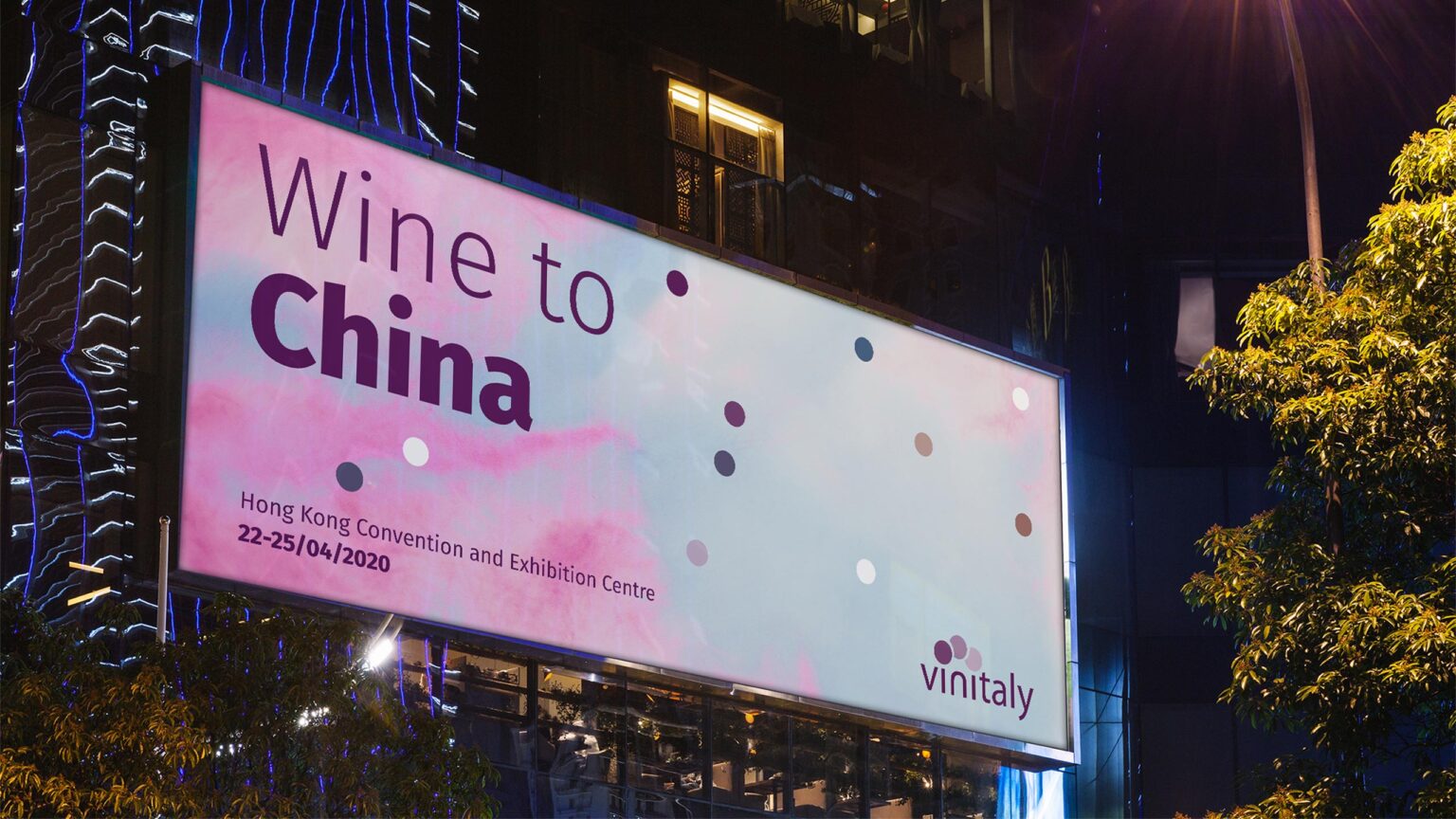
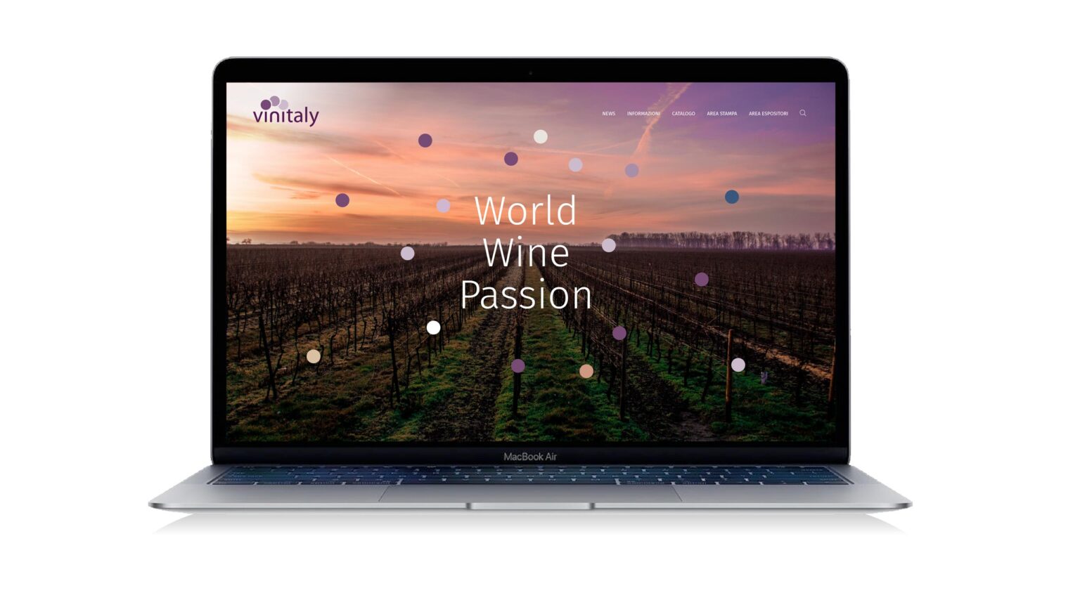
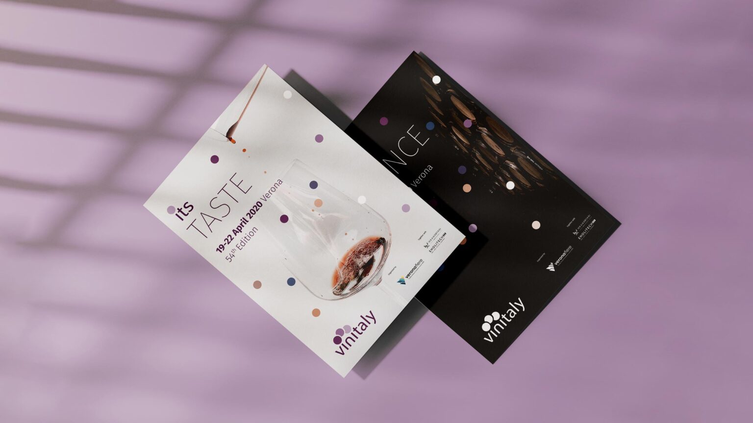
The redefinition of the system was an opportunity to refresh the brand/logo, which was updated by reviewing the font and graphics to bring the composition back to the flat concept preferred level by the contemporary approach, without overlap and transparency. In particular, a specific font intervention was made to enhance use for digital media.
The intervention transformed the original trade show into an outright system. In this context, Vinitaly constitutes the masterbrand and maintains its own “physical” brand characteristics for all activities, projects and events. Identification of individual actions is consequently contained in a plain type description.
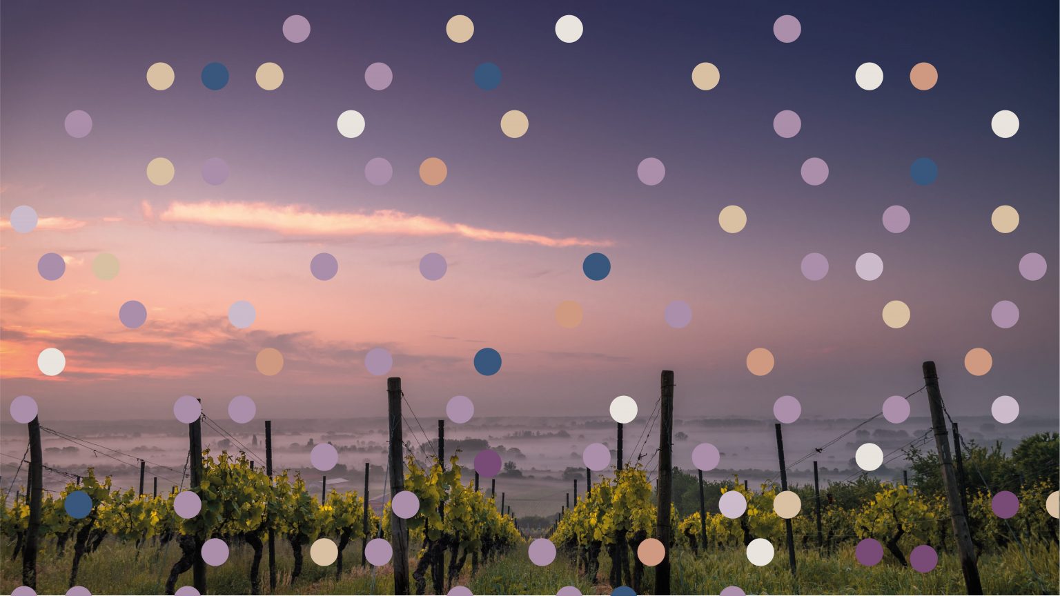
The use of a coloured pattern is envisaged both on institutional and photographic backgrounds.