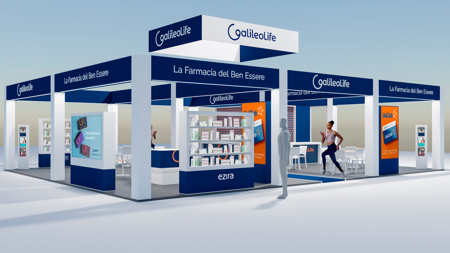
The only Italian network of independent pharmacies now open and offering pharmacists training and marketing consultancy services. The goal was to guarantee healthcare and wellness to people and their community, on a scenario on which it is more important than ever to have a close, credible, reliable point of reference.
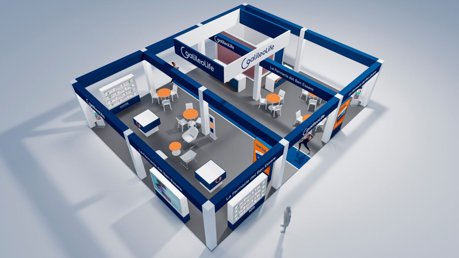
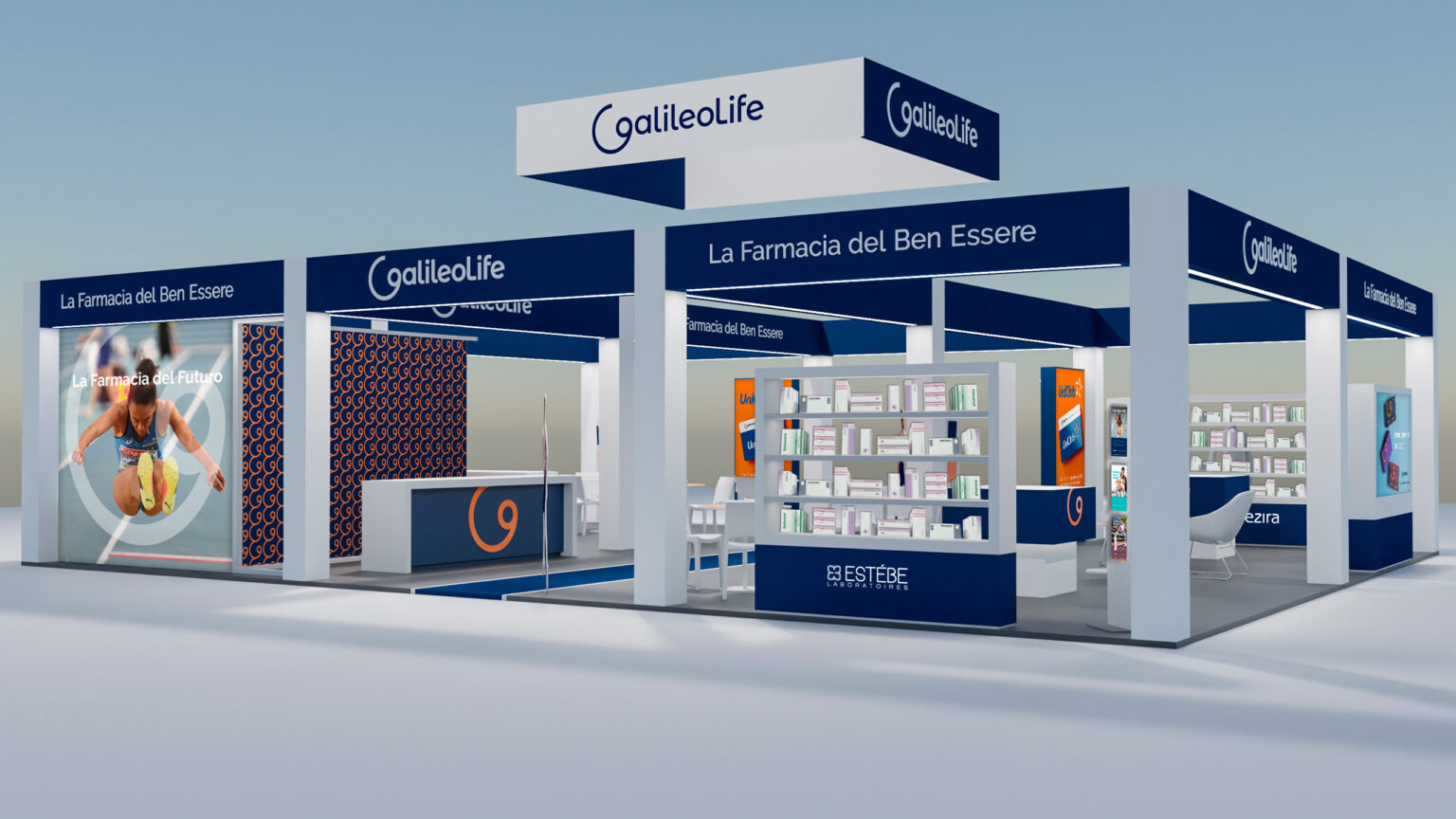
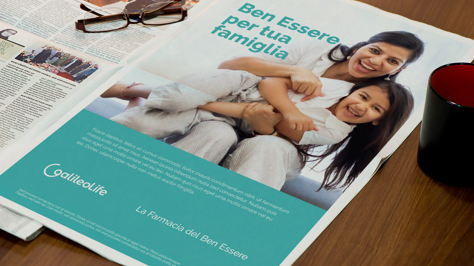
“GalileoLife, the wellness pharmacy” redefines the entire customer experience, collecting around the figure of the pharmacist all the services and products anyone needs for the right lifestyle.
The name clearly expresses the meaning and direction of this new experience. Galileo immediately makes reference to scientific method and recalls the courage of disobedience, typical of those who support a futuristic idea; Life is a word as short as it is ample, declaring the field of action.
The logo is composed with simple and rounded characters, in line with Galileo’s “G” which, with its circular shape, evokes a sense of inclusion and openness. Isolated from the logo, the “G” is transformed into an identifying sign, capable of proposing itself as a signal “flash” in the most diverse contexts.
A rich palette means the tone of communication can be varied while keeping identity references constant. An approach designed for use on various devices while also guaranteeing better management of an extensive range of products and services.
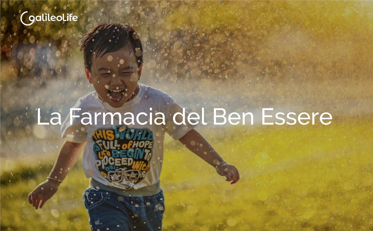
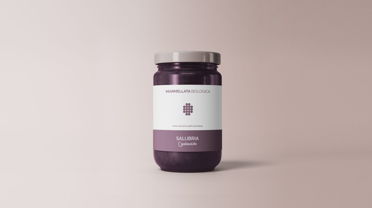
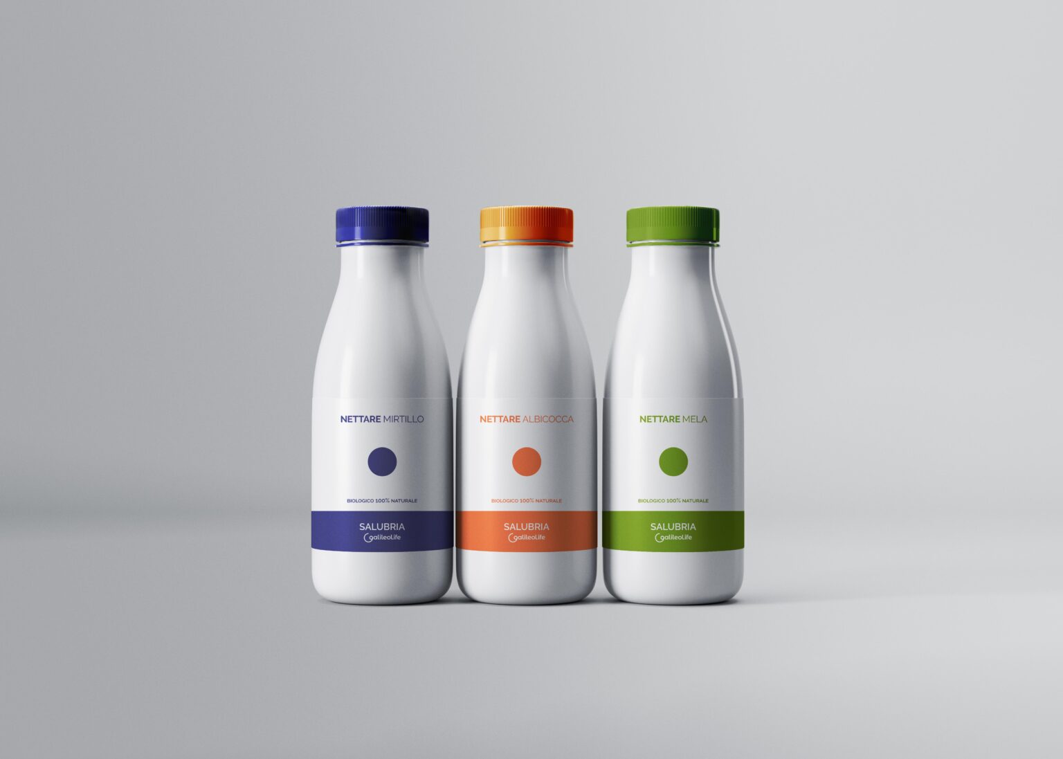
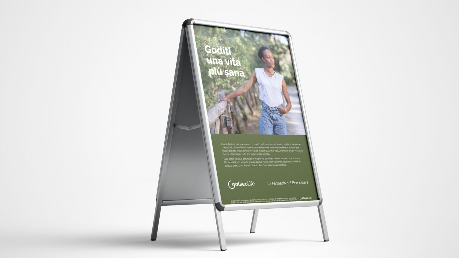
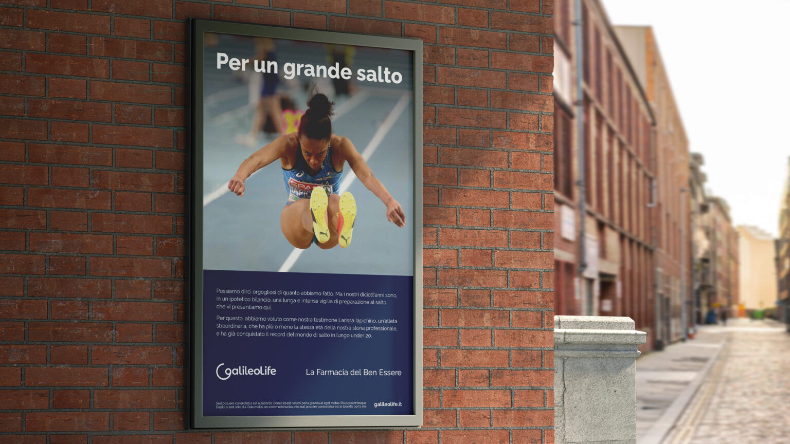
The pay off, “la farmacia del Ben Essere” – the wellness pharmacy – defines the paradigm shift being introduced: no longer a pharmacy, the place providing medication, but a space for relationships where the right lifestyle restores value to the person and their wellness.