Neopharmed Gentili is an Italian pharmaceutical company, specialized in the production and marketing of high therapeutic value solutions and an important player in the national pharmaceutical market. Neopharmed Gentili has sustained its development also through growth by external lines, thanks to successive partnerships and acquisitions, which have helped to strengthen its image as a serious and dynamic company, with an articulated portfolio of products, well distributed among numerous therapeutic areas: from vascular to cardiometabolic, from respiratory to antibiotics and the osteoarticular area, without neglecting over-the-counter drugs and supplements.
Naming. A unified identity
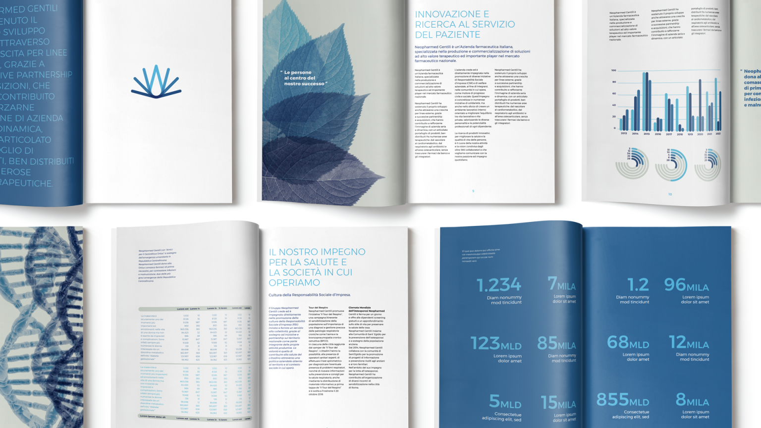
Inarea’s work aimed to define a new profile, both corporate and product, by rationalizing and unifying all touchpoints, existing and new, under a single brand. A design of leadership capable of turning the new identity into a contemporary convergence that embraces different stories and future challenges.
Brand design. A dynamic symbol that expresses change
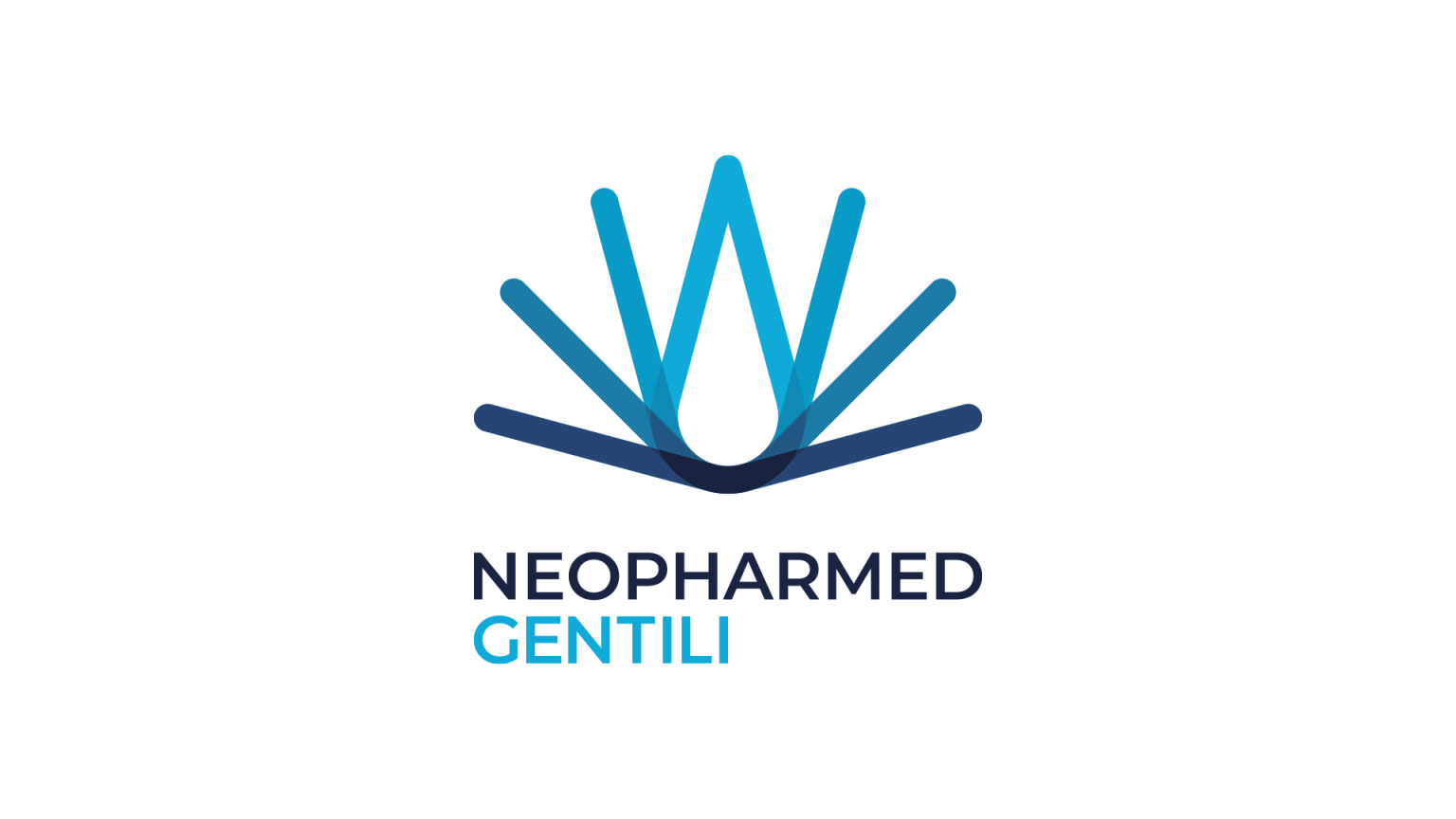
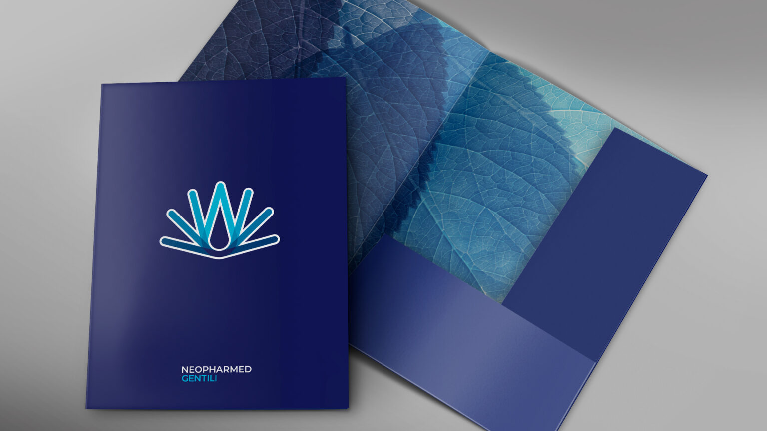
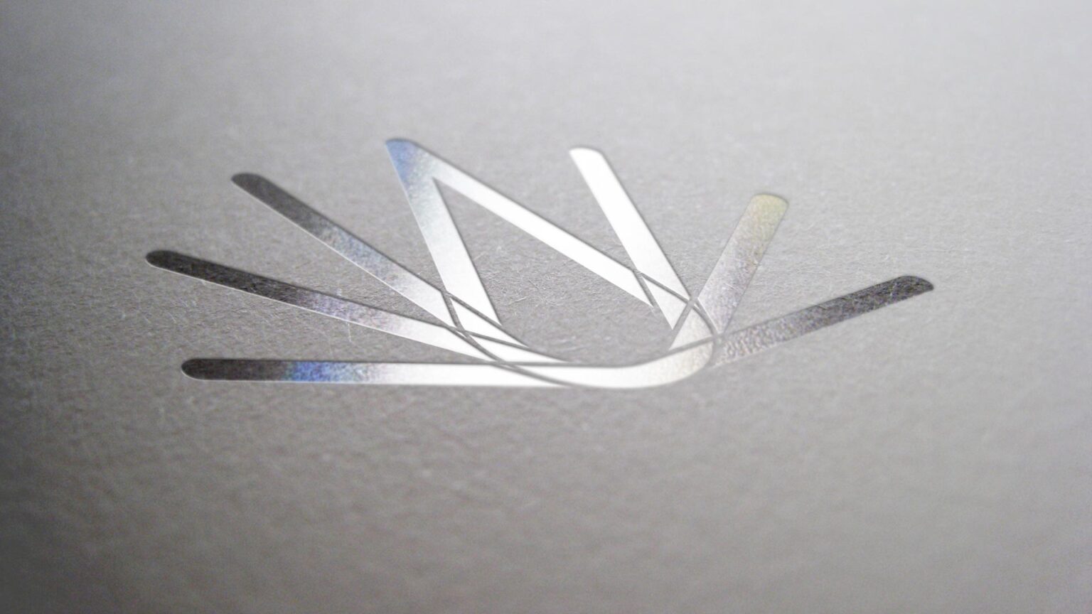
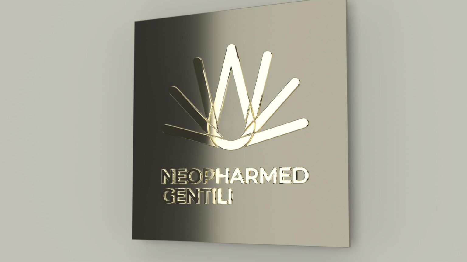
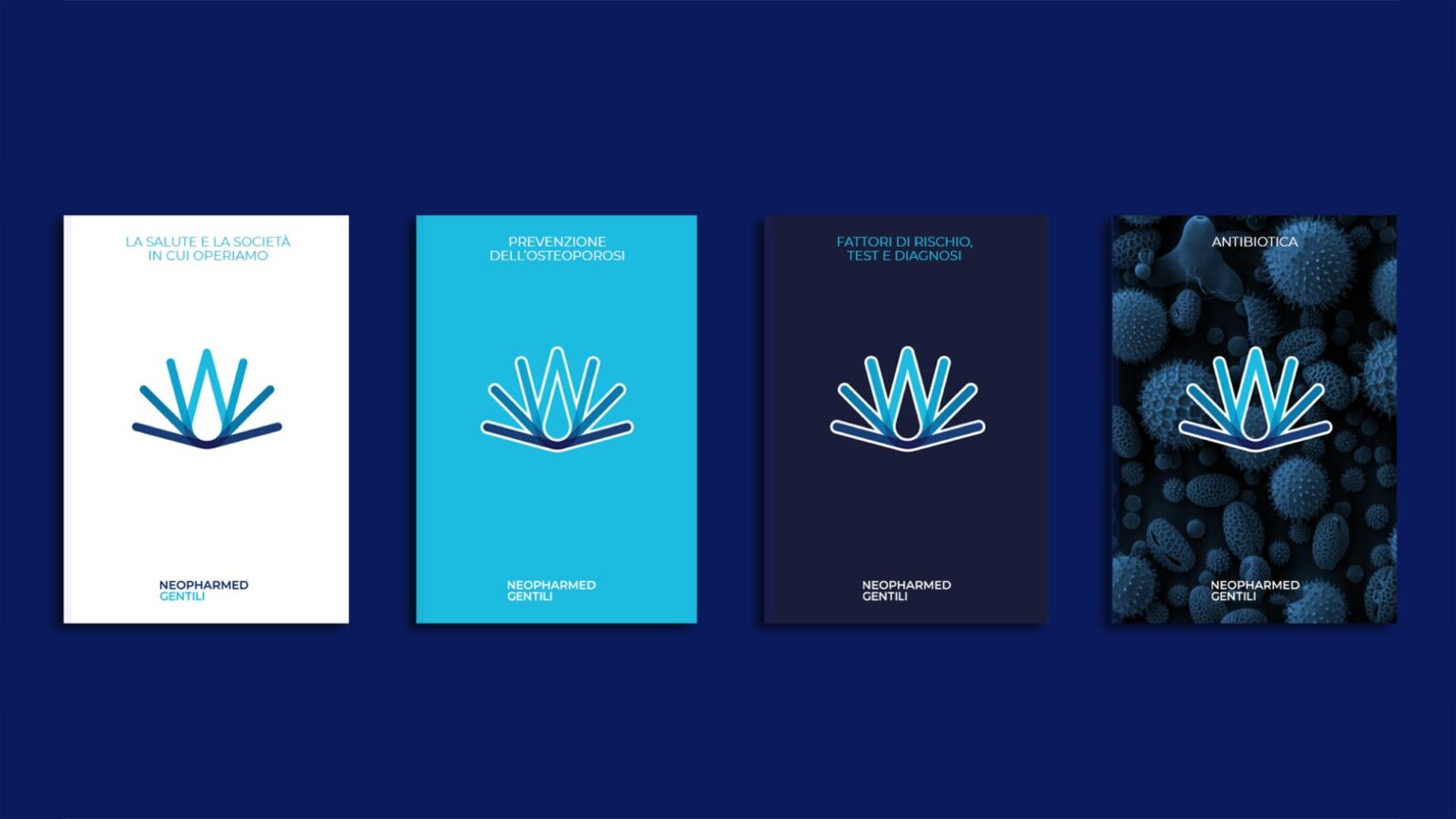
The iconic symbol consists of a symmetrical composition of eight rods, rounded and sloping, degrading chromatically from turquoise to dark ultramarine. The resulting visual suggestion refers to the unfolding of a form: an idea of change, of metamorphosis in progress but also a freeze-frame effect, produced by the “kinetic” sequence of the rods. A sign, trademark, that finds easy associations with well-known forms found in nature (drop of water, flower, flame, etc.) and that, precisely because of the sense of movement, recalls fundamental concepts of Neopharmed Gentili’s corporate philosophy: the dynamic ability to open up to all its stakeholders and the willingness to share its wealth of knowledge and research.
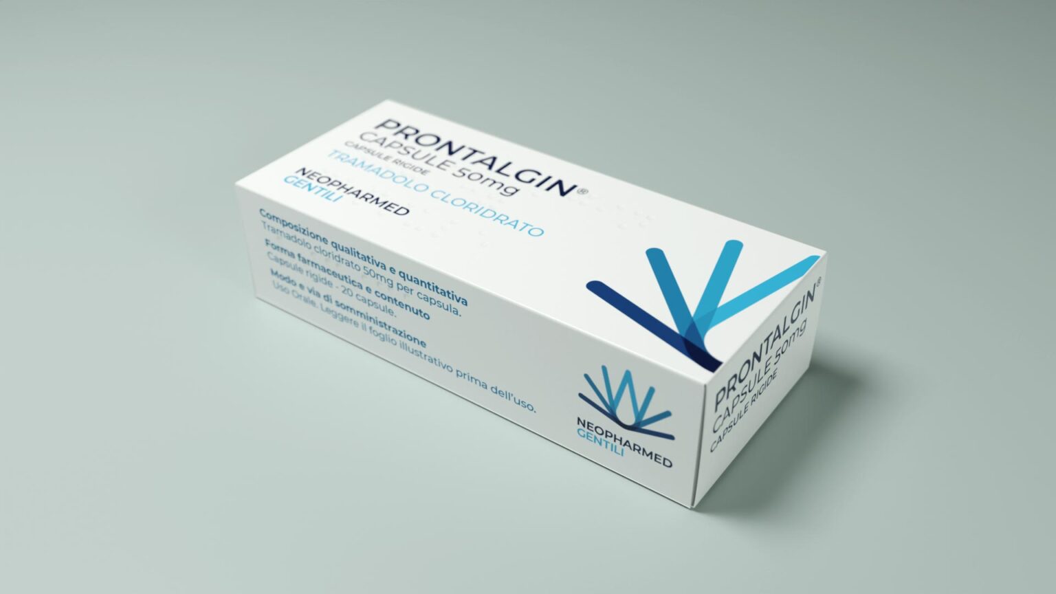
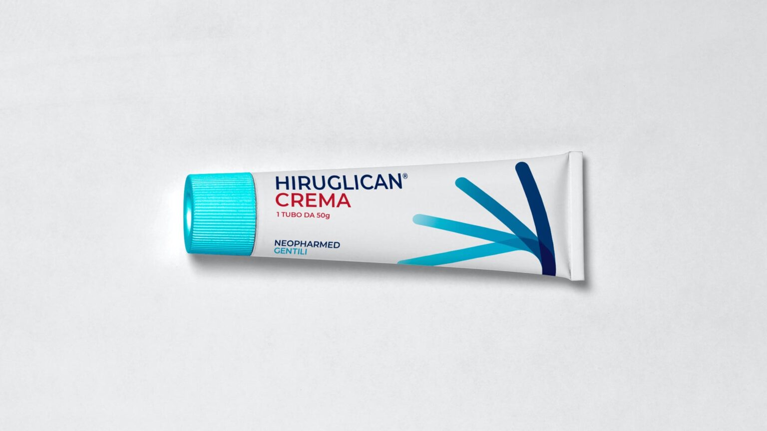
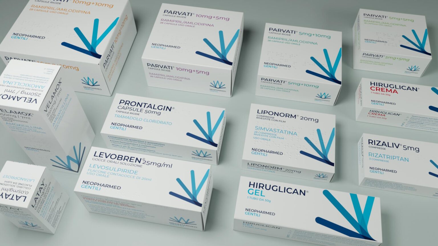
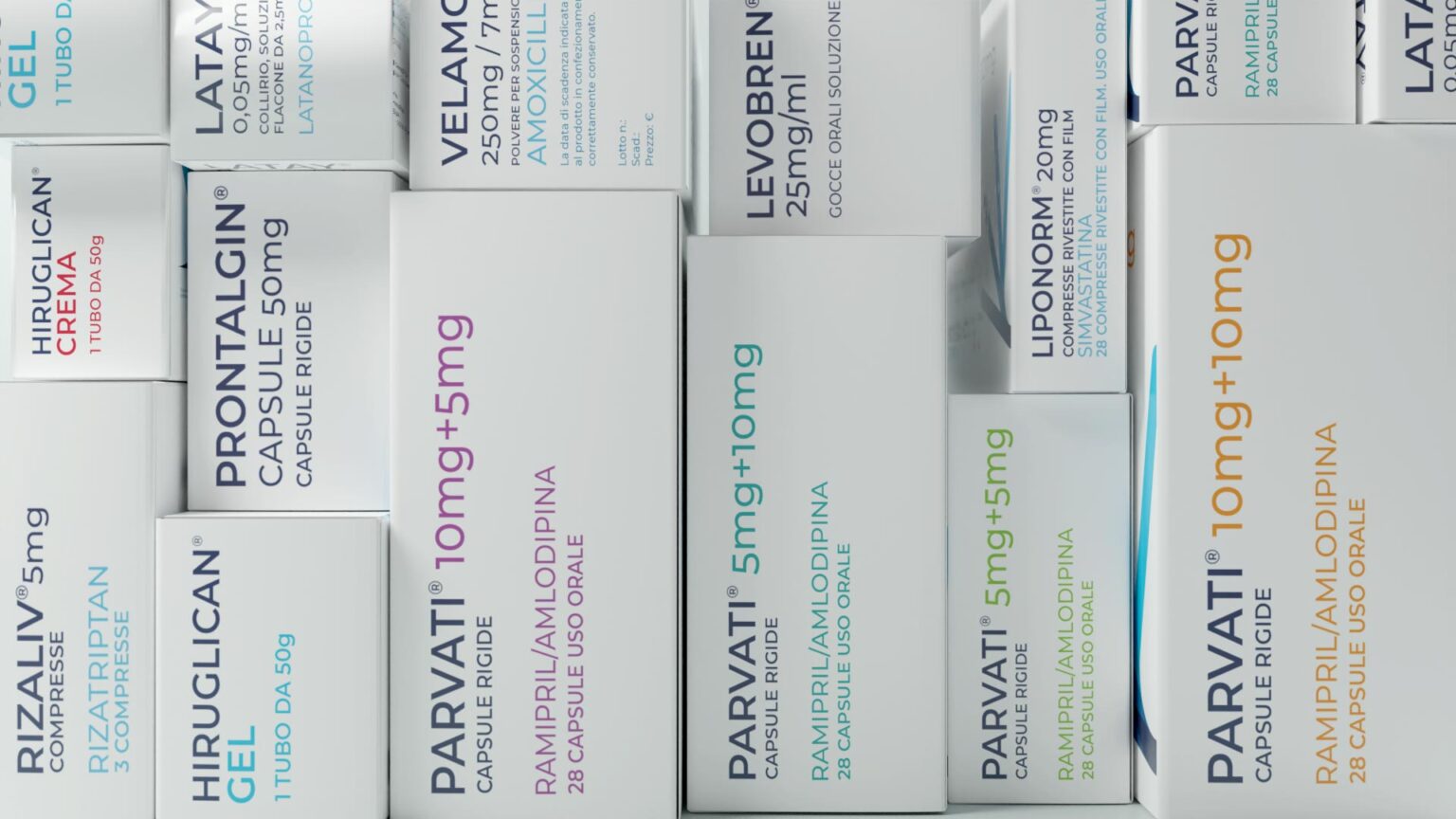
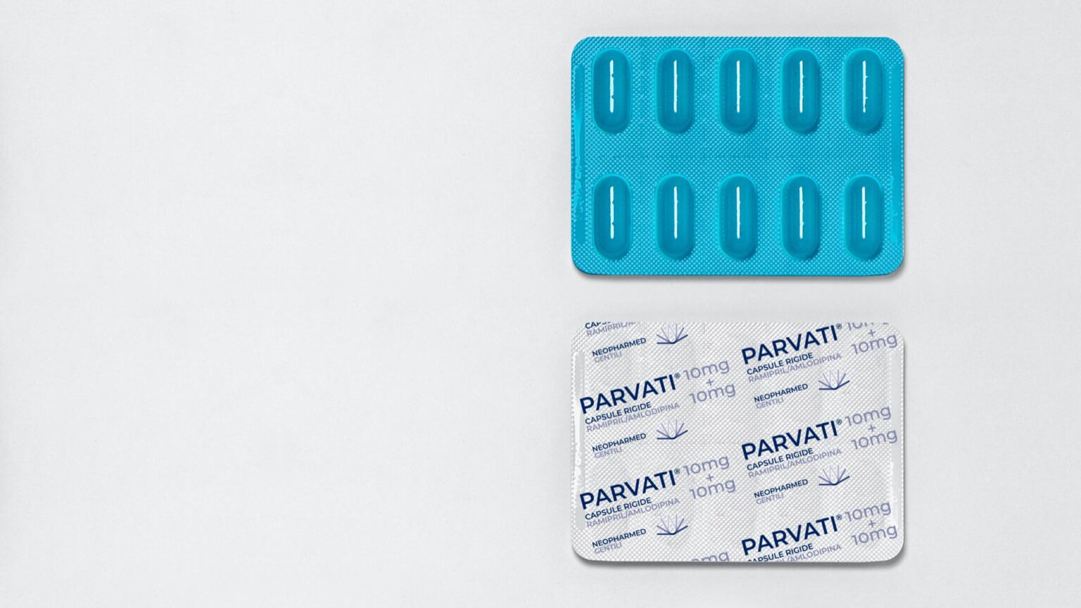
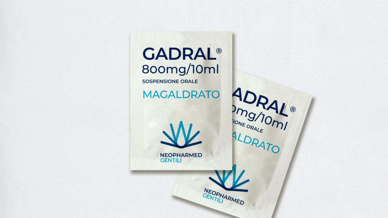
Packaging design. Clarity and visual coherence
The packaging reflects the new visual identity with a clear and harmonious design that enhances the products while ensuring recognizability, consistency, and consumer trust.