MAXXI is the national hub for contemporary art and architecture; not a static space, but a place that generates content.
Brand architecture and brand design. Between roots and constant change
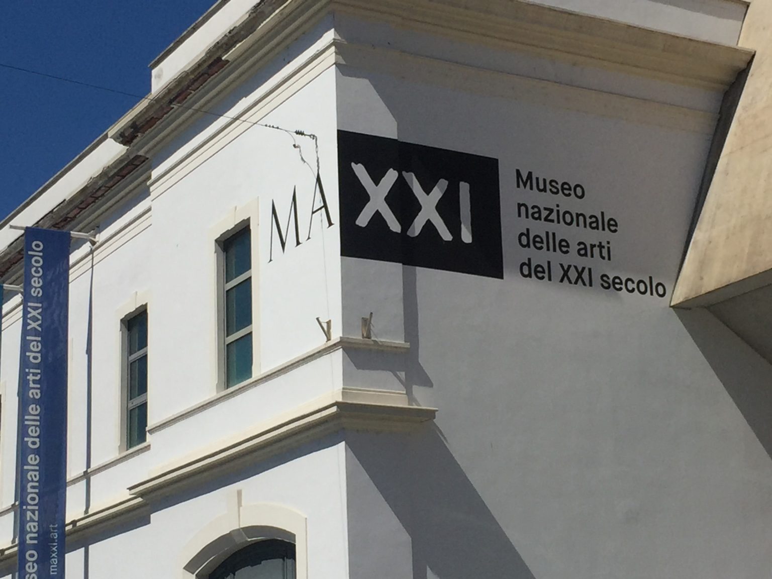
The National Museum of 21st Century Arts, MAXXI, is defined through the graphic and typographic contrast inherent in the composition of its logo.
The root ‘MA’, representing the National Museum of Arts, is composed using characters that evoke the stone engravings of Imperial Rome: this part remains constant in all combinations. The suffix ‘XXI’, as it refers to the twenty-first century, is interpreted through fluid and dynamic visual elements.
Video & Motion Design. An identity in transformation
As the video effectively demonstrates, the ‘XXI’ suffix frame, in a 16:9 ratio, is designed as a true window that is open to ever-evolving interpretations of the brand. This part can feature elements such as concrete (a central material of the museum’s façade), but also lights, typography, and work tools. The possibilities for variation are endless, as they shift according to exhibitions, events, projects, and contributions from artists, among others.”