Fit Consulting was founded in 1997, thanks to the synergic work of a group of sustainable mobility sector experts. Today it is a brainstorming lab with a network of over 300 partners in Europe, Asia and the USA, committed to creating new business models for development of mobility as a service, Internet of Things, and Physical Internet.
Brand design Consistency and an unconventional spirit
Twenty years after its establishment, FIT Consulting renews its identity A radical change in representation, yet at the same time, a testament to consistency with its unconventional spirit.
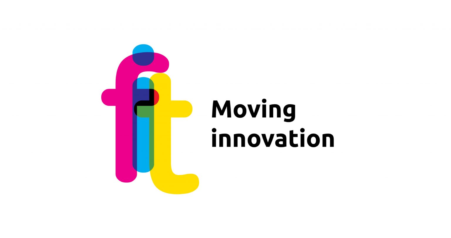
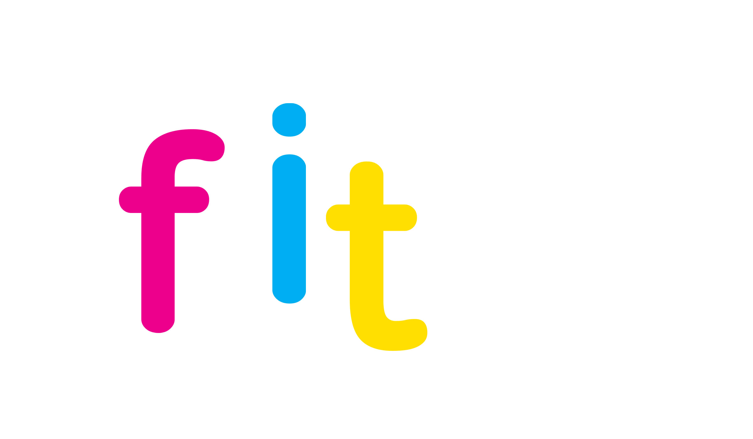
The logo aims to visually position FIT Consulting as distinctly “outside the box,” in contrast to the unwritten rules of the consulting world. The cyan, magenta, and yellow colors characterize the letters F, I, and T, respectively, which are connected in a sort of monogram. The overlapping points, due to the transparencies, create composite colors. A playful and impactful combination, amplified in the logo animation and video & amp; motion design applications. Since color has always had the advantage over form in being perceived more immediately.
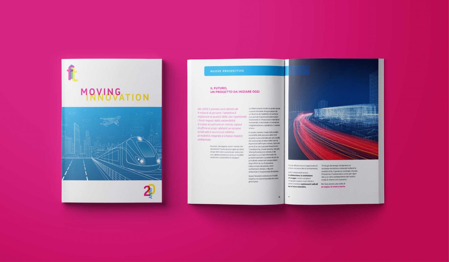
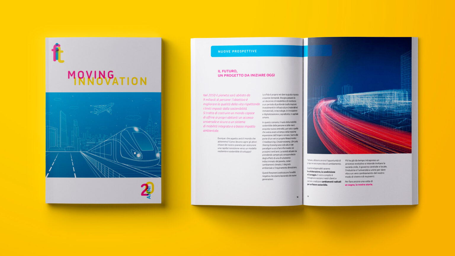
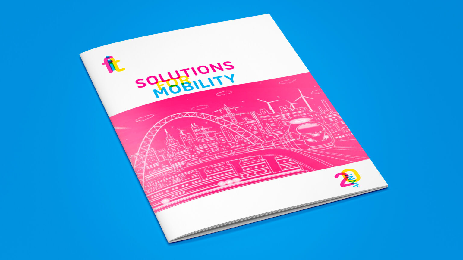
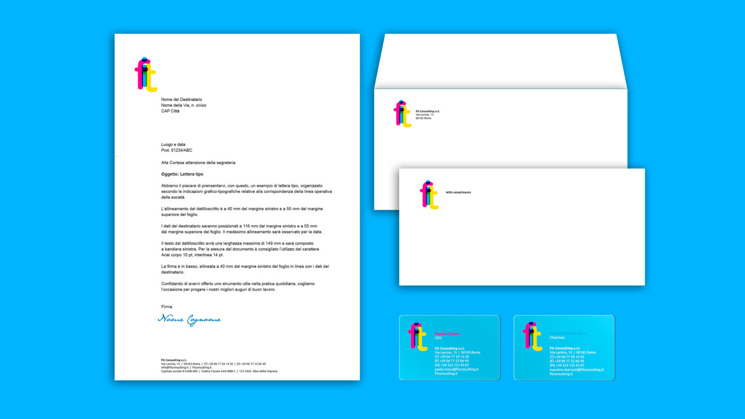
Editorial, communication and digital design. The touchpoints of the brand identity
The goal is to align and update all the touchpoints of the brand identity: fostering identity and a sense of belonging within the organization, as well as ensuring effective and distinctive recognition among stakeholders.
A metaphor of interaction, conveyed through the strength of colors, shapes the sense of change within an ongoing evolutionary process. It evokes qualities—such as courage, sharing, and collaboration—with which FIT Consulting has built its history and, starting today, its future.