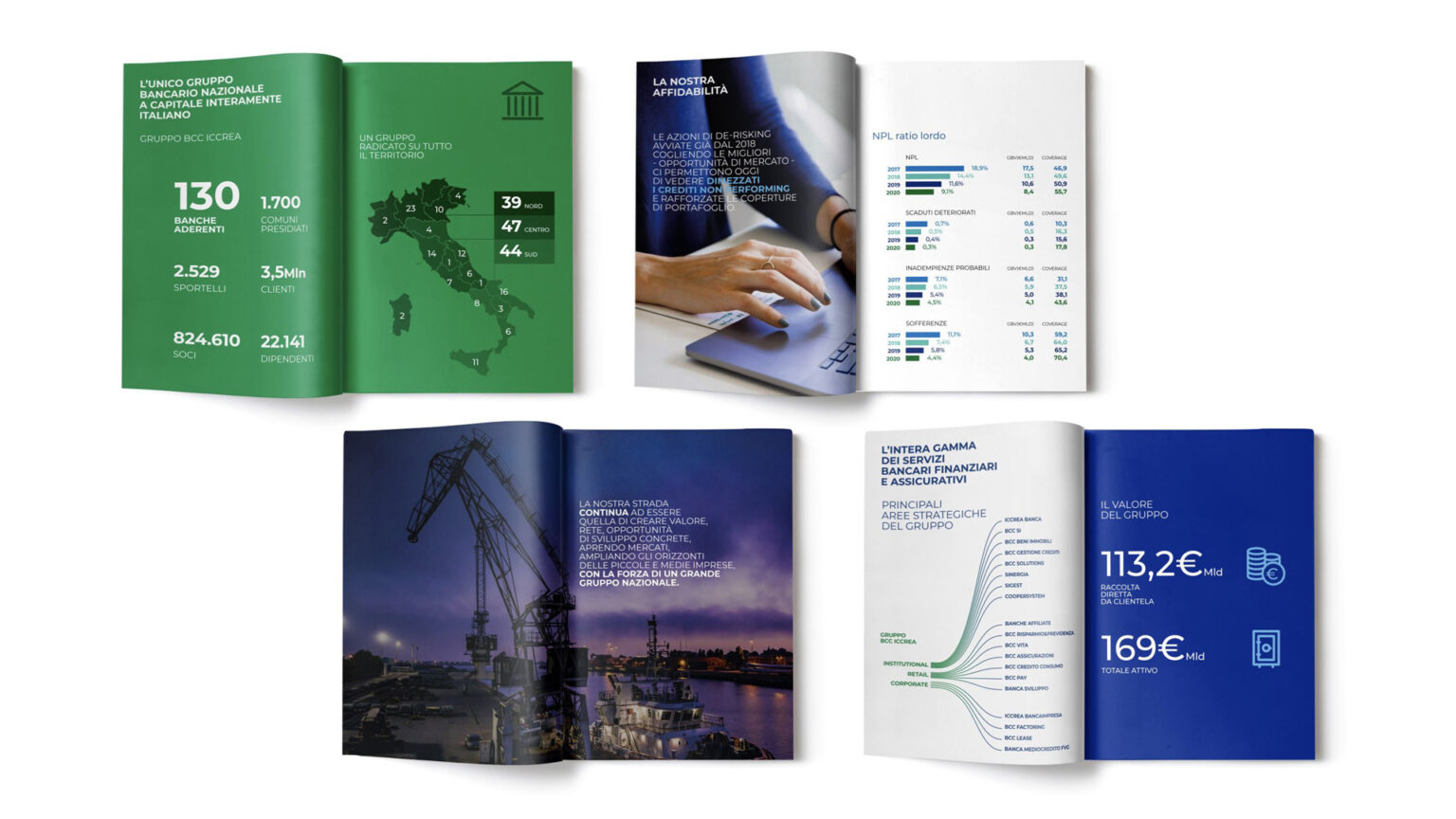
The BCC Iccrea Group is the largest cooperative banking group in Italy. It consists of 120 banks operating in 1,700 municipalities with 2,470 branches, along with other companies controlled by the parent company.
Brand Architecture. Reducing complexity to a system
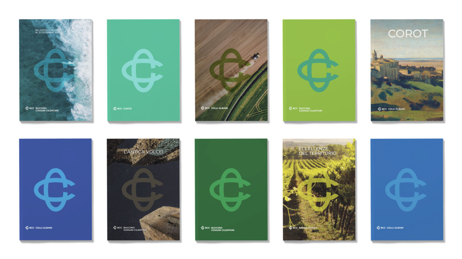
The aim of the task was to gather the different names and representations of the banks into a single system, respecting individual identities. The new brand began precisely from the very meaning of cooperation, which makes of the BCC a whole, a unique universe that succeeds in giving a voice to shared roots while serving as a precious point of reference for Italian individuals, families and businesses. Trust, nearness, social commitment, solidarity, rapport, ethics, empathy, are longstanding values reiterated by the new brand.
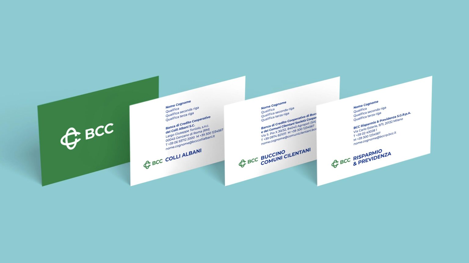
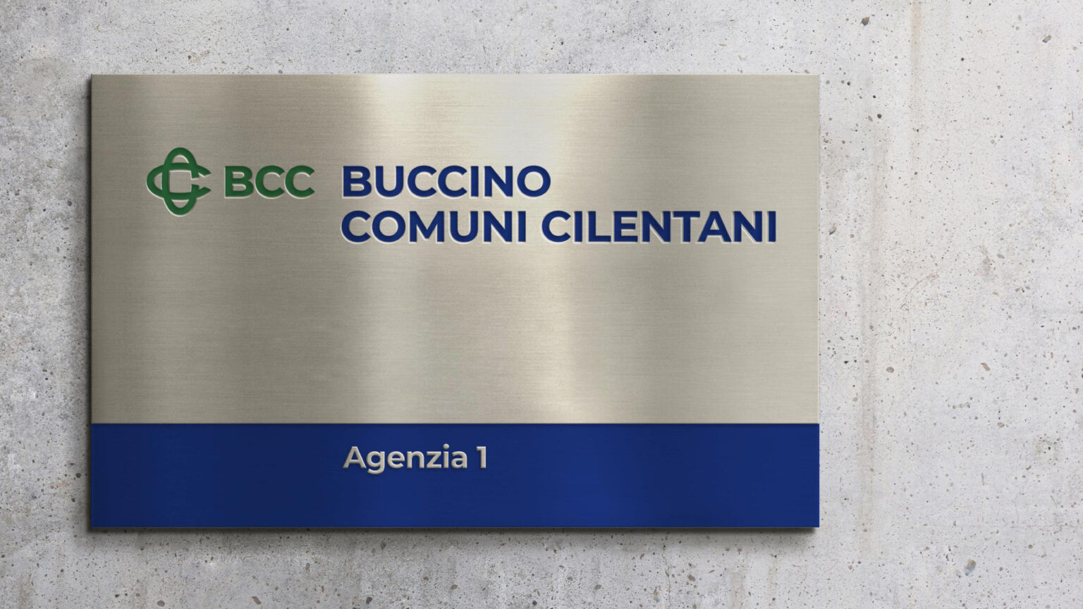
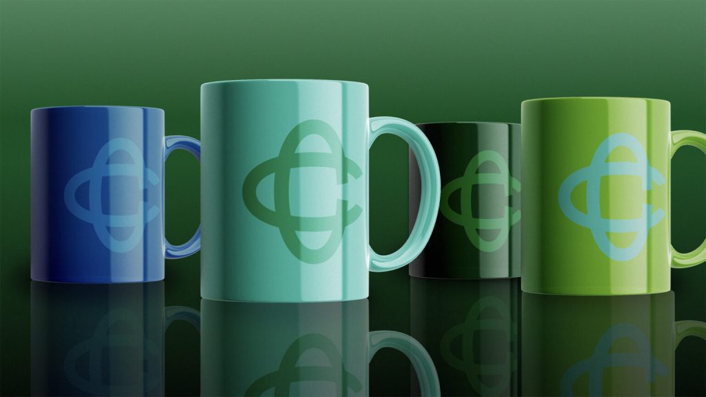
The double C, inspired by Solomon’s knot, and the initials BCC, are the group’s identity heritage and their reputation indicated we should operate seamlessly with simplification and rationalization of sign, colour and font.
Brand Design and Naming for a redesign focused on lightness
Revising one’s identity means evolving and embracing ongoing changes. The logo redesign expresses greater openness, is lighter, and becomes the core of the BCC identity system. This offers a visibility advantage because, along with BCC, it enhances the critical mass of the network across all physical and digital touchpoints
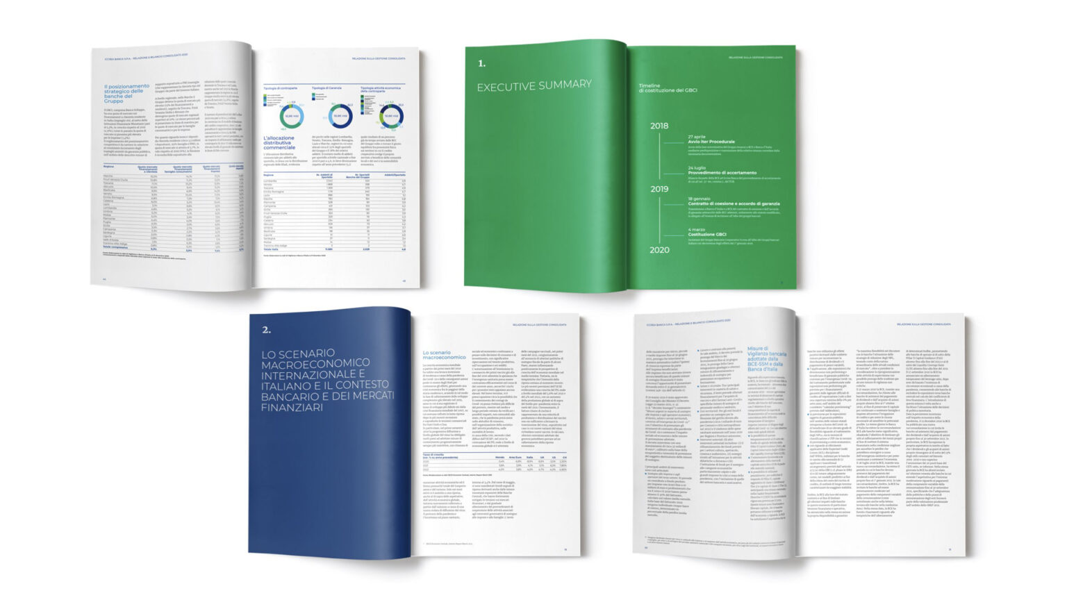
Editorial Design and Signage & Wayfinding Design: towards integrated communication
Forms, corporate communication, websites, and physical retail are the touchpoints of the BCC with its audience. A common, unified, and streamlined system that adapts the corporate identity across its multimodal aspects