Angelini Industries is a multinational group that operates in the pharmaceutical, consumer goods, perfumery and dermocosmetics, wine and industrial technologies fields. Founded in Ancona in 1919, it is present in twenty-six countries around the world.
Naming. A New Beginning for Angelini Industries
A new symbol, a new name – Angelini Industries – and new expressive codes, to make tangible the desire to be a diversified industrial Group with an inclusive, dynamic, and evolving DNA; a Group that builds and grows; that welcomes and protects; that finds its identity in the unity of its intentions and actions. A momentum to bring the future into the present.
Brand design. Under the sign of dynamism and hospitality
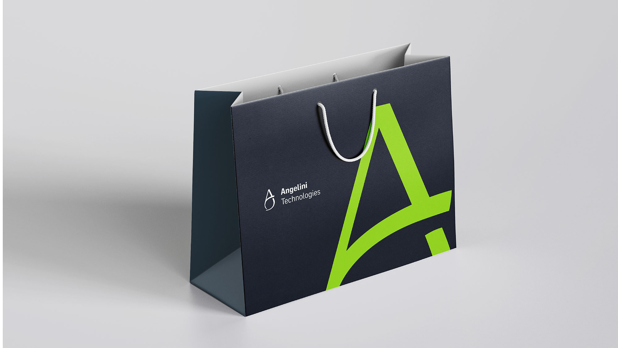
The new brand is intended to symbolize group spirit, its aptitude, founded on the principle of “Unwavering Care”, helping people always, in their daily lives and for their future, in everything they do. The logo is made up of the letter “A”, from the brand name Angelini, combined with an open boundary to form a dynamic whole. The diagonal lines, which give momentum to the shape, evoke parentheses–embraces, symbolizing a world – the world of Angelini – that is always open, inclusive, and welcoming. The Angelini logotype is set in a custom-designed font, with solid and sharp lines.
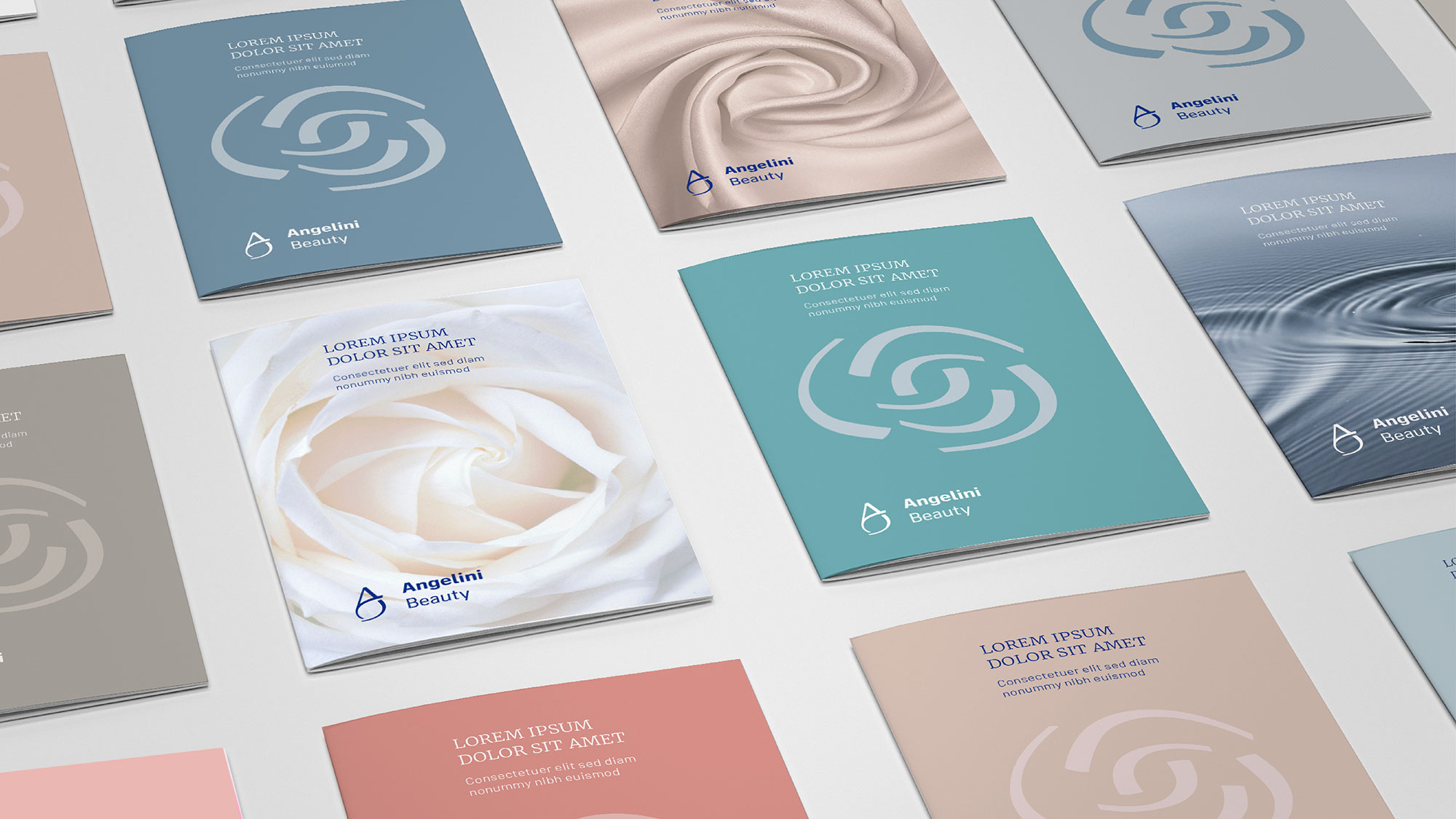
In this way, recognition is always guaranteed in visual communication, not only in forms of expression but also in the group’s innate values. The project embraces and expands the sign’s semantic construction, extrapolating its “curves”, outright embracing parentheses. The latter make up the corporate flash and can be produced in neutral shades or with special colour combinations, even on a photographic background, as a reference to energy, closeness, and the idea of protection and care that the brand wants to express.
The photographic style re-establishes the vigour of curves and embraces. Within this solution, focus can be achieved on the themes of the sector or of a particular topic, using the embrace as a characterizing visual element.
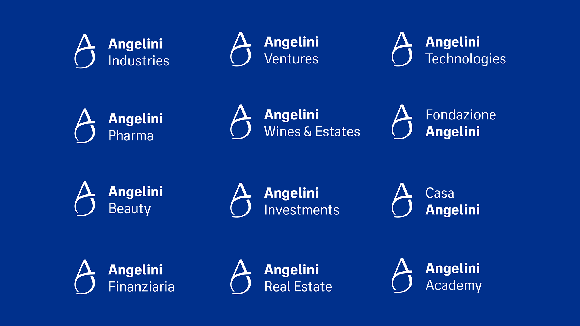
Brand Architecture. A cohesive brand system
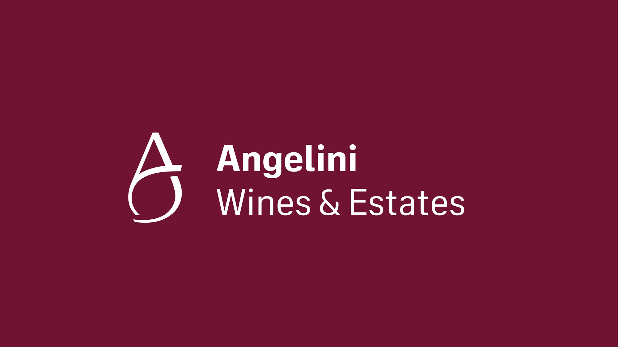
A unified vision, the same values and the same intent to be seen by the world in a cohesive and coherent way, and representing all the industrial group’s companies as part of one universe. The brand system architecture reflects this principle and therefore requires each company to identify itself with the trademark, the Angelini brand name and a descriptor relating to its area of business.
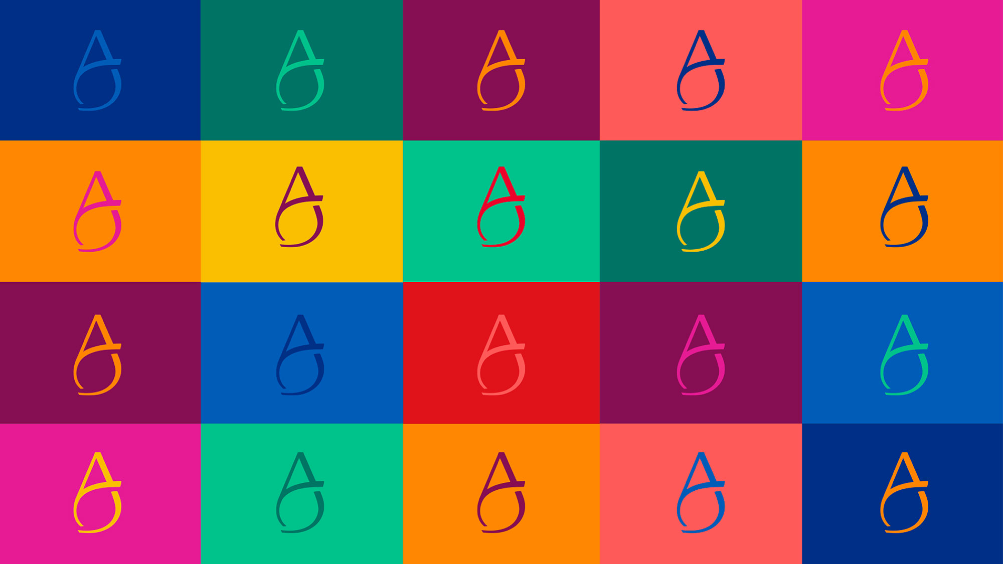
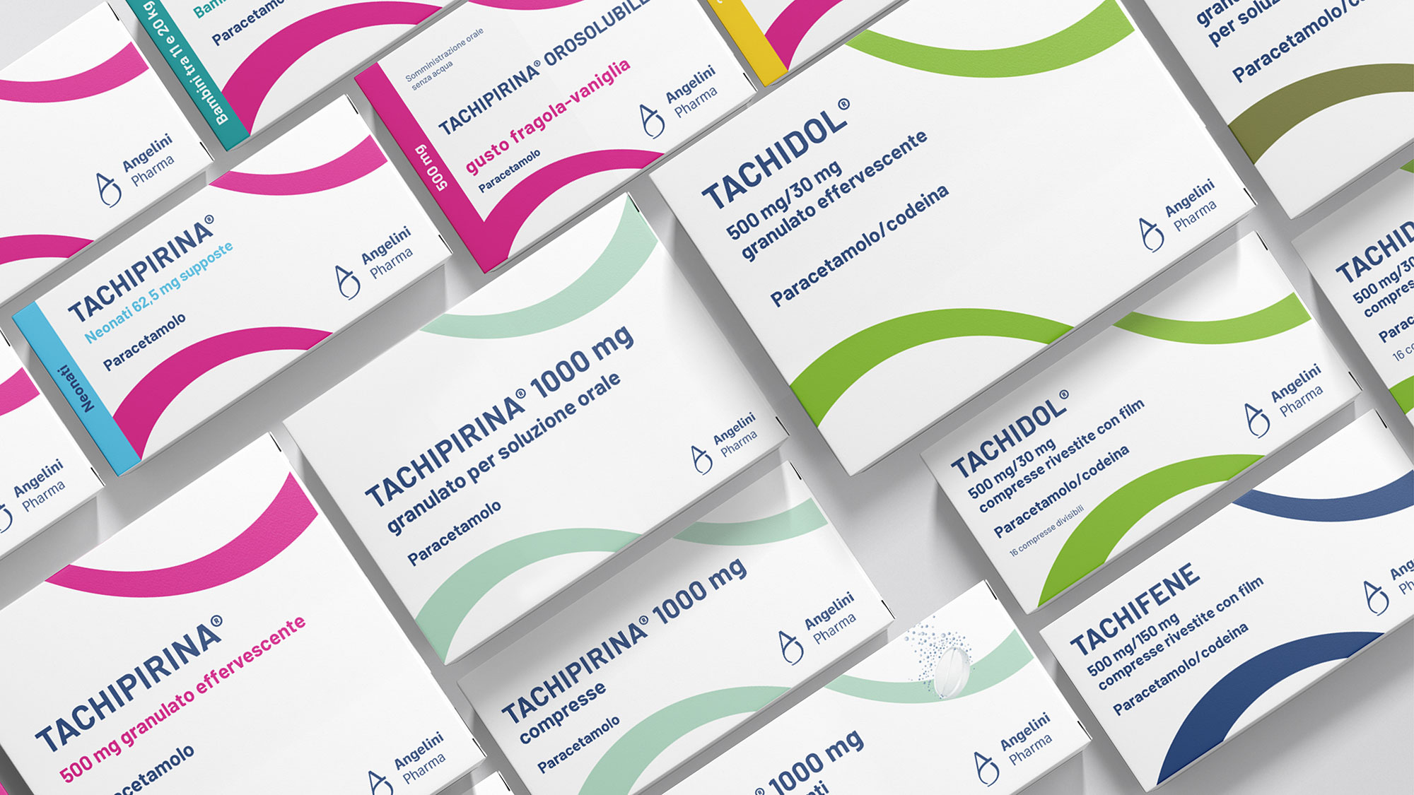
Editorial Design. Colors and typography for effective communication
A diversified group that sees the world from many perspectives and wants to express itself in many ways, with an institutional palette that combines blue and white with other shades of colour as the foundation of brand language. The different color shades and the combinations they create allow for very versatile use across a wide range of applications, from digital to print, helping to convey messages with the right tone – including in terms of color.