Let the closing summer credits roll!
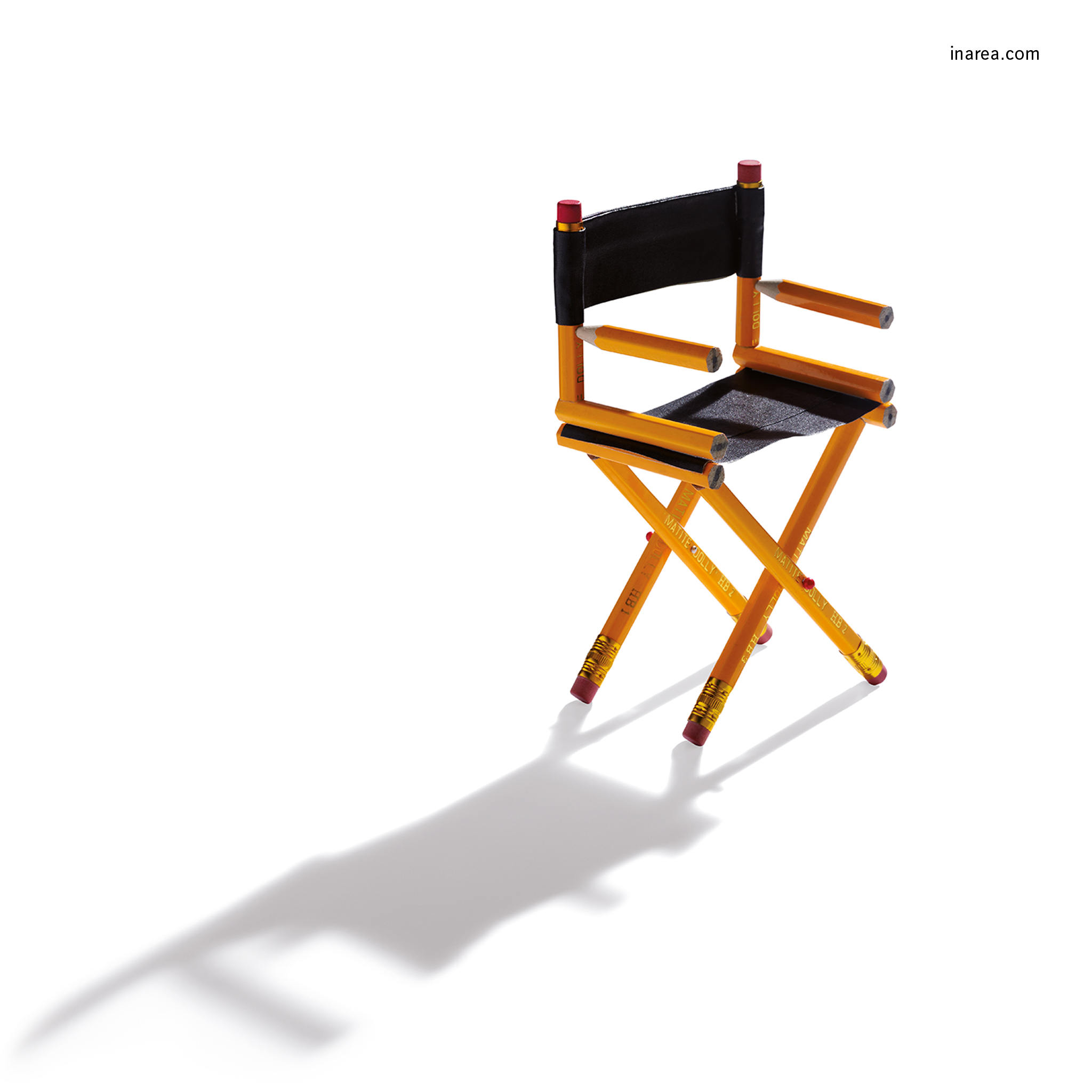
This period of the year is always something of a crossover. The sun is still at a right angle, yet defining events of the year are already taking place and cast much longer (and far more interesting) shadows. The 79th Venice International Film Festival opens next Wednesday, 31st August. But even though it’s 90 years old (the first edition was held in 1932), the festival is fully aware of today’s challenges: screenplays written by a fast and furious ghost writer called algorithm and movie theatres substituted by tablets, to mention but a few. And yet, as we’re talking about late August, and hence about a period of transition, open-air cinemas come to mind. Again this summer, thanks to these modern-day arenas, films have been projected in both obscure or well-known piazzas for the enjoyment of holiday-makers and inhabitants alike. Whether to solitary film buffs or to fun-seeking cliques of friends, moving images have been dished out in generous portions. 82-year-old Francis Ford Coppola believes that films will survive the test of time, as has been the case with the plays of Sophocles and Euripides. In 1936 Walter Benjamin prophesied that in the future our homes would be supplied with images that one would be able to turn on “like water or electricity”. Bingo… the prophecy has indeed come true! Actually, Benjamin had been somewhat adverse to films, suspicious of their distractive nature and of stardom. Yet today we refer to filmmaking as the seventh art and in order to remain thus, i.e. a luminous art that leaves a shining trail behind it, it needs a medium and a message. Directors have the possibility of “drawing” freely. It’s up to us, as spectators, not to delete those images. As the action gets rolling, all that remains is for everyone to sit back and make themselves comfortable.