We all know that the “the bee’s knees” denotes something, or someone, of excellence, often relating to professional zeal. Thus, when it comes to the so-called soft skills, the idiom may refer to performance, expectations, or even desires. “Candidates must have strong teamwork, problem-solving and team-building skills” is one of the most common list of requisites that you’ll read on LinkedIn.
The winged insect that inspired all of these, ahem, buzzwords has always been associated with work of a collegial, honest and organised nature. It’s no coincidence, therefore, that bees have been adopted as logos for various workers’ unions and retail banks. And it’s precisely in this same spirit that the bee features on the coats of arms of 74 Italian municipalities, as well as on those of an unspecified number of cities and towns all over Europe. But the bee is also a symbol of immortality and resurrection, which is why it was chosen as a heraldic emblem, initially by the Merovingian dynasty, and later by Napoleon.
The striped insect is so proud of its standing that it even evokes a certain propensity for grandeur, a point-in-case being when the Barberinis, a family from the Italian nobility, rose to prominence with the election (1623) of Cardinal Maffeo Barberini to the papal throne as Pope Urban VIII, they hastened to change their family symbol. From then onwards, the armorial bearings on the façades of their palaces and fountains featured three bees, replacing what had previously been gadflies. The Barberinis’ leap in status, from merchants to popes, behoved also their totem-insects to come up in the world and fly higher, as it were. All of which just goes to prove that when redesigning our identities and blazonry, we can “bee” whatever we want…
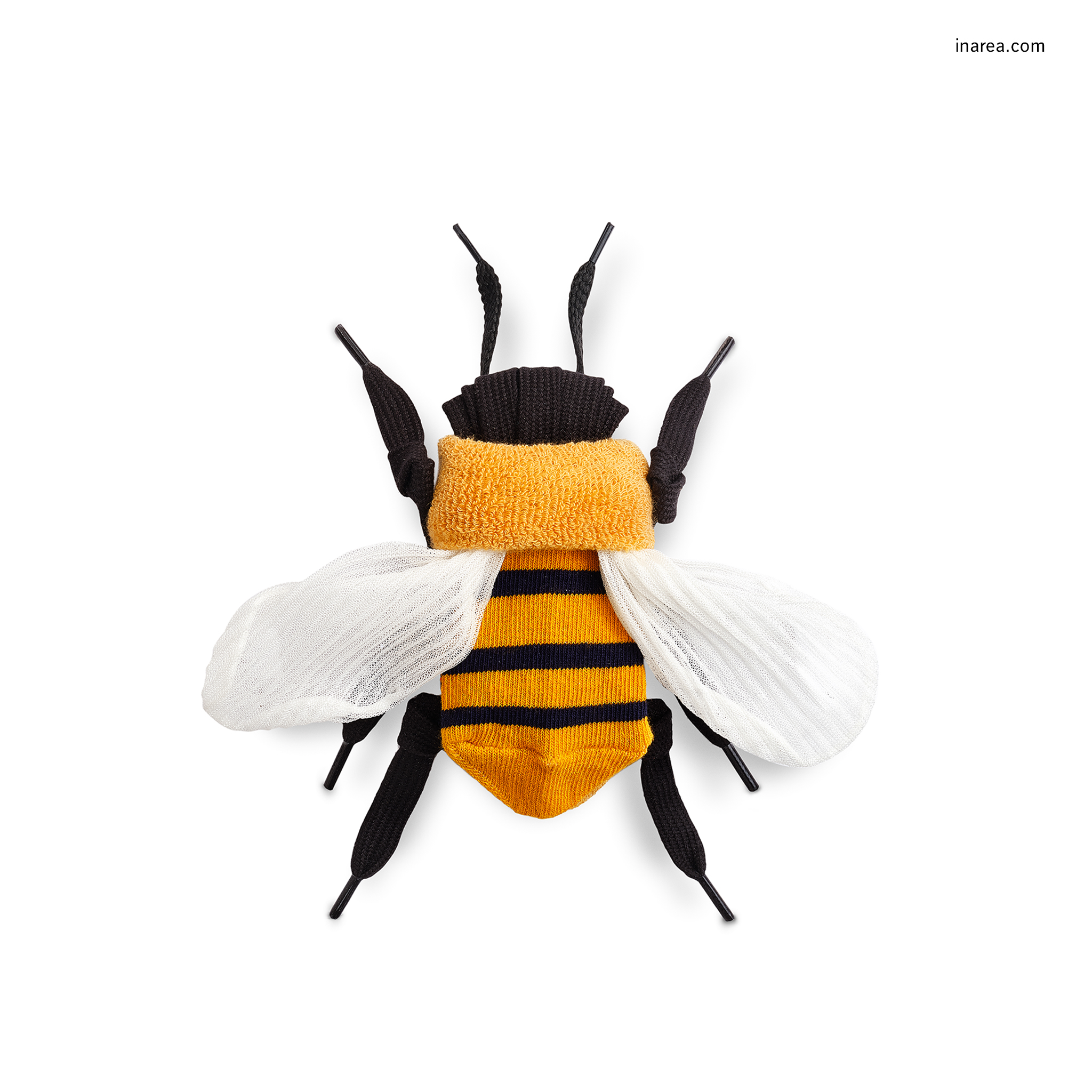
This weekend, however, let’s unroll the socks and unravel the laces that make up our very own bee and take it to the town of San Benedetto del Tronto, in the Italian Marche region, and precisely to the sculpture (by Turin-born artist Ugo Nespolo) that stands proudly on promenade. On it, carved out in gigantic letters, one can read the following sentence: “Lavorare, lavorare, lavorare, preferisco il rumore del mare” (“Work, work, work, I prefer the sound of the sea”). Hardly a motivational Monday morning message but, rather, an invitation to drive out envy and greed from the workplace, attitudes that you’ll never find inside a beehive.
Our bee is decidedly one of the highest standard and we feel it represents us. Happy May Day, Happy Labour Day.
Original Evergreens
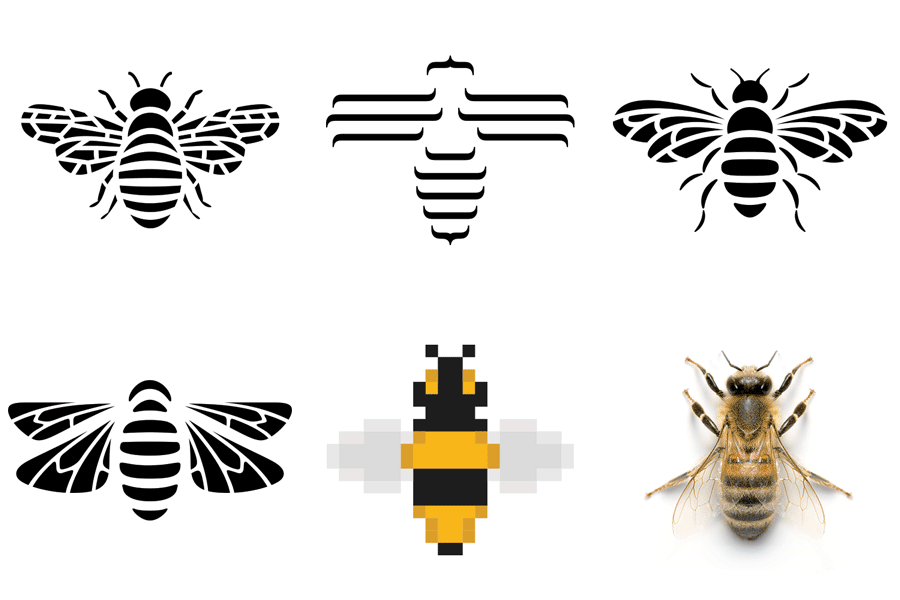
We’re so fond of bees that we’ve adopted one as the symbol of Inarea because it’s an insect that knows how to create original products. When it came to depicting it, our designers allowed their creativity to run free… and the result was a mini beehive.

MadeInarea

In 1983, when we designed the symbol of Italy’s CGIL trade union, the idea of remote working, maybe from a seafront, wasn’t even remotely (!) imaginable. The logo, a visual identity system, was officially adopted by the union in 1986. Today, almost forty years on, we’re happy to note that the branding we conceived at that time still has an extremely contemporary look. Also when it comes to celebrating this year’s International Workers’ Day!

