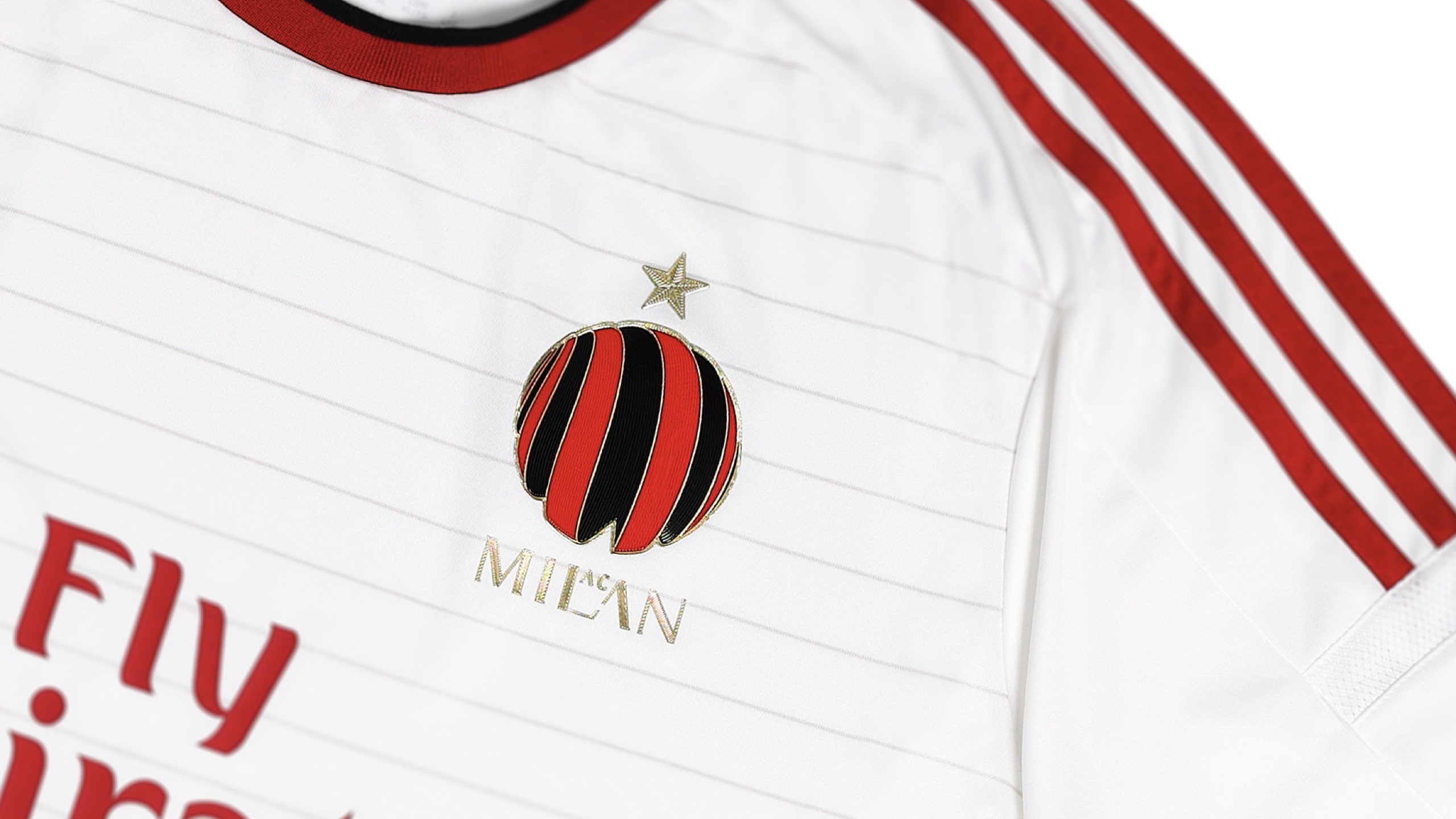
AC Milan, or simply Milan, is one of the most important football clubs in Italy and the world, founded in 1899 in Milan.
The Brand Design for the fans
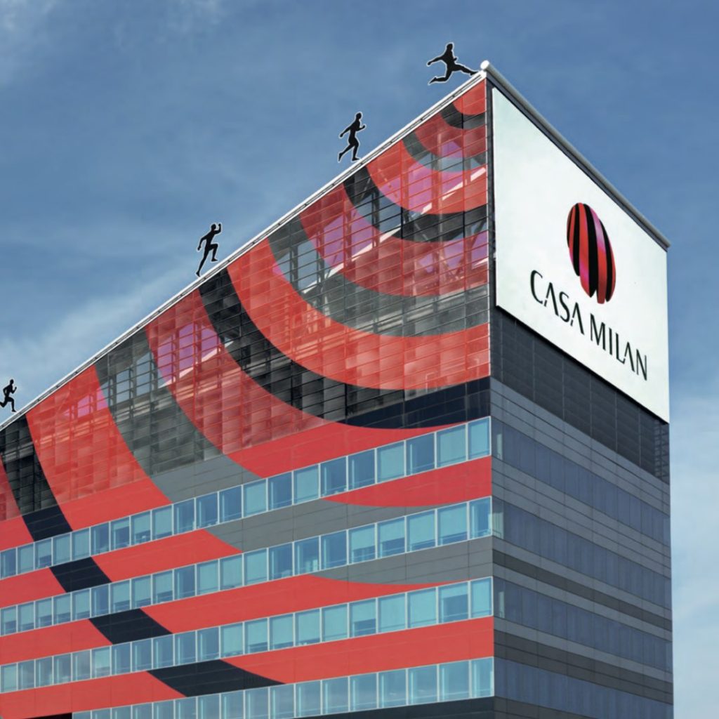
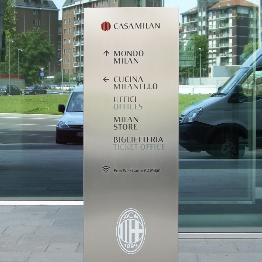
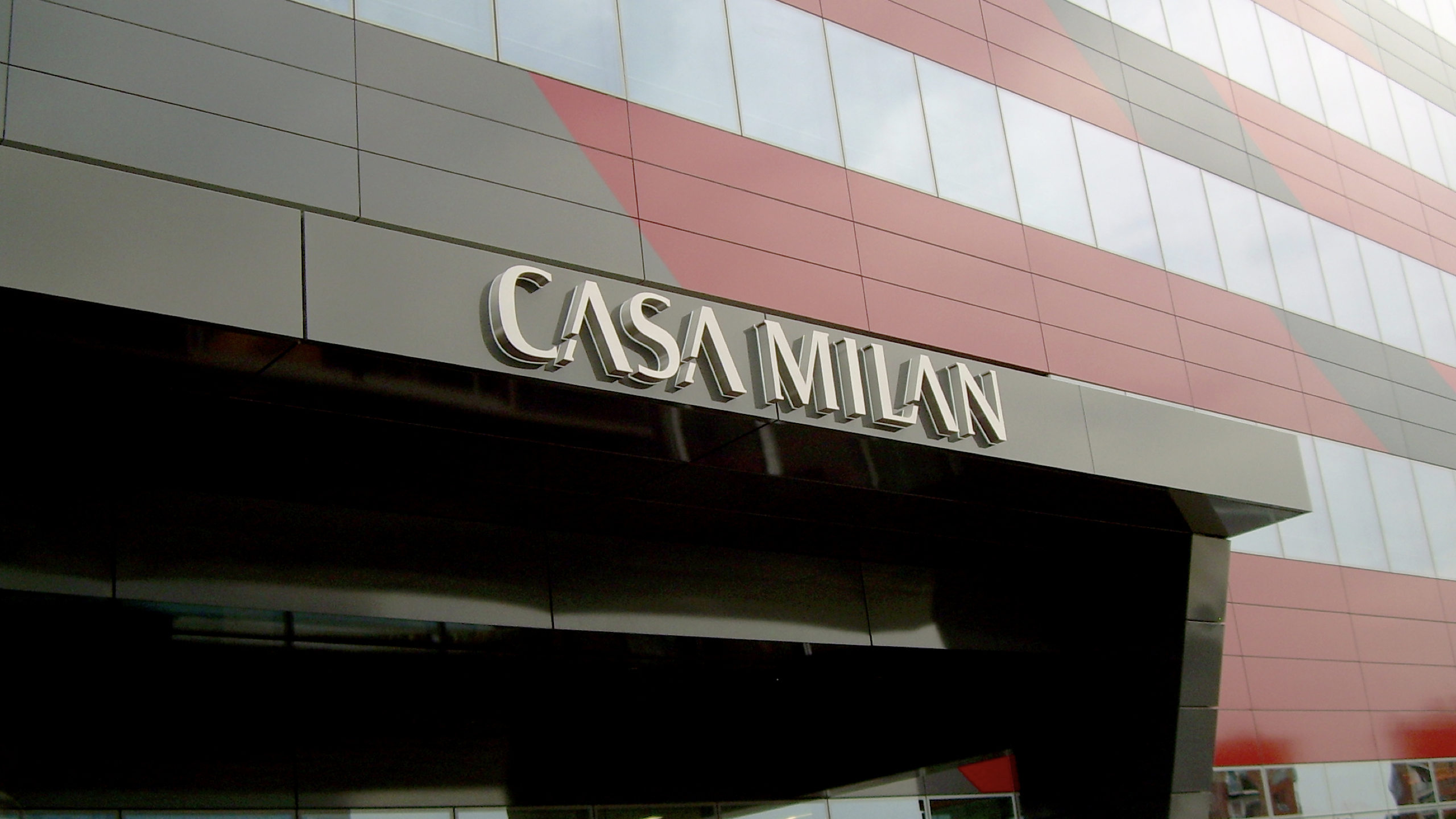
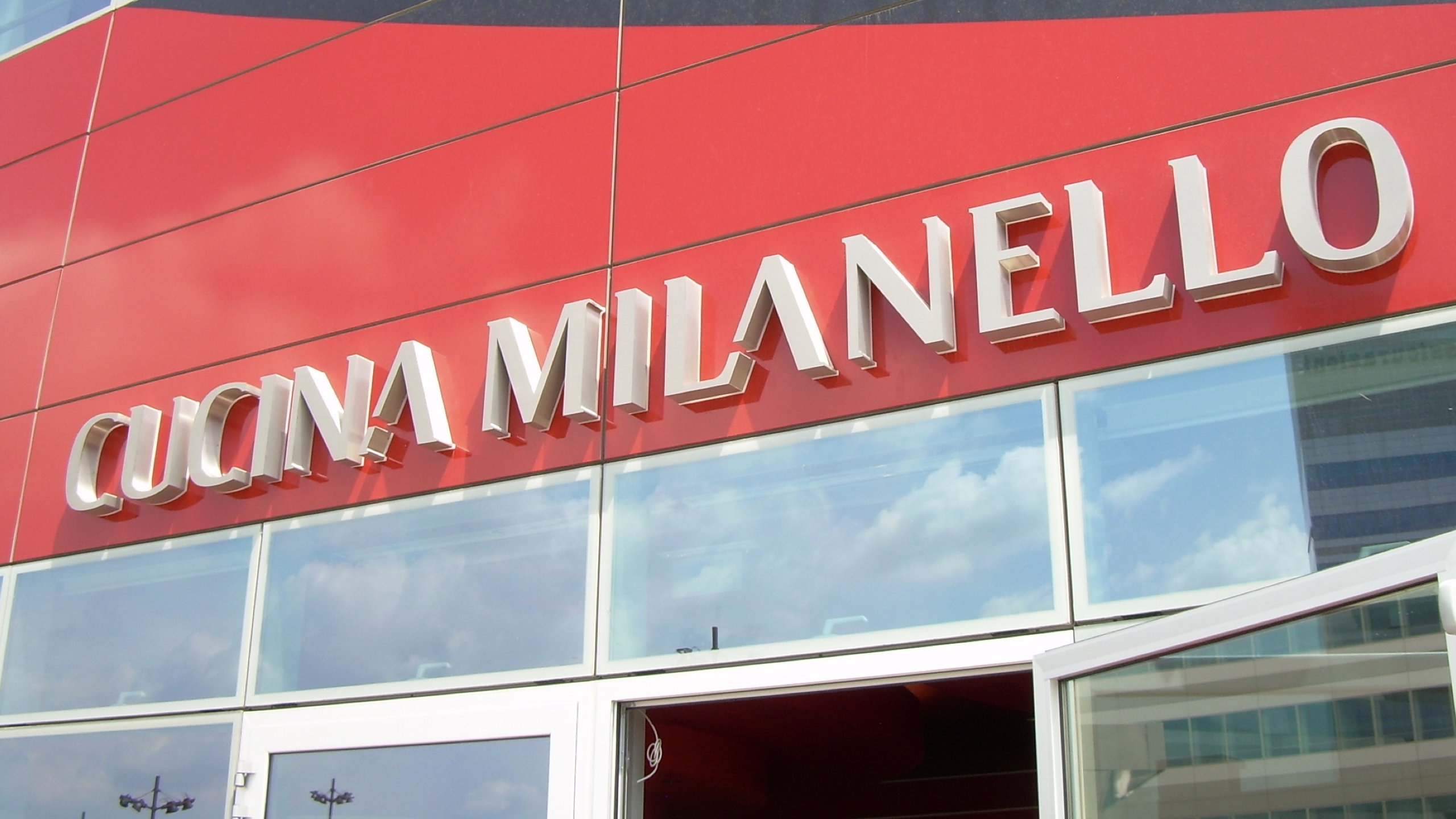
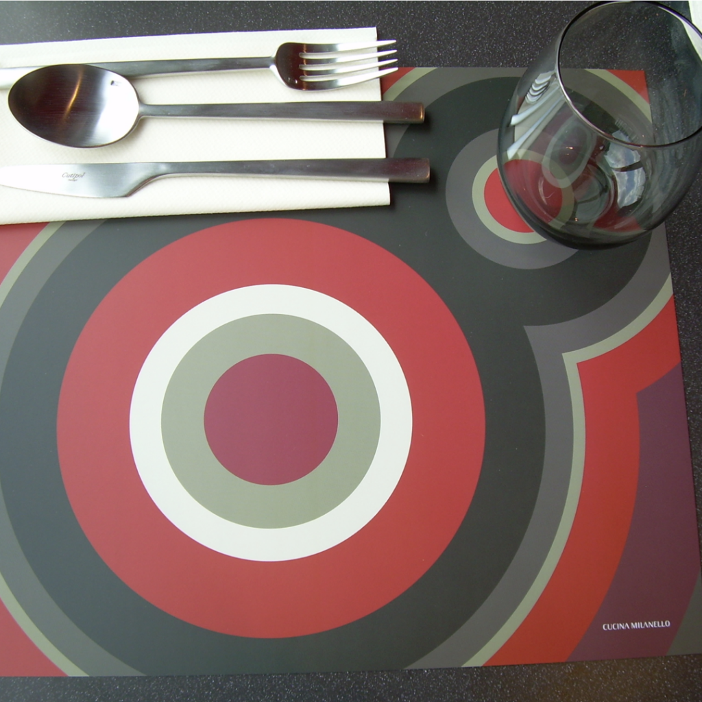
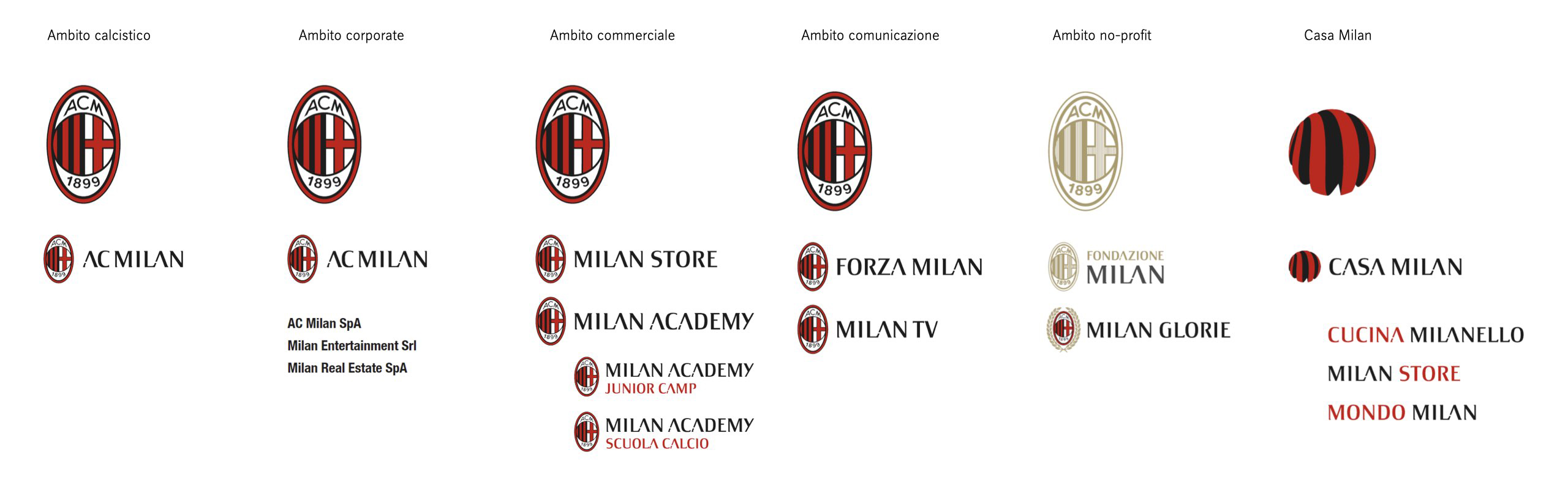
In 2013, with the change of location, Casa Milan was born, where the old offices and new activities converge to strengthen the club’s identity. It is a space designed to welcome fans and host the Mondo Milan museum, the Milan Store, and the Cucina Milanello restaurant.
The symbol accompanying the name Casa Milan is simple and immediate: a sphere made up of vertical red and black stripes, unmistakably recalling the team’s jersey. The idea stems from the desire to represent the new ‘universe’ of Milan, beyond the football realm, and present it under a single symbol.
Type Design to strengthen the identity
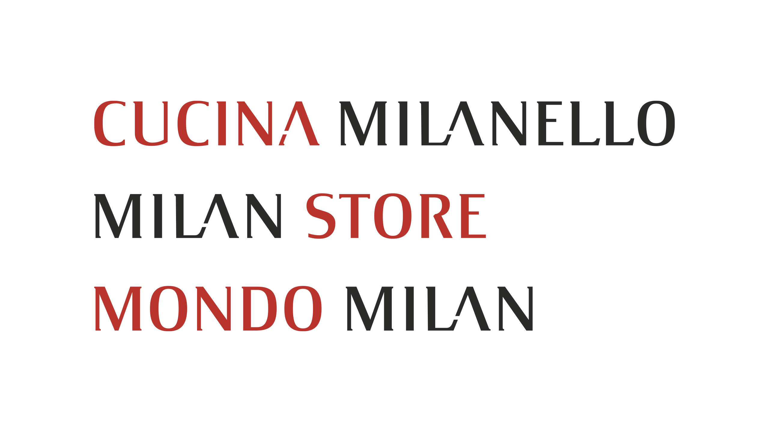
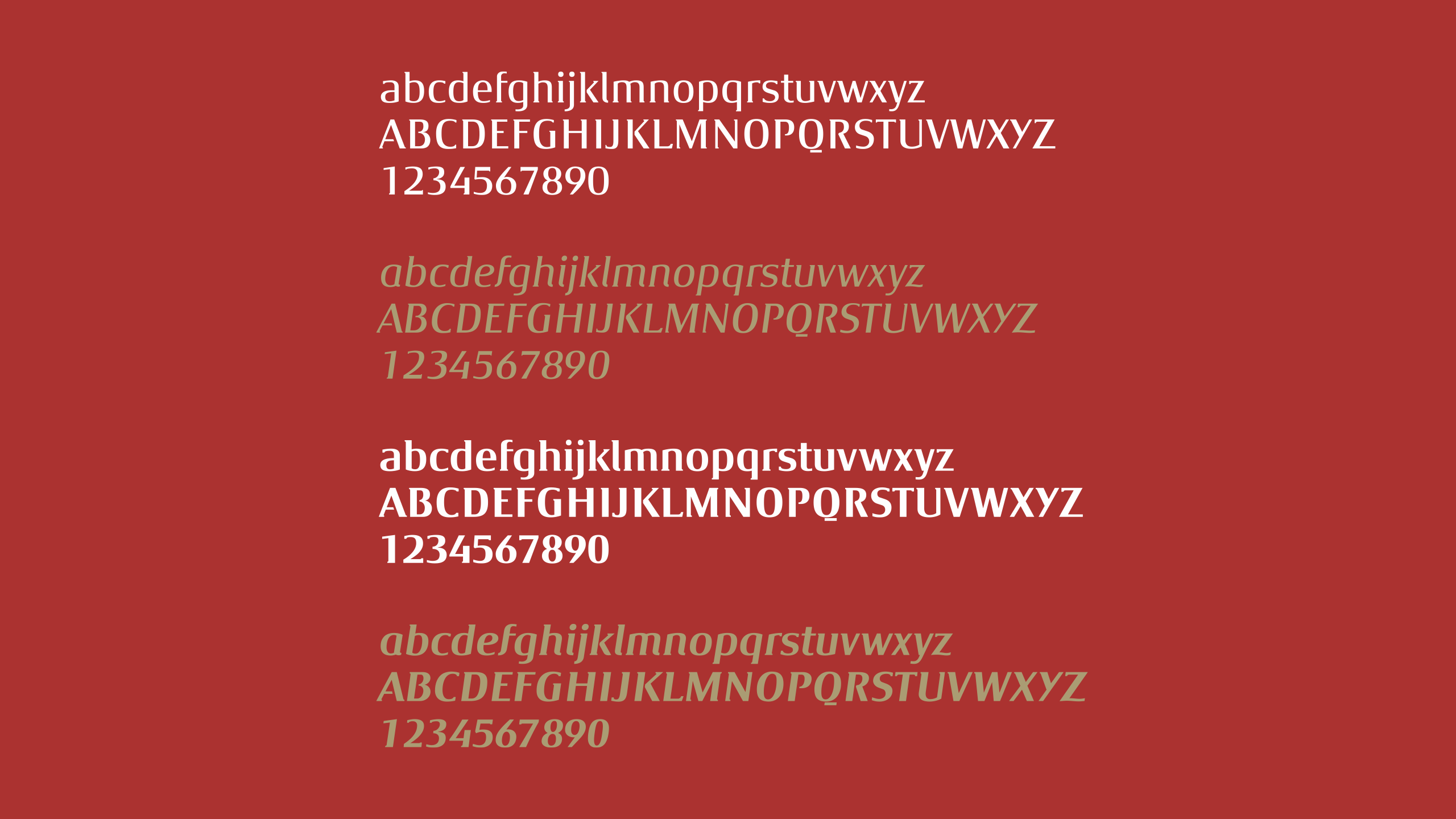
Inarea also created a family of typefaces, Milan Type, to further enhance every aspect of the identity: Casa Milan, Mondo Milan, Cucina Milanello, and Milan Store are the first examples of the proprietary font’s application.
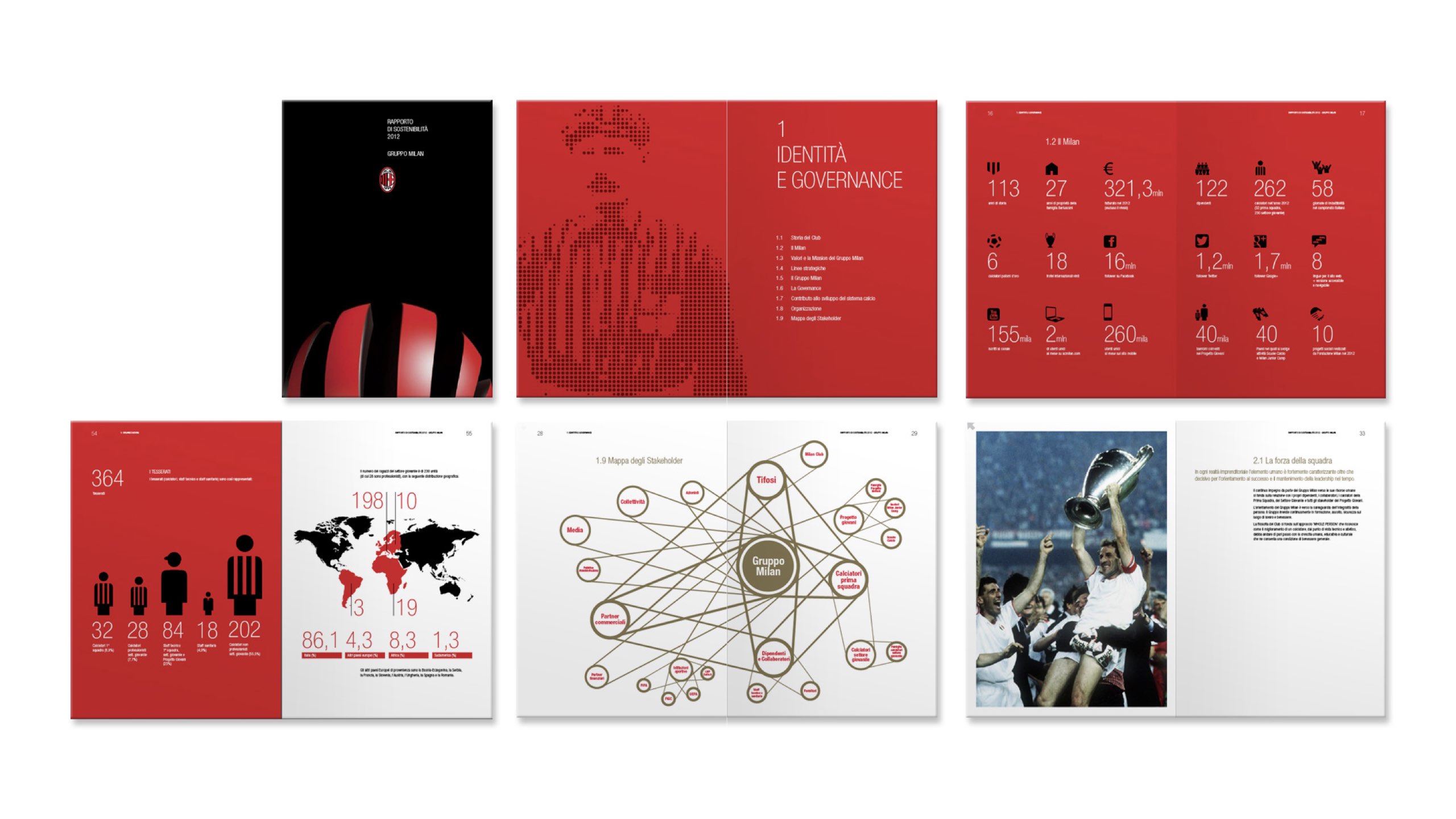
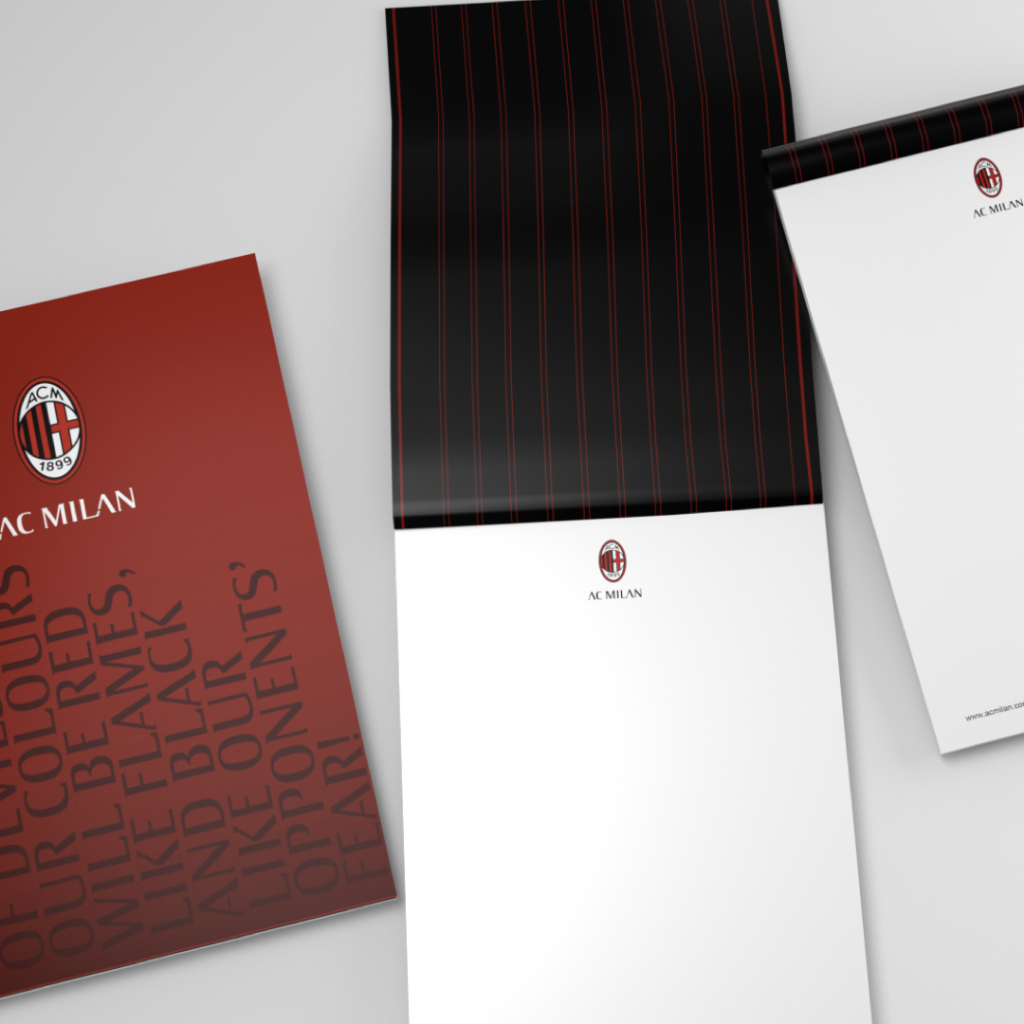
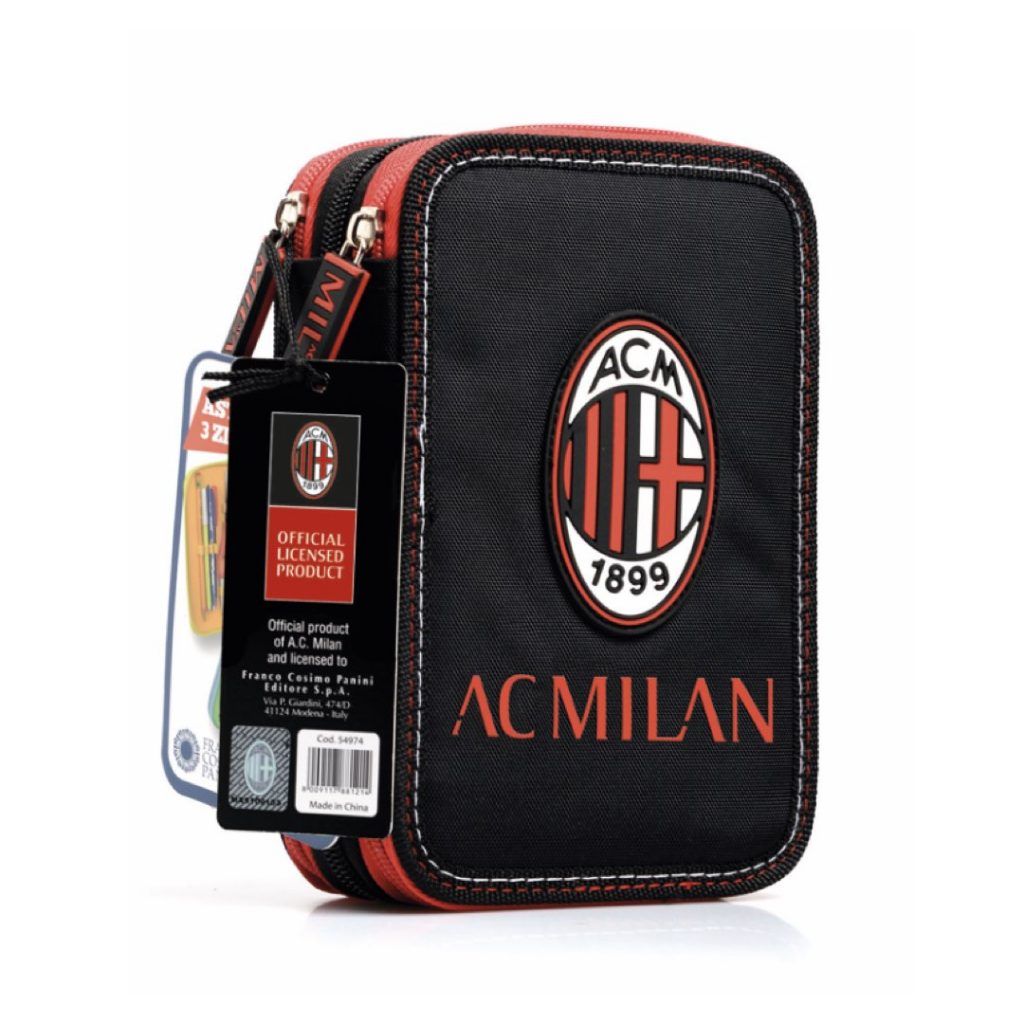
Editorial and Product Design: the brand at 360°
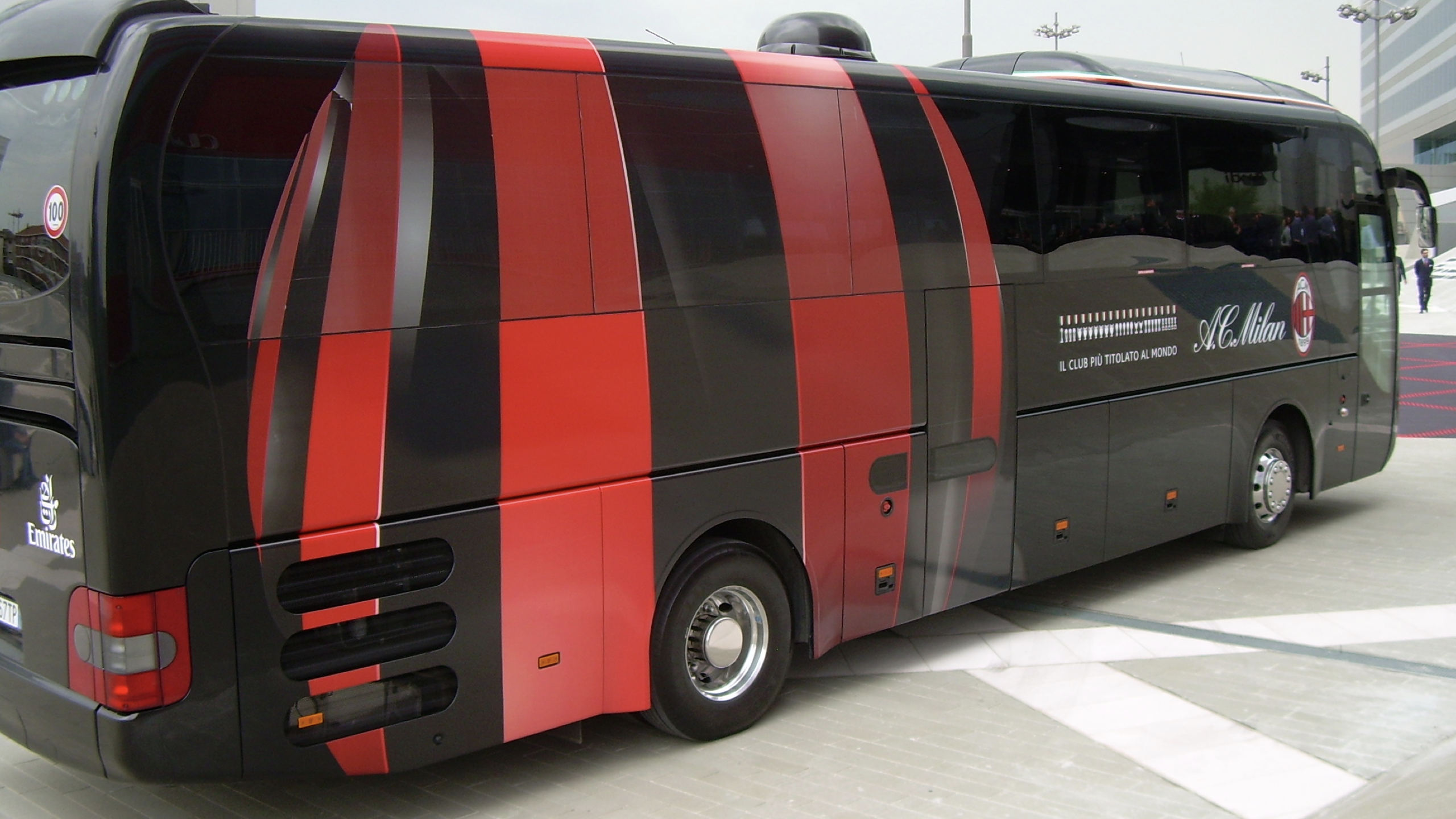
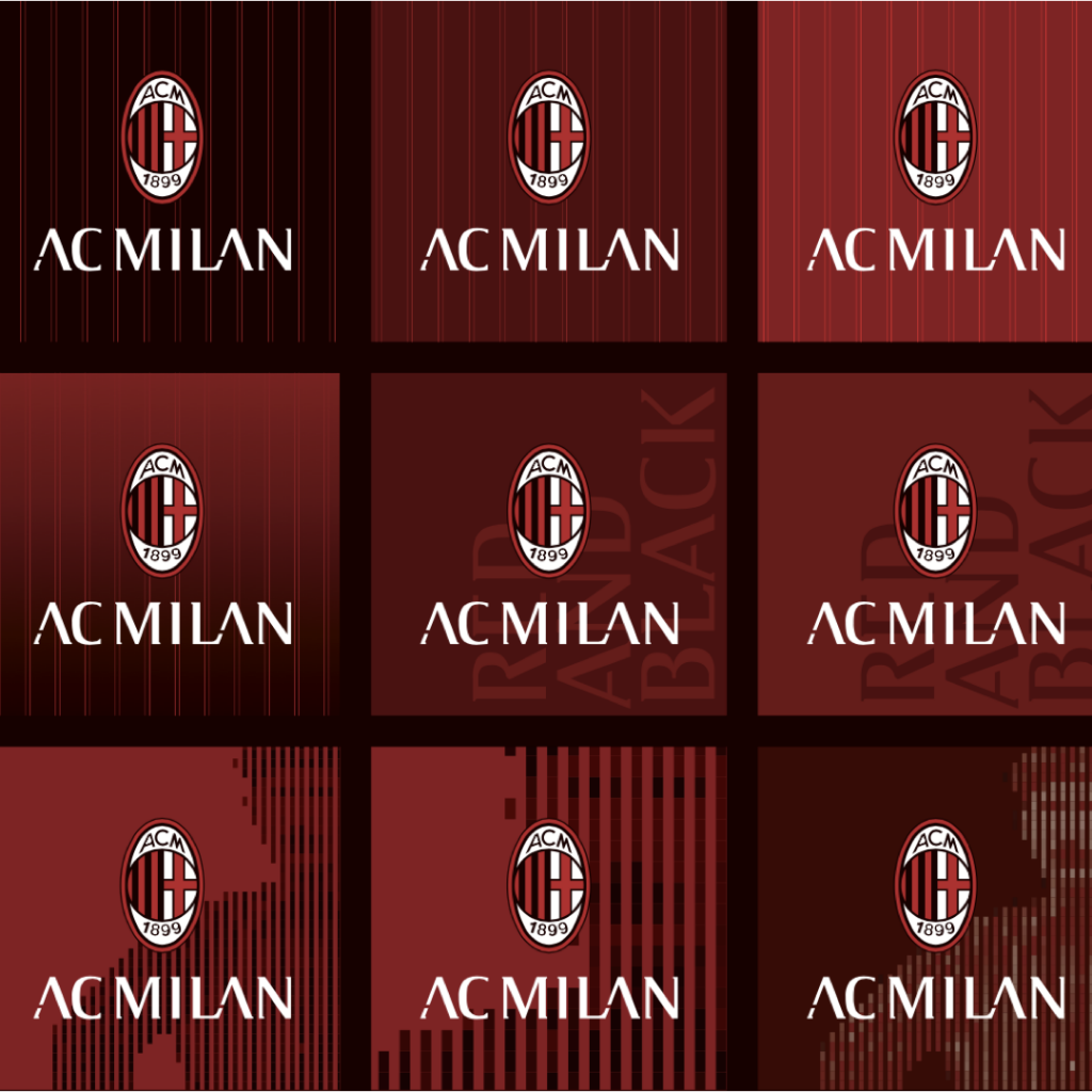
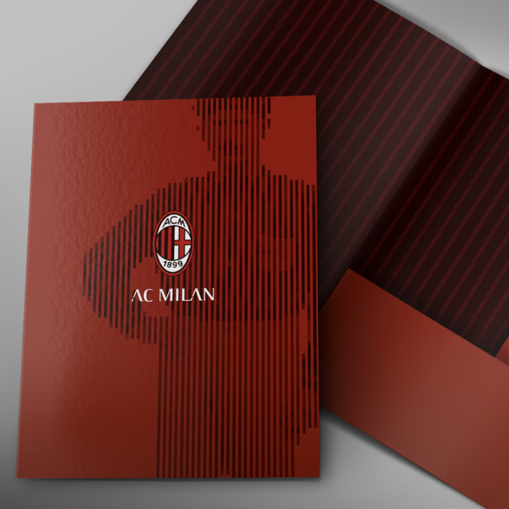
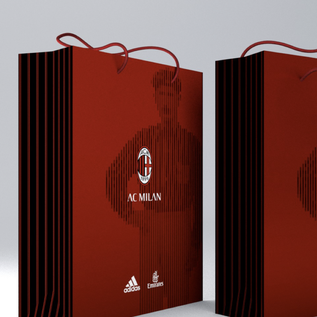
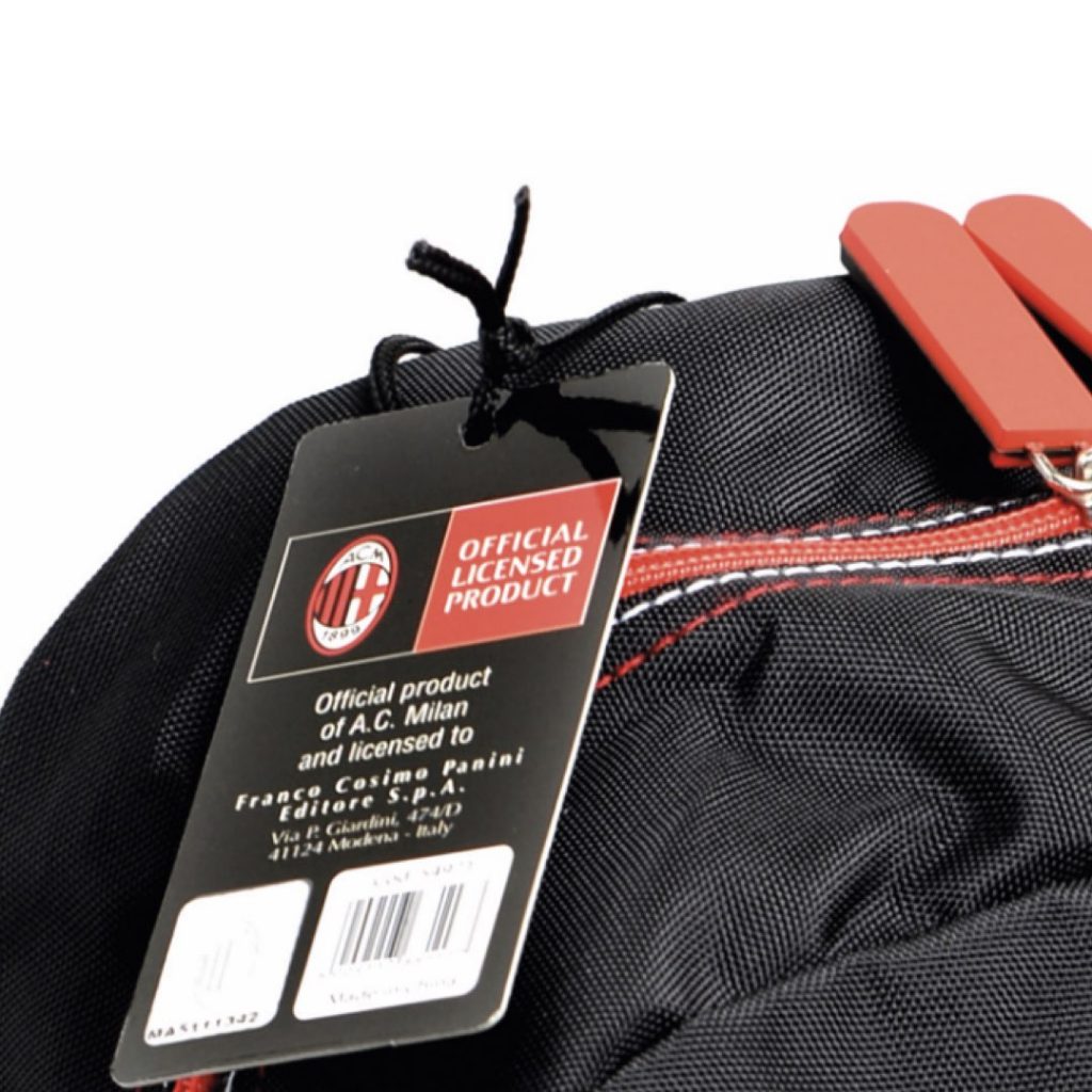
To emphasize the affiliation with the team, its colors, and values, Inarea created a rich series of graphics to be applied to merchandise products, as well as a careful adaptation of the brand, from corporate publishing to the application of the logo and graphics on transportation vehicles.