
Inarea: a design crafted over 45 years
Inarea’s 45 years offer a precious opportunity to reflect on the past while imagining the future. Although it is usually the ‘round-number birthdays’ that inspire the deepest reflections, this milestone nonetheless invites us to take stock of brand-identity design in an era in which both design and communication have been transformed—technically and in content—more than ever before. Many of the rules and tools of 45 years ago no longer exist, yet the fundamental principles—those ‘as old as the world itself’—remain steadfast.
Antonio Romano, what inspiration guided the very beginning of this journey?
At the beginning, we were driven by the dream of total design: the idea of designing ‘from the spoon to the city,’ where graphic design became a bridge between disciplines— a universal language for every form of expression. This ideal has deep, age-old roots: we can think back to the era of the Herald, who designed the prince’s coat of arms and applied it to everything—architecture, uniforms, and textiles—creating a symbolic system of belonging in times of widespread illiteracy. In the end, the underlying logic of branding has not changed all that much. Even today, despite an extraordinary technical and technological transformation, the principles remain the same.
In recent decades, communication has undergone an astonishing acceleration. With the advent of digital, what aspects of branding have changed the most?
The 1980s were the era of visual exaltation. Then came the 1990s, with mobile phones and the Internet—a convergence that would change the course of human history. Attention shifted from the heraldry of the product to that of the corporate realm, but the next step was the relationship itself: products and services became experiences, and the individual moved to the center of everything. We live and work within a digital dimension—an immaterial space in which we spend much of our active time. The physical touchpoints of the past have been integrated—and often replaced—by countless online interactions. “The real challenge today is to build coherence—in words, in images, and in the brand’s digital gestures—because the user’s judgment is formed in an instant, and is often swift and unforgiving.
In such a complex and fragmented world, what core principle is essential for creating a successful identity?
The principle we uphold is authenticity—the foundation that makes a brand’s statements about itself credible and verifiable. Without authenticity, the audience turns away. This stems from the convergence of a trilogy: Purpose (why you do what you do), Process (how you do it), and People (those who make it possible, both inside and outside the organization).
Is brand identity today becoming increasingly multidimensional and multisensory? And is Inarea also moving in that direction?
Certainly. For us, the concept of Brand Sense has become almost an obsession. But in truth, it is anything but new. The Church, for example, is a master of branding: the scent of incense, the verticality of the bell tower dominating the view and carrying the sound of its bells, the atmosphere that weaves together sight, smell, and hearing into a single experience— not to mention Communion, the sublime moment of the celebration, where even taste is engaged. Even Romanesque architecture emerged in response to the need for better sound propagation following the introduction of Gregorian chant. All of this teaches us that the more a brand succeeds in engaging multiple senses and generating synesthetic coherence, the stronger and more memorable its impact will be.
How are you at Inarea preparing for your “golden anniversary”?
We are integrating skills that we once entrusted to external partners—especially in the digital realm—and we are embracing Artificial Intelligence as a tool to amplify both the speed and the depth of our content. Our craft requires us to look through the eyes of those who observe us—our stakeholders—yet the essence of identity value does not change: we aim to continue creating, through design, an implicit and immediate form of communication, capable of generating impact without the need for explanation. As Oscar Wilde said, “beauty has the advantage over genius in that it needs no explanation.” We will therefore continue to give shape to a promise of the future, remaining an enterprise inspired by the Renaissance workshop, yet equipped with a ‘brand corridor’ capable of orchestrating and seamlessly coordinating the many facets of communication.
Healthcare and Identity
From hospitals to foundations, from pharmaceutical companies to regional health systems, Inarea has told the story of healthcare through brand identity.
Each project is a way to make “care” visible — in symbols, in names, in spaces.
And above all, in relationships.
Public Healthcare: standardizing to humanize
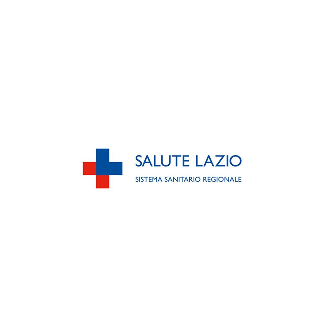
The identity projects for the Emilia-Romagna and Lazio Regions introduced an “umbrella brand” approach capable of bringing coherence to a complex, often heterogeneous, and layered system. Salute Lazio is an example of rationalization that goes beyond aesthetics: it makes services, hospitals, and communications immediately recognizable, fostering a unified language between institutions and citizens. The goal is to create a healthcare system that is more accessible and easy to understand, where the graphic symbol becomes an implicit mark of recognition — and therefore, a guarantee for citizens.
The rebranding of Salute Lazio took shape through a strategic intervention that simplified and unified the identity of the regional healthcare system. The new name, “Salute Lazio,” is accompanied by the descriptor “Regional Healthcare System,” while the logo was designed to visually evoke the red cross, the universal symbol of healthcare. The graphic symbol, derived from the letter “L” in Lazio, ideally reconfigures a red and blue cross and has been used as a distinctive element throughout all communications, creating a coherent and easily recognizable system. This approach made it possible to integrate the various regional healthcare structures under a single identity, streamlining and rationalizing the overall service offering while enhancing the effectiveness of institutional communication.
Hospitals and Foundations: welcoming spaces
From the Gemelli University Hospital to the Bambino Gesù Children’s Hospital and the Santa Lucia Foundation, Inarea has supported these prestigious institutions in building a visual identity capable of making hospital environments more contemporary and empathetic. The wayfinding system at Gemelli, inspired by major airport hubs, was designed to facilitate patient movement, restoring a sense of autonomy and confidence. Its brand identity, developed to mark the hospital’s fiftieth anniversary, translates the institute’s founding values into a visual language: Catholic roots, care for the individual, and a vision of healing as a vital act. The Gemelli blue and the “G” that unfolds into a cross, leaves, and a human figure together tell the story of a form of medicine that unites faith, science, and humanity. In the case of Santa Lucia, the Tree of Life symbol evokes a sense of rebirth, while at the same time recalling the two hemispheres of the human brain — roots and thought, matter and mind.
Industry and research: when the brand unifies
Private healthcare and the pharmaceutical sector represent the other half of the story. Inarea developed the visual identity for GVM (Gruppo Villa Maria), simplifying its name and strengthening its positioning as a network of excellence in care and research.
The Angelini Industries project, on the other hand, brought together a wide range of diverse activities, placing purpose and direction before traditional, product-based distinctions. The pharmaceutical field, in fact, represents just over half of the entire system.
The Aventis Pharma case, from the early 2000s, stands as a paradigmatic example in the history of pharmaceutical branding. It created a unified packaging system for ethical products within a multinational company born from the merger of six different brands, giving a single voice to medicines distributed worldwide while maintaining full compliance with local regulations. It was, in effect, defined as a universal visual code — a language of symbols, colors, and informational hierarchies capable of making each medicine instantly readable, regardless of the target market. Over time, the project remains an important example of how branding can serve not only as an expression of identity, but also as an organizational lever, capable of restoring order and clarity.
Foundations of the common good
From Smile House, which treats craniofacial malformations, to the Veronesi Foundation and the Piedmont Foundation for Cancer Research, design becomes an ethical language. Each brand is an act of giving back — a way to give form to solidarity, to research, and to hope. For example, the rebranding of the Veronesi Foundation — an institution that supports excellence in scientific research and promotes a culture of prevention — enhances the legacy of its founder and, through the “V” in the logo, becomes a human and dynamic symbol, capable of adapting to the various fields of research represented by the ribbon, the universal symbol of struggle and hope. Even in healthcare, branding is an infrastructure of meaning — a tool for making care more human, and therefore, more effective.
Relationship as care
At a time when everything revolves around personal experience and identity, medicine too must find ways to keep up with the times. Healthcare cannot simply be a system that provides treatment; it must become an ecosystem that truly cares — for the person, for their ways of expression and the stories they tell, for their spaces. And, as in
Where does the modern concept of healthcare come from?
Its roots lie in ancient medicine. From Hippocrates to the Salernitan School, health was seen as a balance among elements — air, water, earth, and fire — and bodily humors. Over time, medicine shifted from a “geocentric” view to a “morbocentric” one, focusing more on disease than on the person. Today, we are witnessing a new transition: from curing illness to embracing relationships as a form of care.
What does it mean to bring this transformation into branding?
It means viewing “care” not as a technical act, but as a narrative value. Brands, much like doctors, no longer offer only products or services — they offer experiences of trust. Healthcare thus becomes a field of communication that places the person, their emotions, and their need for understanding at the center. “Care” is expressed through language tailored to the patient, through a corresponding tone of voice, and through spaces designed to welcome and comfort.
How should healthcare facilities adapt to this new perspective?
It is necessary to move beyond the rigid and often impersonal organization of hospitals. The digital experience has accustomed citizens to direct, fluid, and disintermediated relationships in which each individual is always at the center. Healthcare must also embrace this logic, with more intuitive navigation systems, clearer pathways, and open dialogue. The wayfinding system at Policlinico Gemelli, inspired by airport signage, is an example of this approach — designed for those who need to find their destination, not for those who already know the space.
The role of design and visual identity in this context?
Fundamental. Branding is the grammar that coordinates the countless stories that make up the world of health. It is not just about a logo or color, but about coherence between behavior, language, and mission. When the Lazio Region adopted a unified identity as Salute Lazio, it was not merely a graphic choice but a way to make the system more recognizable, accessible, and human.
Which example among Inarea’s case studies best expresses the concept of “care”?
The rebranding of Assogenerici as Egualia is emblematic. From an association once perceived merely as a producer of generic drugs, the narrative has evolved toward a message rooted in Article 3 of the Italian Constitution: equality as a principle of equity in healthcare. No longer “producers of copies,” but advocates for the right to healthcare for all.
What is the cultural challenge of the future?
Putting the person back at the center. The digital age has taught us that everything starts from the “self,” but in healthcare this “self” must move beyond the traditional subordination of the citizen — made an even weaker participant by becoming a “patient.” They must feel welcomed, not isolated. Relational medicine is the true frontier of contemporary healthcare: a form of medicine that listens, supports, and above all, communicates.
Telling the story of a university: coherence and identity in a connected world
A university is not just an institution that teaches. It’s a world that tells its own story, that engages those who choose it, and that projects the future it promises. And in an increasingly connected, emotional, and competitive world, it’s the story that truly makes the difference.
Today, a university communicates across many channels, which makes consistency — both online and offline — essential. Websites, social media, physical spaces, events, and materials all need to speak the same language. The digital experience, in particular, must be clear and accessible: it’s often the first real point of contact with the university and can strongly influence how its identity and credibility are perceived.
A university’s brand identity is what makes it instantly recognizable — but also what speaks through the messages it conveys. It’s not just a logo, and even less a crest: it’s a mix. From the name to the colors, from the website to open days, every detail — signs, tone, style — tells the story of who you are and why someone should choose you.
Case Studies
Conservatorio di Milano
A dynamic logotype combines different typefaces to represent musical plurality. The graphic movement creates a visual mark in constant transformation, while the spatial reference remains stable, grounding history and identity.
Sapienza
A brand identity and brand architecture project that streamlined the complexity of a large university by simplifying its naming, redesigning historical symbols, and introducing a custom typeface.
Opit
A project that communicates innovation, flexibility, and social impact in the field of digital education. A visual identity built on binary symbols, modern typography, and a dynamic color palette to stand out in the online education landscape.
Case Studies
LIUC
A brand identity that brings together academic culture and the business world, using a clear and straightforward language. The constellation symbol evokes the idea of the future, while the blue color conveys stability and reliability.
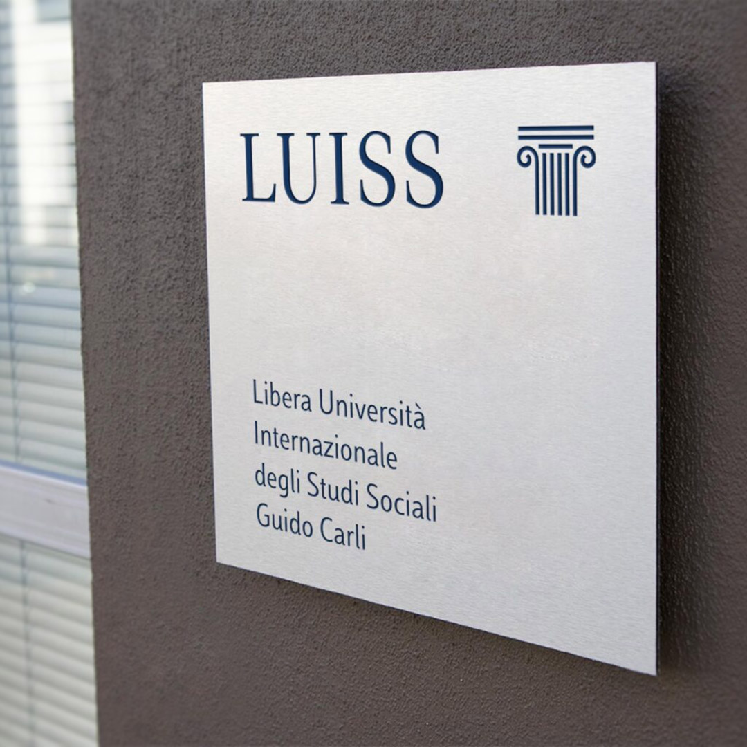
LUISS
A project that conveys an idea of education as continuous growth, symbolized by a column transforming into a capital. A consistent visual and typographic language reinforces a sense of belonging and openness to knowledge.
Intercultura
The brand design reinforces autonomy by emphasizing the name as the central element of the logo. The reference to AFS remains in the background, acknowledging the origins while highlighting a more evolved and independent vision.
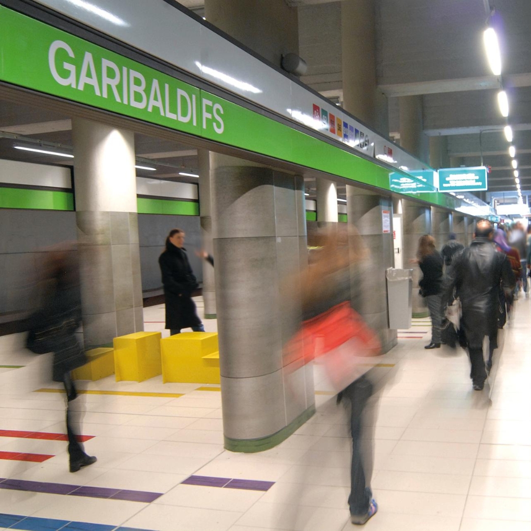
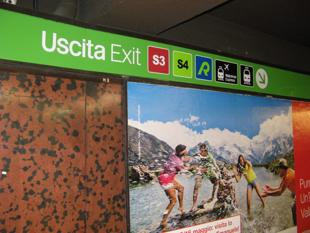
Metropolitana Milanese: Iconic Signage and Wayfinding
The design of Milan’s Metro Lines 1 and 2 is a milestone in the history of Italian design. This project earned ATM, Franco Albini, Franca Helg, and Bob Noorda the prestigious Compasso d’Oro award in 1964 and introduced the concepts of coordinated image and standardization.
One of its most recognizable elements is the continuous perimeter band in the stations, where the station name is repeated every five meters to ensure readability from a moving train. For the signage, Noorda redesigned Helvetica, creating a custom typeface that now bears his name.
The expansion of stations and lines over time, along with the need to comply with safety regulations and introduce new services, led ATM to initiate a comprehensive signage and wayfinding refresh starting in the mid-2000s.
“Inarea began with the design of Garibaldi Station. It was both stimulating and rewarding to engage with a project like the Milan Metro, which we approached with respect and historical accuracy,” explains Niccolò Desii, Design Director and Partner at Inarea, who has been overseeing the collaboration with ATM for the past twenty years.
Signage and Type Design: Interpreting an Icon
“We found an interview with Bob Noorda in which he stated that he had wanted to create a lowercase typeface for the Milan Metro. Newer stations with longer names, as well as simple directional messages such as ‘to trains’ or ‘exit,’ required a lowercase typeface for better readability.
We developed a font, Metro Type, based on Noorda’s original design, to be used for textual elements on panels, informational signs, and station regulations—essentially, a tool that would allow ATM to communicate in a consistent and cohesive manner.
We also undertook a complex update of the signage manual to better integrate the early Metro lines with Line M3, which had introduced discontinuities in elements such as sign architecture and lighting. During that period, the Noorda studio was brought back in to work on updating the typeface.
As a result, ATM ended up with two typefaces: Noorda’s original font for station signage and Inarea’s Metro Type for other textual information. However, both coexist harmoniously, as Metro Type was developed as a faithful evolution of the iconic 1964 design.”
Rules and Wayfinding for a Timeless Design
“After working on the signage and wayfinding for Garibaldi Station, we went on to design the systems for ten more Metro stations. Over time, we have continued to update signage, vehicle liveries, and surface transport elements, culminating in our work on Line M4, where we created the updated mobility map.
We developed a set of simple rules and algorithms to ensure the coherent, uniform, and functional distribution of signage within each station. This approach prevents an overload of information in narrow or high-traffic areas while ensuring that signs are strategically placed at key junctions—or, when distances are significant, as confirmation markers along the route.
For major interchange stations where multiple lines intersect, we established general guidelines. The handbook outlines key specifications, such as luminescence levels and whether signs should be positioned orthogonally or laterally to entry points.
Additionally, we redesigned the pictograms and more technical regulatory signage, making it easier for those managing the system to categorize information and plan the future distribution of signs within station spaces.”
Milan: A City in the Spotlight
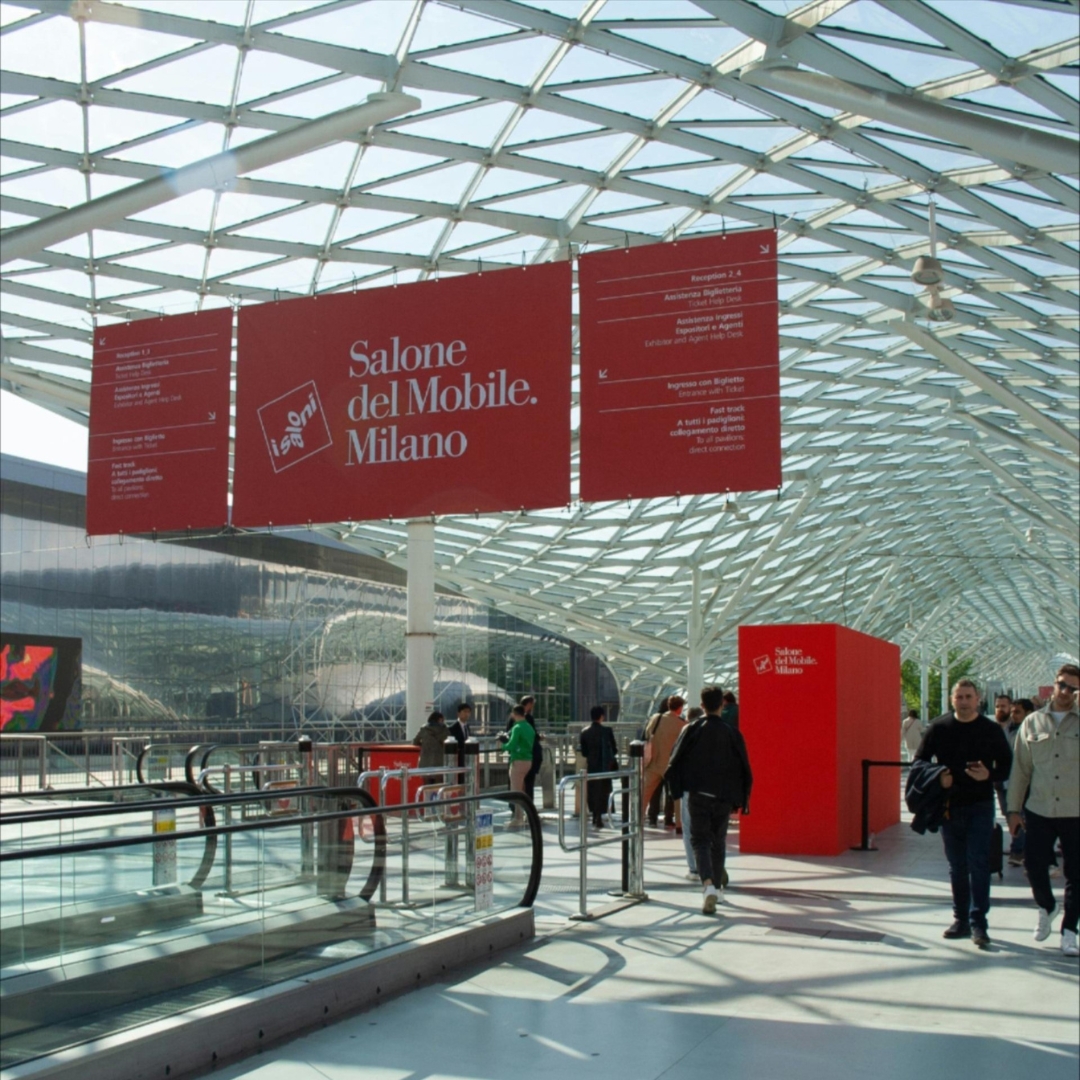
Milan Design Week is a showcase of potential and leadership recognized worldwide. It is rooted in a unique vision of design—specifically furniture design—that has developed historically within the very fabric of the city. Since 1961, this has been represented by the Salone del Mobile, the international furniture fair, and since 1990, by the FuoriSalone, a city-wide network of events initiated by Interni magazine.
“The real question today,” comments Antonio Romano, “especially in an edition where the industry must also grapple with tariffs imposed by Trump, is how to strengthen the identity of the Salone del Mobile and define the role that Design Week is meant to play. Looking ahead, we cannot limit everything to furniture design (and its closest derivatives), particularly at a time when the word design is one of the most widely used adjectives in every vocabulary… even the philosopher Luciano Floridi defines his field as conceptual design! What truly concerns me is when success turns into self-celebration. That’s why Design Week must open up to the many dimensions of the discipline, exploring their interactions and building on Milan’s long-standing ability to attract creativity.”
How Can Milan and Design Week Stay Attractive?
“We need to rethink FuoriSalone without weakening Salone del Mobile. It’s essential to promote a city-wide program of events that go beyond what happens at the fair and the furniture sector—preserving the quality of Milan’s genius loci while embracing international experiences. Milan must remain in the spotlight by enhancing its appeal across different creative and industrial fields.However, if the event becomes too focused on spectacle or turns into mere self-congratulation, its future is uncertain. The key shouldn’t be the obsession with the present moment or the relentless pursuit of the ‘new & more new’ driven by likes and instant metrics.”
What does Milan represent for Inarea?
“We opened our Milan offices in 1988: Enichem had become an important client, and we needed to ensure a near-daily presence. Shortly after, Snam and Union Carbide joined, and with the latter, we began a collaboration at a European level. Because Milan at that time was also this: a design capital where you could meet international players. Our first foreign clients were gained precisely because of our presence here.
In 1999, we won the competition to redesign the city crest and reorganize the identity system for the Municipality of Milan. This project allowed us to capture the essence of the city at a critical moment in its history, highlighting the distinctive Milanese combination of a deep attachment to tradition and a passion for innovation. The new design of the crest quickly replaced all previous versions, but the core of the project was the intention to turn the word ‘Milan’ itself into a brand. After all, many businesses (starting with Prada) had already associated their brands with their Milan identity, clearly proving that the city itself was (and still is) an added value. We designed a new typeface – aptly named Milano City – and separated the word from the phrase ‘Comune di Milano.’ The project was halted when the Albertini administration ended; though it still exists, it has since been modified.
During these years of profound urban transformation, we also completed significant branding projects for real estate developments that reshaped the city’s skyline: Milano Santa Giulia, followed a few years later by Milano Porta Nuova, and later Pirelli RE (now Prelios). Staying within the realm of Milan-based institutions, it’s worth noting our rebranding work for Borsa Italiana and Edison. Additionally, in the energy sector, we also created the name and brand for the new Lombard multiutility, A2A.” Within the same broader field, though in more recent years, we’ve seen the rebranding of Snam and Italgas, and—just to name a few from memory—the brand identities of the Italian Infrastructure Fund F2i, Fondazione Cariplo, Fondazione Fiera Milano, the Milan Conservatory, Casa Milan, as well as many other projects that may have originated in Milan but were destined for broader horizons, such as the brand identity for the Venice Biennale, which certainly deserves to be remembered.
There are also long-term projects that directly impact the daily lives of Milan’s citizens—like the rationalization of ATM’s wayfinding system, which included a redesign of signage (the pictogram system) and the creation of a dedicated display typeface, Metro Type.