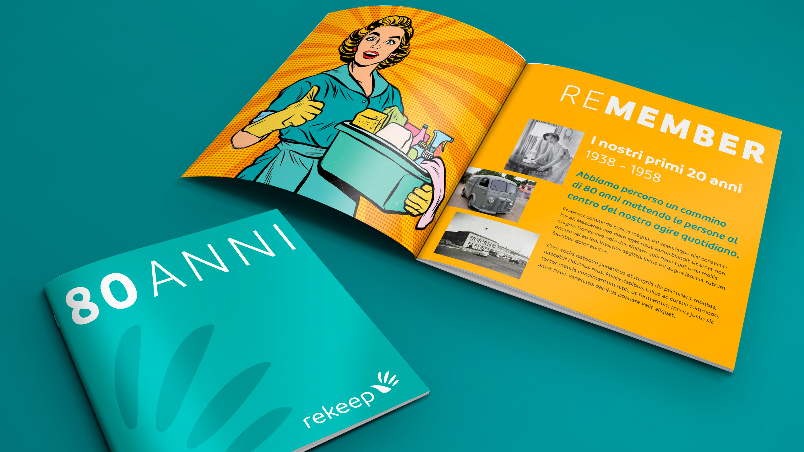
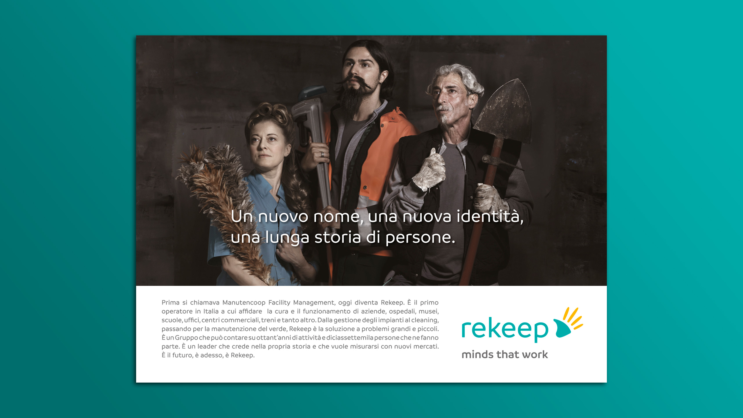
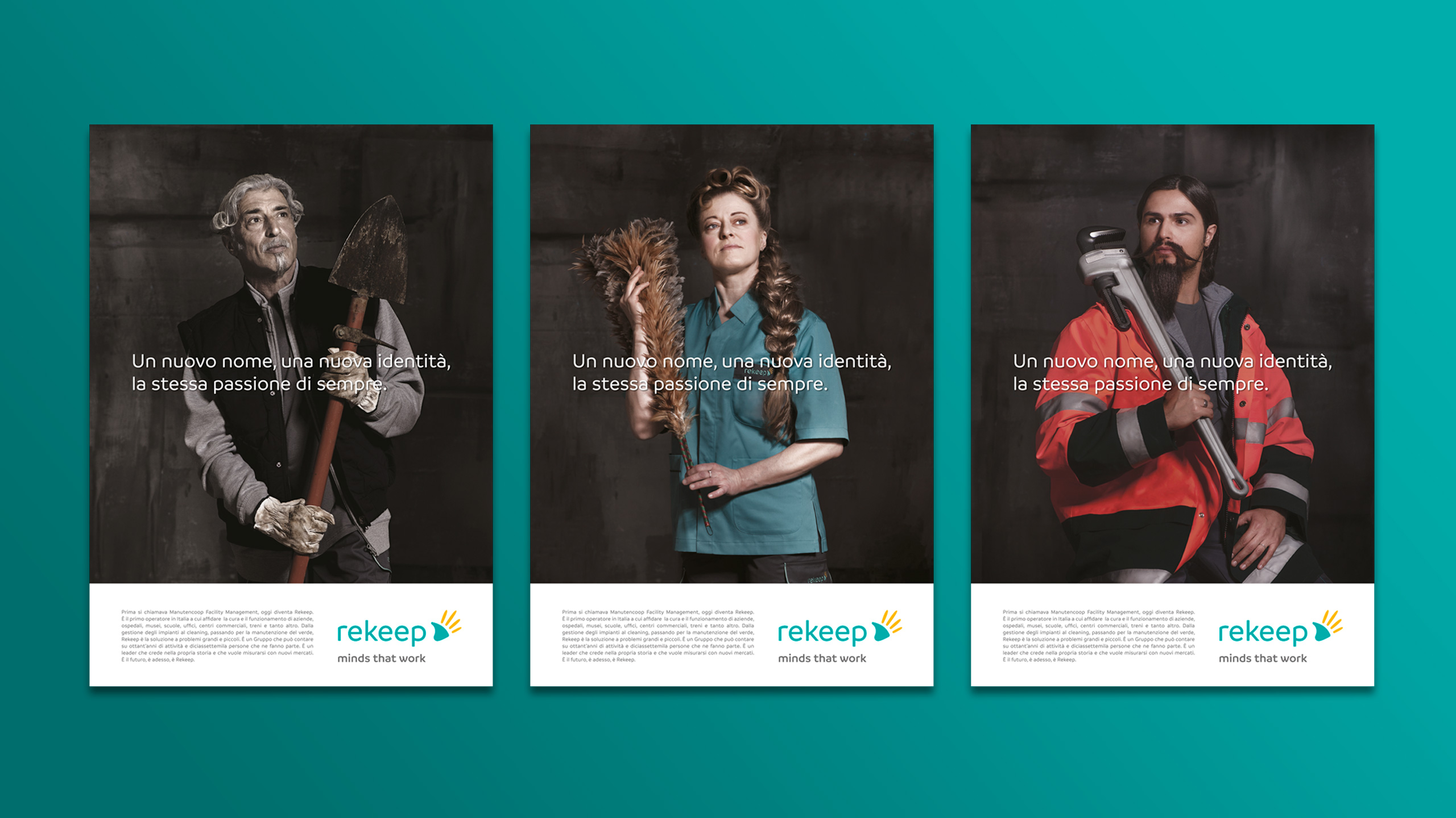
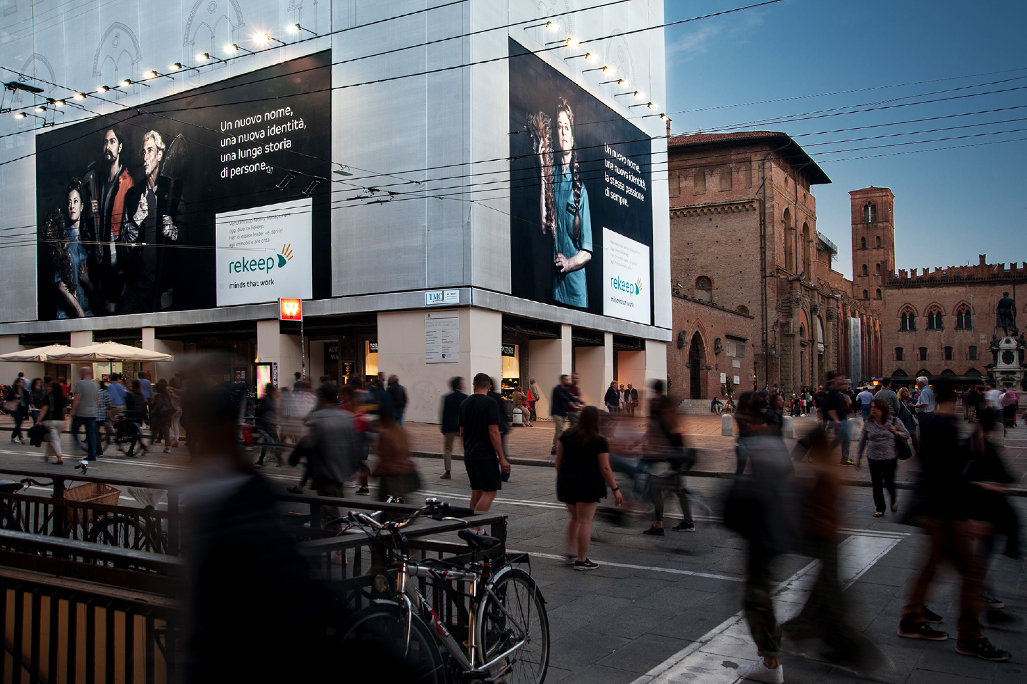
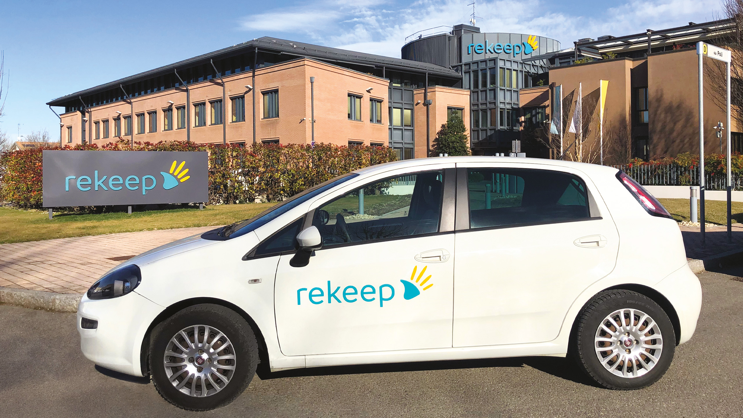
Rekeep is the new name of Manutencoop, the cooperative founded in 1938 that has become Italy’s leading group in support services for public and private enterprises, and one of the main players in integrated facility management in Europe.
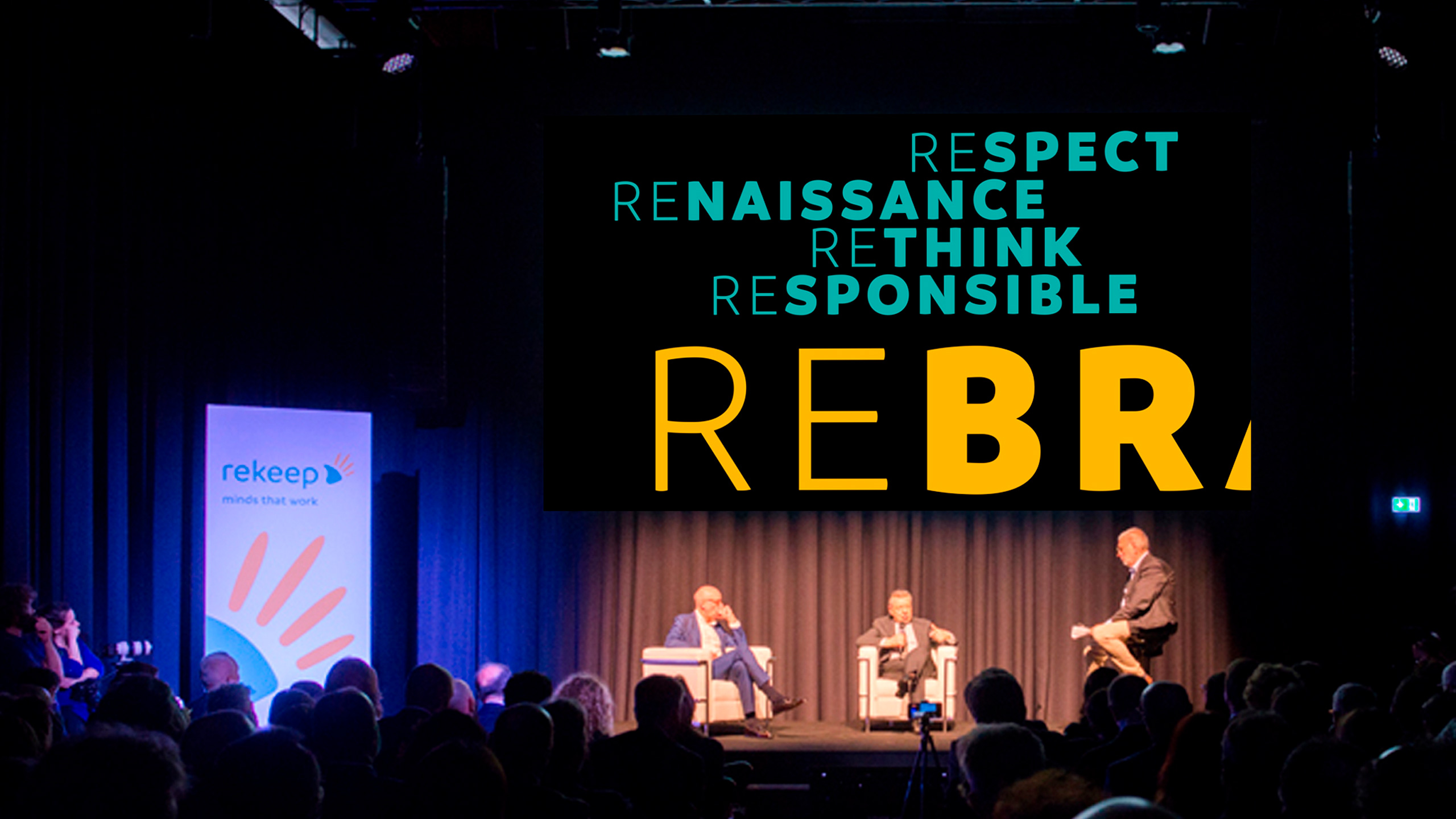
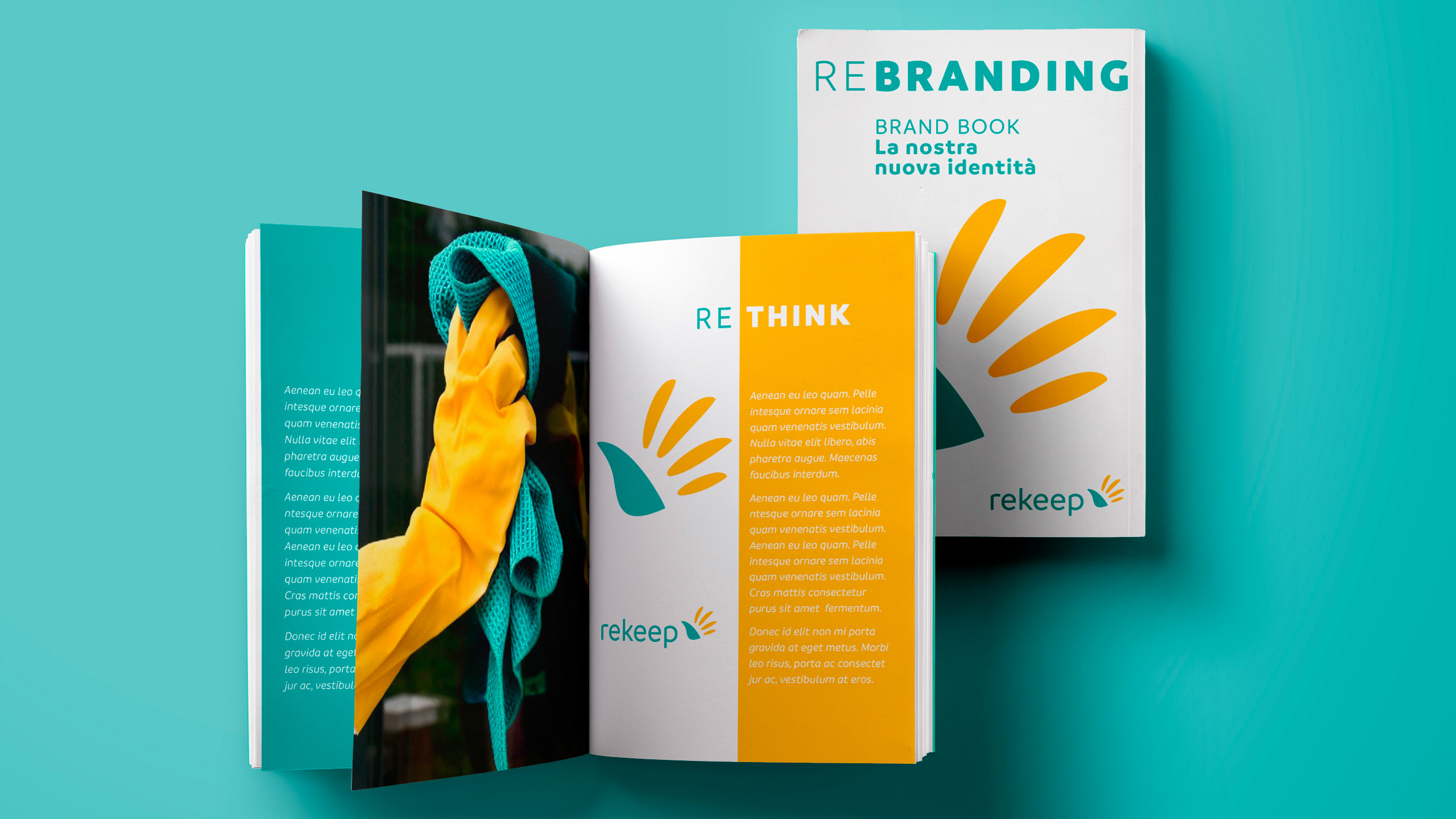
Naming. A global brand that stands for renewal.
A new name, a new brand, to celebrate the first eighty years by starting fresh. With a global positioning and a renewed identity, the aim is to better showcase the company’s expertise and expand into new markets. It’s a new challenge—transforming a legacy into a vision for the future.
Rekeep is a name designed for an international audience: it has a simple, direct sound that comes across as both friendly and authoritative. It’s a name that signals a new beginning—“RE” highlights a fresh start and renewal, while “KEEP” conveys the ideas of caring for, maintaining, preserving, and safeguarding.
Brand Design. A symbol of efficiency and humanity.
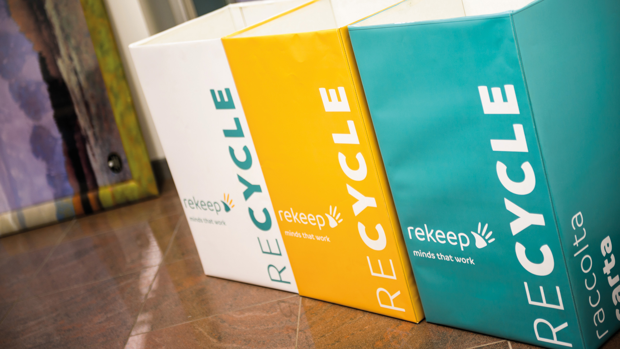
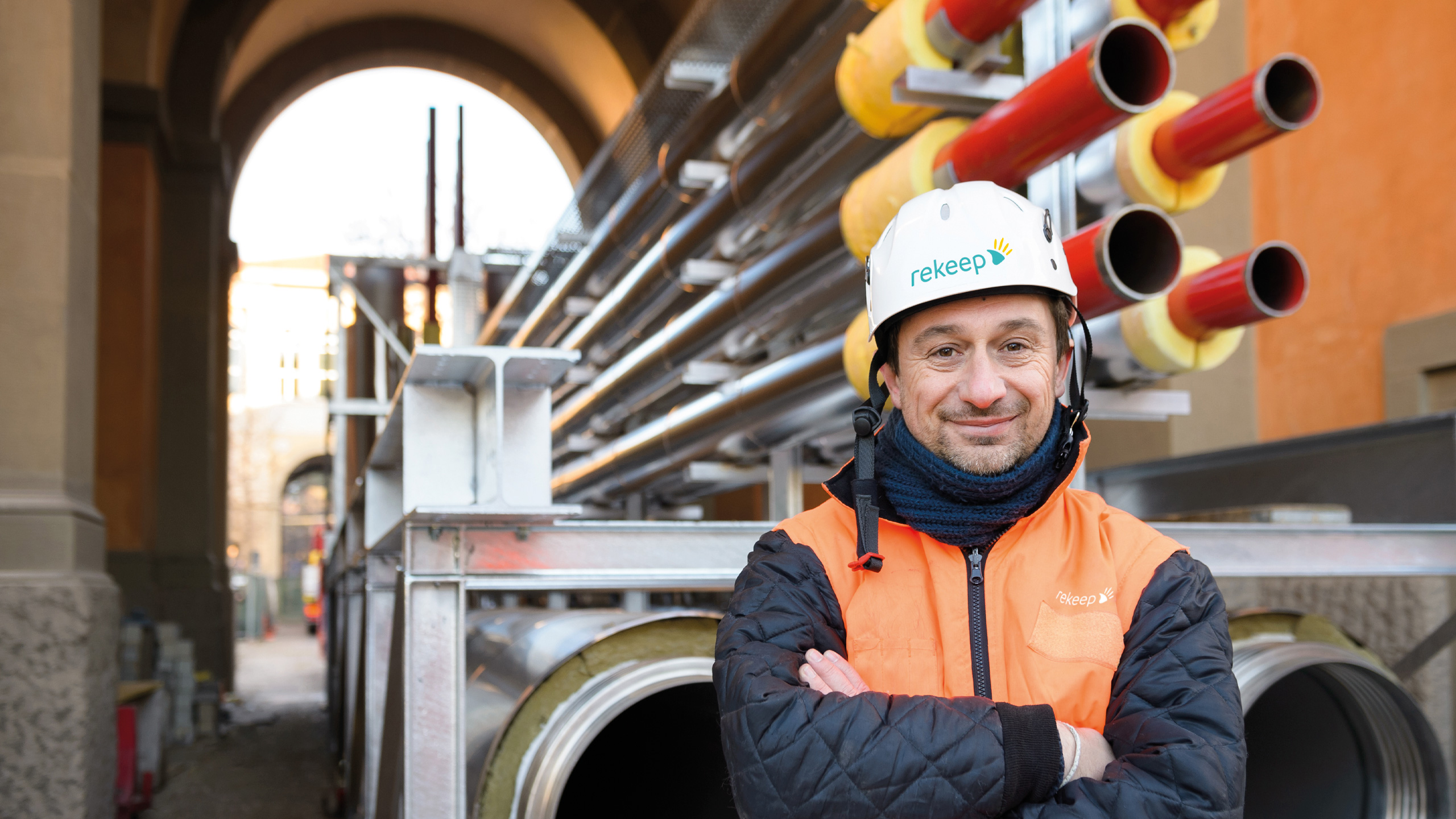
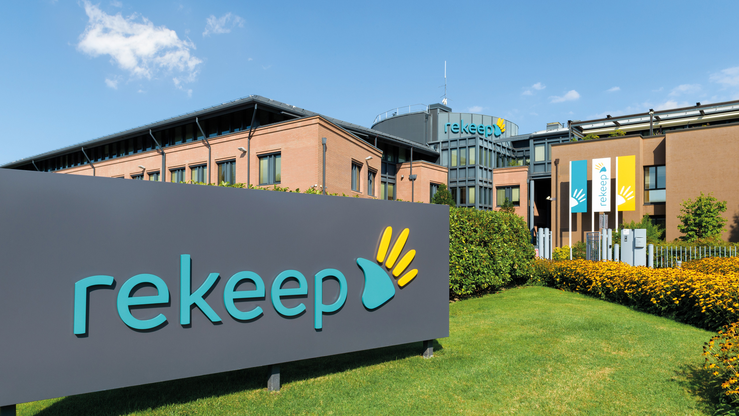
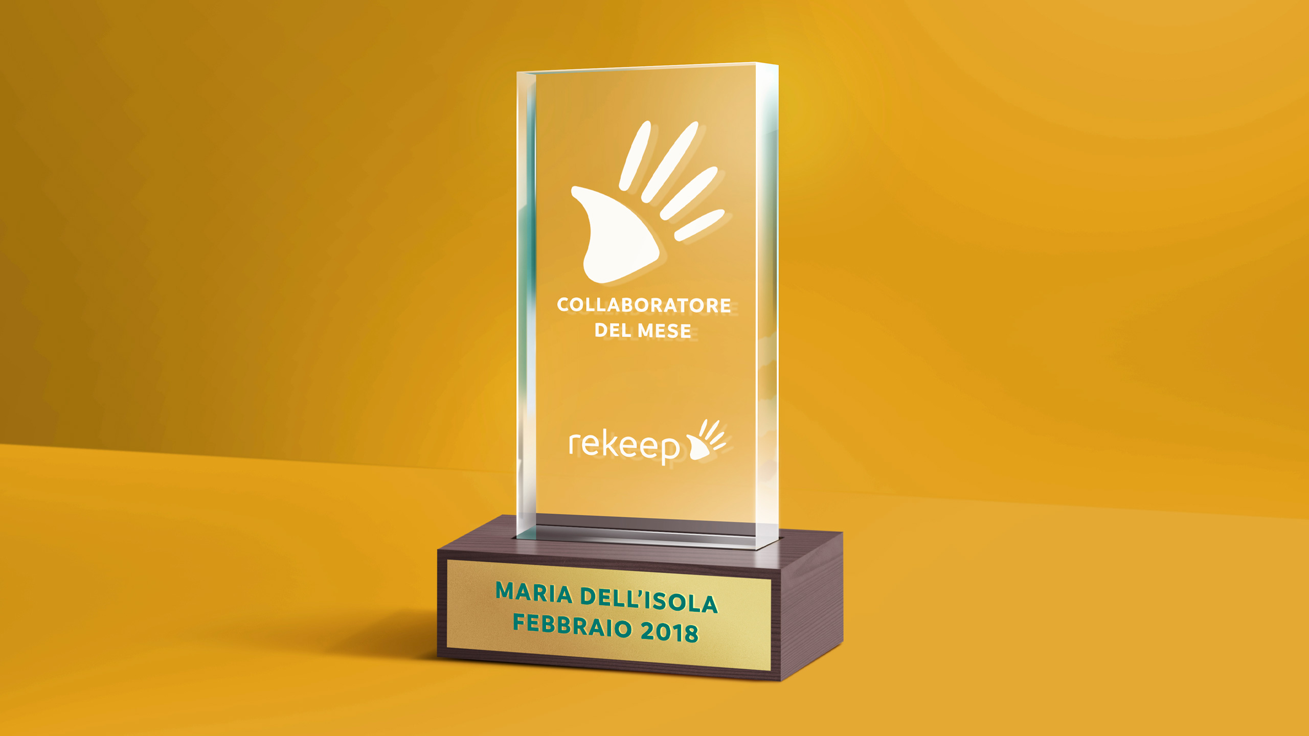
The new logo uses a contemporary typeface, with all the letters in lowercase to emphasize the direct, approachable tone the organization wants to convey. The chosen color is a shade of green that suggests cleanliness and efficiency. Alongside the logo is a symbol of an open hand, with the fingers—accented by yellow—evoking rays of sunlight.
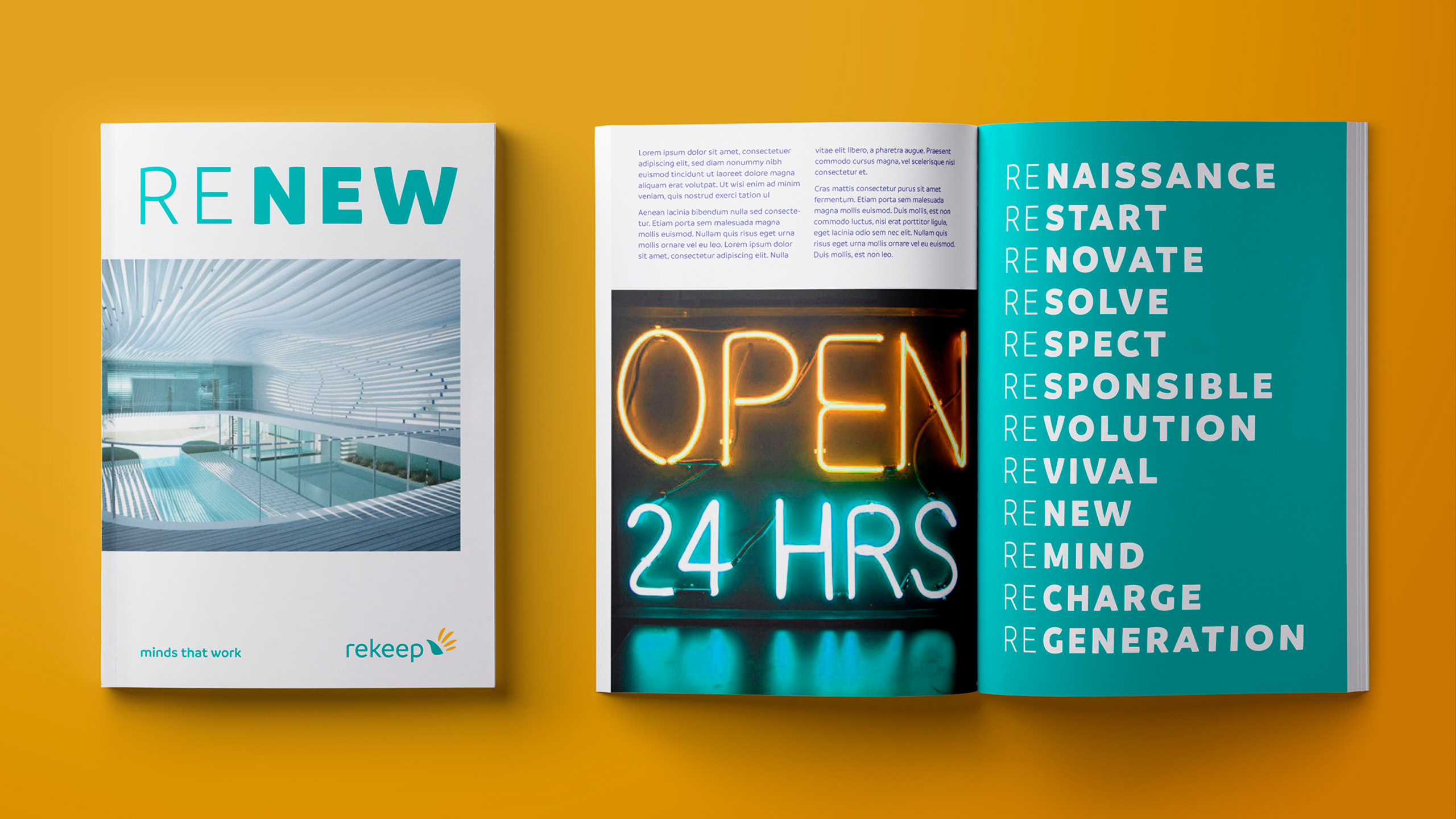
Beneath the logo is the payoff, the company’s DNA: “minds that work”. This phrase highlights that intelligence comes into play even before the work begins—thought precedes action, and planning comes before execution.
Communication & Editorial Design, Exhibition Design. An integrated system.
The milestone of eighty years—with a new name and a new brand—becomes an important starting point for renewing the company’s communication style. The visual identity takes shape through a coherent system across all platforms, from exhibition layouts to editorial design and communication on various digital touchpoints. This approach tells the story of change using clear, accessible, and contemporary language.