We use technical cookies to remember your choice and, so that we can prove it, we record on our own server the date, your choice and a shortened version of your IP address. Only if you accept do we also use Google Analytics, to measure visits to the site in aggregate form. If you decline we install no analytics cookie and send no data to Google. You can change your mind at any time from "Cookie preferences" at the bottom of the page. Cookie PolicyPrivacy Policy
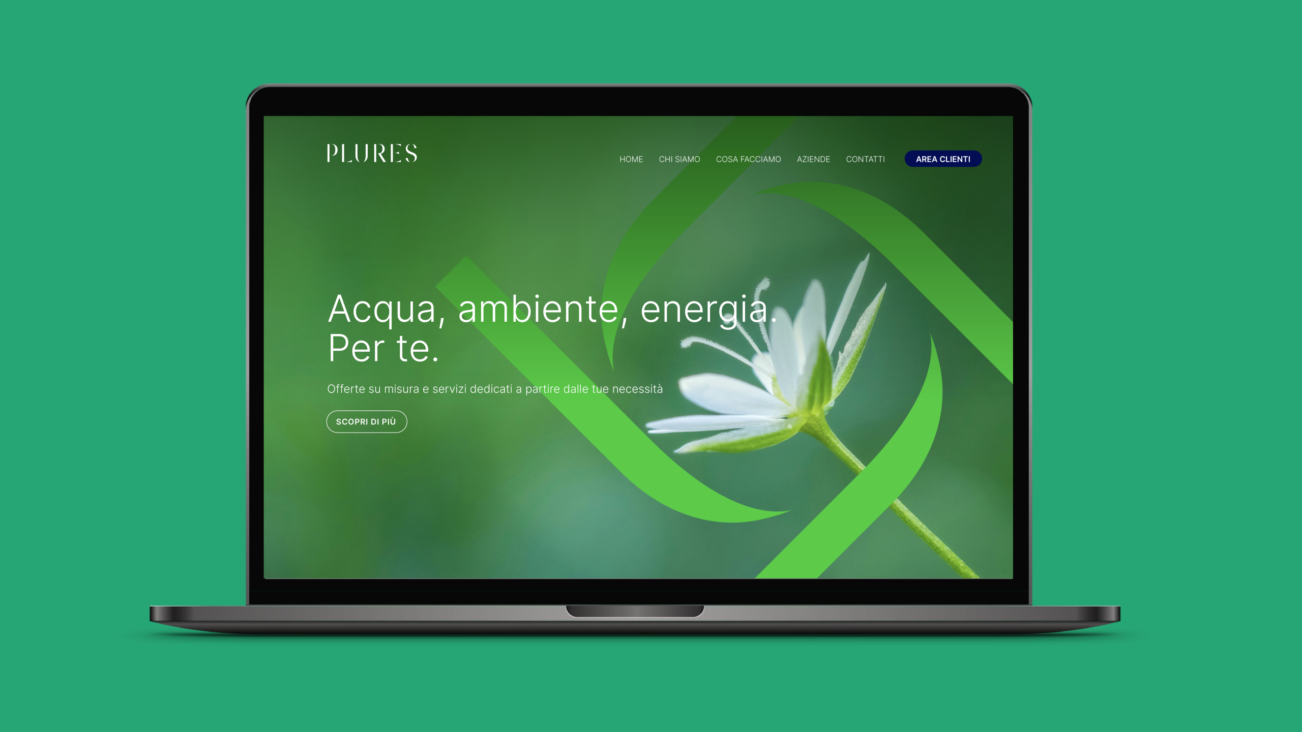
Plures is the new name of the multiutility born in Tuscany from the merger of Alia Servizi Ambientali, Publiservizi, Consiag and Acqua Toscana. A public company operating in the sectors of environment, energy and water cycle, serving over one and a half million citizens. The name marks a step forward towards a common, shared and innovative vision. Plures – from the Latin “plures”, meaning “the many”, and by extension “plurality” – expresses the richness of diversity, the strength of collaboration and an industrial vision able to go beyond localism and speak the language of a shared future.
Brand design: a logotype to represent plurality
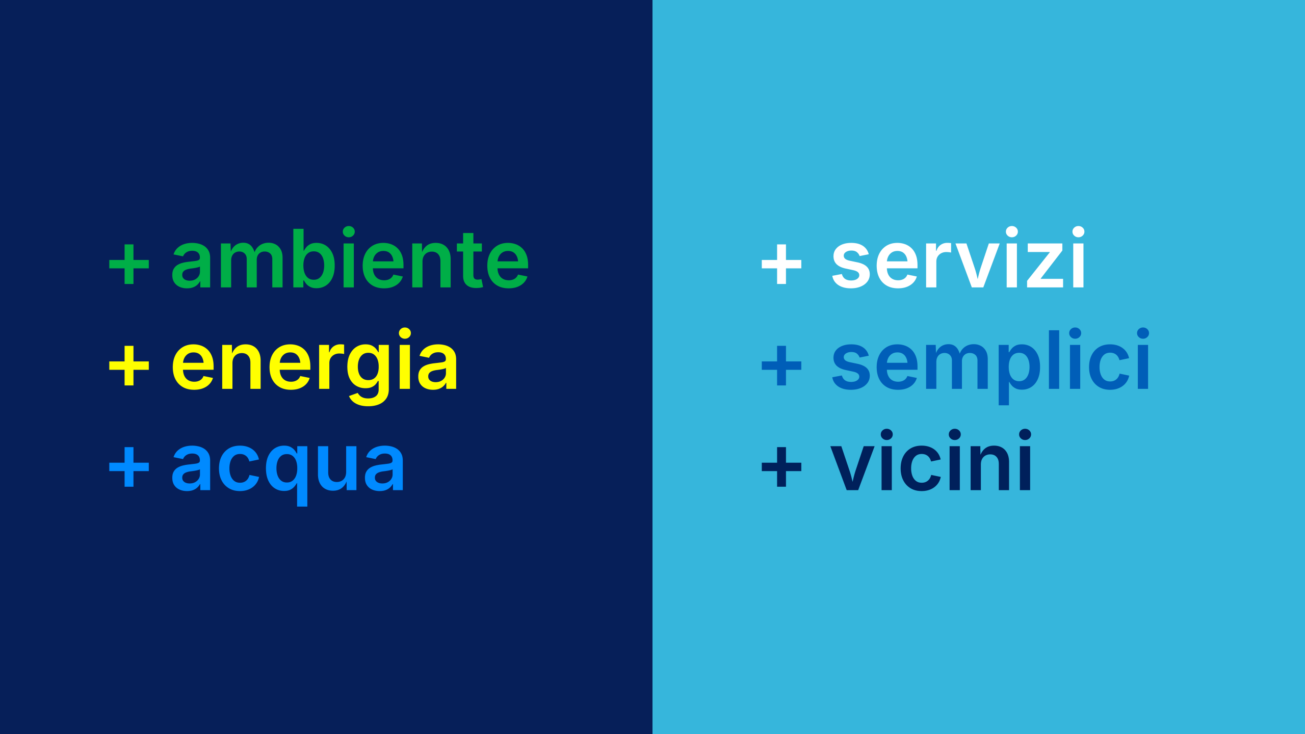
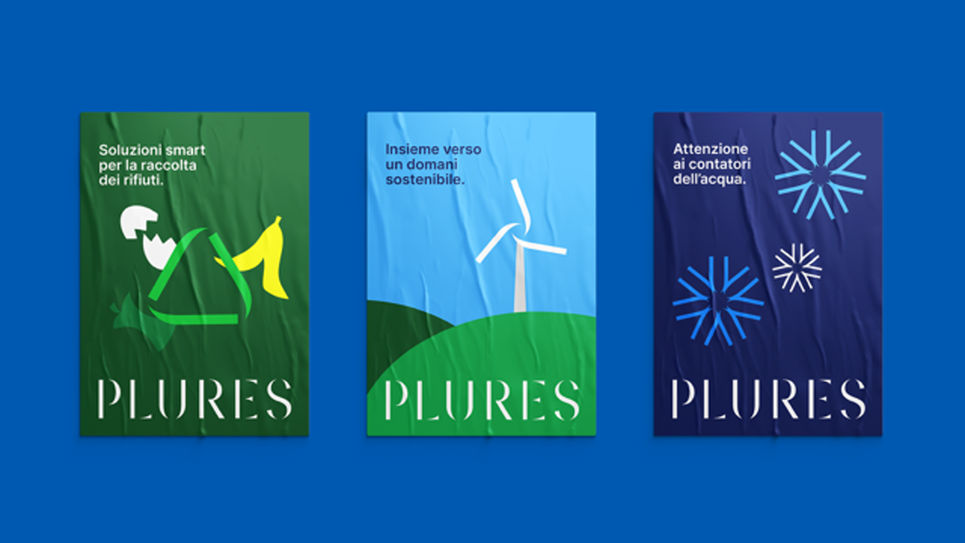
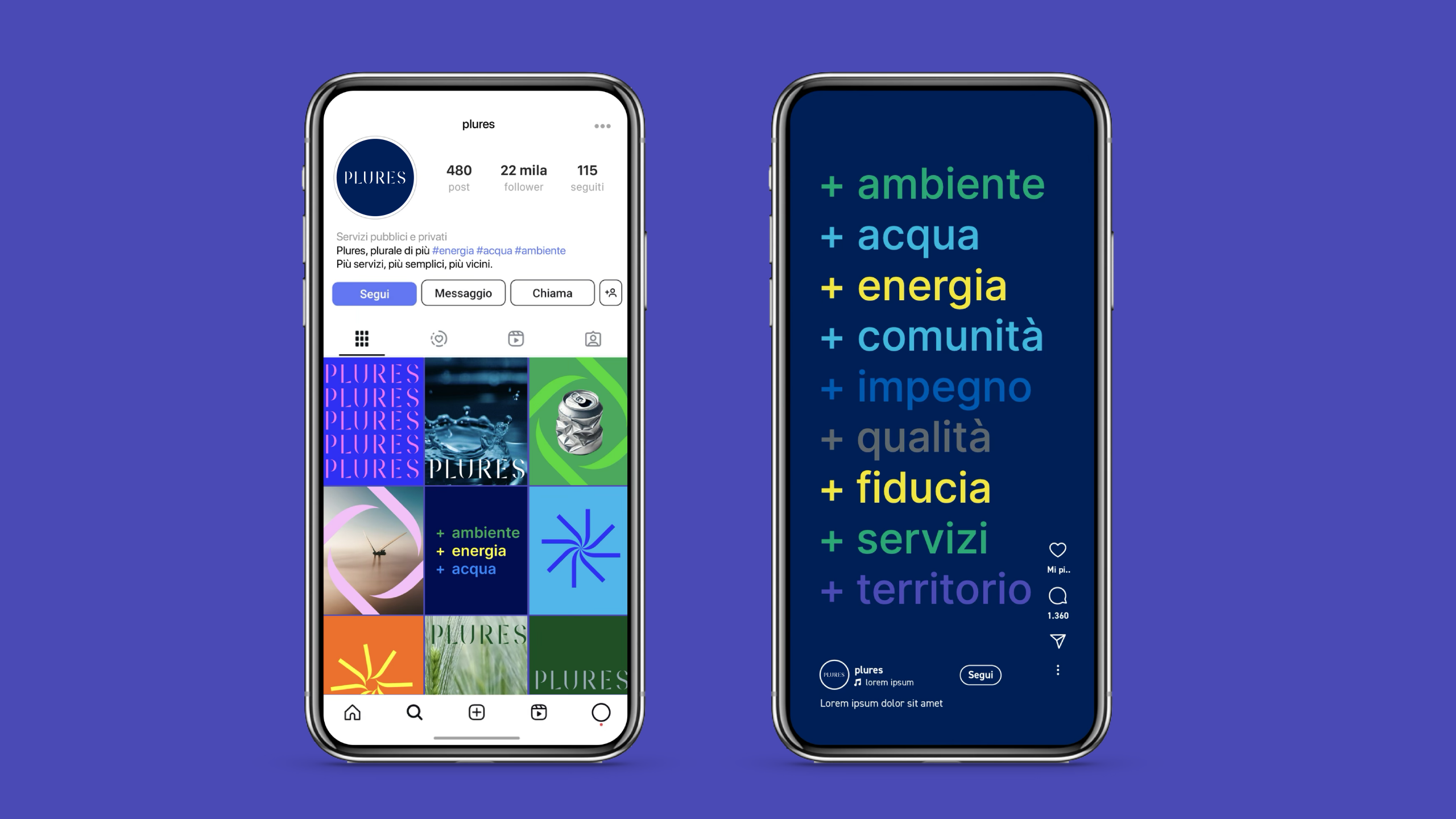
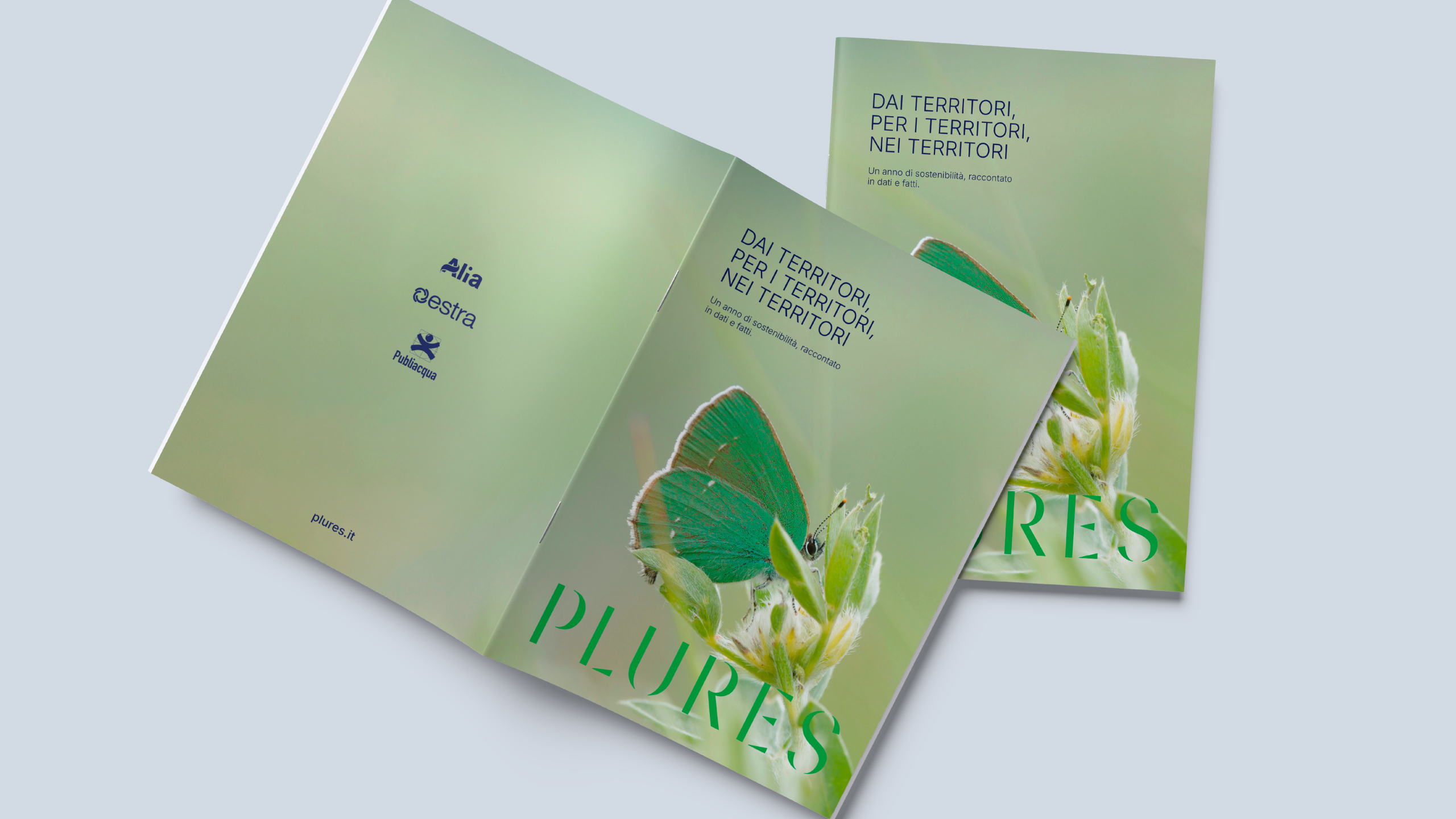
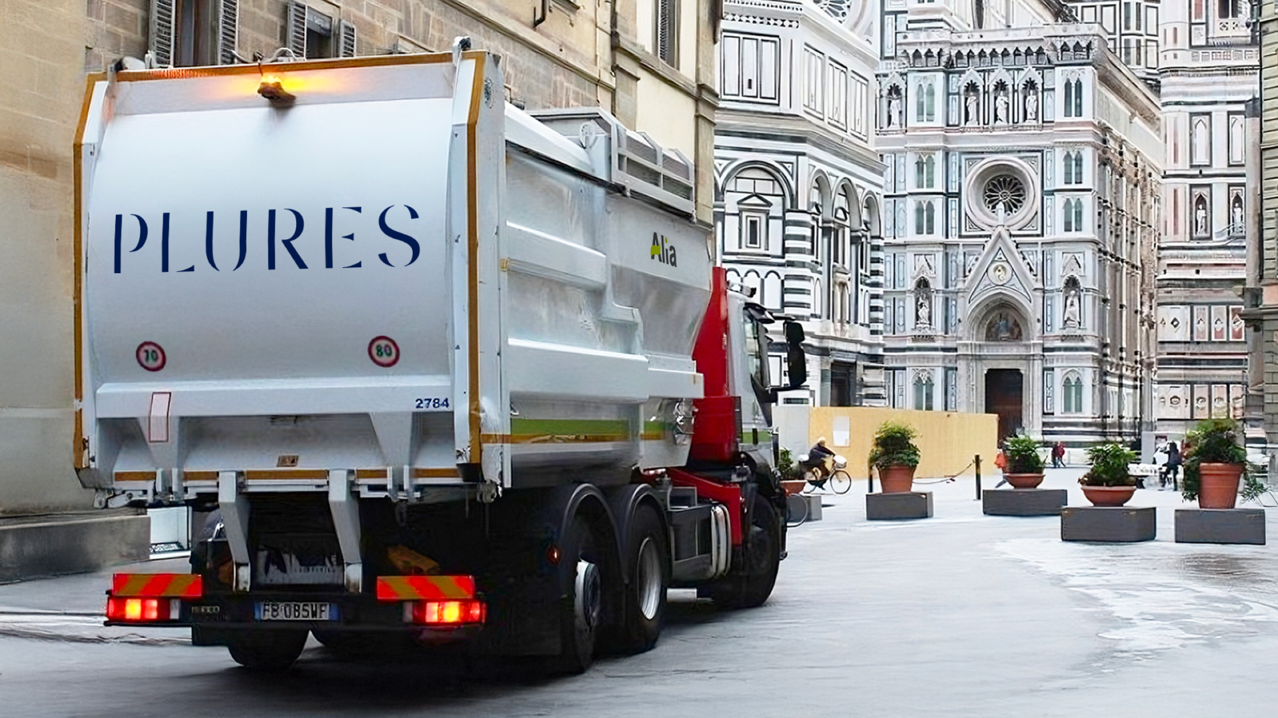
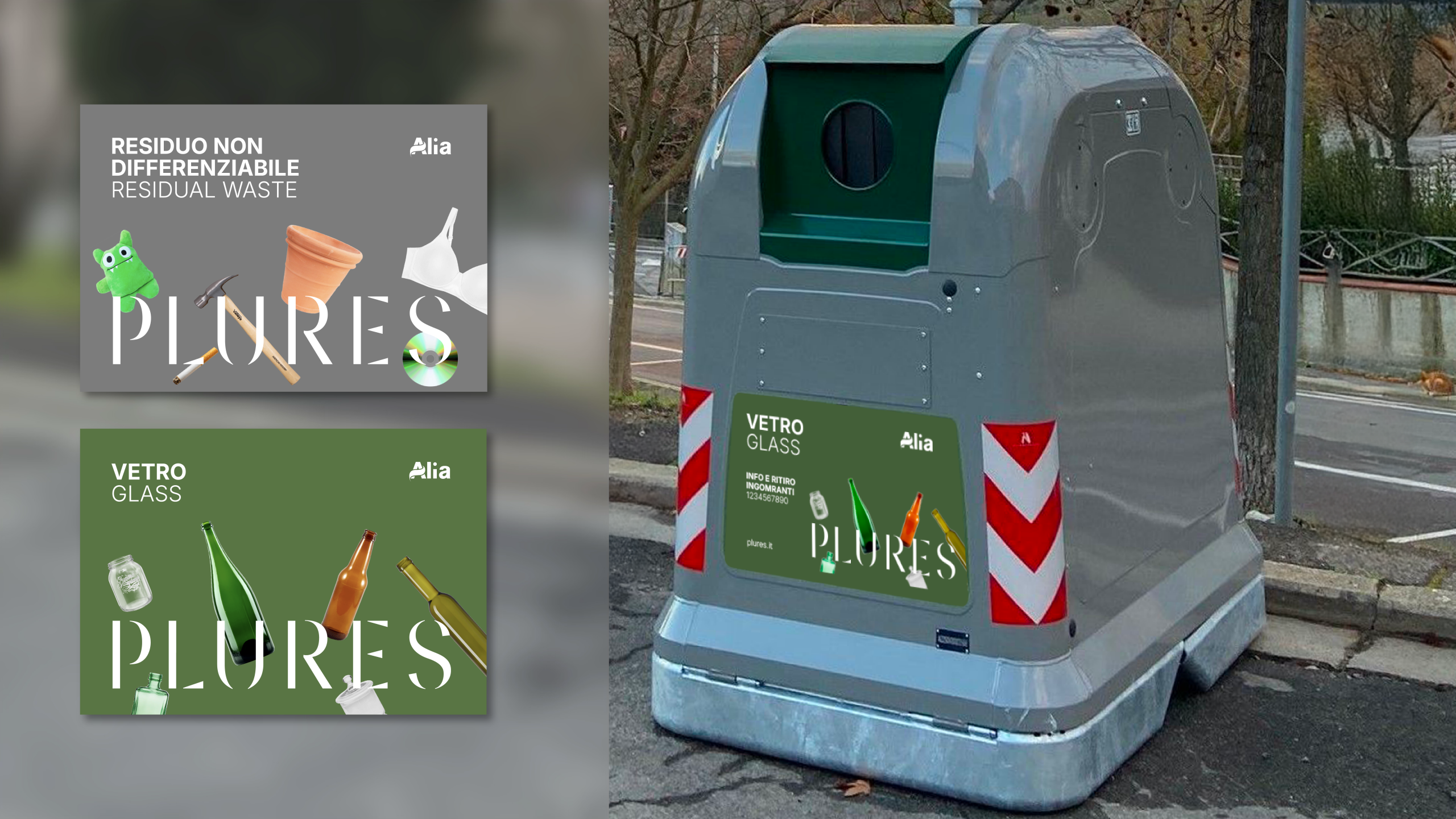
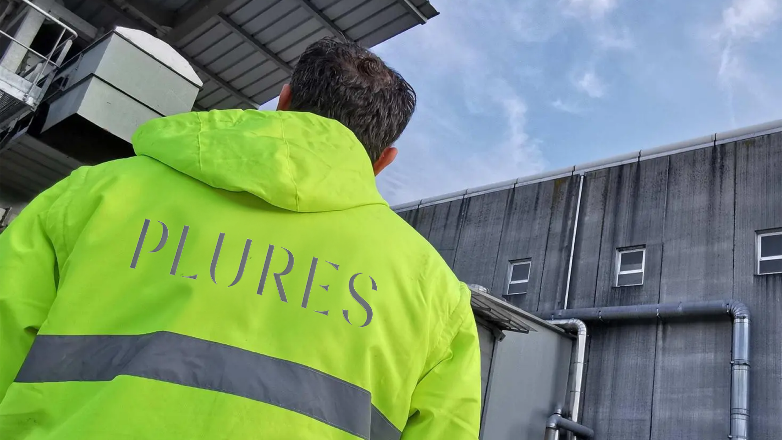
To express the new identity, Inarea created a logotype that is both essential and distinctive. The capital letters, in a custom-designed stencil typeface, evoke elegance, lightness and modularity, creating a contemporary and easily recognizable visual identity. The logo design also responds to the need, defined by the brand architecture, to connect the main existing brands (Alia, Estra and Publiacqua), which enjoy strong recognition, with the new one. The brand identity is built around the statement “plural of more”, reinforced by the presence of the + sign associated with the services offered and the mission that drives them. This sign, featured in communication materials, becomes a symbol of action and of the union between the parts.
This content is hosted by Vimeo. By loading it, Vimeo receives your IP address and may set cookies.
Plures is therefore a sum of experiences, energies and skills. A tool of connection: between people, territories, and the past and future of local public service.