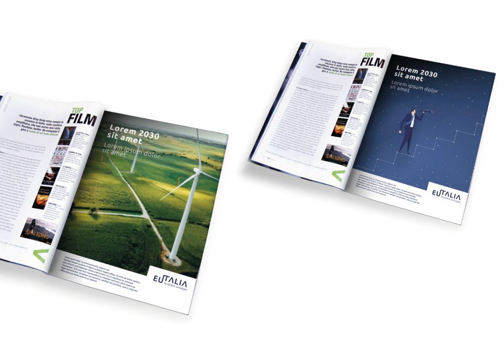
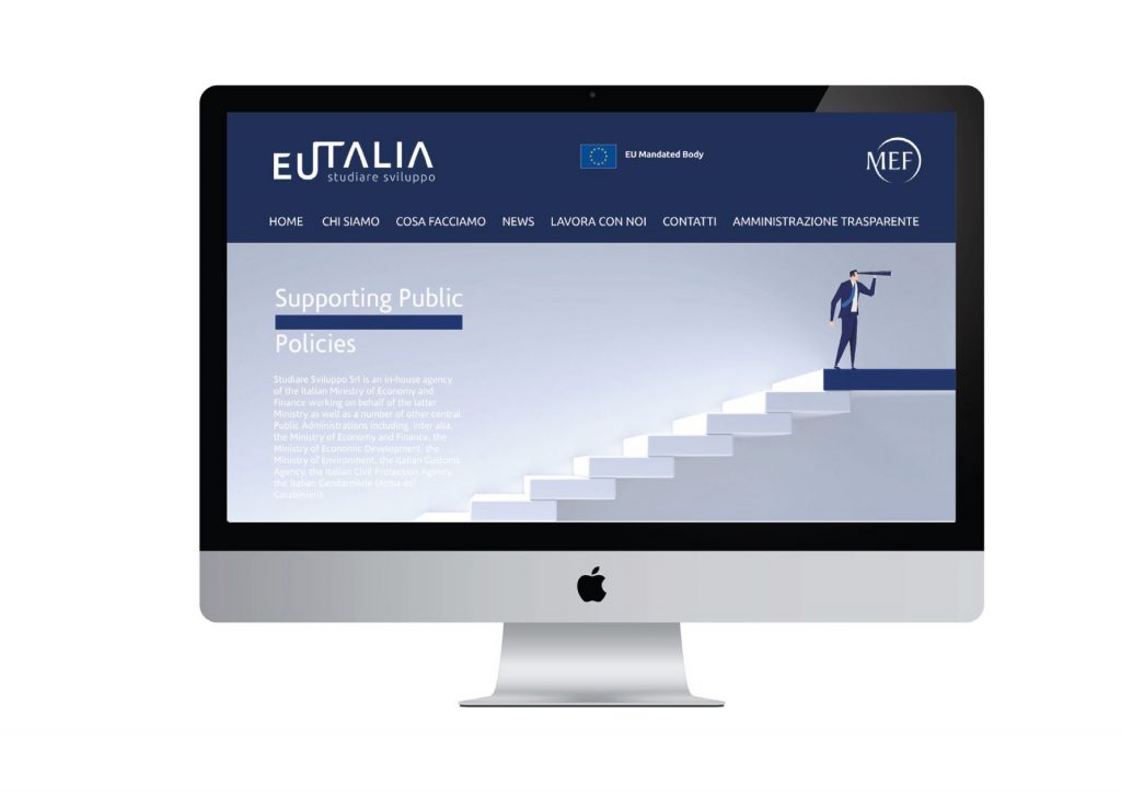
Eutalia is an in-house company of the Italian Ministry of Economy and Finance.
It operates within the framework of projects co-financed by structural funds and European investments, supporting public administrations in the analysis, planning, and implementation of public policies for development.
Initially established under the name “Development expertise”, the company built a unique reputation in managing EU funds. Its technical skills and in-depth competence have, over the years, made it a reference point in the field of public administration. With the renewed momentum of EU policy, the company felt the need to rethink its identity structure in order to reflect and embrace the ongoing changes.The analysis revealed, on the one hand, a need for greater awareness of the company’s strategic capabilities, and on the other, the importance of communicating them effectively—overcoming the limitations of a highly technical expertise that risked remaining confined to a narrow circle of stakeholders.
In the initial phase of the project, Inarea supported the company in identifying and defining its brand values. This process marked a clear transition from an institutional “boutique” to a thought-leading enterprise actively shaping public development policy. A key outcome of this evolution is the new name: Eutalia. The name blends Europe and Italy, encapsulating in a single word the company’s two operational dimensions—national and international. Eutalia is also simple, authoritative, and pleasant to hear. The prefix “eu”, found in many Greek-derived compound words, means “good” or “well”; it conveys a sense of positivity, virtue, and efficiency.
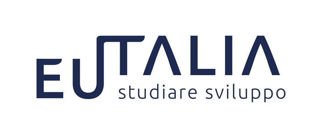
The logotype consists of the name Eutalia and the descriptor Studiare Sviluppo. In its graphic configuration, the word appears in two distinct parts, connected by the letter “U”, which extends to join the “T”—a union symbolizing the link and continuity between the two “souls” of the company: Italian and European. Additionally, the letter “U” can also be read as an “I”, forming the word ITALIA. The underlying prefix “EU” suggests a supportive foundation, reinforcing the company’s role in fostering the country’s growth. The stepped structure of the logotype, highlighted by the offset alignment between the “EU” prefix and the remaining letters, conveys a sense of movement: a visual metaphor for progressive development and forward momentum, reflecting the agility, lightness, and flexibility of the company’s renewed identity.
Eutalia is no longer just a pool of expertise, but a catalyst for processes and a communicator of results—a key partner for Public Administrations in transforming EU policies into concrete actions and measurable outcomes.
