The Maisaloon Group is a leading provider of facility management services in the United Arab Emirates. Over its 30 years of operation, it has built a successful track record founded on professionalism, quality, expertise, and a strong commitment to sustainability.
The rebranding aimed to create a new identity capable of guiding the Group toward an international market position.
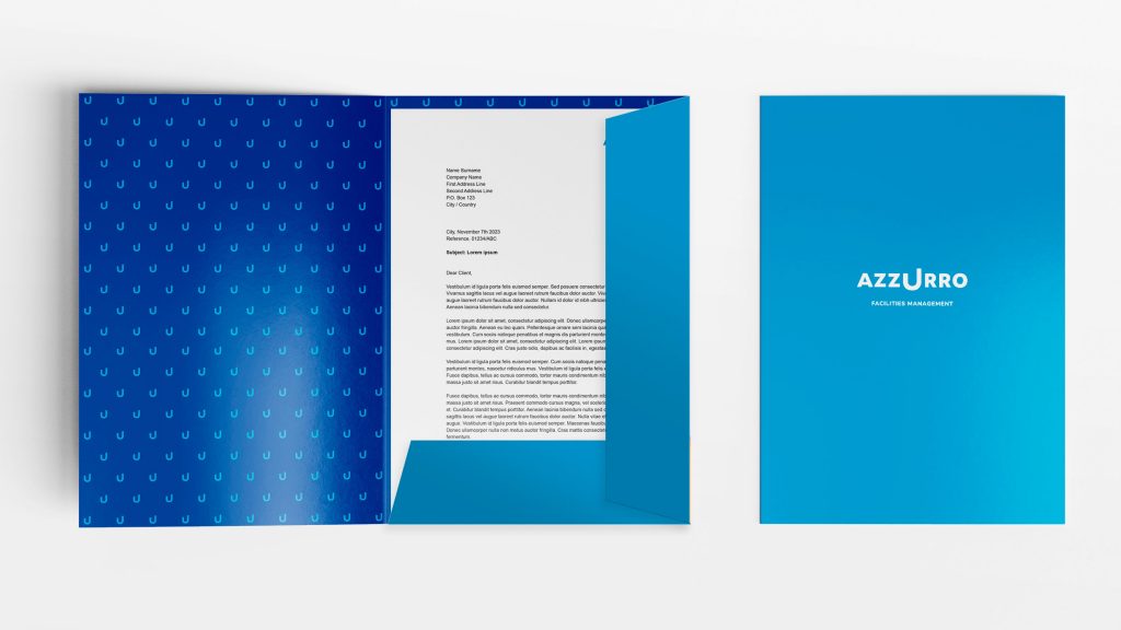
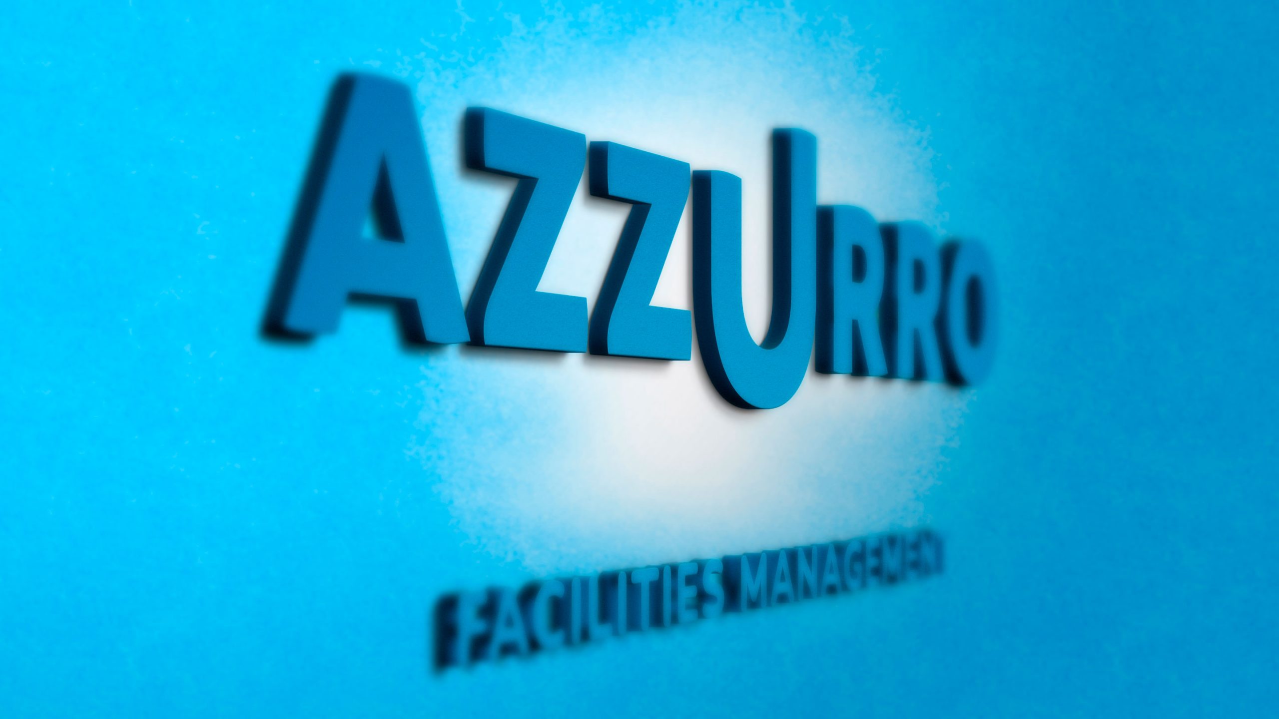
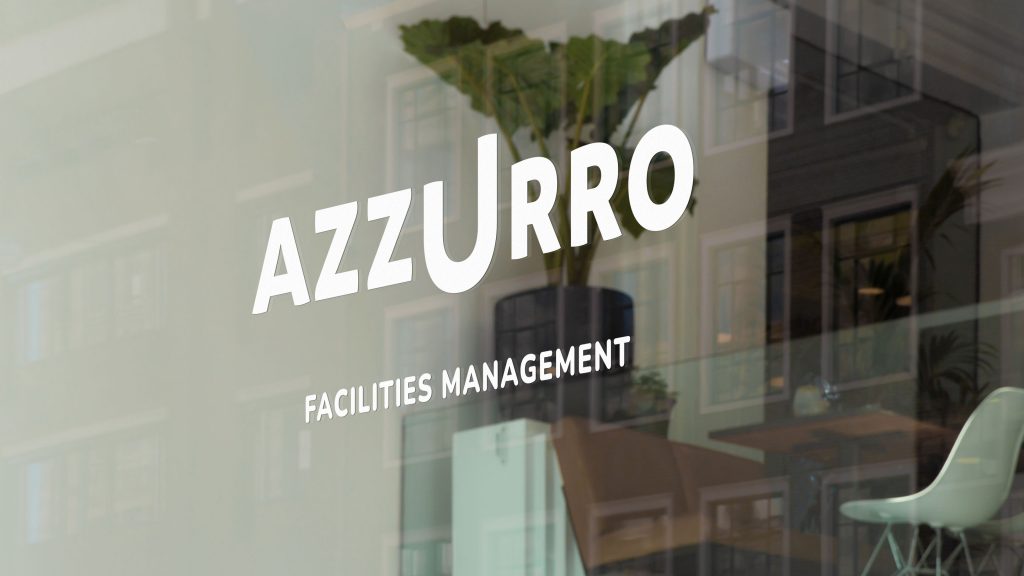
A new name and logo, identity system, and key messages forming the foundation of the brand repositioning were developed: Maisaloon becomes Azzurro Facilities Management.
‘Azzurro’ was chosen for its meaning of ‘blue sky’ and its ability to convey positivity, well-being, and transparency.
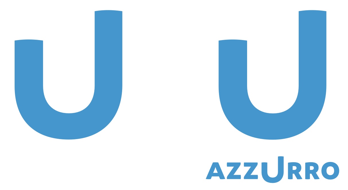
The logo features a soft, rounded lettering style and stands out for its distinctive asymmetrical “U” at the center. It conveys the company’s ability to “take a step forward” and “elevate facility management to a higher level.”
The central role of Azzurro’s employees and clients is emphasized by the “U,” which echoes the sound of the English word “you” and serves as the focal point of the logo.
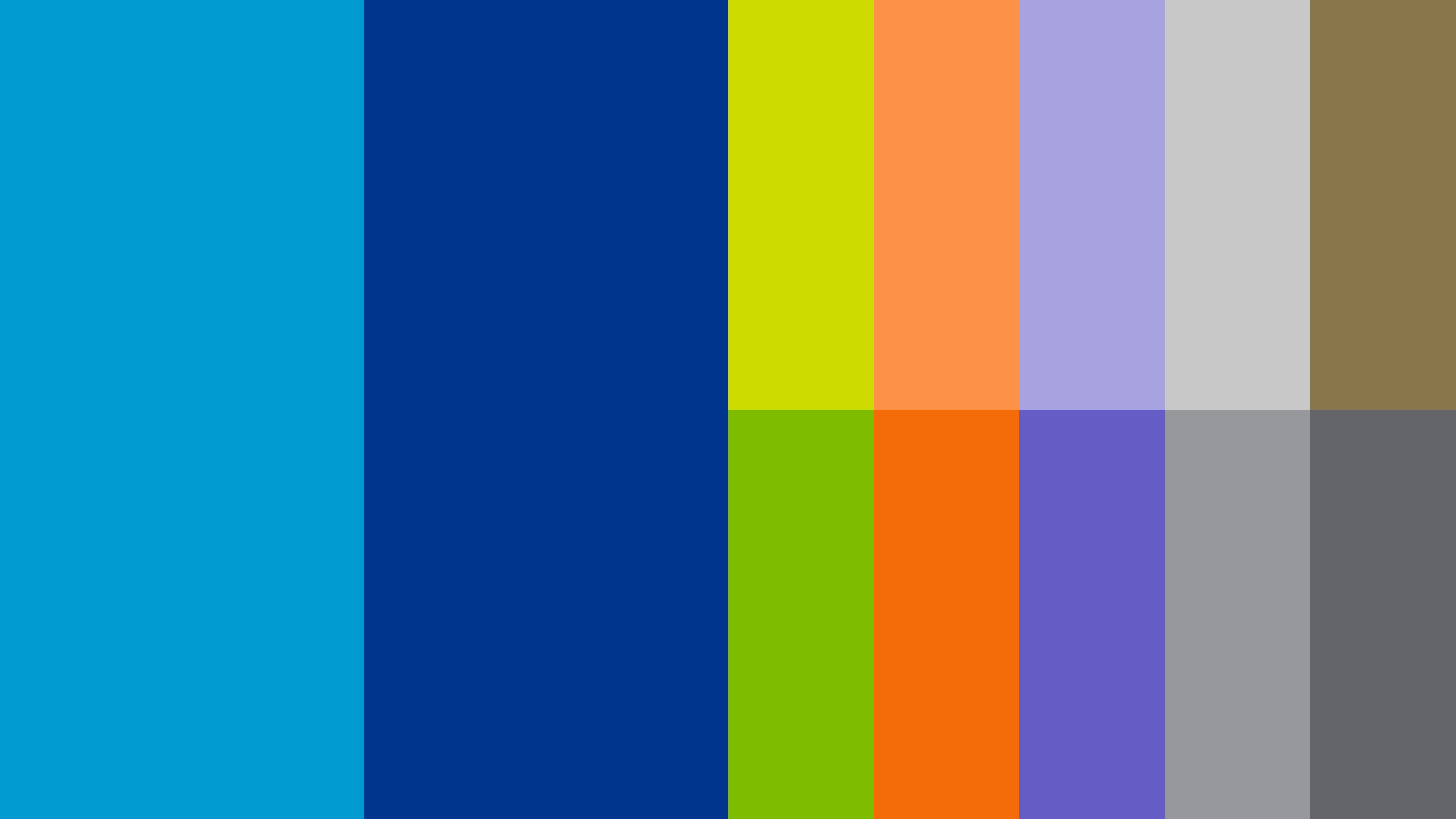
The primary color scheme features two shades of blue: sky blue (azzurro) and dark blue.
The sky blue color forms the logo and also symbolizes the company’s commitment to sustainability and the environment, expressing the idea that “blue is the new green.” It’s a way of seeing the world—and being part of it.
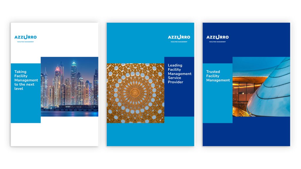
The brand language reinforces the idea of a “step forward”: text and imagery are composed through the use of colored squares and rectangles that rise and project upward.
The rebranding project marks a new starting point for Azzurro—a new horizon for its facility management services.