ANAS is an FS Italiane group company dealing with infrastructures. For almost a century, it has been building and managing the roads that connect every town in the country: a network now covering about 32,000 kilometres. The brand renews through the priceless respect for its heritage and corporate history but looking to the future.
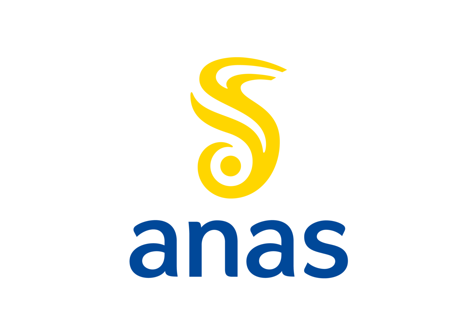
The winged steamroller that paved the roads was used to develop a dynamic contemporary fusion: from the roller to the circle, which becomes a point, which generates the road with its vibrant lines, evoking the traditional wing. A deliberate reference to the human figure: people are at the heart of the company’s new relational communication. Thus the ANAS brand switched seamlessly from the original to a new symbol.
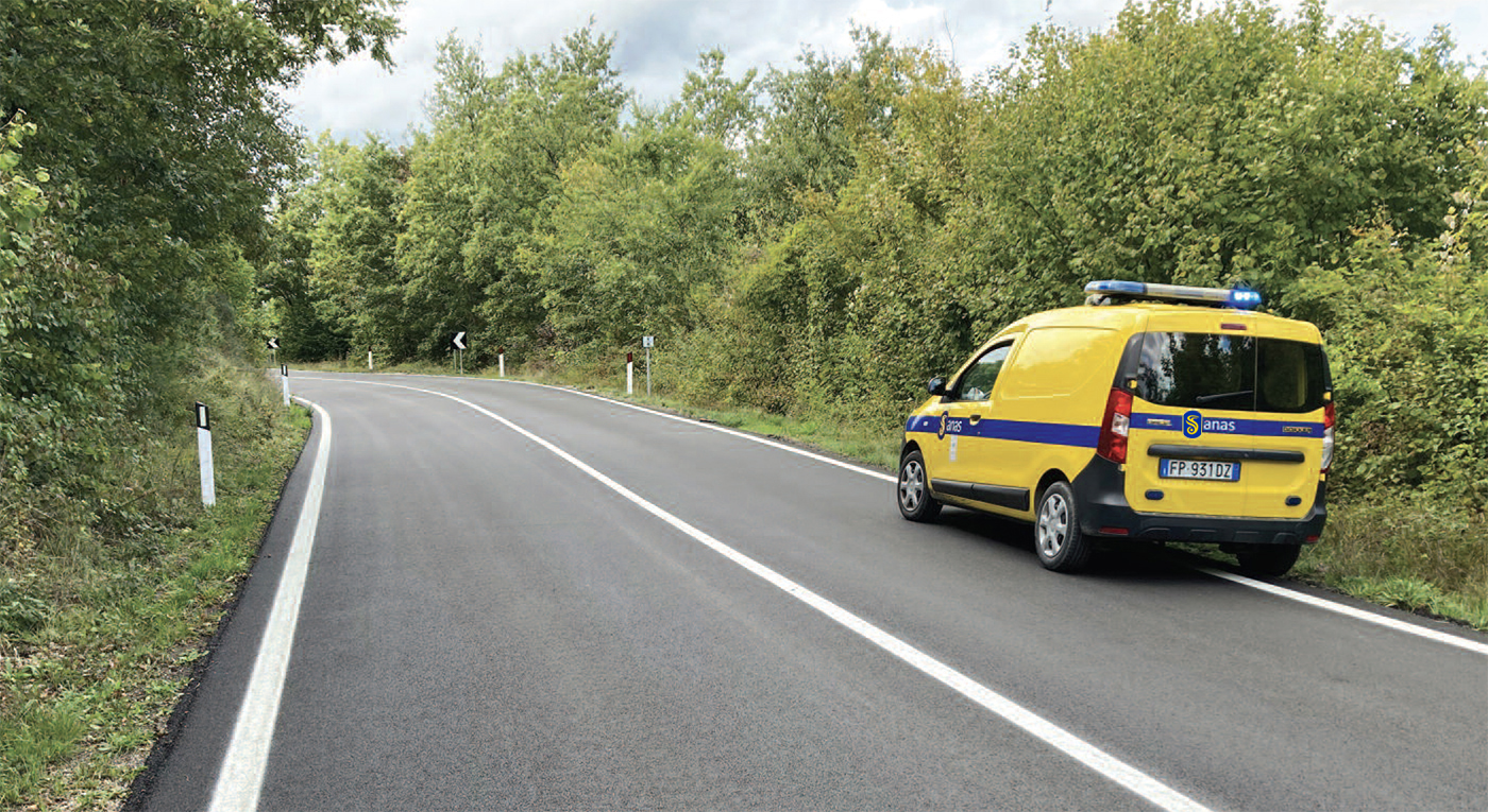
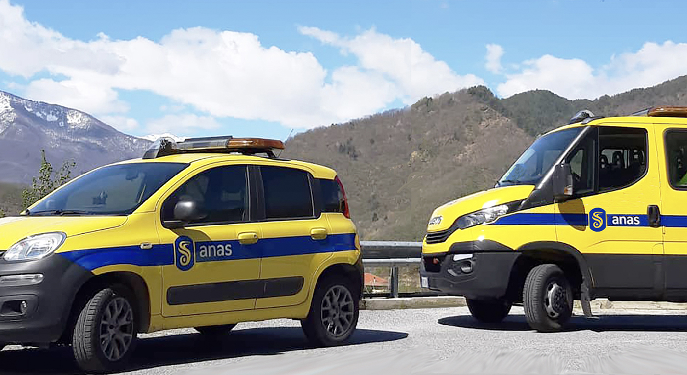
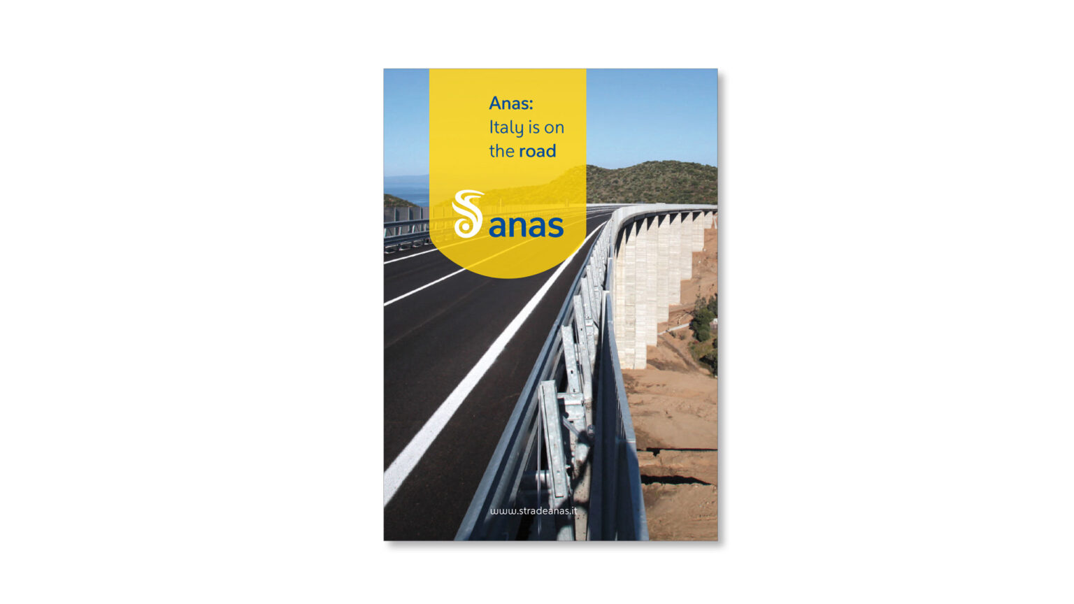
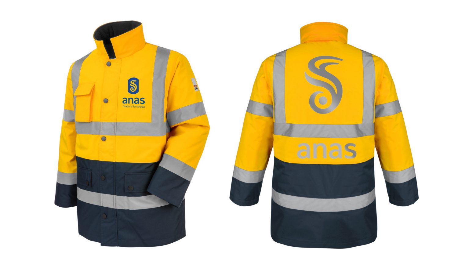
Identity is constructed on unvarying signs that guarantee better recognition. The icon–symbol, font, and powerful yellow combined with blue bring a striking emblematic impact while triggering new empathy in the interaction with the manifold types of user.
An identity system aligning all points of contact with the various stakeholders and arriving at the state of the art.