
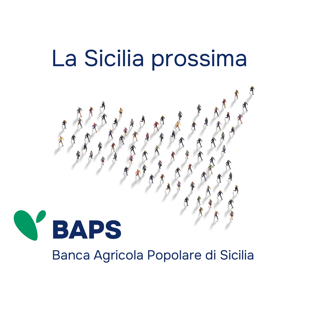
A clear trend is emerging in banking communication: a move toward simplification and the adoption of a tone that is both authoritative and relational. Financial institutions are working to build trust through a sober, direct tone of voice, paired with a clean, essential visual style. The goal is twofold: to convey institutional solidity and to strengthen brand identity in an increasingly digital market.
“In this context,” says Emanuela Camera Roda, Project Director at Inarea, who led the brand identity project for BAPS (Banca Agricola Popolare di Sicilia), “we’re seeing a progressive shift in communication toward the master brand rather than promoting individual products. This approach supports consistency, clarity, and recognizability across all touchpoints—both physical and digital.”
This was precisely the case with BAPS, whose brand identity project was driven by a deep need: to redefine the identity of a historic bank without betraying its territorial roots.
BAPS is, in fact, the only major financial institution operating across the entire region that is authentically Sicilian. It is a cooperative joint-stock bank, and its shareholders—often employees themselves—live and work on the island.
The new narrative set out from this uniqueness, drawing on the historical roots of the cooperative movements which, between the 19th century and the early decades of the 20th, gave rise to organized forms aimed at restoring dignity to disadvantaged segments of the population—those traditionally excluded from access to credit. The symbols of those movements were often linked to the agricultural world: the wheat ear, the rose, the reaper, the bee, and so on.
In this context, and to underscore its distinctly Sicilian character, the new logo adopts a stylized prickly pear paddle—a plant found throughout the Mediterranean, but deeply rooted in the island’s landscape. This choice is meant to evoke, in a simple, iconic, and subtly ironic way, the ability to withstand extreme conditions while continuing to grow and thrive. At the same time, it visually expresses the strong bond that connects BAPS to its territory, moving beyond the ‘traditional’ and typically conservative imagery of the banking sector.
The color green, now a key element of the logo, directly recalls the meaning of the word “agricola” in the bank’s name and implicitly conveys a message of sustainability. At the same time, BAPS’s historic blue is retained in the typography to preserve its institutional tone and maintain continuity with the past. The result is a color identity that balances nature and authority, tradition and innovation.
A consistent system from physical to digital
The project involved a systemic reorganization of the product brands, eliminating unnecessary logos and symbols and bringing everything back under the visual umbrella of the BAPS master brand. This “brand concentration” extended to every aspect of communication—from physical signage, sensitively adapted to specific local contexts, to digital platforms. Formal consistency across all channels became essential to strengthen the sense of belonging to the BAPS universe, making every touchpoint a recognizable and reassuring element.
Territorial and local presence
Even in the digital age, BAPS has chosen not to reduce its physical presence. On the contrary, it has expanded by acquiring new branches across Sicily—reaffirming that, especially for a cooperative and local bank, human connection remains essential. Branches serve as trusted touchpoints, particularly in small towns, helping to preserve strong ties with local communities. The result is a new identity that is strong, cohesive, and contemporary, yet deeply rooted in the bank’s history and values.