Metropolitana Milanese: Iconic Signage and Wayfinding

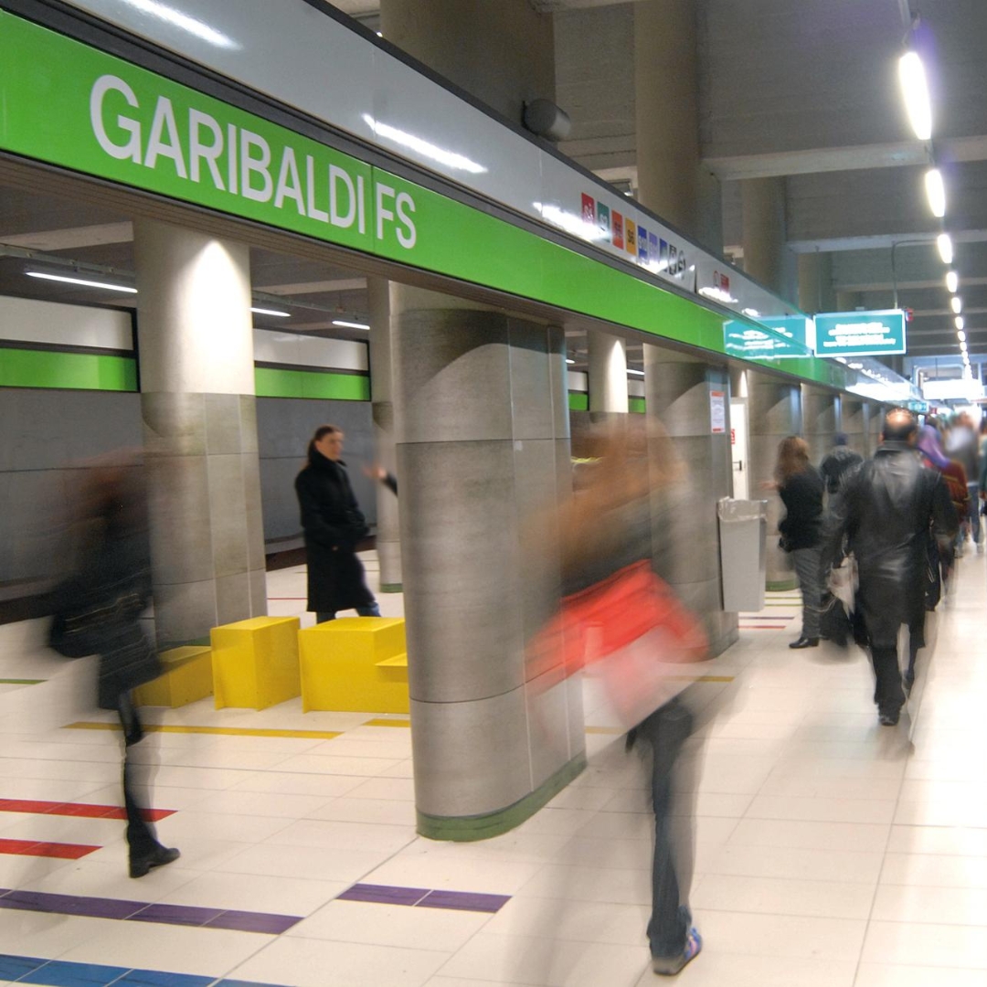
The design of Milan’s Metro Lines 1 and 2 is a milestone in the history of Italian design. This project earned ATM, Franco Albini, Franca Helg, and Bob Noorda the prestigious Compasso d’Oro award in 1964 and introduced the concepts of coordinated image and standardization.One of its most recognizable elements is the continuous perimeter band in the stations, where the station name is repeated every five meters to ensure readability from a moving train. For the signage, Noorda redesigned Helvetica, creating a custom typeface that now bears his name. The expansion of stations and lines over time, along with the need to comply with safety regulations and introduce new services, led ATM to initiate a comprehensive signage and wayfinding refresh starting in the mid-2000s.“Inarea began with the design of Garibaldi Station. It was both stimulating and rewarding to engage with a project like the Milan Metro, which we approached with respect and historical accuracy,” explains Niccolò Desii, Design Director and Partner at Inarea, who has been overseeing the collaboration with ATM for the past twenty years. Signage and Type Design: Interpreting an Icon “We found an interview with Bob Noorda in which he stated that he had wanted to create a lowercase typeface for the Milan Metro. Newer stations with longer names, as well as simple directional messages such as ‘to trains’ or ‘exit,’ required a lowercase typeface for better readability.We developed a font, Metro Type, based on Noorda’s original design, to be used for textual elements on panels, informational signs, and station regulations—essentially, a tool that would allow ATM to communicate in a consistent and cohesive manner.We also undertook a complex update of the signage manual to better integrate the early Metro lines with Line M3, which had introduced discontinuities in elements such as sign architecture and lighting. During that period, the Noorda studio was brought back in to work on updating the typeface.As a result, ATM ended up with two typefaces: Noorda’s original font for station signage and Inarea’s Metro Type for other textual information. However, both coexist harmoniously, as Metro Type was developed as a faithful evolution of the iconic 1964 design.” Rules and Wayfinding for a Timeless Design “After working on the signage and wayfinding for Garibaldi Station, we went on to design the systems for ten more Metro stations. Over time, we have continued to update signage, vehicle liveries, and surface transport elements, culminating in our work on Line M4, where we created the updated mobility map.We developed a set of simple rules and algorithms to ensure the coherent, uniform, and functional distribution of signage within each station. This approach prevents an overload of information in narrow or high-traffic areas while ensuring that signs are strategically placed at key junctions—or, when distances are significant, as confirmation markers along the route.For major interchange stations where multiple lines intersect, we established general guidelines. The handbook outlines key specifications, such as luminescence levels and whether signs should be positioned orthogonally or laterally to entry points.Additionally, we redesigned the pictograms and more technical regulatory signage, making it easier for those managing the system to categorize information and plan the future distribution of signs within station spaces.”

Milan: A City in the Spotlight

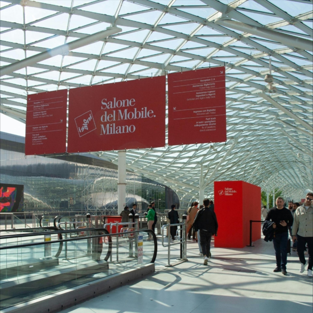
Milan Design Week is a showcase of globally recognized excellence and innovation. Its foundation lies in a deep-rooted design culture—furniture design—which has historically shaped the city’s identity. Since 1961, this has been represented by the Salone del Mobile trade fair, and since 1990, thanks to Interni magazine, by the FuoriSalone, a citywide network of events that transforms Milan into the world’s design capital. “The real question today,” comments Antonio Romano, “is how to strengthen the identity of the Salone del Mobile and define the evolving role of Design Week. Looking ahead, it cannot remain confined solely to furniture design (and its closest derivatives), especially as the term design is now one of the most widely adapted words in every vocabulary—even philosopher Luciano Floridi describes his field as conceptual design! What concerns me, ultimately, is success turning into self-celebration. That’s why Design Week must embrace the many dimensions of design, exploring their intersections and leveraging Milan’s long-standing ability to attract creativity.” How Can Milan and Design Week Stay Attractive? “We need to rethink FuoriSalone without weakening Salone del Mobile. It’s essential to promote a city-wide program of events that go beyond what happens at the fair and the furniture sector—preserving the quality of Milan’s genius loci while embracing international experiences. Milan must remain in the spotlight by enhancing its appeal across different creative and industrial fields.However, if the event becomes too focused on spectacle or turns into mere self-congratulation, its future is uncertain. The key shouldn’t be the obsession with the present moment or the relentless pursuit of the ‘new & more new’ driven by likes and instant metrics.” What does Milan represent for Inarea? “We opened our Milan offices in 1988: Enichem had become an important client, and we needed to ensure a near-daily presence. Shortly after, Snam and Union Carbide joined, and with the latter, we began a collaboration at a European level. Because Milan at that time was also this: a design capital where you could meet international players. Our first foreign clients were gained precisely because of our presence here.In 1999, we won the competition to redesign the city crest and reorganize the identity system for the Municipality of Milan. This project allowed us to capture the essence of the city at a critical moment in its history, highlighting the distinctive Milanese combination of a deep attachment to tradition and a passion for innovation. The new design of the crest quickly replaced all previous versions, but the core of the project was the intention to turn the word ‘Milan’ itself into a brand. After all, many businesses (starting with Prada) had already associated their brands with their Milan identity, clearly proving that the city itself was (and still is) an added value. We designed a new typeface – aptly named Milano City – and separated the word from the phrase ‘Comune di Milano.’ The project was halted when the Albertini administration ended; though it still exists, it has since been modified.During these years of profound urban transformation, we also completed significant branding projects for real estate developments that reshaped the city’s skyline: Milano Santa Giulia, followed a few years later by Milano Porta Nuova, and later Pirelli RE (now Prelios). Staying within the realm of Milan-based institutions, it’s worth noting our rebranding work for Borsa Italiana and Edison. Additionally, in the energy sector, we also created the name and brand for the new Lombard multiutility, A2A.” “In the same sector, but in more recent times, we worked on the rebrandings of Snam and Italgas, and continuing from memory, the brand identities for the Italian Infrastructure Fund F2i, Fondazione Cariplo, Fondazione Fiera Milano, Conservatorio di Milano, Casa Milan, and many other projects, some born in Milan but destined elsewhere, such as the brand identity for the Venice Biennale, which truly deserves a mention… However, one of the most enduring projects, which impacts the daily life of Milanese citizens, is the rationalization of ATM‘s wayfinding system. For this, we revised the signage (the pictogram system) and created a custom typeface (Metro Type).”

Newsletter 01-25

Warning: realpath(): open_basedir restriction in effect. File(/var/www/domain/inarea.com) is not within the allowed path(s): (/var/www/virtual/inarea.com:/tmp:/var/lib/php5:/usr/share/php) in /var/www/virtual/inarea.com/htdocs/wp-includes/l10n/class-wp-translation-controller.php on line 106 Warning: realpath(): open_basedir restriction in effect. File(/var/www/domain/inarea.com) is not within the allowed path(s): (/var/www/virtual/inarea.com:/tmp:/var/lib/php5:/usr/share/php) in /var/www/virtual/inarea.com/htdocs/wp-includes/l10n/class-wp-translation-controller.php on line 106 Warning: realpath(): open_basedir restriction in effect. File(/var/www/domain/inarea.com) is not within the allowed path(s): (/var/www/virtual/inarea.com:/tmp:/var/lib/php5:/usr/share/php) in /var/www/virtual/inarea.com/htdocs/wp-includes/l10n/class-wp-translation-controller.php on line 106 January 2025 “When the result surprises me, it means that only the essential remains on the page. There is lightness, yet it conveys everything. This is the reason behind the predominant white background in our images.” Antonio Romano 40 years of metaphorical images. Topics The Calendar is a complex and emblematic project that embodies Inarea’s methodology. The philosophy behind each image can be traced back to the early works of the 1980s. Even before taking shape, it adheres to a precise way of thinking and creating. It is a metaphor—both in its use of images, which are ironic, surprising, and handcrafted, and in the underlying mission of identity design: the ability to perceive what already exists, forging unexpected connections to inspire new ways of seeing. Full Article Calendarea: Reflections and Behind the Scenes VVoices Beyond its thirtieth edition, we reflect on the essence of the Inarea Calendar and its yet-unexplored potential. And, in light of the complexities of its creation, we consider how this project might evolve. 1998 ZIP Code 2016 Renaissance 2024 Pet Terapyer 1991 Tools of the Communication Trade 2011 A step ahead 2021 Me tool Uncompromising quality and a rigorous code in the (analog) construction of images are the defining elements of the Inarea Calendar. Given that, over the years, it has garnered a wide base of devoted supporters, is it possible to reinterpret this project with new tools without betraying its identity? And how can we enhance the value of a heritage of hundreds of archival images, the result of over thirty years of creation? Monica Solimeno, Project Director at Inarea, shares her insights with us. Full Article News & Events Those who have traveled on Italy’s motorway network in the past three months may have noticed that Autostrade per l’Italia has changed its brand identity—a nod to the “&” symbol that signifies connection, just as its roads link the country together. It is the rebranding designed by Inarea. Click Here The Australian Open has just concluded, and the Italian team has made a remarkable impression. To celebrate the passion and success in racket sports, FITP has entrusted Inarea with the creation of its sonic identity. Click Here

Newsletter 02-25

“I realized that there is no real and objective separation between sound and silence, but only between the intention to listen and the intention not to.” John Cage That sound that goes through the mind Voices In a world saturated with images, sound is one of the elements that most captures attention. It is the stimulus that the human brain perceives the most quickly. Identifying a brand’s identity with a key sonic concept, capable of translating into the different languages of the company, means creating a powerful and deeply rooted tool. This is explained by Enrico Giaretta, “cantaviator” and Sonic Brand Director at Inarea, who also introduces the concept of a “sonic alphabet”: for a communication of pure music. Full Article Sonic Identity, the Difference in a Chord Topics Attention towards sonic identity design is growing not only due to the proliferation of digital channels and touchpoints but also because sound interacts with users on a more emotional level. BAULI Case Study Banca IFIS Case Study FIGC Case Study FITP Case Study Uncompromising quality and a rigorous code in the (analog) construction of images are the defining elements of the Inarea Calendar. Given that, over the years, it has garnered a wide base of devoted supporters, is it possible to reinterpret this project with new tools without betraying its identity? And how can we enhance the value of a heritage of hundreds of archival images, the result of over thirty years of creation? Monica Solimeno, Project Director at Inarea, shares her insights with us. Full Article News & Events Green to evoke sustainability, a central driver of the strategic plan, and blue to recall the sea surrounding the island. Inarea designs the logo for BAPS (Banca Agricola Popolare di Sicilia), the first cooperative bank in Italy, following the merger of Banca Popolare Sant’Angelo and Banca Agricola Popolare di Ragusa, representing the synthesis between continuity and the future. The reference to the heraldic coat of arms of the Puglia Region is combined with the design of branches and leaves within an octagonal shape, evoking the architecture of Castel del Monte and the concept of diversity and cultural richness of the territory. This is the new logo with which the Puglia Region presents itself in 2025.