For over twenty years, Comtel has been a leader in Italy in ICT systems integration, with the goal of connecting people, technologies, and information in a single dynamic and scalable infrastructure. Founded in 1992 as Intelrom, Comtel has experienced constant growth, marking important milestones such as the acquisition of branches from Alcatel Italia and entry into new strategic areas. Since 2020, it has been part of the Nextaly group, expanding its offerings with vertical solutions such as hospitality, finance, private, modern work, data center, and cybersecurity. In 2025 the company was listed on Euronext Growth Milan and acquired NovaNext, consolidating its leadership. With an eye towards international development, Comtel has also acquired NEC Italia and NEC Nederland, which also includes the branch in the United Arab Emirates.
Naming in strategic positioning
Inarea, which handled the repositioning and rebranding of Comtel and the group it belongs to, Nextaly, supported the company in the acquisition and integration process of NEC Italia and NEC Nederland. The intervention also redefined, among other things, the naming of the two acquired entities. The goal was to align the identity of the new subsidiaries with the Comtel masterbrand, while maintaining their own recognizability, consistent with their respective reference markets. Thus, “Comtel Innovation” was created for Italy and “Comtel International” for the Netherlands, reflecting the mission of the two companies within the group’s global vision. The group, through the tagline “a Nextaly Company,” gives greater impact and highlights the critical mass of the entire business system.
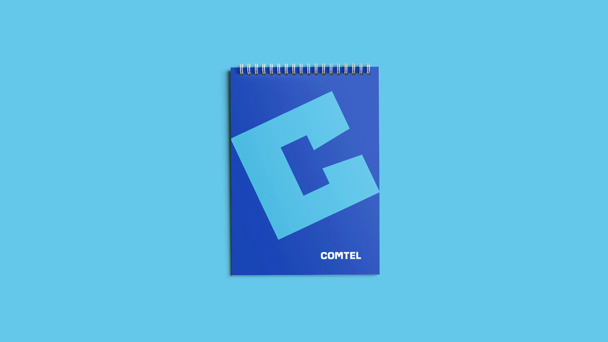
Brand design Graphic synthesis in two letters
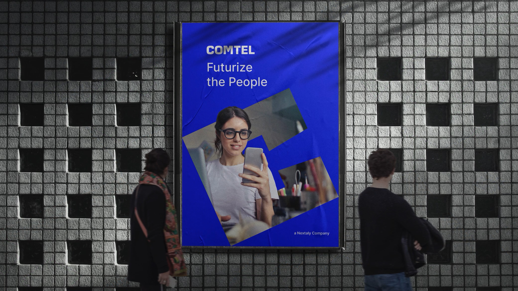
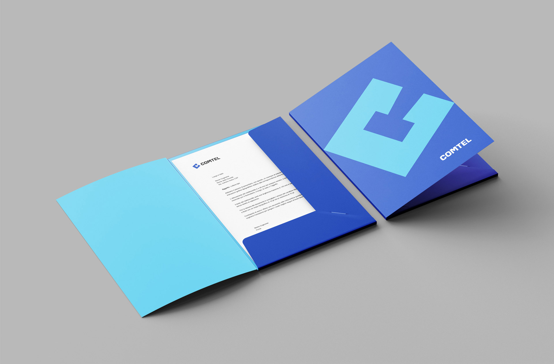
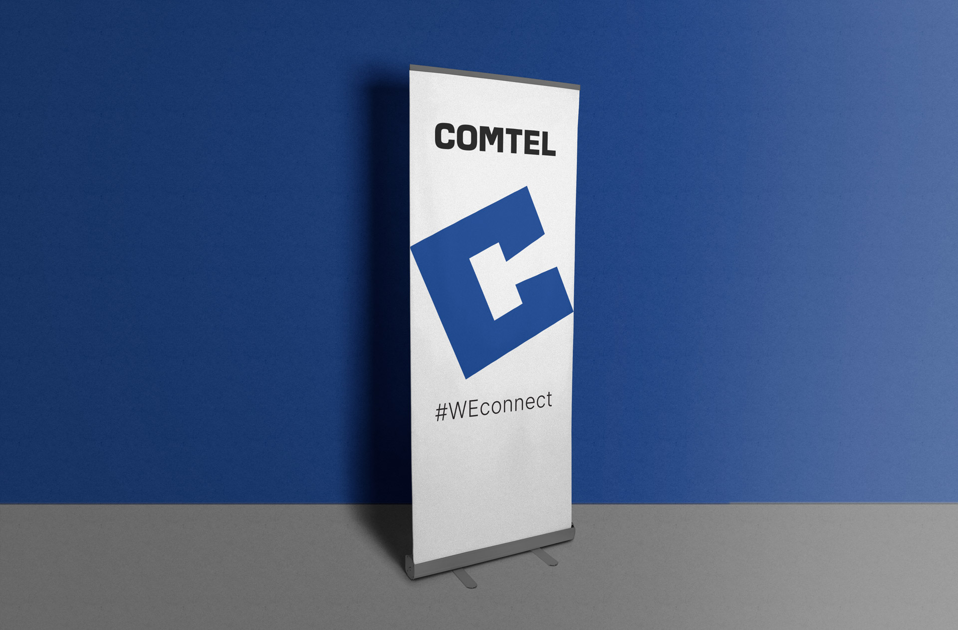
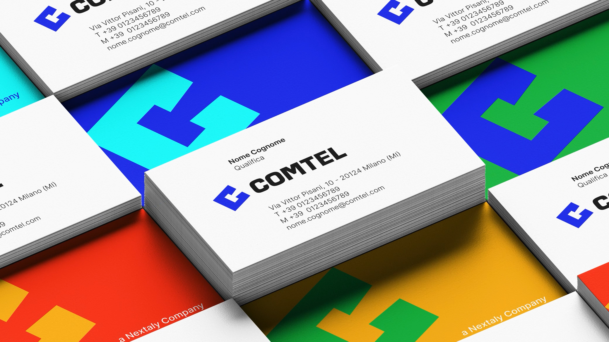
The Comtel logotype is built around the “CT” symbol, in which the “T” in negative creates the “eye of the C” within a square shape, allowing for a smooth and integrated reading of the two letters. The logo is tilted at 25° and accompanied by slightly squared characters. The institutional colors are blue, white, and black, and the system font is the Sans Serif “Inter,” chosen for its visual clarity and versatility across the brand’s various touchpoints.
Communication design: brand languages
The brand languages include a wide range of applications, both on physical and digital media, from corporate presentations to packaging, trade show materials, as well as apps and advertising. The brand identity was designed to ensure a high degree of flexibility in use. For example, the logo can integrate photographic images with sharp subjects that partially emerge from the shape to create a sense of depth and three-dimensionality. Patterns have also been developed, adaptable in the colors of the institutional palette.