Dicolab is a free training program aimed at strengthening the digital skills of public and private professionals in the broad cultural sector, supporting them as they face the challenges of digital transformation. Implemented by the Fondazione Scuola Beni e Attività Culturali, it offers a comprehensive training program designed to foster the development of a digital cultural ecosystem—one that can train, guide, and support individuals, organizations, and professional communities.
Naming. A versatile brand
Digital, Skills, Laboratory: these are the three key words that form the acronym Dicolab, around which the brand identity has been built, emphasizing the values of completeness, collaboration, and versatility in the training program.
Brand design The dynamic essence of a letter
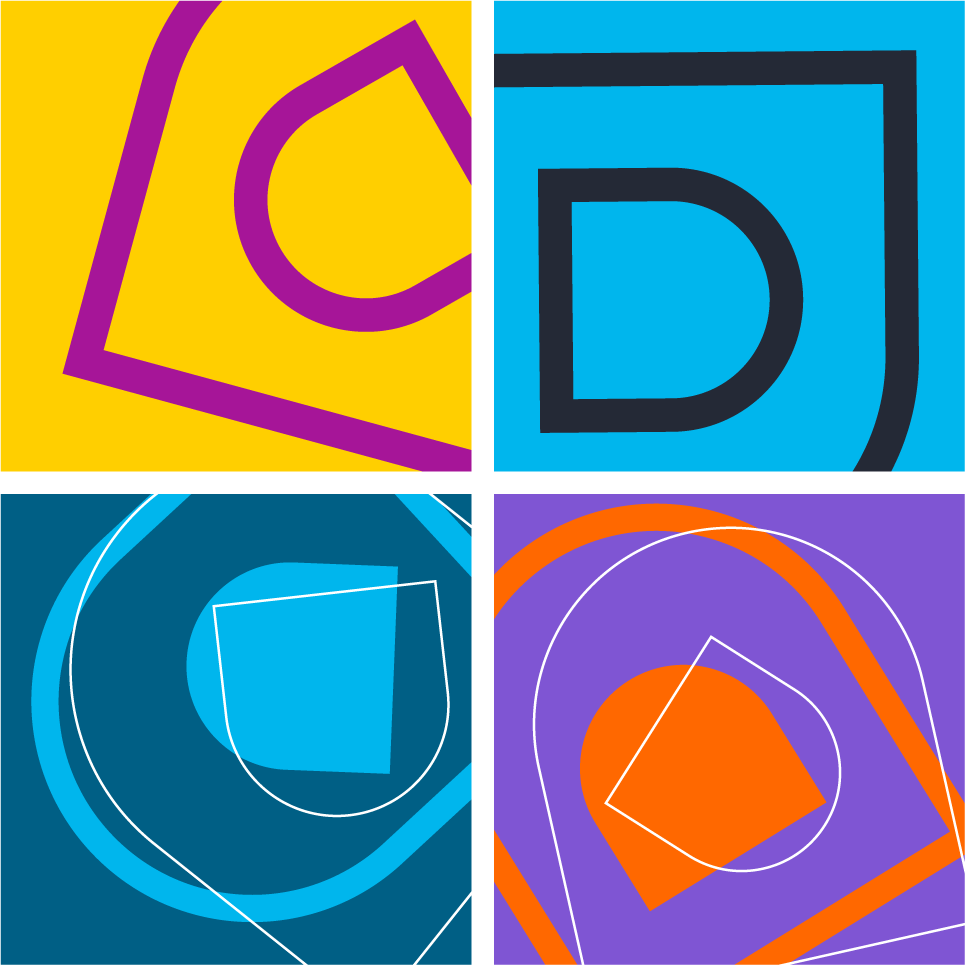
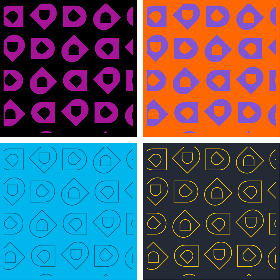
Dicolab’s identity is built around the distinctive use of the initial letter “D,” which, from a simple initial, becomes an icon. The solid form of the “D” is simplified for immediacy and enhanced internally by a counter rotated counterclockwise.
The essential nature of the symbol is complemented by the monumentality of the Blacker serif typeface, used for the logotype. Its sculpted serifs make it particularly well-suited for digital contexts.
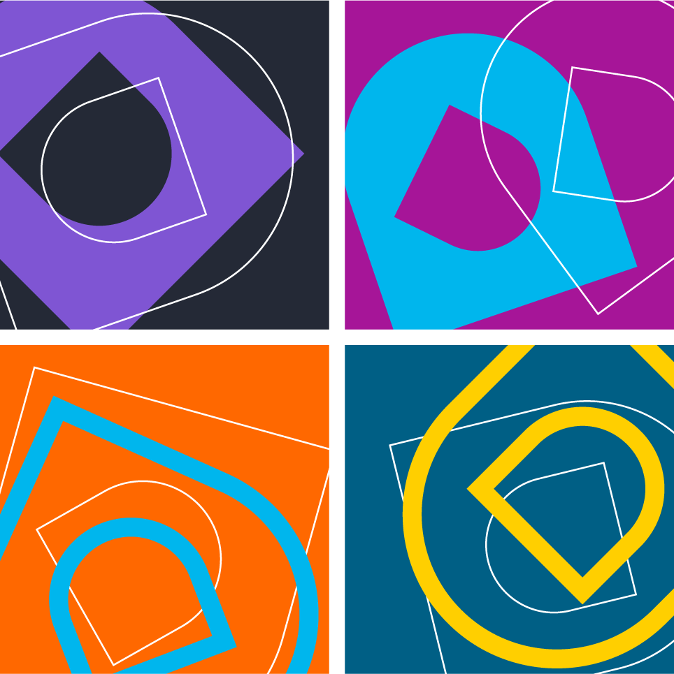
Communication design. Identity in motion
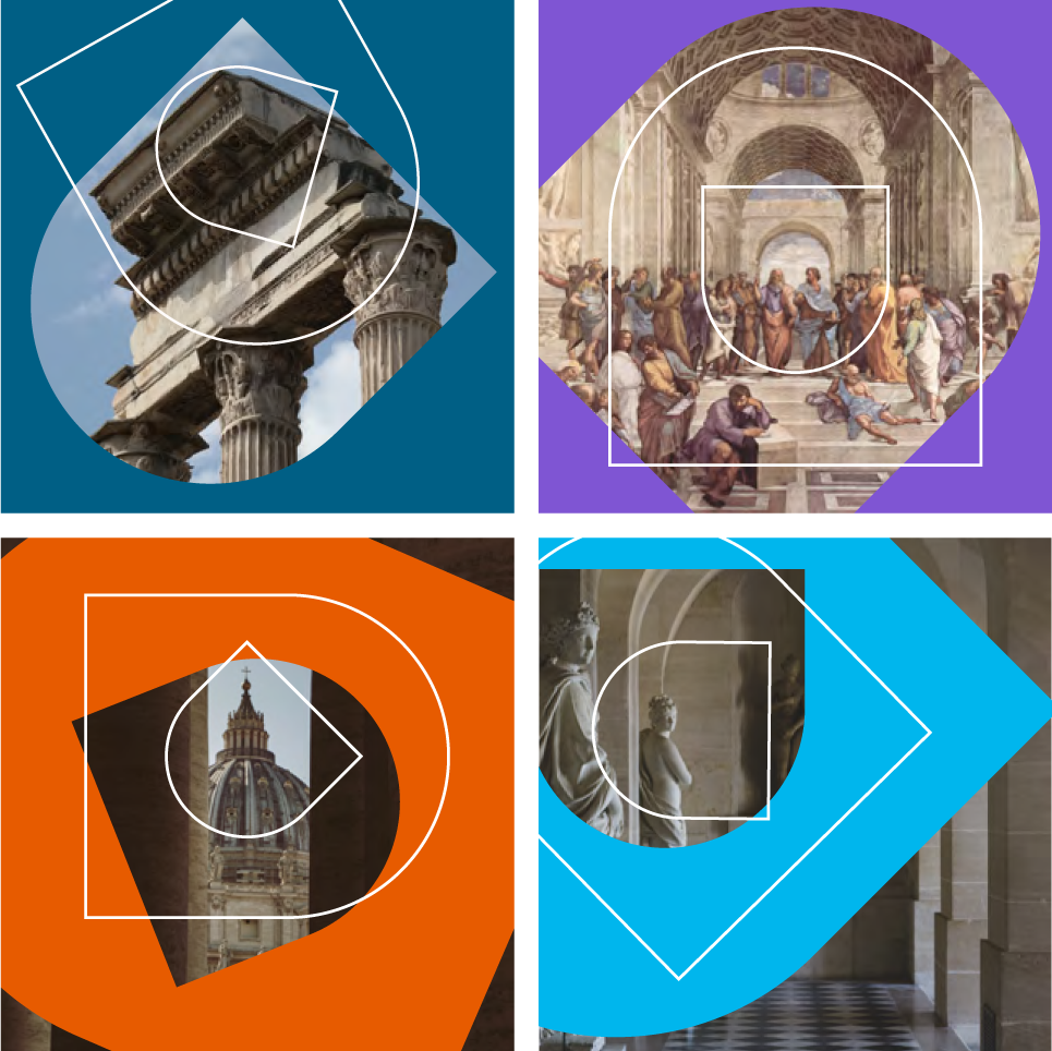
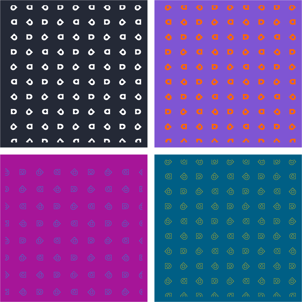
The brand’s visual language is enriched by the “flash”, created through the combination of multiple treatments of the letter D. These treatments range from outline versions in different weights to solid logo variations and make extensive use of the institutional color palette. The various phases of rotation of the overlapping elements express the breadth of the Dicolab offering, evoking the idea of an open, ever-evolving project.