“Living in Milan, I was accustomed to change without the need to emigrate elsewhere.”
Maurizio Nichetti
Milan: A City in the Spotlight
Voices
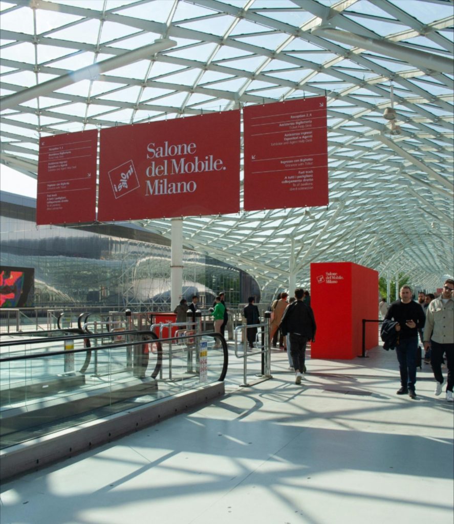
The Salone del Mobile and Design Week have long been a prominent global stage for Milan. However, it is inevitable that their established success can lead to forms of self-celebration, which, in the long run, pose a threat to the role the City plays, especially in an era of constant change that affects every aspect of design. Some thoughts by Antonio Romano.
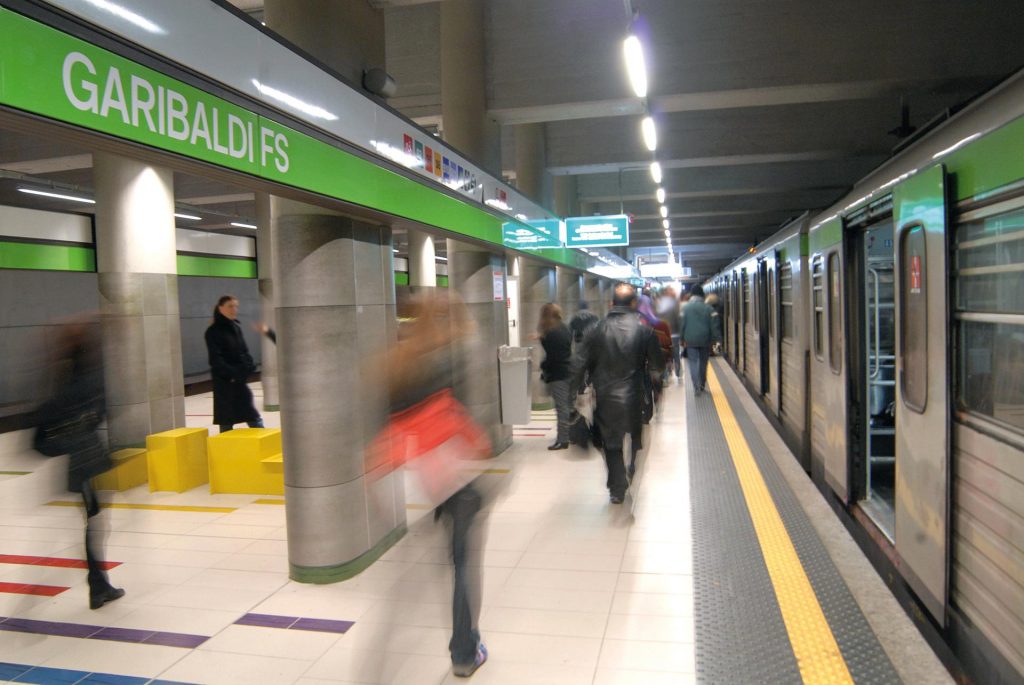
Metropolitana Milanese: Iconic Signage and Wayfinding
Backstage
The Milan Metro is a project that belongs to the collective imagination and experience. Inaugurated in 1964, it introduced key innovations in signage, which have since required updates. How do we design a signage and wayfinding system that remains efficient over time while also interpreting an icon? We discuss this with Niccolò Desii, Design Director and Partner at Inarea, who has been collaborating with ATM for twenty years.
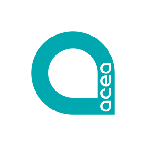
The “A” evokes a drop of water, symbolizing both the simplicity and preciousness of this natural resource. Introduced in 2023 to emphasize Acea’s commitment to developing a national water network, the logo evolves in 2024 to celebrate the company’s 115th anniversary.
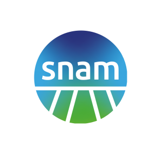
On its 75th anniversary, SNAM renews its brand identity. The new logo, designed by Inarea—partnering with the company since 2011—highlights the sustainable nature of natural gas through the use of green, while the introduction of lowercase letters symbolizes a closer connection to people.