“I realized that there is no real and objective separation between sound and silence, but only between the intention to listen and the intention not to.”
John Cage
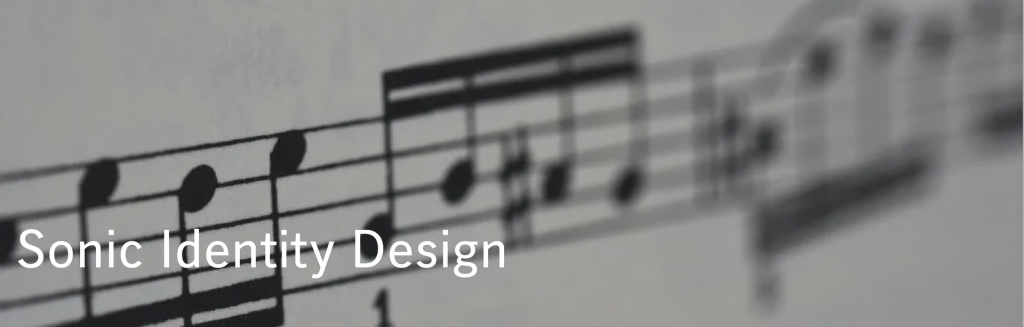
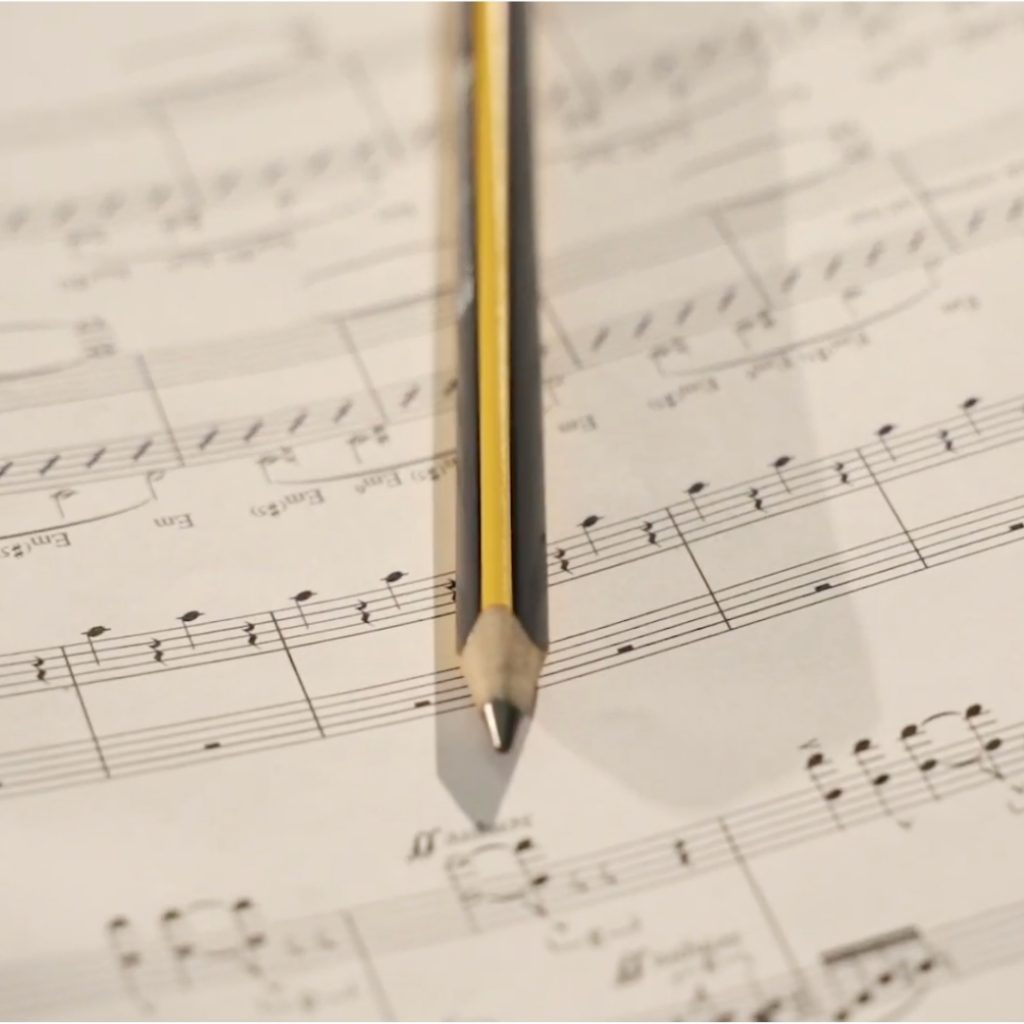
That sound that goes through the mind
Voices
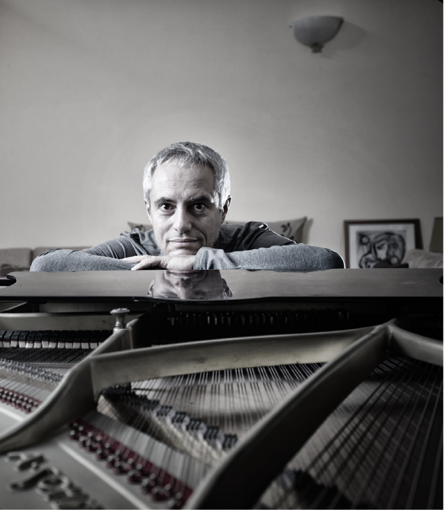
In a world saturated with images, sound is one of the elements that most captures attention. It is the stimulus that the human brain perceives the most quickly. Identifying a brand’s identity with a key sonic concept, capable of translating into the different languages of the company, means creating a powerful and deeply rooted tool. This is explained by Enrico Giaretta, “cantaviator” and Sonic Brand Director at Inarea, who also introduces the concept of a “sonic alphabet”: for a communication of pure music.
Attention towards sonic identity design is growing not only due to the proliferation of digital channels and touchpoints but also because sound interacts with users on a more emotional level.
Uncompromising quality and a rigorous code in the (analog) construction of images are the defining elements of the Inarea Calendar. Given that, over the years, it has garnered a wide base of devoted supporters, is it possible to reinterpret this project with new tools without betraying its identity? And how can we enhance the value of a heritage of hundreds of archival images, the result of over thirty years of creation? Monica Solimeno, Project Director at Inarea, shares her insights with us.
Green to evoke sustainability, a central driver of the strategic plan, and blue to recall the sea surrounding the island. Inarea designs the logo for BAPS (Banca Agricola Popolare di Sicilia), the first cooperative bank in Italy, following the merger of Banca Popolare Sant’Angelo and Banca Agricola Popolare di Ragusa, representing the synthesis between continuity and the future.
The reference to the heraldic coat of arms of the Puglia Region is combined with the design of branches and leaves within an octagonal shape, evoking the architecture of Castel del Monte and the concept of diversity and cultural richness of the territory. This is the new logo with which the Puglia Region presents itself in 2025.