Healthcare and Identity

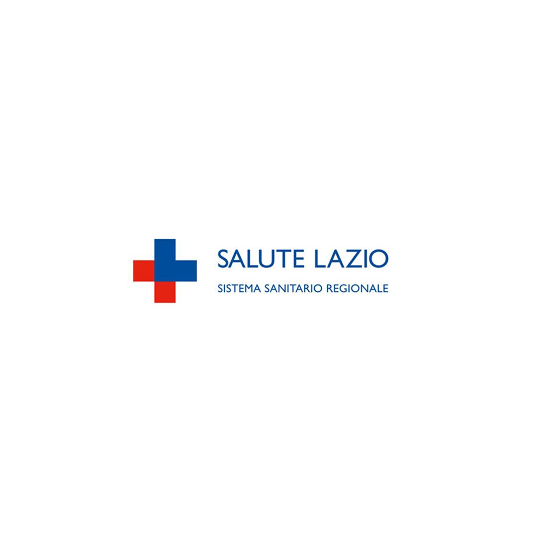
From hospitals to foundations, from pharmaceutical companies to regional health systems, Inarea has told the story of healthcare through brand identity.Each project is a way to make “care” visible — in symbols, in names, in spaces.And above all, in relationships. Public Healthcare: standardizing to humanize The identity projects for the Emilia-Romagna and Lazio Regions introduced an “umbrella brand” approach capable of bringing coherence to a complex, often heterogeneous, and layered system. Salute Lazio is an example of rationalization that goes beyond aesthetics: it makes services, hospitals, and communications immediately recognizable, fostering a unified language between institutions and citizens. The goal is to create a healthcare system that is more accessible and easy to understand, where the graphic symbol becomes an implicit mark of recognition — and therefore, a guarantee for citizens.The rebranding of Salute Lazio took shape through a strategic intervention that simplified and unified the identity of the regional healthcare system. The new name, “Salute Lazio,” is accompanied by the descriptor “Regional Healthcare System,” while the logo was designed to visually evoke the red cross, the universal symbol of healthcare. The graphic symbol, derived from the letter “L” in Lazio, ideally reconfigures a red and blue cross and has been used as a distinctive element throughout all communications, creating a coherent and easily recognizable system. This approach made it possible to integrate the various regional healthcare structures under a single identity, streamlining and rationalizing the overall service offering while enhancing the effectiveness of institutional communication. Hospitals and Foundations: welcoming spaces From the Gemelli University Hospital to the Bambino Gesù Children’s Hospital and the Santa Lucia Foundation, Inarea has supported these prestigious institutions in building a visual identity capable of making hospital environments more contemporary and empathetic. The wayfinding system at Gemelli, inspired by major airport hubs, was designed to facilitate patient movement, restoring a sense of autonomy and confidence. Its brand identity, developed to mark the hospital’s fiftieth anniversary, translates the institute’s founding values into a visual language: Catholic roots, care for the individual, and a vision of healing as a vital act. The Gemelli blue and the “G” that unfolds into a cross, leaves, and a human figure together tell the story of a form of medicine that unites faith, science, and humanity. In the case of Santa Lucia, the Tree of Life symbol evokes a sense of rebirth, while at the same time recalling the two hemispheres of the human brain — roots and thought, matter and mind. Industry and research: when the brand unifies Private healthcare and the pharmaceutical sector represent the other half of the story. Inarea developed the visual identity for GVM (Gruppo Villa Maria), simplifying its name and strengthening its positioning as a network of excellence in care and research. The Angelini Industries project, on the other hand, brought together a wide range of diverse activities, placing purpose and direction before traditional, product-based distinctions. The pharmaceutical field, in fact, represents just over half of the entire system.The Aventis Pharma case, from the early 2000s, stands as a paradigmatic example in the history of pharmaceutical branding. It created a unified packaging system for ethical products within a multinational company born from the merger of six different brands, giving a single voice to medicines distributed worldwide while maintaining full compliance with local regulations. It was, in effect, defined as a universal visual code — a language of symbols, colors, and informational hierarchies capable of making each medicine instantly readable, regardless of the target market. Over time, the project remains an important example of how branding can serve not only as an expression of identity, but also as an organizational lever, capable of restoring order and clarity. Foundations of the common good From Smile House, which treats craniofacial malformations, to the Veronesi Foundation and the Piedmont Foundation for Cancer Research, design becomes an ethical language. Each brand is an act of giving back — a way to give form to solidarity, to research, and to hope. For example, the rebranding of the Veronesi Foundation — an institution that supports excellence in scientific research and promotes a culture of prevention — enhances the legacy of its founder and, through the “V” in the logo, becomes a human and dynamic symbol, capable of adapting to the various fields of research represented by the ribbon, the universal symbol of struggle and hope. Even in healthcare, branding is an infrastructure of meaning — a tool for making care more human, and therefore, more effective.

Milan: A City in the Spotlight

Milan Design Week is a showcase of potential and leadership recognized worldwide. It is rooted in a unique vision of design—specifically furniture design—that has developed historically within the very fabric of the city. Since 1961, this has been represented by the Salone del Mobile, the international furniture fair, and since 1990, by the FuoriSalone, a city-wide network of events initiated by Interni magazine. “The real question today,” comments Antonio Romano, “especially in an edition where the industry must also grapple with tariffs imposed by Trump, is how to strengthen the identity of the Salone del Mobile and define the role that Design Week is meant to play. Looking ahead, we cannot limit everything to furniture design (and its closest derivatives), particularly at a time when the word design is one of the most widely used adjectives in every vocabulary… even the philosopher Luciano Floridi defines his field as conceptual design! What truly concerns me is when success turns into self-celebration. That’s why Design Week must open up to the many dimensions of the discipline, exploring their interactions and building on Milan’s long-standing ability to attract creativity.” How Can Milan and Design Week Stay Attractive? “We need to rethink FuoriSalone without weakening Salone del Mobile. It’s essential to promote a city-wide program of events that go beyond what happens at the fair and the furniture sector—preserving the quality of Milan’s genius loci while embracing international experiences. Milan must remain in the spotlight by enhancing its appeal across different creative and industrial fields.However, if the event becomes too focused on spectacle or turns into mere self-congratulation, its future is uncertain. The key shouldn’t be the obsession with the present moment or the relentless pursuit of the ‘new & more new’ driven by likes and instant metrics.” What does Milan represent for Inarea? “We opened our Milan offices in 1988: Enichem had become an important client, and we needed to ensure a near-daily presence. Shortly after, Snam and Union Carbide joined, and with the latter, we began a collaboration at a European level. Because Milan at that time was also this: a design capital where you could meet international players. Our first foreign clients were gained precisely because of our presence here.In 1999, we won the competition to redesign the city crest and reorganize the identity system for the Municipality of Milan. This project allowed us to capture the essence of the city at a critical moment in its history, highlighting the distinctive Milanese combination of a deep attachment to tradition and a passion for innovation. The new design of the crest quickly replaced all previous versions, but the core of the project was the intention to turn the word ‘Milan’ itself into a brand. After all, many businesses (starting with Prada) had already associated their brands with their Milan identity, clearly proving that the city itself was (and still is) an added value. We designed a new typeface – aptly named Milano City – and separated the word from the phrase ‘Comune di Milano.’ The project was halted when the Albertini administration ended; though it still exists, it has since been modified.During these years of profound urban transformation, we also completed significant branding projects for real estate developments that reshaped the city’s skyline: Milano Santa Giulia, followed a few years later by Milano Porta Nuova, and later Pirelli RE (now Prelios). Staying within the realm of Milan-based institutions, it’s worth noting our rebranding work for Borsa Italiana and Edison. Additionally, in the energy sector, we also created the name and brand for the new Lombard multiutility, A2A.” Within the same broader field, though in more recent years, we’ve seen the rebranding of Snam and Italgas, and—just to name a few from memory—the brand identities of the Italian Infrastructure Fund F2i, Fondazione Cariplo, Fondazione Fiera Milano, the Milan Conservatory, Casa Milan, as well as many other projects that may have originated in Milan but were destined for broader horizons, such as the brand identity for the Venice Biennale, which certainly deserves to be remembered.There are also long-term projects that directly impact the daily lives of Milan’s citizens—like the rationalization of ATM’s wayfinding system, which included a redesign of signage (the pictogram system) and the creation of a dedicated display typeface, Metro Type.

Enrico Giaretta. What is Sound Design?

“In a world saturated with images, sound is one of the most powerful attention triggers—even with eyes closed,” begins Enrico Giaretta, musician, composer (or rather, “cantaviatore”) and Sonic Brand Director at Inarea. After various experiences with overseas agencies, Giaretta brings to Inarea a unique approach to sound design, centered around a core concept: a ‘pure sound source’ as the foundation for multiple outputs. The goal is to provide the brand with a communication tool that seamlessly integrates into its identity world, much like a symphony. In general, creating a sound is not complex; what is challenging is crafting one that can integrate across all levels and forms of corporate communication. It’s similar to the red used by Valentino Garavani, which, regardless of the garment it’s applied to, is always associated with the designer. How is a brand’s sonic identity built? “Once we understand the content, values, and meanings associated with a brand, as well as its existing sonic elements and characteristic phonemes,” Giaretta continues, “we then identify the physical and digital touchpoints where the brand can be perceived. For example, sounds below 80 Hz are not audible on all mobile devices, while in environments like a stadium, frequencies can drop well below 80 Hz. Next, we define the brand’s sonic DNA: that unique and recognizable source that allows the brand to be instantly associated with its sound. For example, the sound essence of Banca Ifis is characterized by a “glissando” that recalls its payoff “the value of growing together.” For Bauli, we selected the A3 note (at 440 Hz), the tuning reference for nearly all instruments, which we associated with the animation of the letter “i” at the end of the sound logo.” The sound logo is usually less than two seconds long. The shorter and more essential it is, the more effective and memorable it becomes, and consequently, the more enduring over time. Towards a Sonic Future: Inarea’s Musical Alphabet If words are increasingly intertwined with sound, and sound itself is deeply connected to perception—since the human brain reacts more quickly to auditory stimuli than any other, interpreting a sound in just 0.146 seconds—then the next step could be enabling a brand’s communication through music alone. With this goal in mind, at Inarea, we are developing the concept of a “sound alphabet,” which assigns a musical note to each letter, creating a universal language. This is a pervasive and engaging tool that, starting from a simple identifying sound cell, can transform into small melodies and even into complex brand themes. A prime example of this is Beethoven’s Symphony No. 5, which emerges from the evolution of a simple rhythmic cell composed of just four notes.

A 100-year-old encyclopedia in the digital age.

“A century ago,” begins Antonio Romano, “Giovanni Treccani and Giovanni Gentile brought together the brightest minds of the time to create a ‘national’ identity, expressed through the unity of Italian cultural heritage.” The first edition of the Treccani Encyclopedia was published in 1929 and completed in 1937: 35 volumes, plus one of indexes, which have served as a backdrop to many portraits of important figures. It became an ‘interior monument’ that has grown over time and enriched the knowledge of many. Then, with the advent of digital technology, this heritage became dematerialized but did not lose its authority. The entries in Treccani represent the most credible and accurate source, even in Google searches: a certification that provides certainty in contrast to the randomness of Wikipedia or the approximation of social media, or, more generally, the internet. What is the significance of an online encyclopedia in the digital age? “Although the vision of encyclopedic, unified knowledge may seem rather outdated in the age of Google, the true contemporary significance and value of the Treccani Encyclopedia lies in being a universally recognized reference. This is a crucial merit in an era of fake news, where we are no longer able to interpret phenomena through cause-and-effect relationships. The digitization process of Treccani was initiated in 1993 by Rita Levi Montalcini, then president of the Institute of the Treccani Encyclopedia, with the goal of making it a reference point for new generations. What was then unforeseeable, and what makes its online accessibility even more relevant today, is that with digital technology and social media, we have transitioned from a visual culture, typical of the last century, to one centered on written words. Everything is consumed through Google search strings, which, to quote Alessandro Baricco, has changed our posture towards life.” “How can the heritage of an encyclopedia be translated into a multimedia format?” “At the core of the rebranding developed in 2020 was the desire to establish a connection with an intangible identity that carries authority. We had to realign the brand architecture, which had been structured around a system of editorial products (and more), making it unified and adaptable to the multimedia nature of the digital world. We modified the ‘tree’ T and replaced the previous font with a Sans Serif (bastoni, without serifs) to ensure better readability, even at smaller sizes. Finally, we translated the theme of the frame, which defines the structured composition of Treccani publishing and draws from both rationalist culture and the tradition of bookbinding, into recurring frame motifs across all new editorial formats, from digital to print.” “Read Antonio Romano’s description of the visual identity for Treccani.”

Monica Solimeno. Reflections and behind the scenes of the Inarea Calendar

With a poetic and ironic language, the Inarea Calendar has been capturing contemporary themes for over thirty years, addressing topics such as sustainability and interpreting aspects of everyday life, from our relationship with pets to the tools of various trades—contrasting with the unstoppable digital dematerialization.

Yet, despite its ability to be a synthesis of thought and lightness in expression, the Calendar’s production process is anything but simple: each edition involves approximately seventy preparatory sketches, thirty semi-final drawings with material indications, over twenty mock-ups to be photographed, numerous photo shoots with post-production (cut-outs, retouching, two or three layout proposals, and print tests), as well as packaging and shipping.

The theme is conceived at the beginning of the year to be released at the end of the same year. A dedicated team of around ten designers, the same ones year after year, ensures continuity and depth of understanding in this complex project. If in 1991, the first Calendar was sent to approximately 1,500 people, by its twenty-fifth edition in 2016, it had reached 16,000 recipients worldwide.

Irony and Surprise: The Secret Ingredients of the Calendar

The Inarea Calendar pursues an uncompromising standard of quality, reflected in its format (48.5×34 cm), white background, and high-end typographic printing.

“Surprise is its key element,” says Monica Solimeno, Project Director at Inarea, who has been overseeing the project for over fifteen years.

“The unexpected effect comes from semiotic play and the decontextualization of everyday materials in the creation of each subject. The figures emerge from the formal correspondence with these materials or from the composition of multiple elements. The more essential the shape, the more effective the result.

This visual language is rooted in a systematic communication method, first developed in the 1980s, which organizes images through ready-made abstraction.

The Calendar embodies synthesis, essentiality, and meticulous attention to detail—qualities that form the very DNA of Inarea and its interdisciplinary approach (known as plural design). For example, despite the different visual outcomes, the essential shape of the tulip in the Sara Assicurazioni logo follows a similar use of metaphor and sign abstraction, surpassing the conventional language of its industry.

How Can the Calendar Evolve?

Considering that in over three decades, the Inarea Calendar has built a strong and loyal following, can this project be reinterpreted through new tools without losing its identity?

If the mock-ups are still crafted by hand, could artificial intelligence assist in this phase or facilitate the creative layout process?

“A few years ago,” Solimeno continues, “we experimented with objects like mugs and placemats featuring some of the calendar subjects. However, these designs live best on a white background, printed on high-quality paper with top-tier typography. Transferring them onto plastic supports did not yield the same result.”

The only successful adaptations outside of the Calendar itself have been notebooks and shopping bags, where the use of paper preserved the quality and visual impact.

Recently, an app was launched to showcase 34 years of work. For now, it serves as an image repository, but it has the potential to create an interactive and immersive experience for users—something that cannot be achieved on paper—thus bridging the gap with younger, digitally connected generations.

More than three decades of Calendar production have generated a vast archive of sketches, discarded subjects, work-in-progress mock-ups, and both analog and digital photographs.

A creative treasure trove that retains its ironic and playful essence, offering endless possibilities for new associations and interactions. Once again, everything is already there—just waiting to be rediscovered.

SCOPRI I CALENDARI DI INAREA