Webuild is one of the leading global players in the development of major infrastructure projects for sustainable mobility (railways, metros, bridges, roads, ports), hydroelectric energy (dams and hydroelectric plants), water (treatment plants, desalination facilities, dams), and large-scale green civil and industrial buildings. The Group was formed through the consolidation of Italian excellence in the infrastructure sector.
A rebranding starting from the name
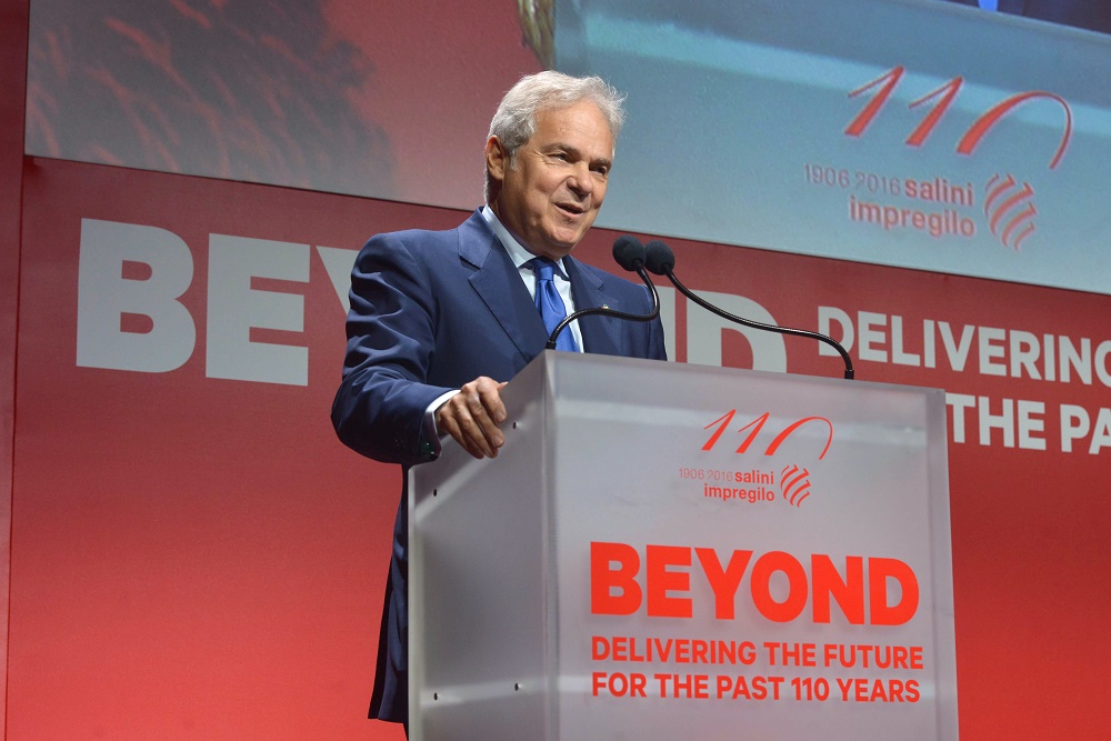
In 2020, Salini Impregilo changed its name and became Webuild: “Bigger and stronger in service of the country,” as stated in the campaign’s message. Inarea has been a partner of the Group since 2015, supporting its growth through brand management activities that, over time, have updated and strengthened the Group’s identity system.
The company’s presence across five continents and its evolving positioning made a new name necessary. The naming process distilled the core concepts of the brand’s value system. This gave rise to webuild: not just a name, but a concept. “We” reflects the human and collaborative dimension of the Group, while “build” highlights its focus on work, technical expertise, and forward-thinking vision.
The words Challenge, Building, and Achievement ultimately expressed the essence of the brand, in continuity with the payoff and the name of the digital magazine We Build Value, launched in 2015. Challenge evoked the pursuit and accomplishment of ambitious goals; Building referred to the technical expertise involved in creating infrastructure that drives progress around the world; Achievement recalled a legacy of nearly 120 years marked by pioneering spirit, know-how, technology, and the ability to solve complex problems.
From core values to brand identity and type design
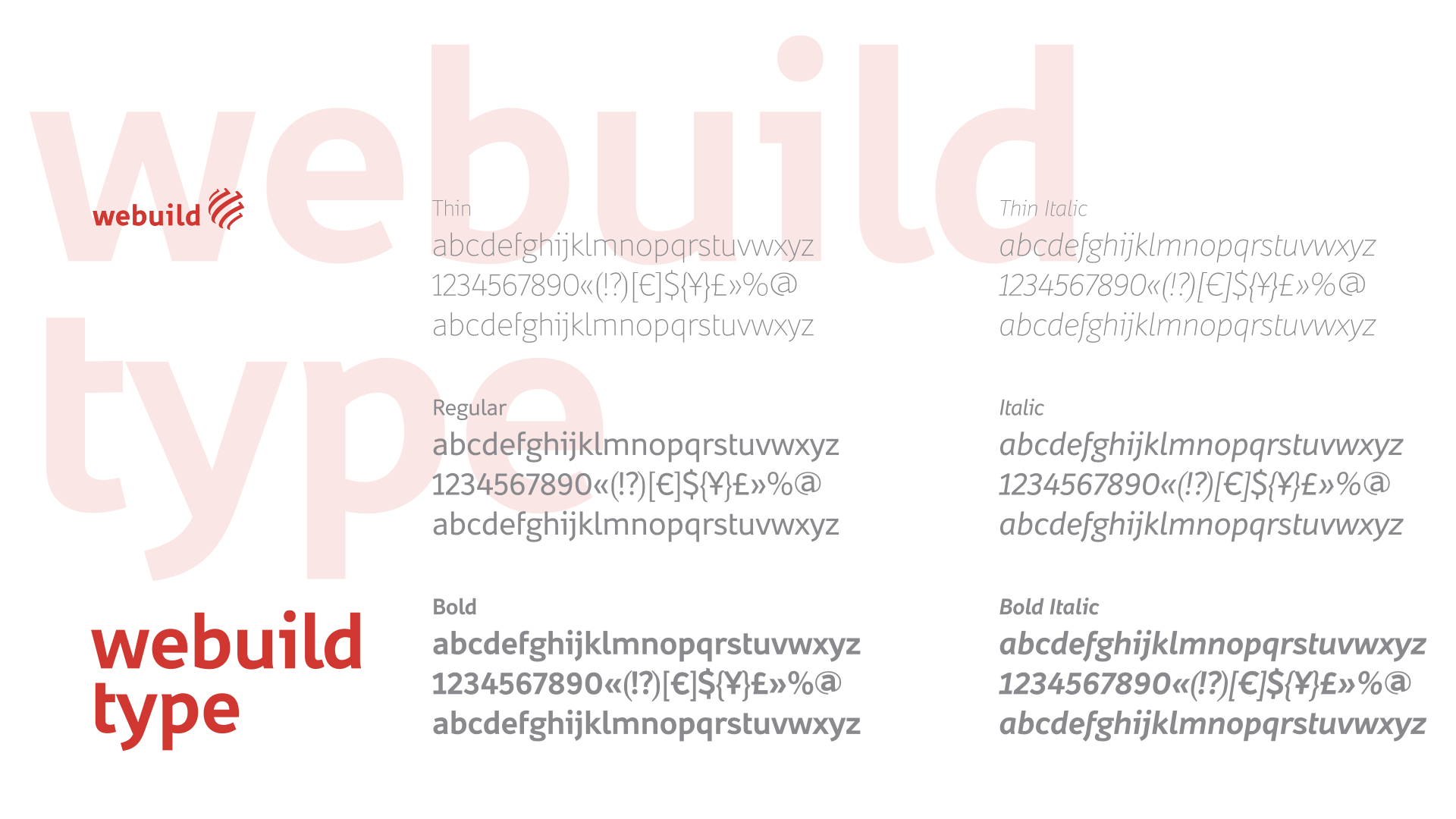
In designing the logo, Inarea retained theglobe—an established symbol of the Group—enhancing it with a rotational effect created by five compositional lines (the five “whirls”), evoking both dynamism and the Group’s global presence across five continents. For the type design of the new name, Inarea developed a proprietary sans-serif font, “Webuild Type,” designed to ensure clarity and readability across all touchpoints, both physical and digital. The visual identity is built around a set of bold, distinctive primary colors: red, white, black, and three shades of gray. To make the identity system more flexible, a complementary color palette was also developed—harmonized with the institutional colors—for use in communications where those are already present.
Brand architecture. when synthesis becomes clarity
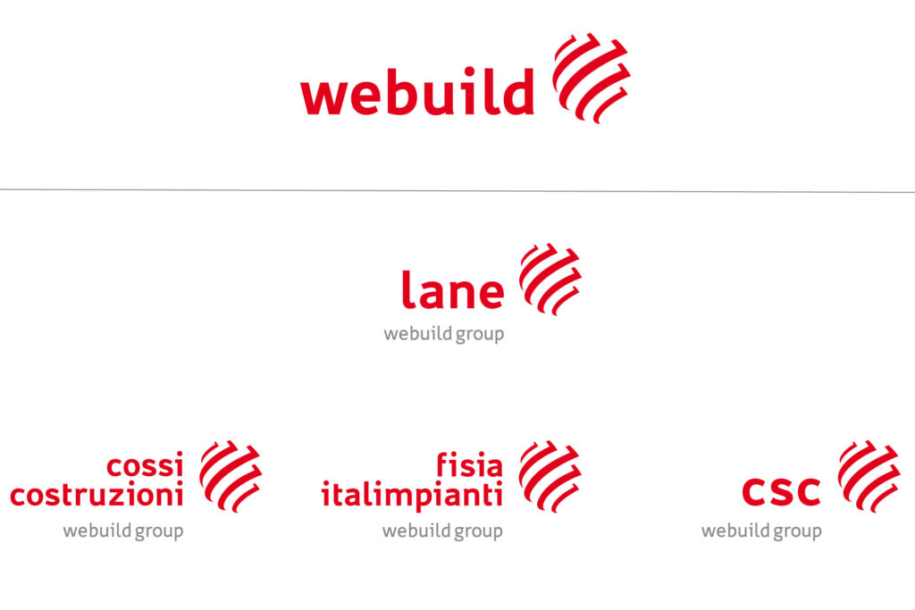
The Webuild masterbrand defines a system of hierarchies and relationships with the entities connected to it. The logotype adapts according to the name of the subsidiary while consistently retaining the institutional typeface. The globe symbol, along with the name “Webuild Group,” remains a constant presence, reinforcing the recognition of each individual company as part of the Group.
Digital design: brand identity across digital touchpoints
Website, app, social media, video, newsletter, and more — within the Webuild system, all appear under a single, unified identity, consistent in color, typography, and the proportions that underpin its visual language.
The sound of brand identity
As a complement to the brand’s identity system, Inarea developed an audio logo to accompany its animation: a sonic signature used at the beginning or end of videos that emphasizes and reinforces the brand’s presence through sound. And because Webuild operates across diverse geographies and cultures, this sequence of notes becomes a powerful element of recognition—transcending written messages.
Communicating major infrastructure projects
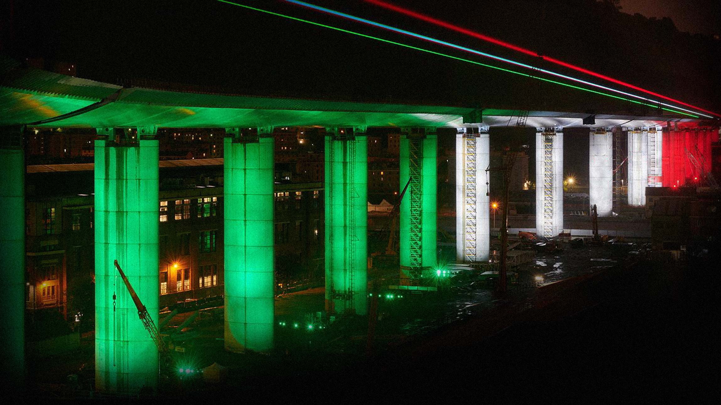
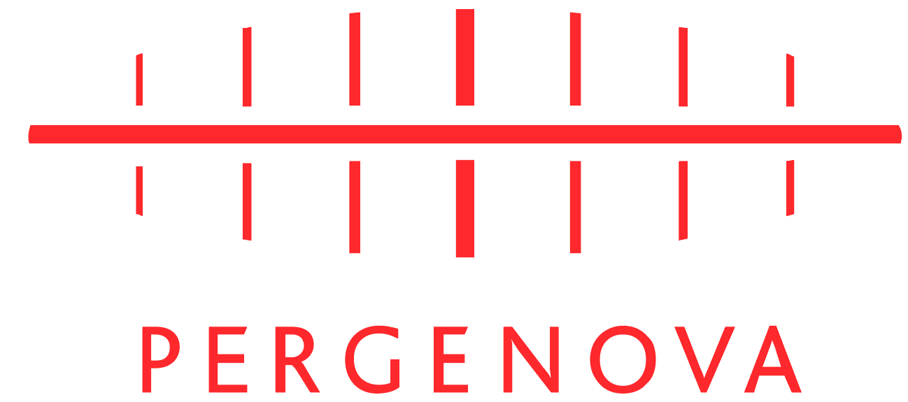
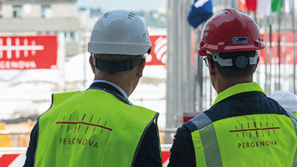
Webuild’s projects touch on environmental and territorial, social and employment-related, economic and political issues. As such, the Group’s major works must be communicated clearly at every stage of their development. Over the course of this long-standing collaboration, Inarea has carried out various identity and communication initiatives for key infrastructure projects. Among them is the reconstruction of the San Giorgio Bridge in Genoa, for which the name of the consortium—“PERGENOVA”—was created.
Analogous projects have been developed, linked to initiatives such as high-speed rail, the M4 line of the Milan Metro, the C line of the Rome Metro, the breakwater dam for the Port of Genoa, etc.