In recent years, Sara has initiated a streamlined and fast process, both in terms of digital transformation and internal and external communication, while maintaining, through innovation, its character as a company close to people and solid in the territory.
Brand architecture and brand design: A radical yet recognizable change
Inarea, which had previously created the Brand Identity, assisted Sara’s management in the overall process of realigning the touchpoints. This led to the redesign of the logo, the codification of new brand languages, and the structuring of an identity system capable of conveying the innovative momentum instilled by the company.
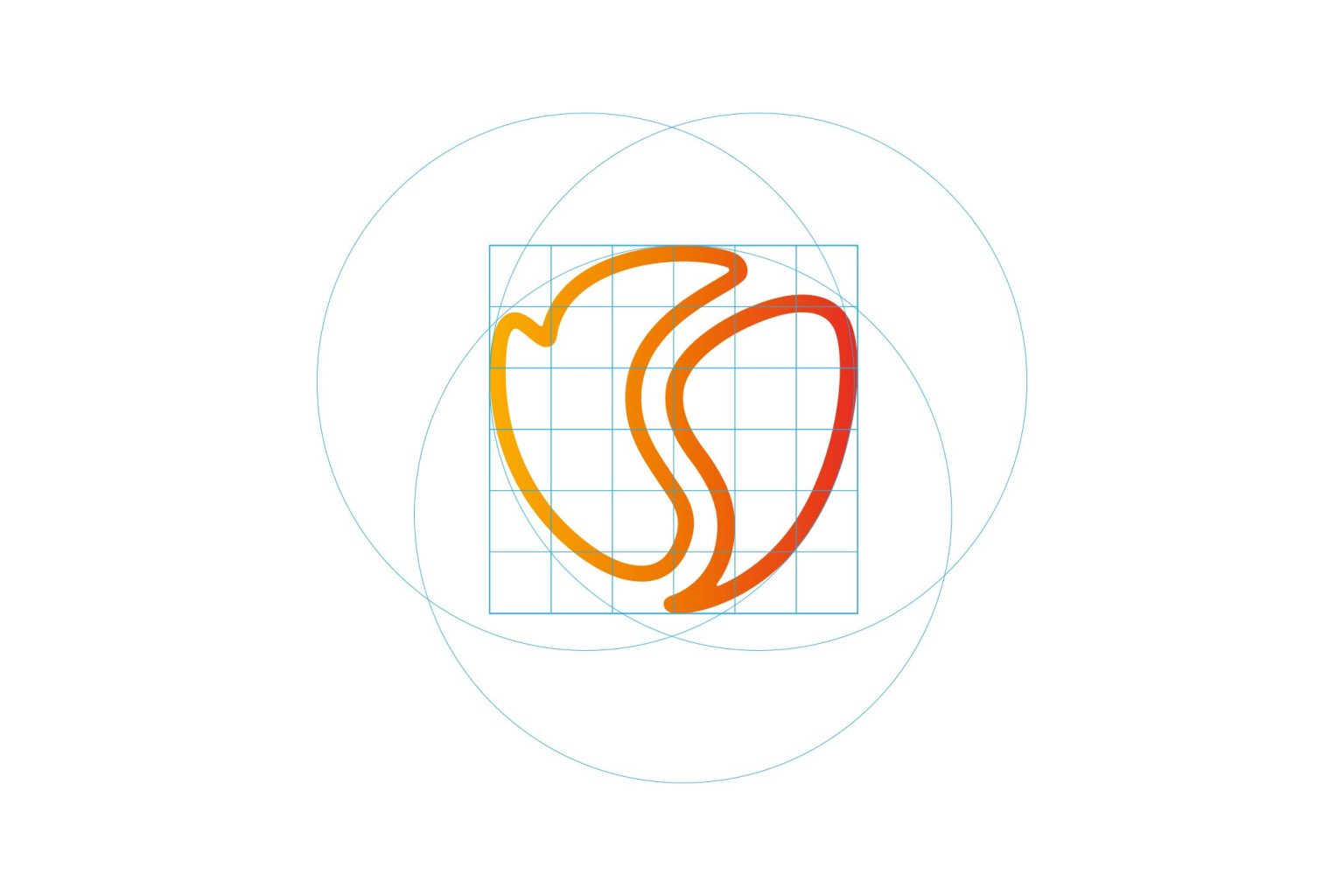
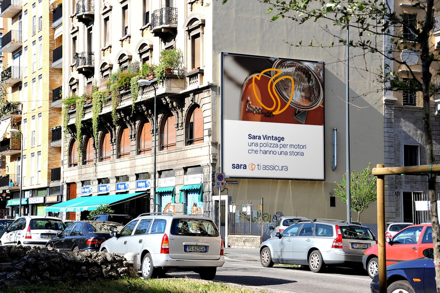
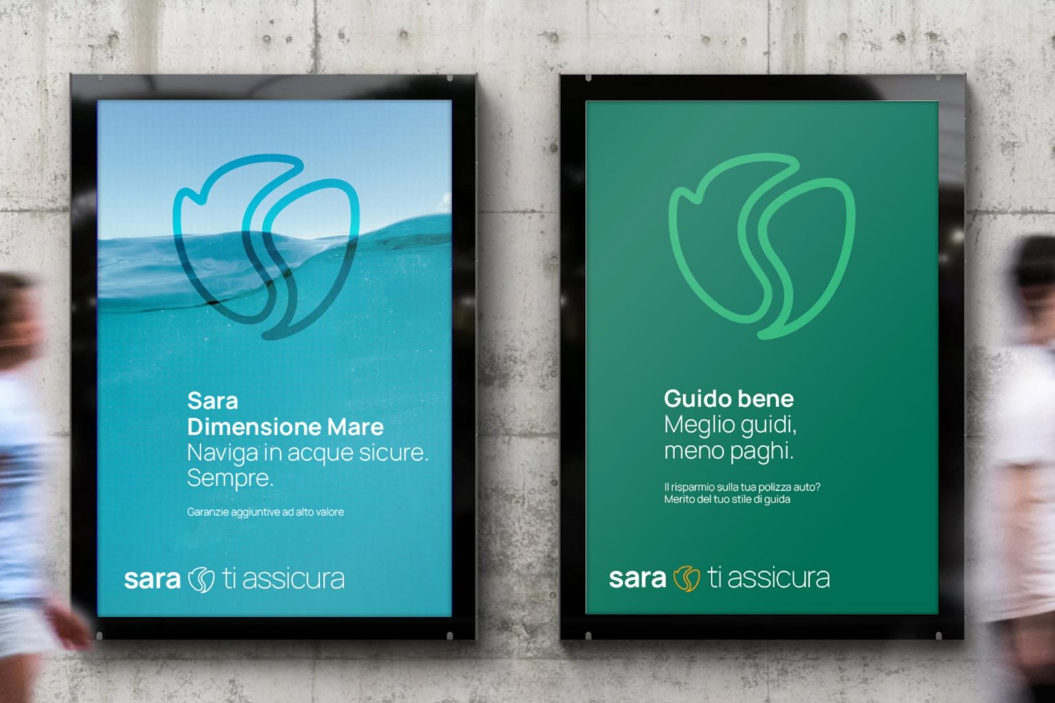
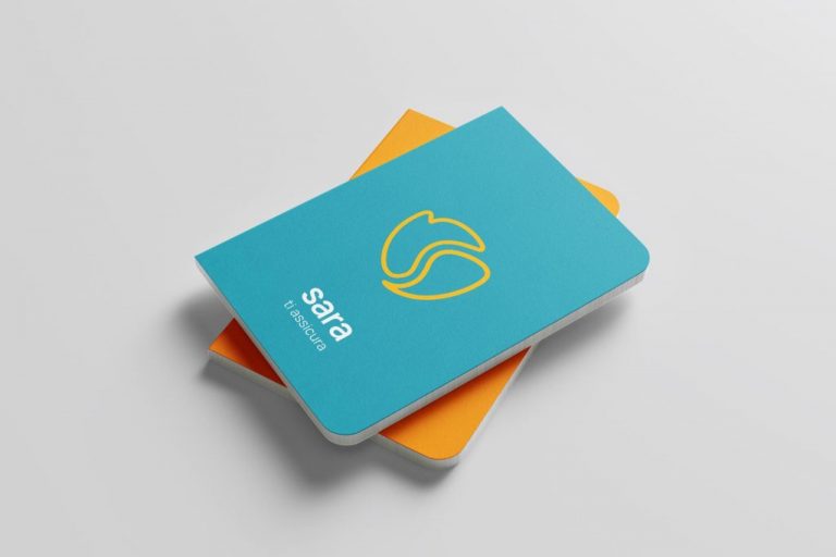
The flower has undergone a restyling that has softened its shapes, making it more organic. The solid color has been replaced with an outline, which, on one hand, makes the symbol lighter, and on the other, allows for the creation of graphic languages that help enhance the brand’s recognizabilit
Editorial design and the immediacy of the brand’s languages
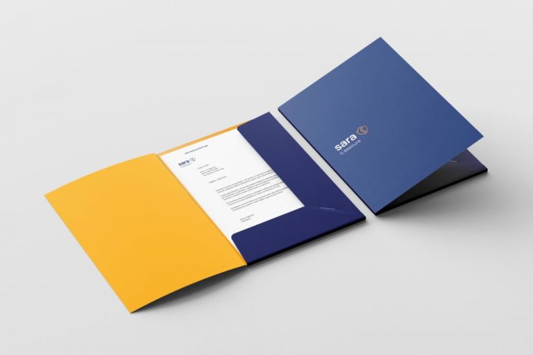
The institutional color palette forms the foundation of the brand language. The breadth of the palette allows for the definition of basic combinations that can be used across all areas of application.