Founded in 1303, Sapienza is the oldest university in Rome and one of the oldest and largest in Europe. With a mission rooted in research, excellence in education, and international cooperation, the University positions itself as a key player in the transition from an information-based society to a knowledge-based one, grounding its identity in a continuous dialogue between tradition and innovation.
Brand Architecture The reorganization of the brand identity
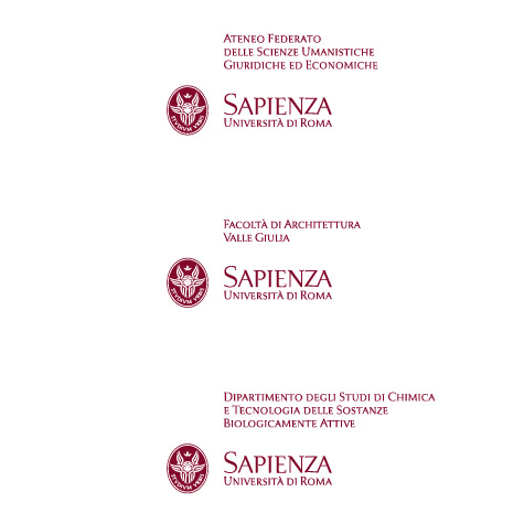
The University’s highly complex structure—with dozens of Faculties, Departments, Schools, and satellite campuses—had, over time, led to a brand proposition that was as layered as it was fragmented. For this reason, one of Inarea’s first initiatives was to rethink the brand architecture through a participatory approach, engaging representatives from the various academic entities. The result is a coherent system that ensures immediate recognition, streamlines complexity, and harmonizes the identity across all academic divisions. The hierarchical organization between the University, Schools, Faculties, and Departments is now clearly defined, projecting a unified and orderly image.
Brand Identity and Naming. From the baroque to the contemporary
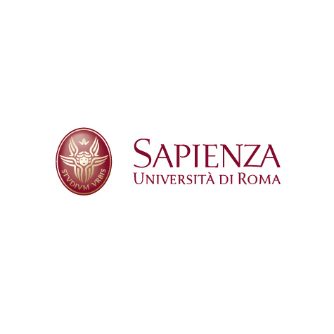
Alongside the structural reorganization, the entire brand identity system was redefined. The cherub, Sapienza’s historical symbol, was redesigned drawing inspiration from the figures depicted in the dome of Sant’Ivo alla Sapienza, a masterpiece by Borromini. To further strengthen the University’s identity, the use of overlapping symbols—such as the statue of Minerva, often mistaken for the official emblem—was deliberately avoided. This intervention restored iconographic coherence to the logo, reconnecting it with its Baroque origins while giving it renewed expressive power. The oval that frames the cherub, together with the motto Studium Urbis, recovered from an 18th-century seal, reinforces the institution’s historical legacy without compromising its contemporary relevance.
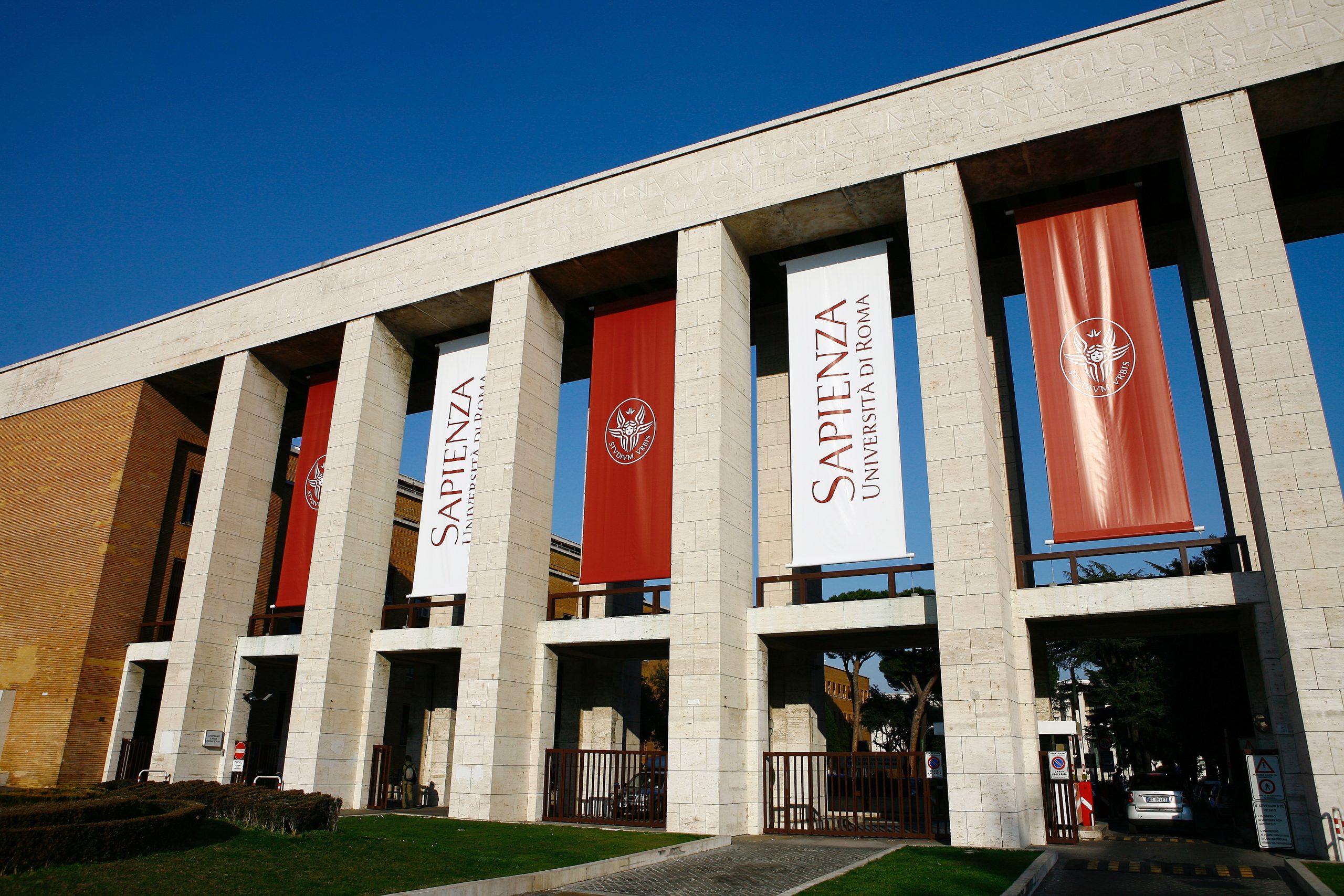
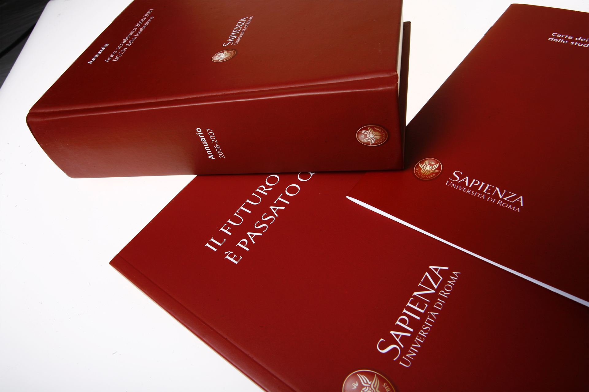
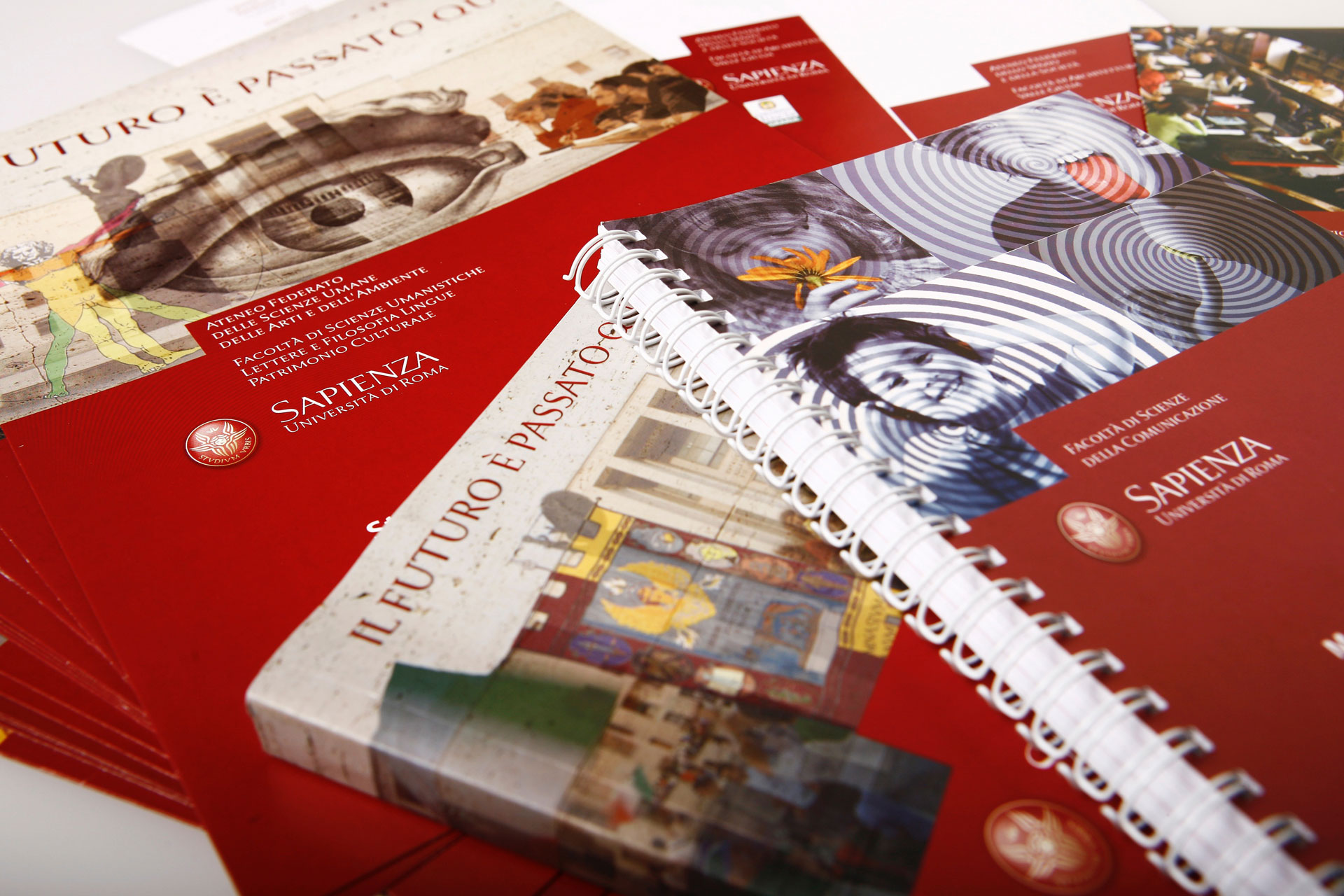
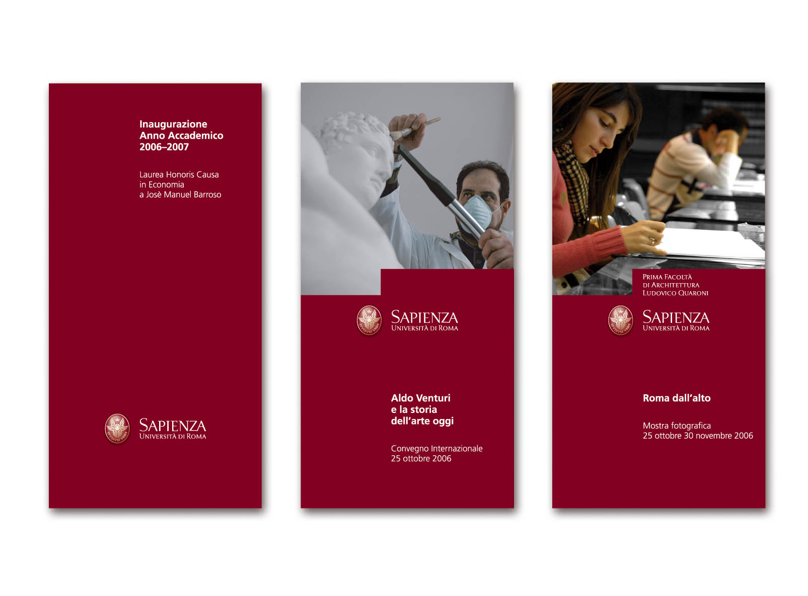
The name itself was also simplified: “Sapienza – Università di Roma” replaces the previous, longer and more bureaucratic version, preserving the core identity references while enhancing the University’s authority. The payoff “The Future Passed Here” highlights the connection between centuries of history and a forward-looking drive for innovation, paying tribute to the great minds in culture and science who once walked its halls. Finally, the official colors—crimson and gold—replace the University’s traditional blue, adopting the historic colors of Rome and reinforcing the symbolic and cultural bond with the city.
Type Design. A fusion of culture and functionality
A central element of the new system is the proprietary typeface, Sapienza. Specifically designed for the University, it blends three typographic influences: the structure of Carolingian scripts, the elegance of Bodoni, and the functionality of a modern sans-serif. This stylistic hybrid reflects the nature of the Institution—deeply rooted in history, yet forward-looking. The typeface thus becomes a consistent visual voice across all levels of communication, from academic publications to digital information tools.
Communication Design. Consistency and recognizability in every expression
Sapienza’s visual identity is built on a solid and coherent visual grammar. The entire system is designed to ensure clear, accessible, and authoritative communication. From internal signage to official documents, from digital channels to administrative forms, every element contributes to reinforcing the University’s identity. The format integrates typography, color palette, and logo in a simple way, allowing for flexible and recognizable applications that can adapt to different contexts while maintaining strong consistency.
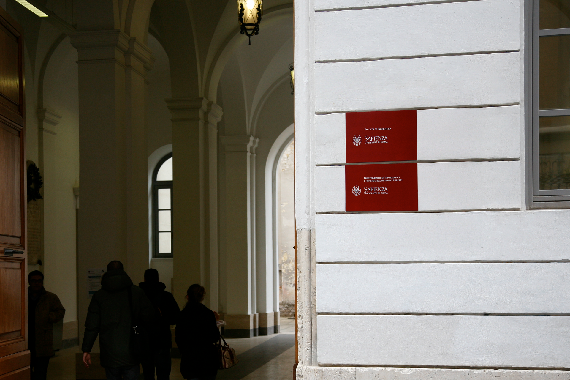
Signage & Wayfinding. Unifying navigation and brand identity
The internal signage system has also been redesigned to fit within a unified, logical framework that reinforces the Institution’s cohesive identity. In response to the uneven and complex layout of the University’s buildings, the new wayfinding system ensures clarity and accessibility. Color codes consistent with the brand identity, a legible typeface, and simple, intuitive symbols have been introduced. Panels, maps, and both internal and external signage have been harmonized to provide clear and straightforward navigation. Signage thus becomes not only a functional tool but also a visible extension of the brand identity.