Over the past twenty years, Puglia has become a region where a wide variety of cultural events can be experienced. The regional administration has expanded its activities through a rich program of exhibitions, seasons, festivals, cultural routes, and showcases. At the same time, it has worked to protect and promote both tangible and intangible heritage—sites, rituals, and traditions—helping to shape and strengthen the cultural sector. Similarly, the Teatro Pubblico Pugliese, founded in 1979, has gathered and supported the region’s many artistic expressions, transforming them—through greater awareness—into a shared cultural heritage.
A name to reach the international scene
The Teatro Pubblico Pugliese – Regional Consortium for Arts and Culture – needed a name that could convey both the diversity of the events it promotes and its international outlook. The new naming had to capture the richness of artistic expression across the region while also reflecting the strength of the institution, which has developed deep expertise in interpreting local culture. The result is Puglia Culture—a name in which “culture” expresses the variety of artistic forms while also evoking the English word “culture,” positioning the institution within a broader international context.
Brand Architecture: The choice of an “umbrella brand”
The rebranding of Teatro Pubblico Pugliese as Puglia Culture achieves not only a powerful act of semantic synthesis, but also the creation of a brand that conveys a sense of prestige and authority—while staying true to its founding identity. Puglia Culture becomes an “umbrella brand”: a name that brings together and supports a range of concepts around which its content and specific cultural programming are articulated.
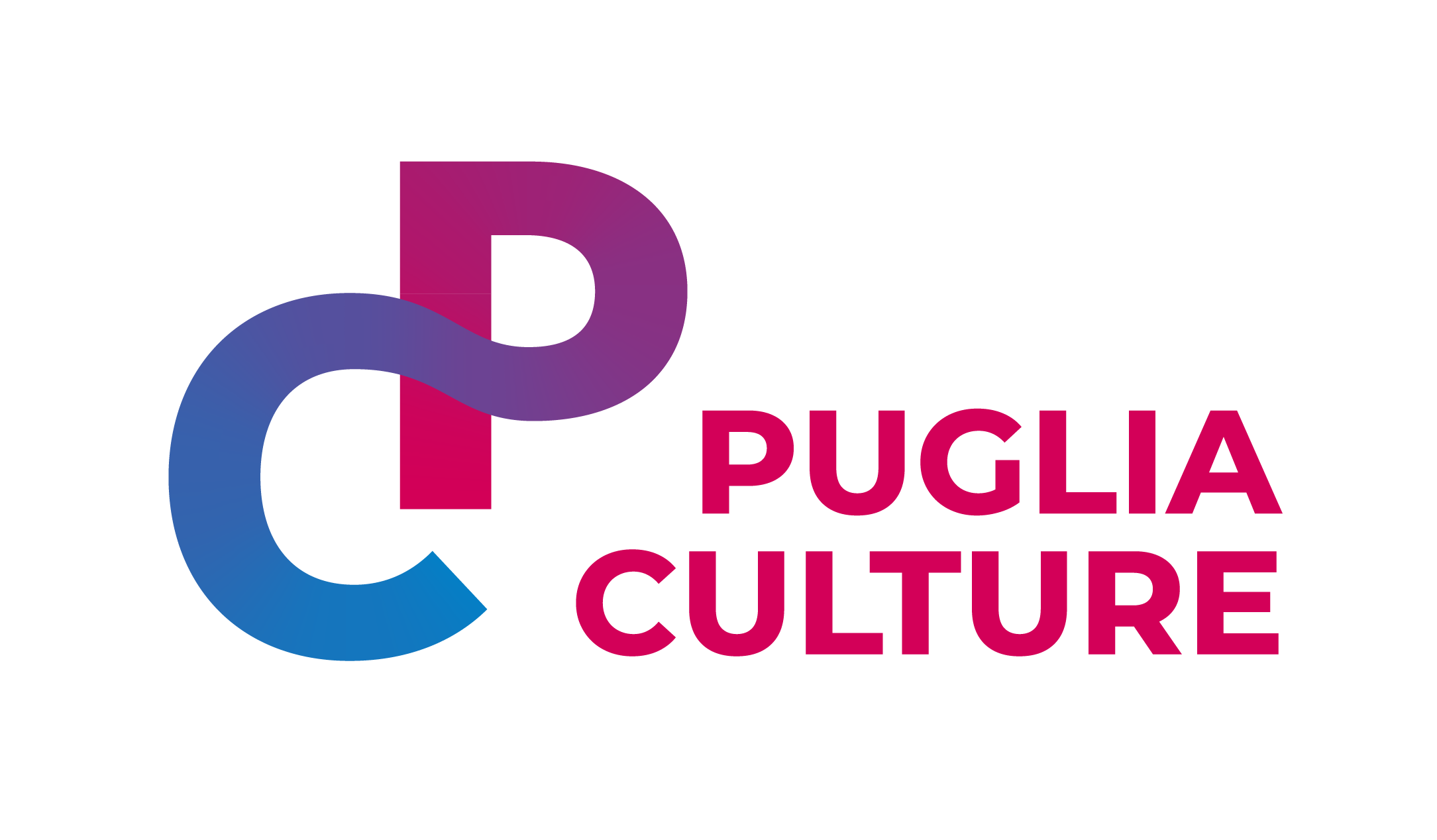
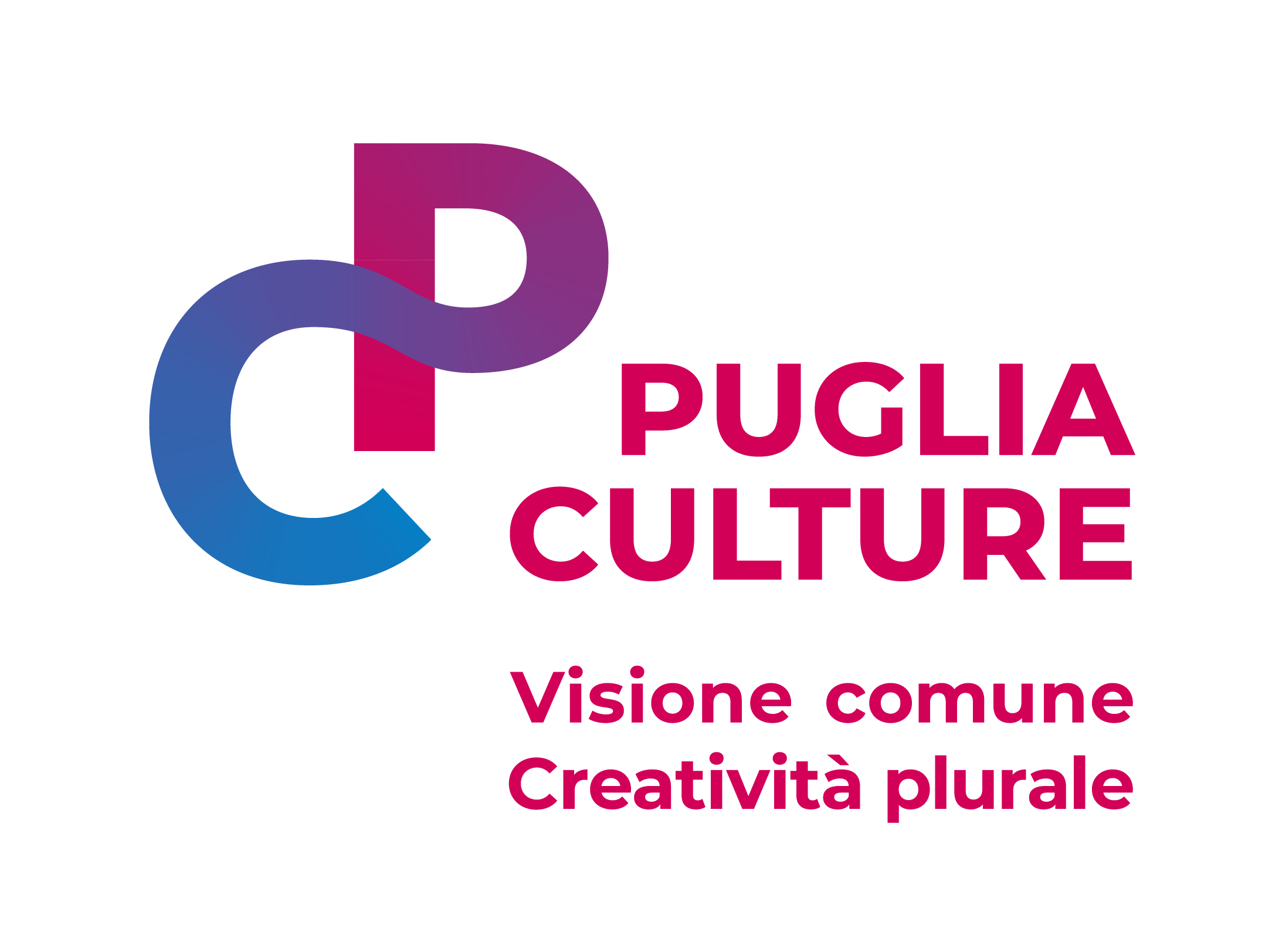
Brand Identity: A Logo that expresses plurality, dynamism, and flexibility
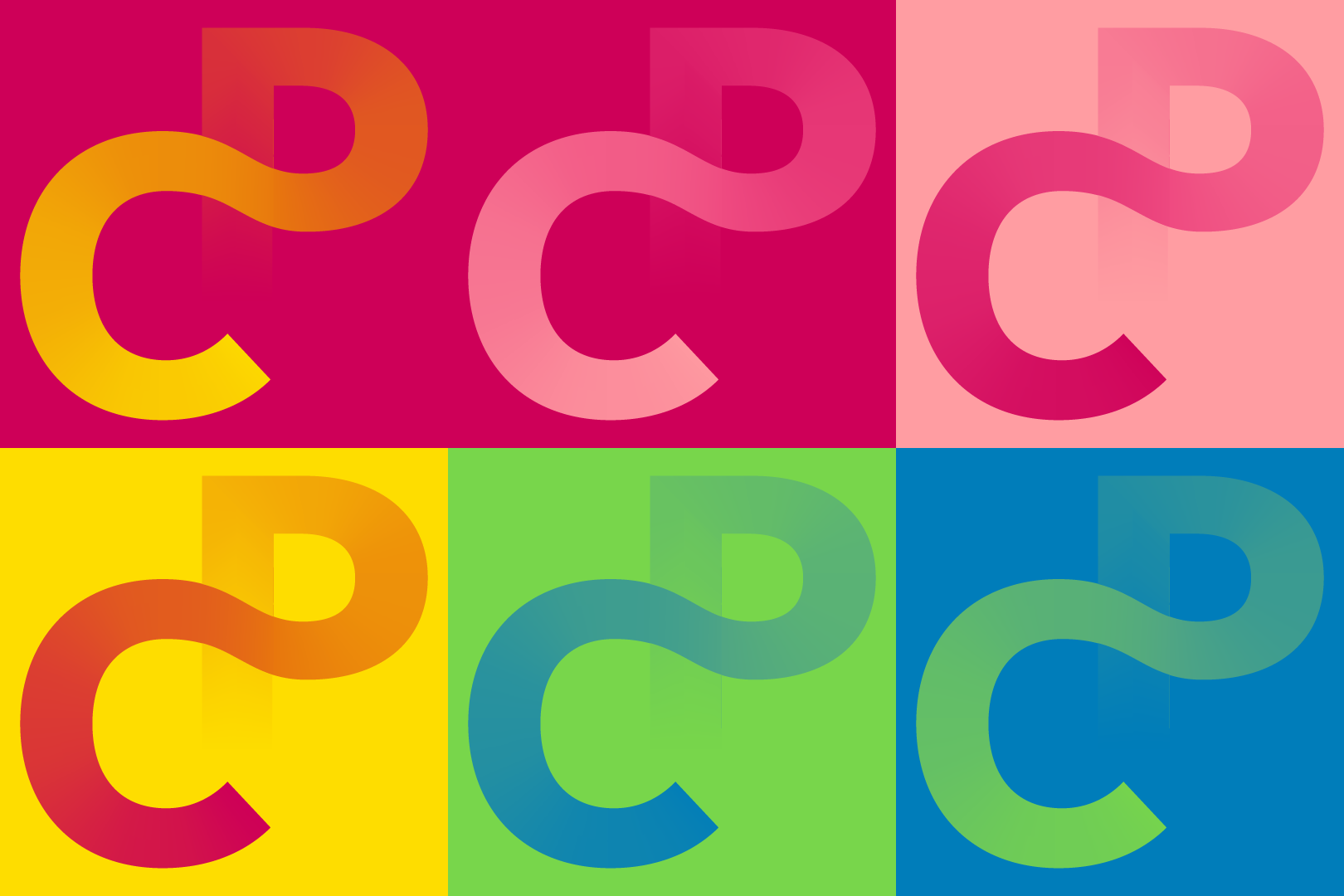
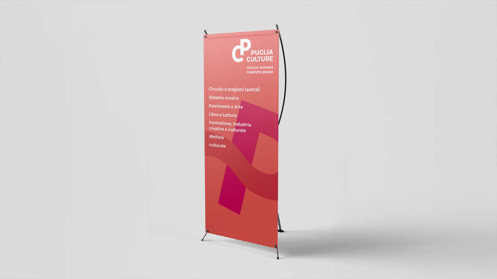
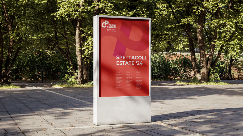
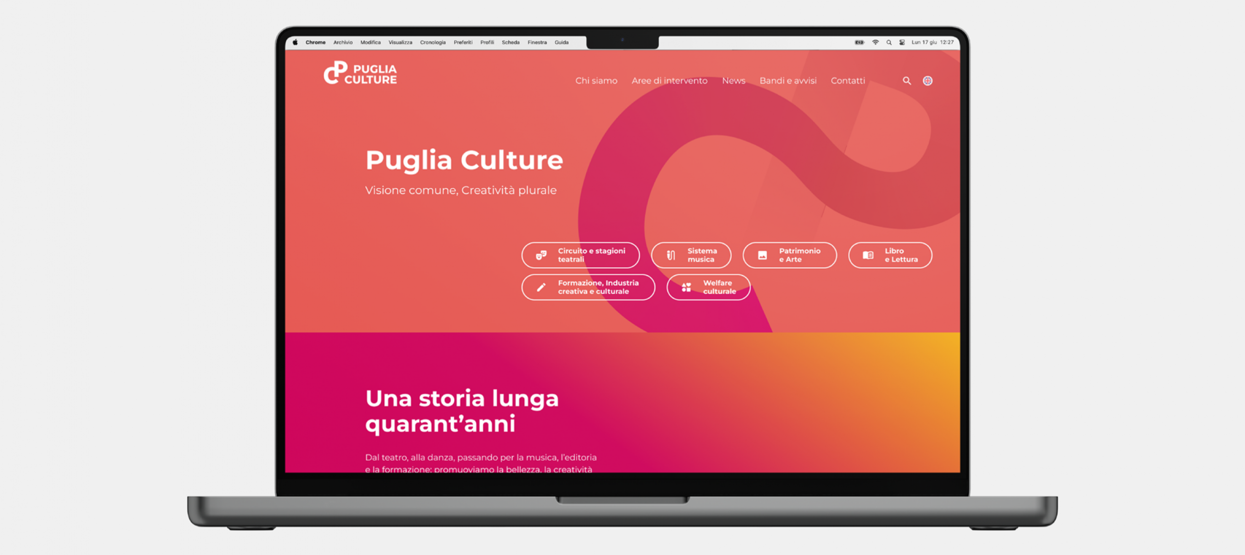
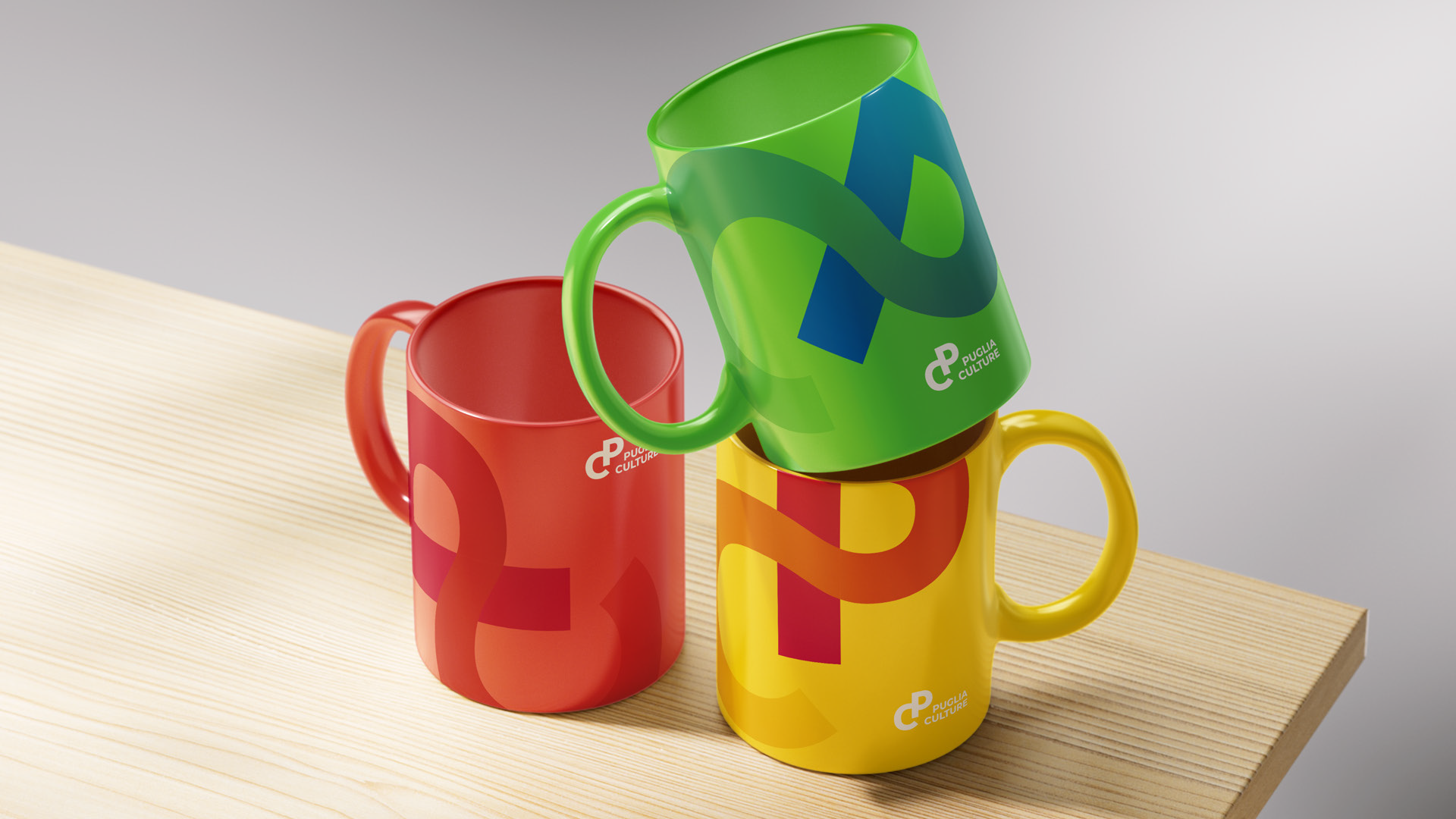
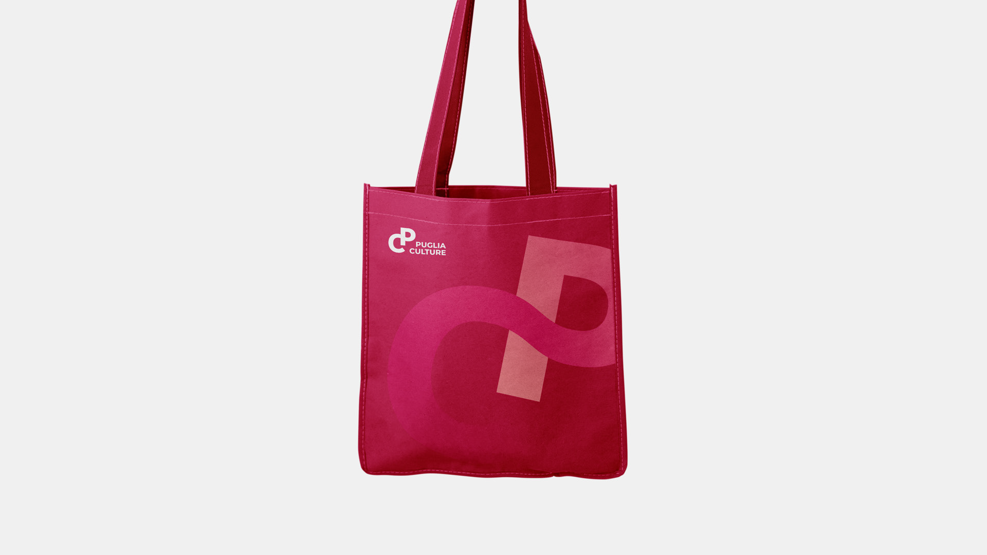
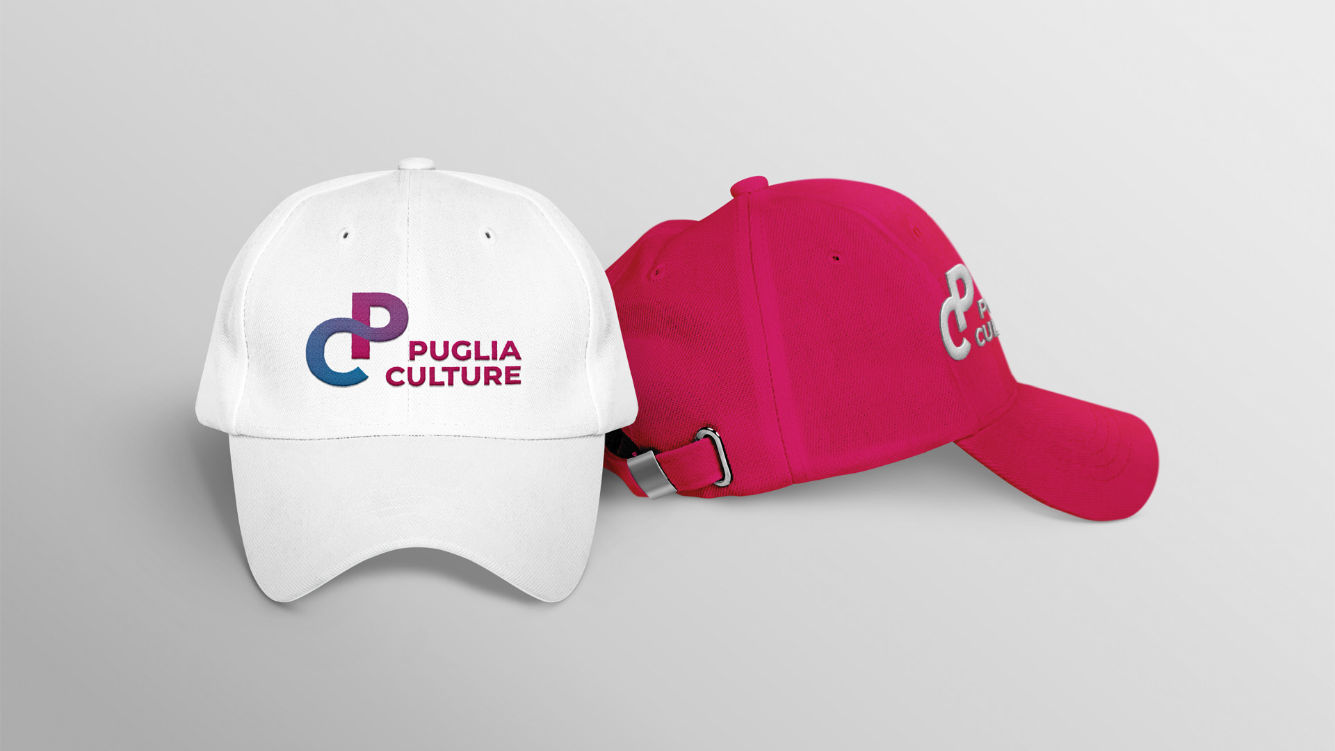
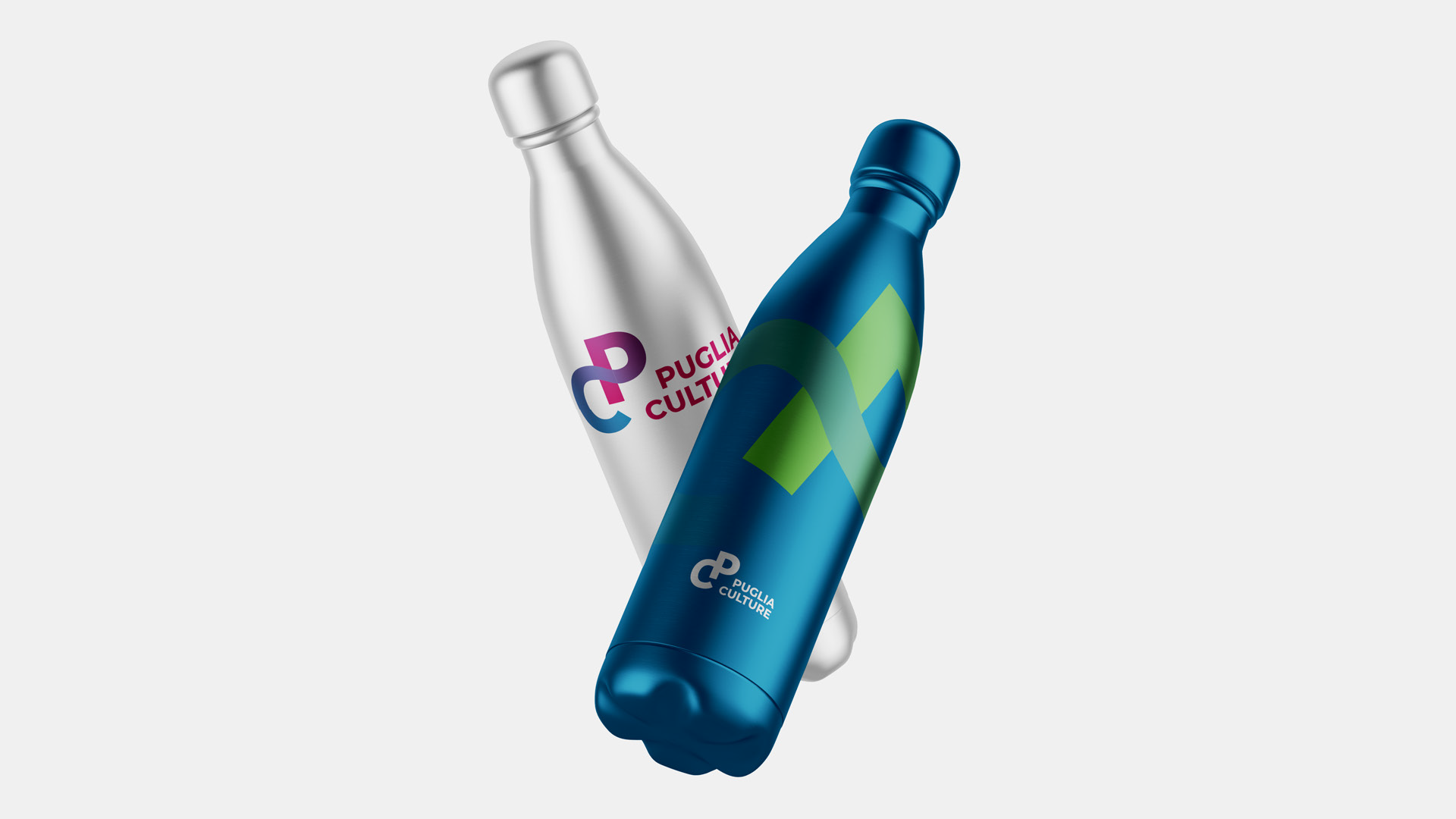
The logo, created from the intertwining of the two initial letters, embodies themes such as imprint (identity), groove (evolution and growth), and movement (dynamism and flexibility), while emphasizing the idea of a relational dimension. The color scheme is a fusion of magenta, light blue, and violet, complemented by a palette built on harmonious tones. The primary version of the logo is designed for use on white or very light backgrounds. The brand language is defined by the logo’s “flash” effect, which fades into the background. The rotational design of the logo’s forms enhances the sense of movement and dynamism.
Finally, the payoff “Shared Vision, Plural Creativity” defines the mission of transforming the many forms of creativity that shape the Puglia region into a solid, collective vision.
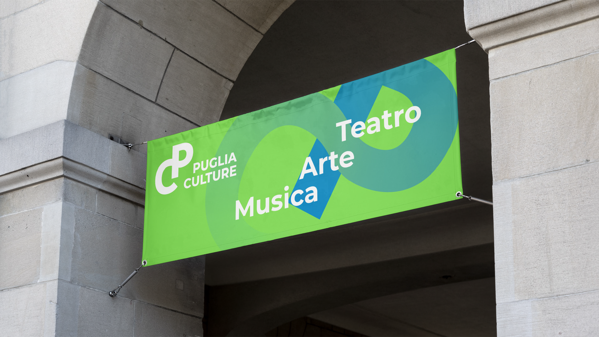
Communication and Digital Design: Consistency across all touchpoints
Informational totems, the website, communication strategy—including social media—signage, events, and publishing materials were all developed.