Oregon Scientific is a leading multinational company in the field of consumer electronics. Driven by significant commercial growth that has established its presence across five continents, the company has chosen to renew its brand identity and redefine its market positioning.
Brand identity. The “smart” vision beyond the product.
The project first required a new perspective for the organization, one that could move beyond the traditional product-oriented approach. Paradoxically, the starting point for Inarea came from the product itself. The breakthrough was found in the range of electronic devices offered, which are able to independently learn users’ habits and needs, simplifying everyday life and making it “smart.”
From there, it was only natural to shift the focus from the product itself to the quality of life of the people who use it. “Smart Living” became the phrase that best captured this vision—a concept that might seem obvious today, but one in which Oregon Scientific was truly a pioneer.
Brand e communication design. Onde di significato
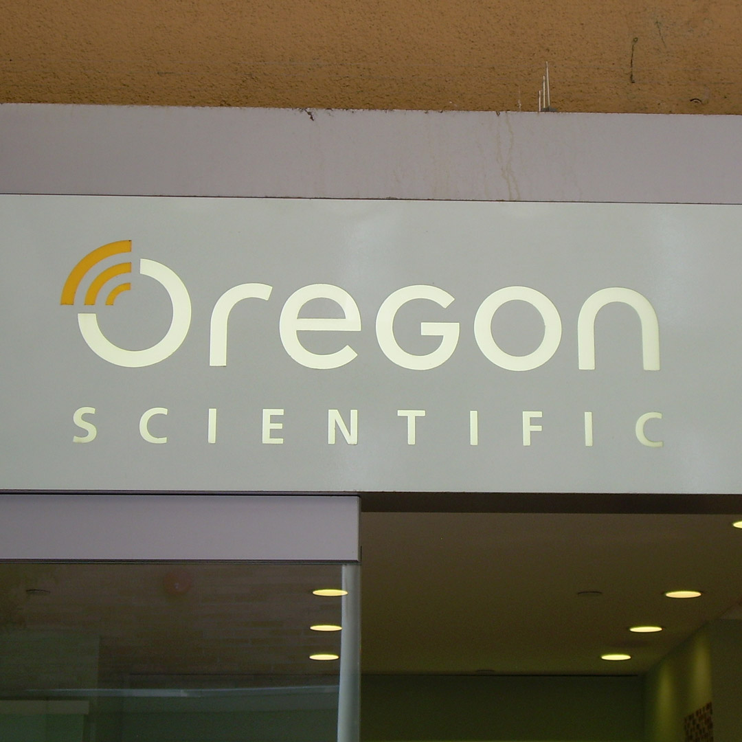
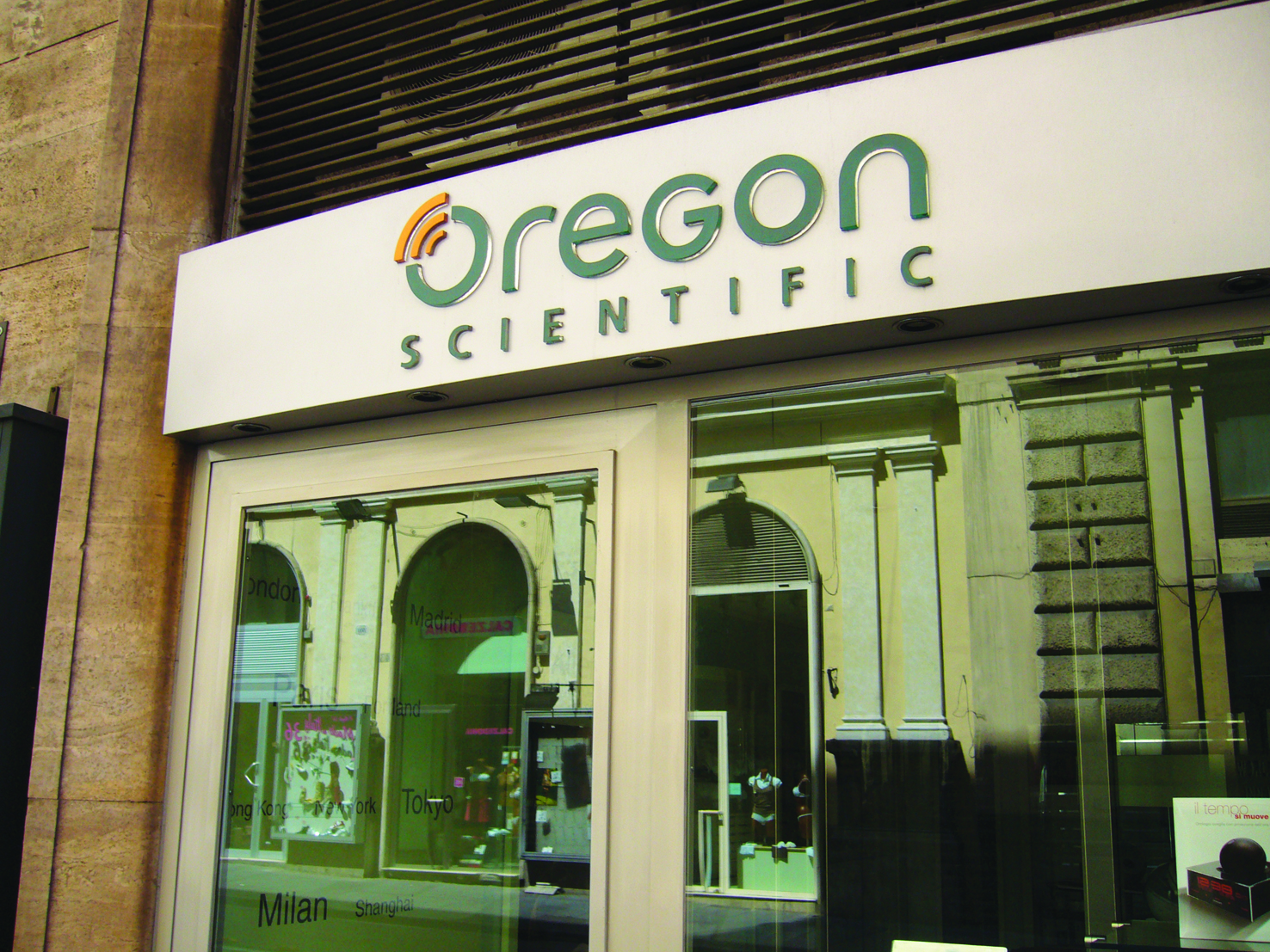
This spirit of pioneering innovation has been translated into the brandmark through its new positioning, anticipating the radical simplicity that defines the digital world. The sans-serif logotype, which retains the company’s iconic green—a long-standing part of its visual identity—is introduced by three waves placed above the initial ‘O’. These three symbols represent the universe, Oregon Scientific, and the human being, while also recalling the waves that drive the functioning of electronic devices.
The bold simplification of these visual elements has shaped the brand identity across multiple touchpoints—from the products themselves to their packaging, from retail spaces to all forms of communication.