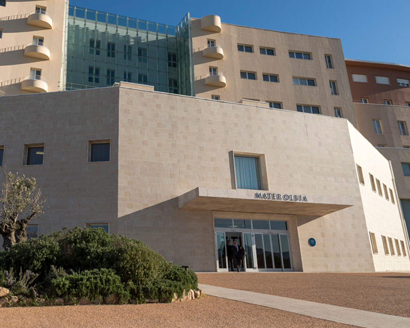
Mater Olbia Hospital is a leading healthcare center in Sardinia, born from the collaboration between the Qatar Foundation Endowment and the Agostino Gemelli University Hospital IRCCS in Rome. The hospital offers state-of-the-art medical services with advanced technology and scientific expertise, focusing on conditions with high epidemiological impact. Its mission is to provide the highest standards of care by combining professionalism, compassion, and humanity.
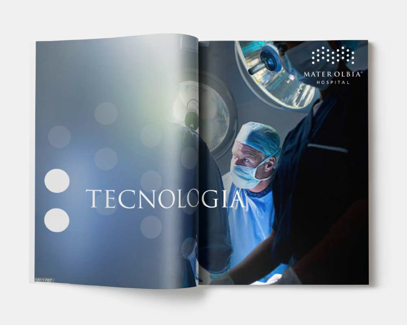
Brand design. Mater mediterranea and the symbols of the region
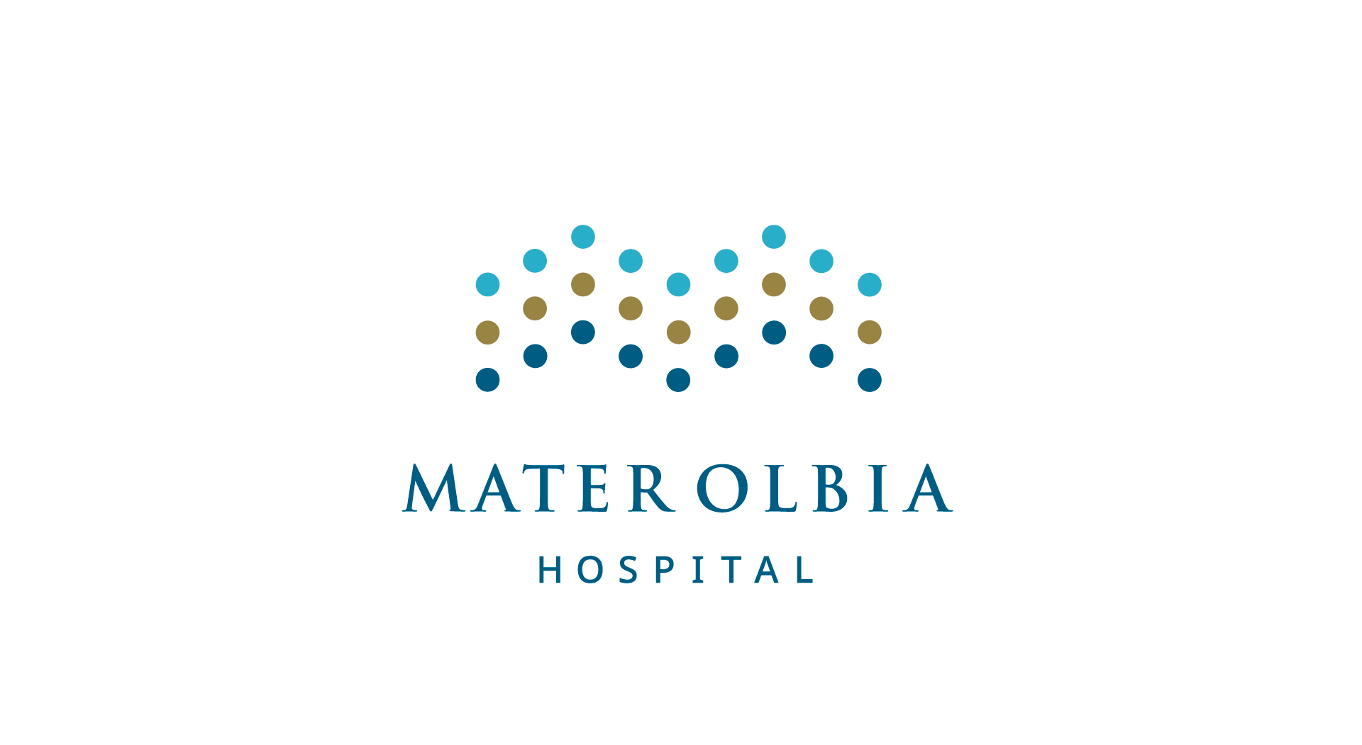
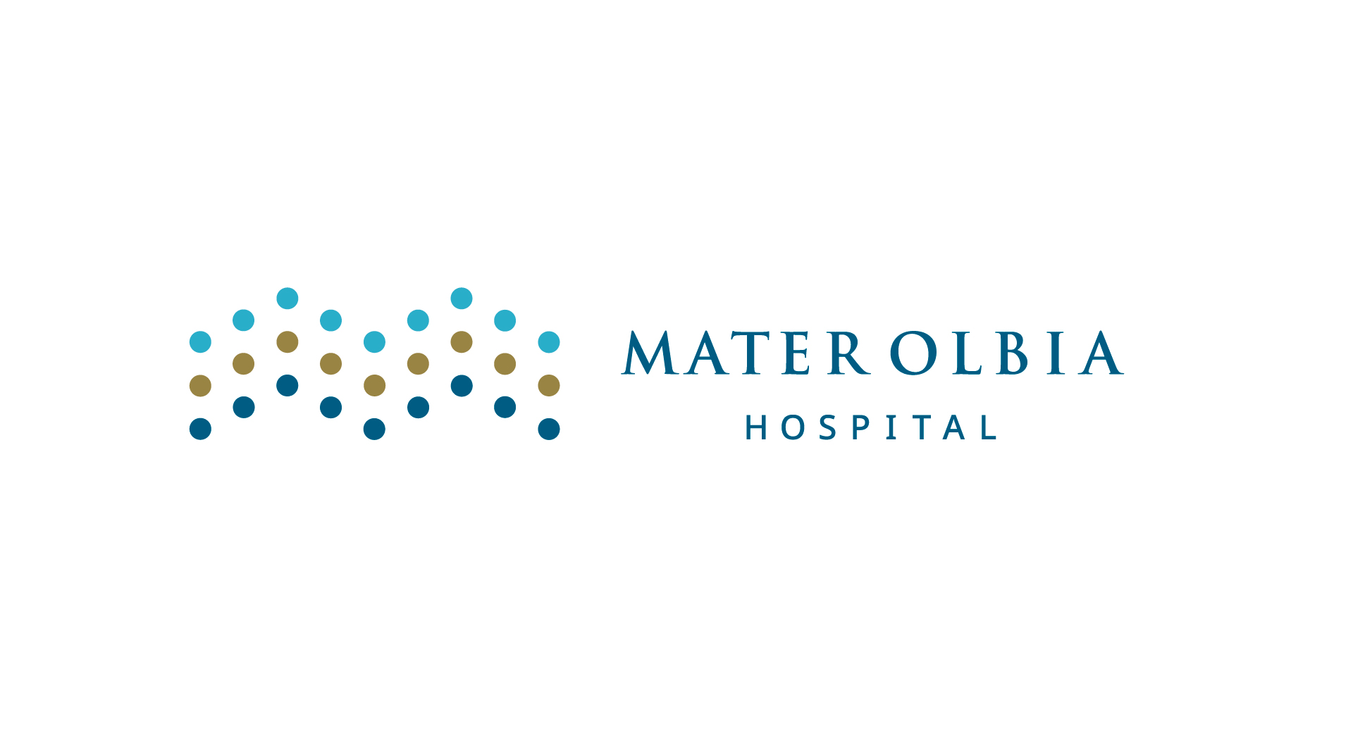
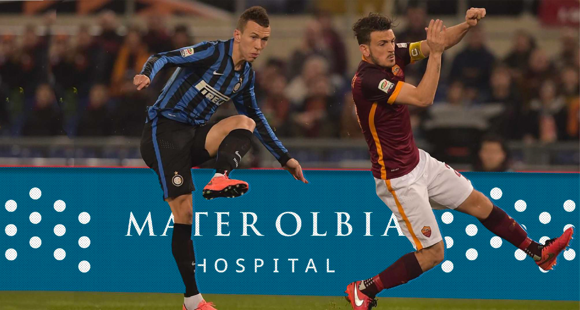
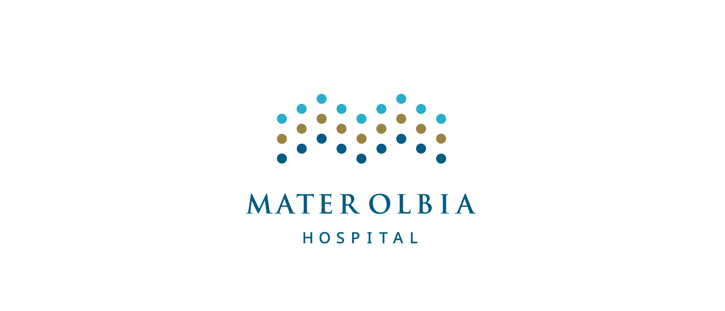
The brand identity of Mater Olbia Hospital is deeply rooted in its connection with Sardinia and the Mediterranean, drawing inspiration from the Mater Mediterranea — the ancient prehistoric icon symbolizing fertility, the cycle of life, and the natural world. Symbolically, the hospital draws from this figure a sense of hope and a calling to care. The logo features a symbol made up of graceful, flowing lines reminiscent of stylized waves and the fluidity of the sea, a vital element embracing the Gallura region. This line represents at once care, innovation, and a strong bond with the territory. Color plays a key role in the visual identity, merging the hues of land and sea. A deep blue — associated with both professionalism and the marine environment — is paired with a warm tone that evokes the earth, Sardinian roots, and vitality. Together, these colors express the union between advanced medical science and human warmth. The typography, a clean uppercase sans-serif, conveys clarity and institutional strength. Overall, the design is refined and professional, balancing the authority of a hospital with the empathy essential to patient care.
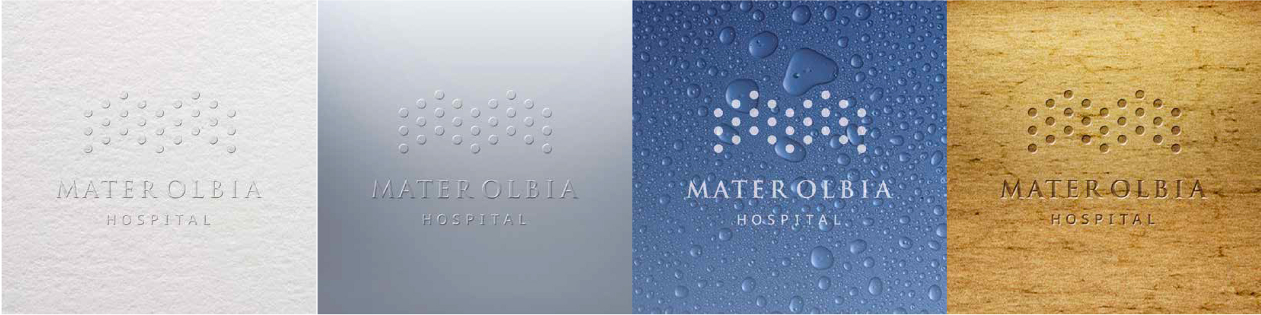
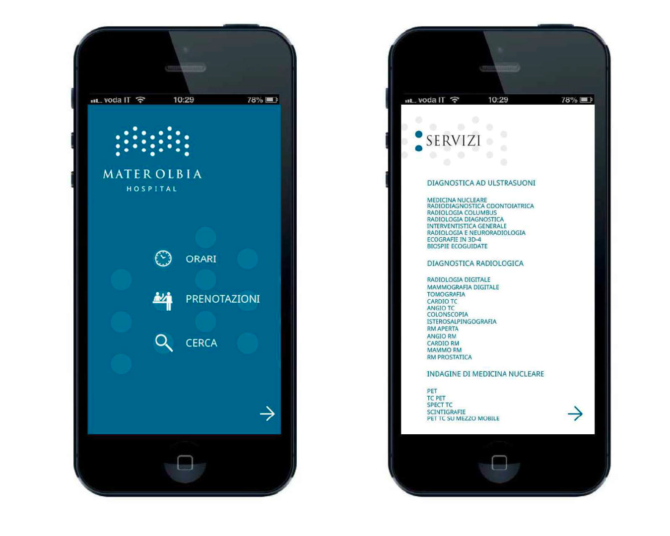
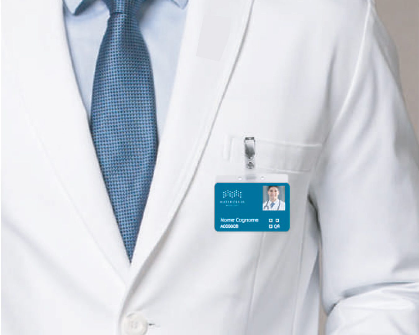
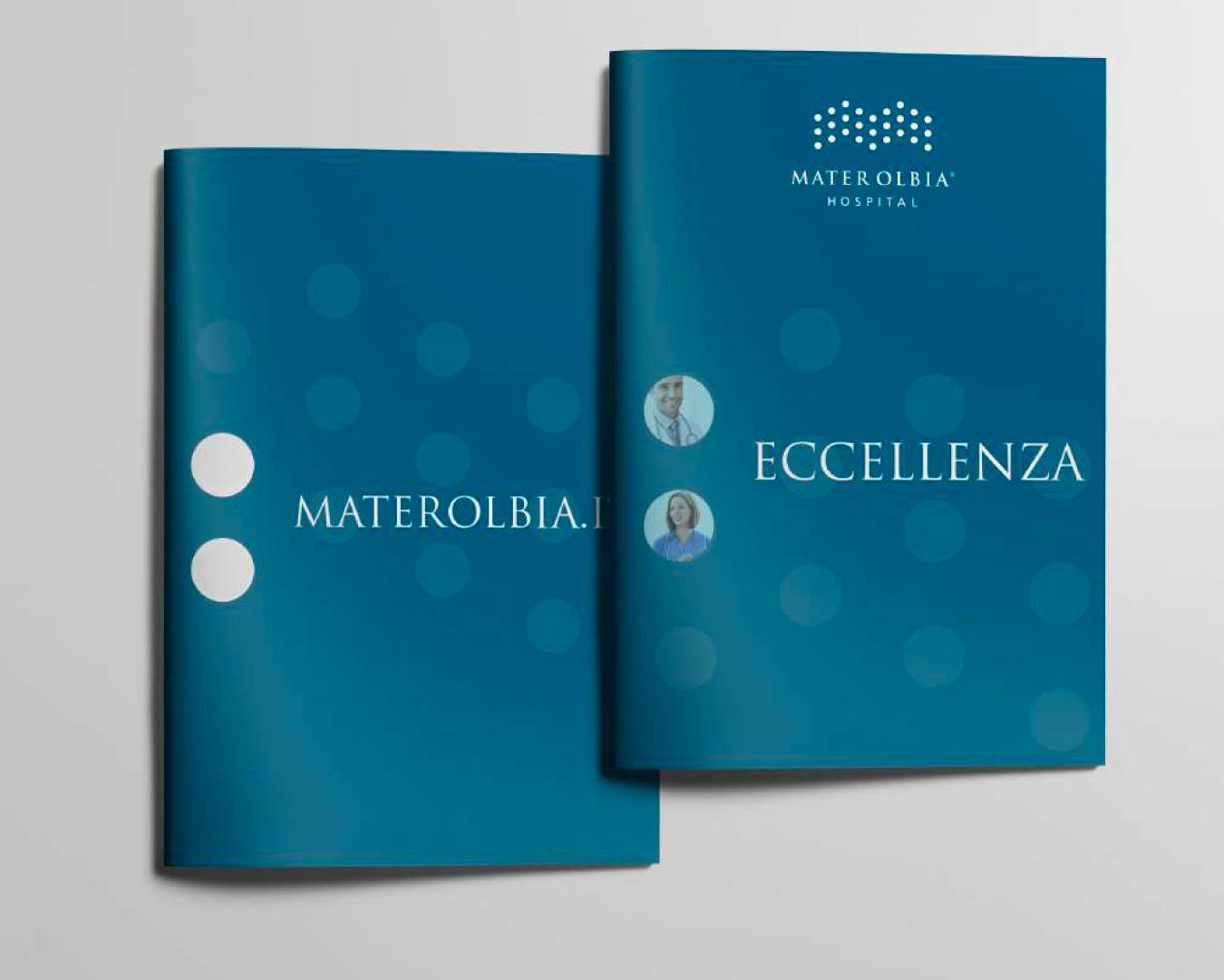
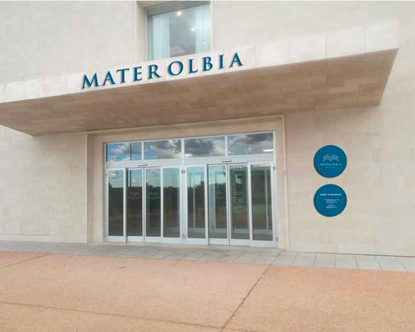
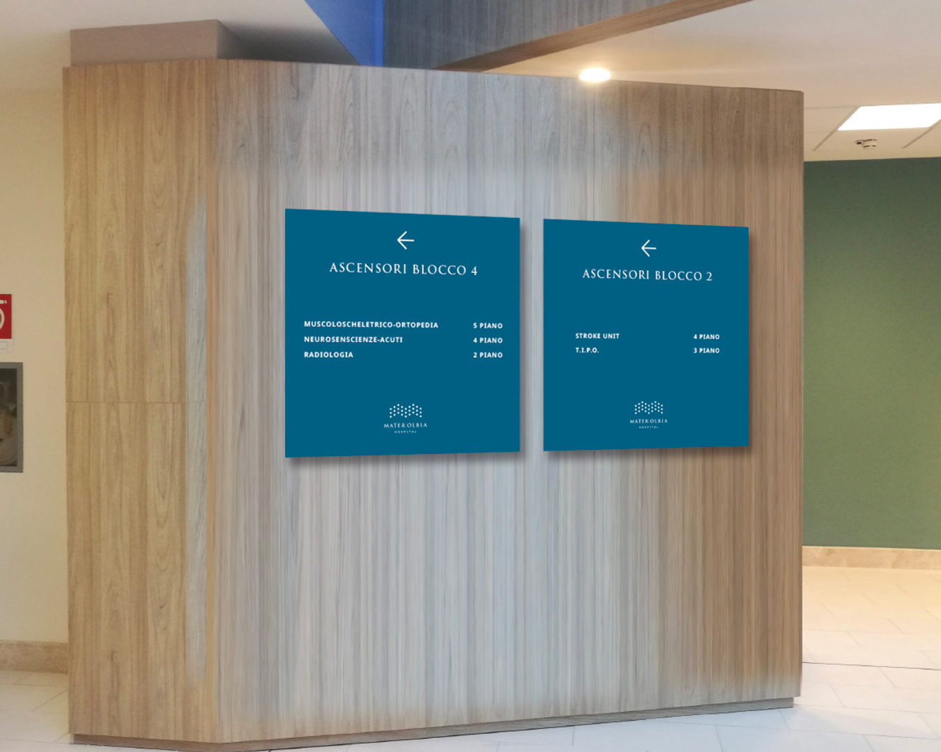
Communication design. A coherent, reassuring, and multicultural image
The communication language of Mater Olbia translates into a clear, reassuring, and functional image across all touchpoints—both physical and digital—maintaining visual consistency through the recurring use of the logo and color palette. The communication focuses on concepts such as multiculturalism, reflecting the international nature of the partnership and its openness to a global audience.