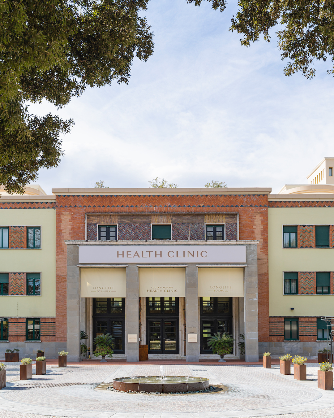
The Lucia Magnani Health Clinic, in Castrocaro Terme, is a health and wellness clinic. The facility stands out for its Long Life Formula® Method, a medical-scientific approach that aims to combat oxidative stress, believed to be responsible for premature aging. The clinic offers personalized preventive and predictive medicine programs, along with health spa and aesthetic medicine services.
Brand design and brand architecture. Geometries of well-being
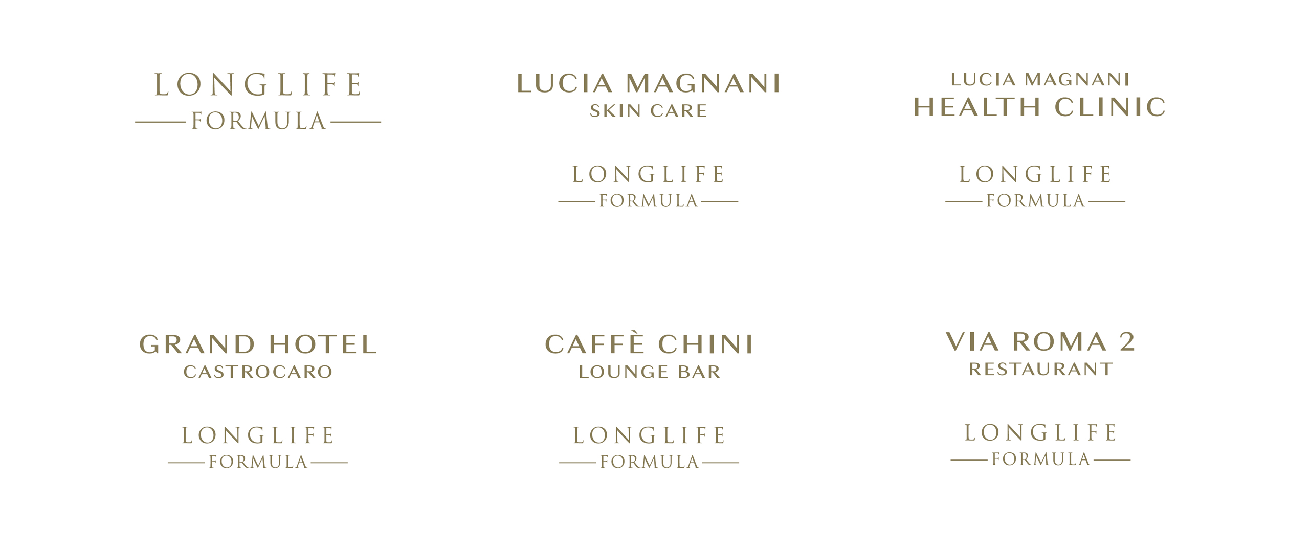
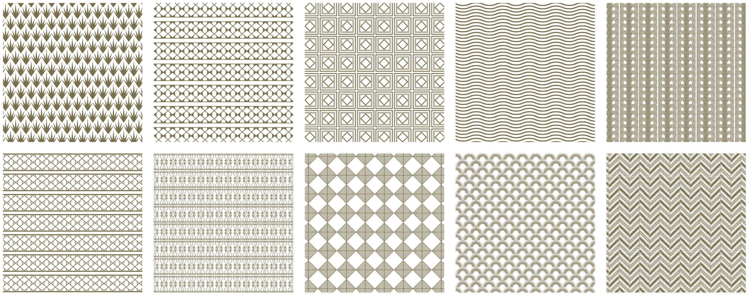
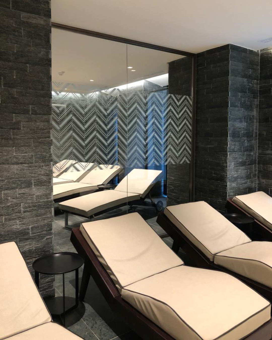
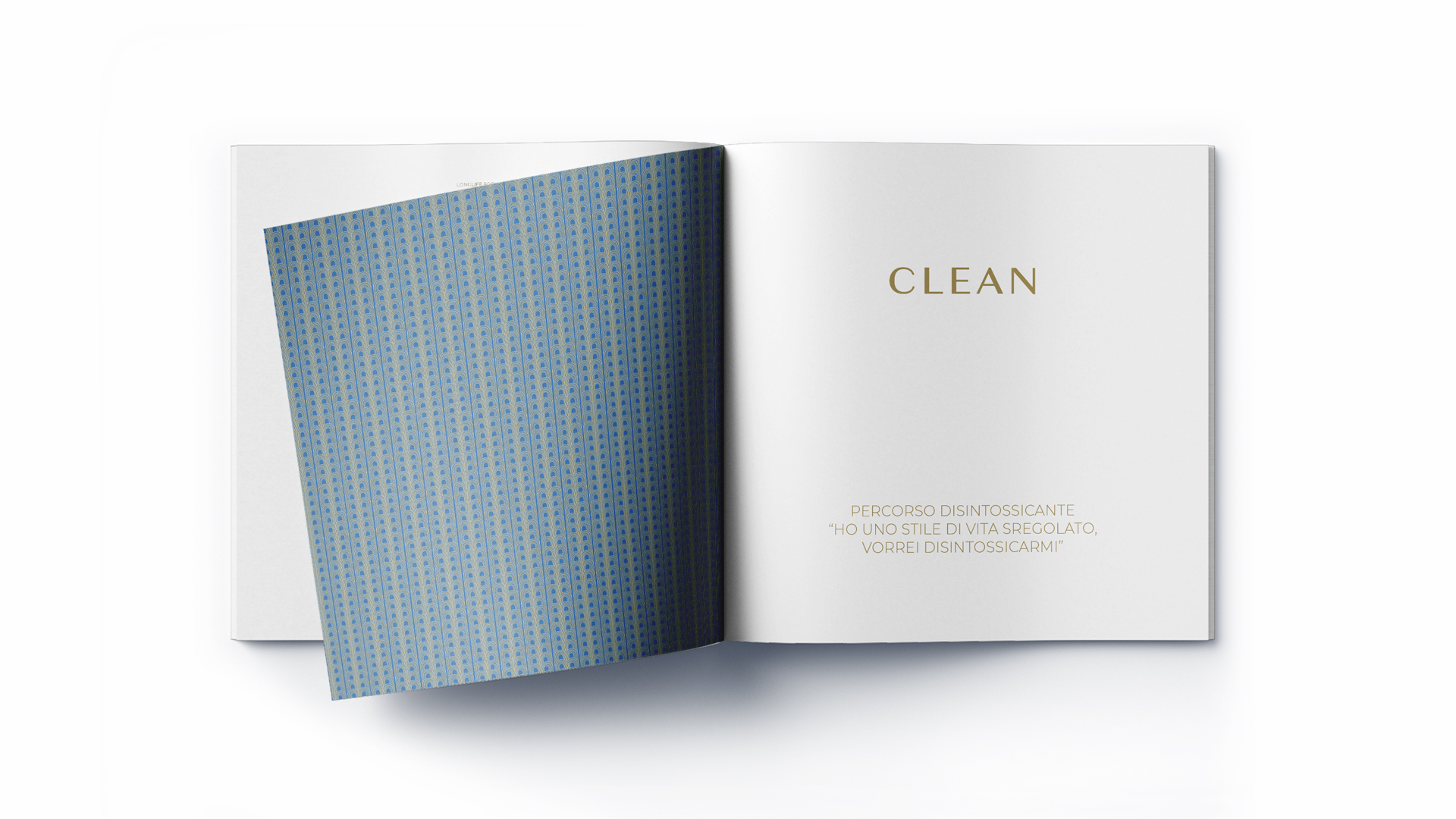
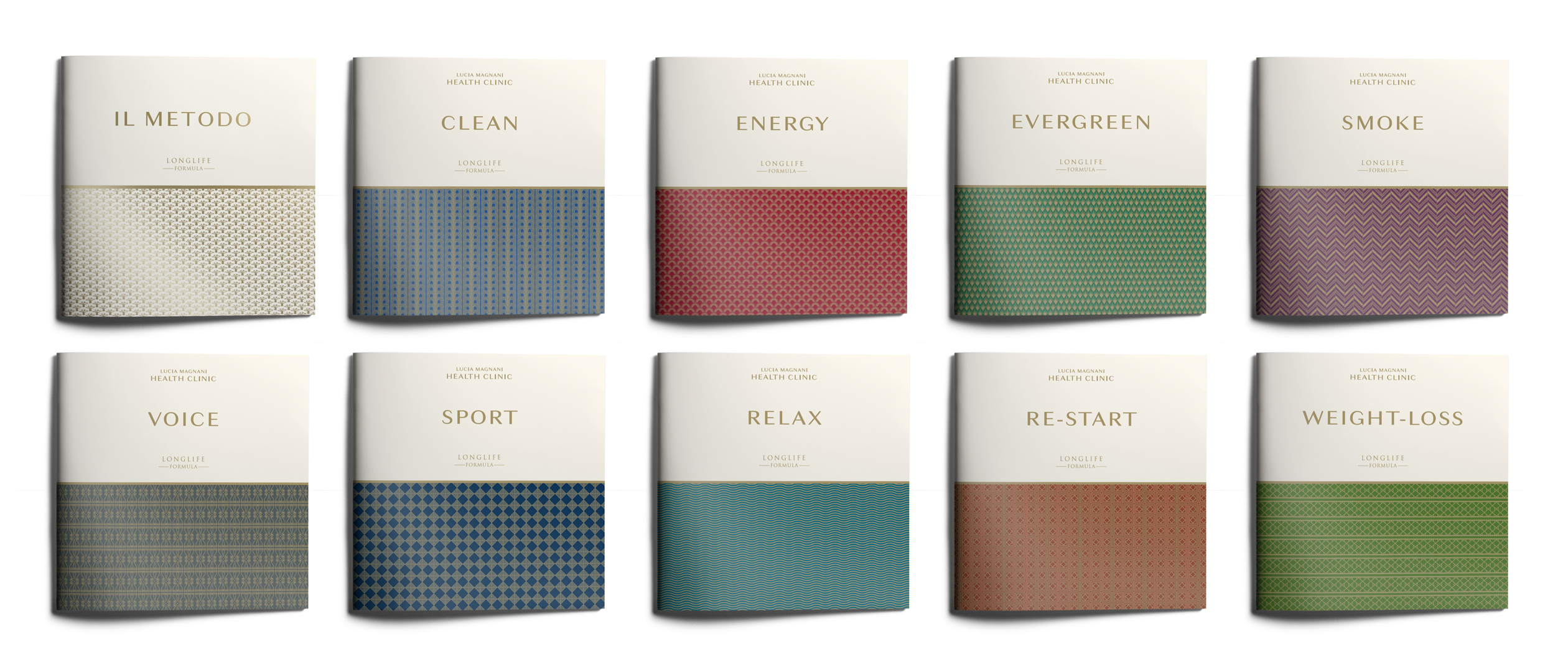
The brand identity is structured around a clear brand architecture, where the tagline “Longlife Formula” serves as an endorsement. “Lucia Magnani Health Clinic” is the umbrella brand that extends across the main entity, the clinic itself, and extensions such as the skincare line, ensuring immediate recognition. Visual consistency is supported by an elegant design that uses a neutral color palette paired with gold typography, conveying a sense of cleanliness and preciousness. A distinctive element is the series of geometric patterns used to differentiate the clinic’s various wellness programs and to visually unify the group’s assets, including the Grand Hotel Castrocaro and Caffè Chini.
Communication design. Recognizability at every touchpoint.
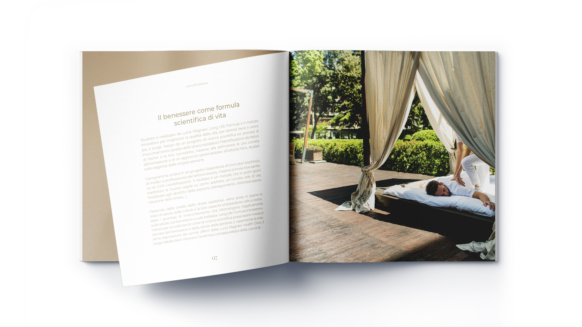
The brand identity extends across all communication media, maintaining its sense of rigor and elegance. Printed materials, such as wellness program brochures, play with geometric motifs, often repeated on a larger scale throughout the physical spaces, acting as signage distinguishing the different paths within the space. This consistency and repetition ensures that every touchpoint, both physical and digital, is a powerful visual vehicle capable of conveying exclusivity and attention to detail.
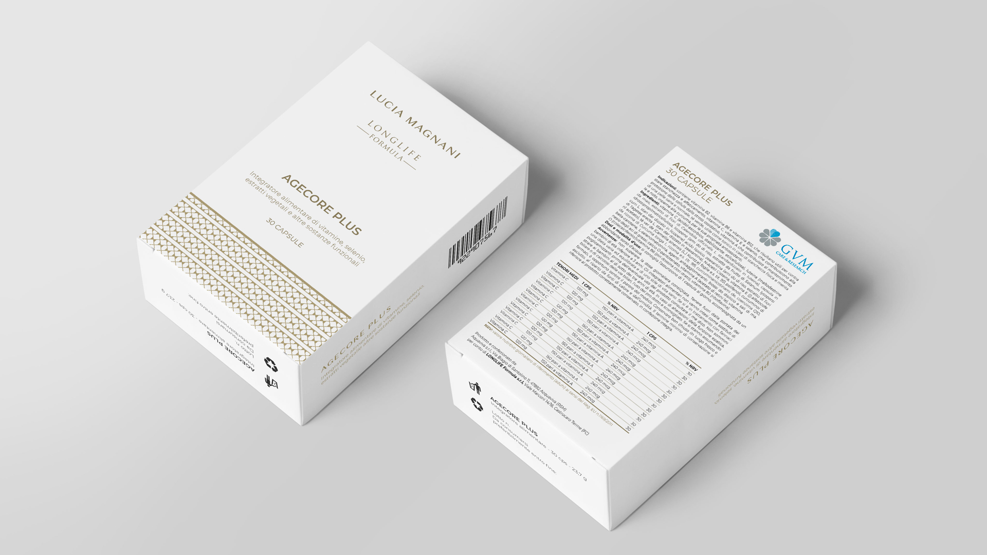
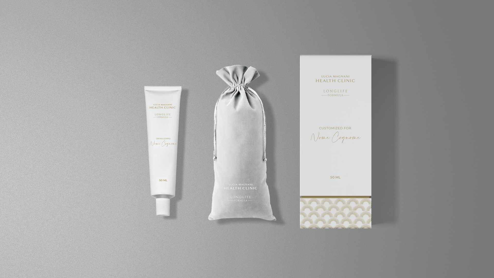
Packaging Design
The cosmetics packaging design is an exercise in formal minimalism and discreet luxury. Clean white predominates, evoking a sense of purity and scientific inspiration. The Lucia Magnani Health Clinic and Longlife Formula logos are embossed with a gold metallic finish and paired with the brand’s geometric motifs, used as a band at the base of the packaging: a visual “seal” that connects the cosmetic product to the clinic’s corporate identity.