The Carlo Cattaneo Free University Institute, known as LIUC, is a university founded in 1991 in Castellanza, in the province of Varese, on the initiative of the Industrialists’ Union. With a unique approach in the Italian academic landscape, LIUC stands out for its strong connection with the business world. Its goal is to train students to be ready for the job market, combining academic knowledge with an entrepreneurial mindset in an international and dynamic environment.
Brand identity: the integration of the culture of knowledge and the culture of action
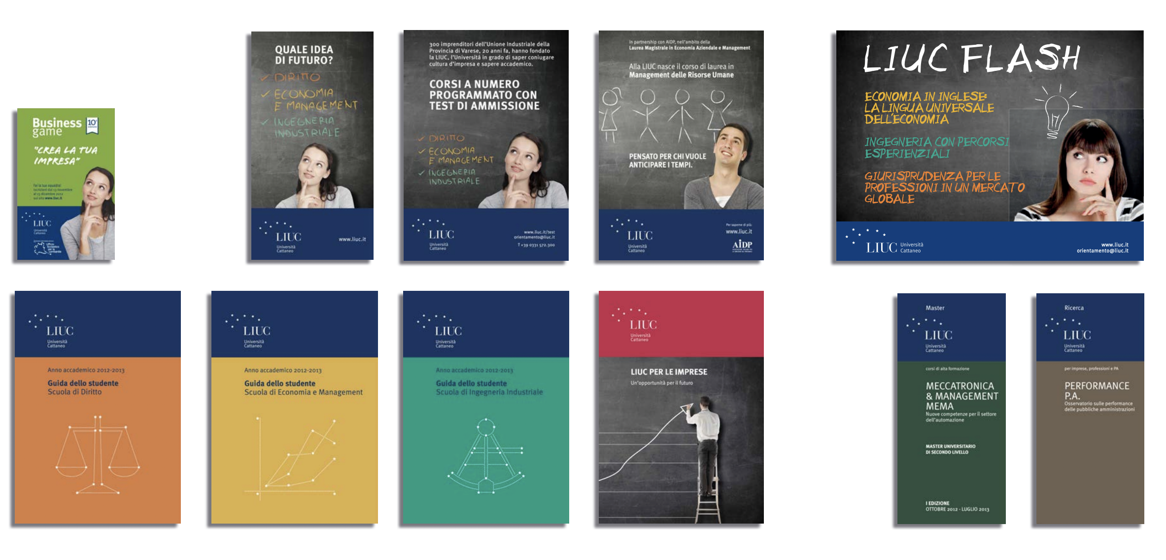
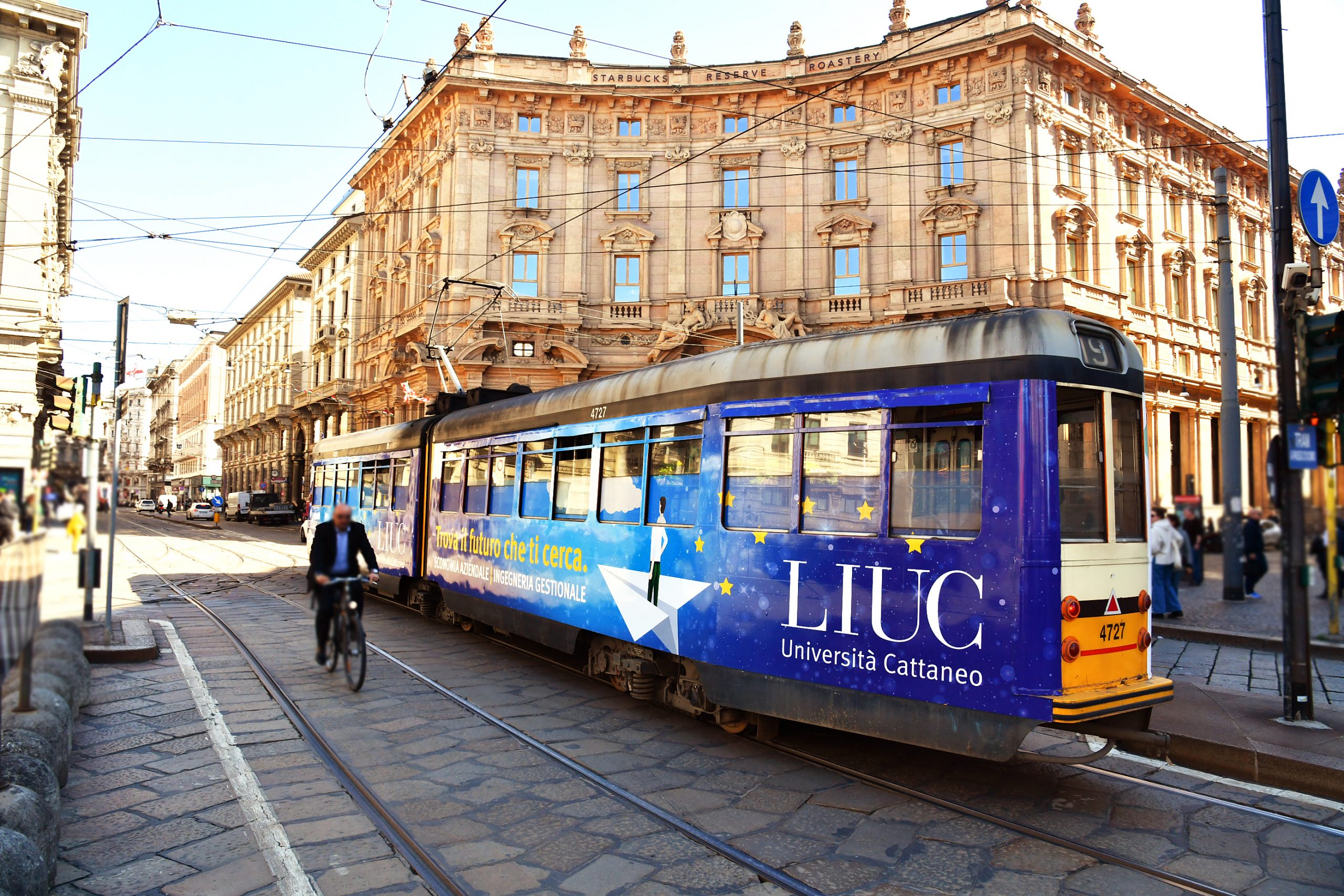
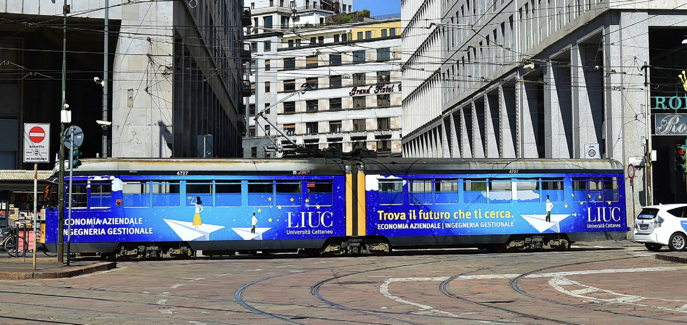
Inarea guided the university through a repositioning process that resulted in a new brand identity. The work focused on simplifying the core elements of the identity, starting with the name—shortened to “LIUC Università Cattaneo”—and then extending the approach to all touchpoints through a design that is both simple and rigorous.
In an increasingly competitive university landscape, the brand identity project aimed to highlight the university’s distinctiveness and recognizability, while maintaining an authoritative, direct, and pragmatic tone.
In this context, the student’s central role is closely connected with the local business community through an educational model that is almost unique in Italy.
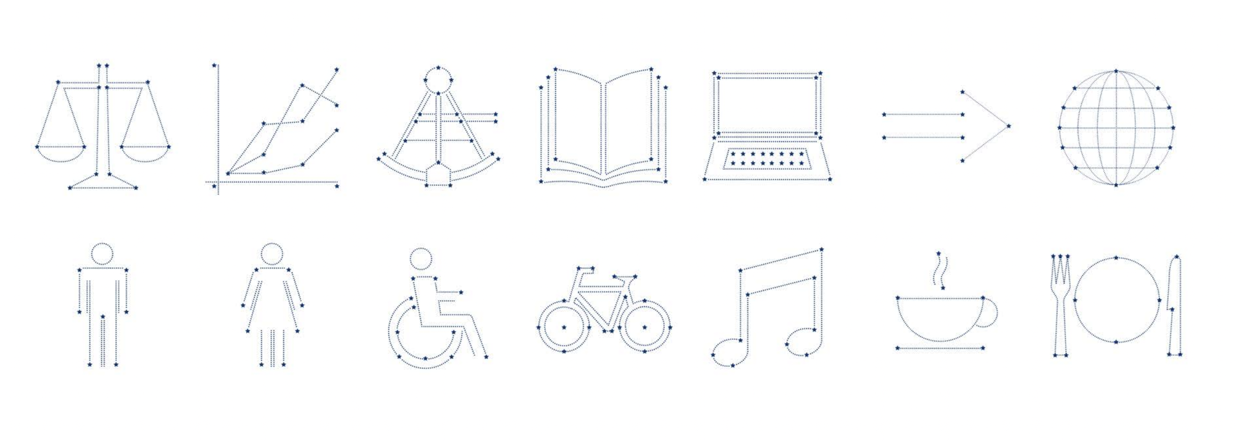
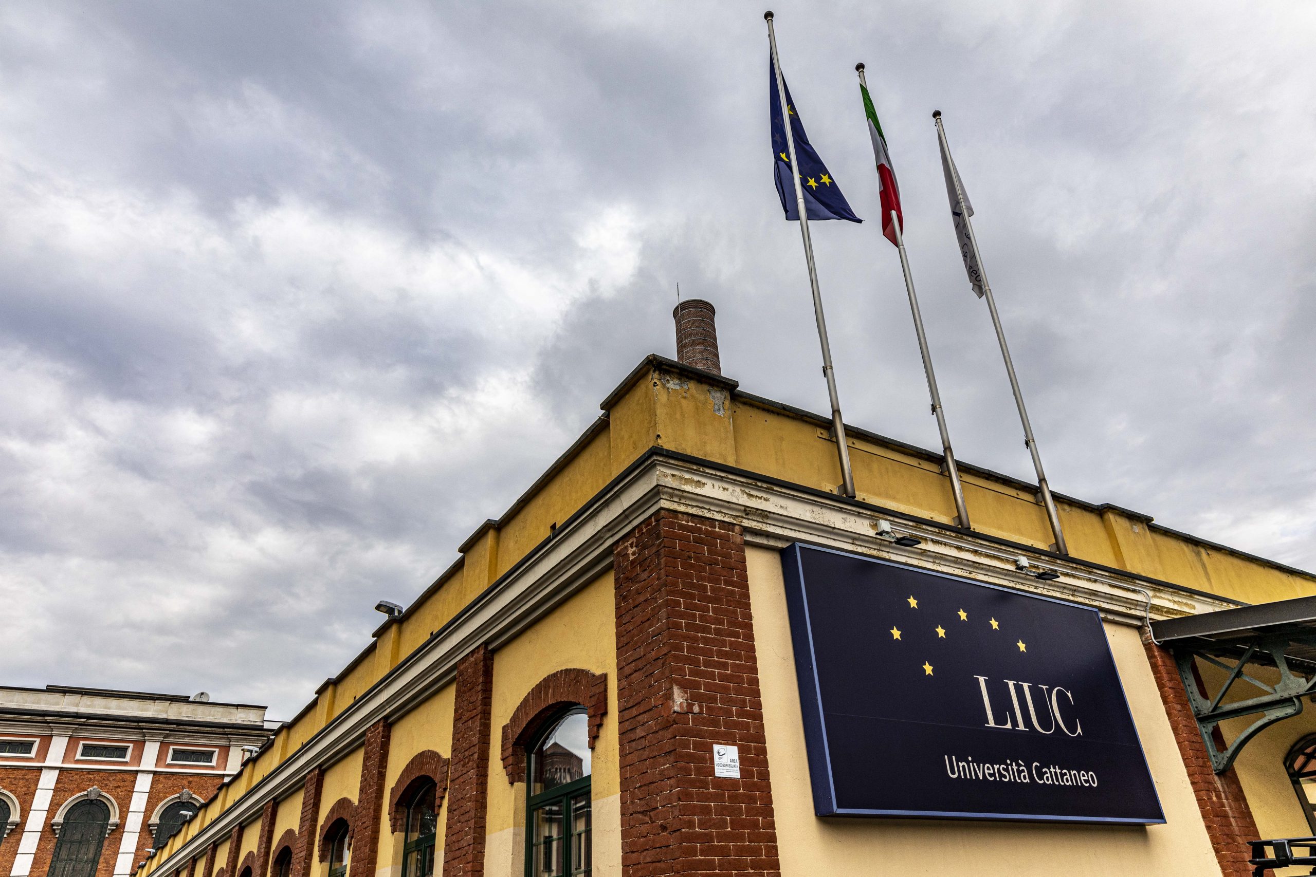
The distinctive element is the reimagining of the constellation of Ursa Minor, which appears to emerge from within the letter “U” — already the symbol of the university — now freed from its previous graphic constraints.
The idea of a starry horizon represents the future that every LIUC student has the opportunity to build through their educational journey. The color palette is understated: blue, chosen as the primary color, evokes stability and reliability—fundamental values for a higher education institution.