GVM Care & Research is an Italian healthcare group founded in Lugo di Romagna, with over forty years of experience in accredited private healthcare. The network includes hospitals, outpatient clinics, diagnostic centers, and rehabilitation facilities throughout Italy and abroad. GVM’s mission is to integrate care, research, and innovation, offering personalized care pathways that combine clinical quality, advanced technologies, and attention to patient well-being.
Brand architecture. A single language for the entire Group
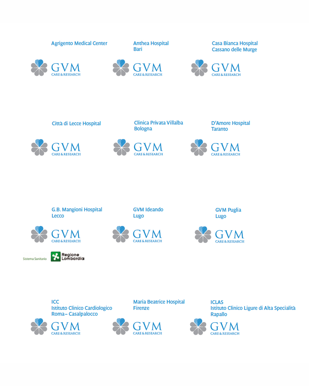
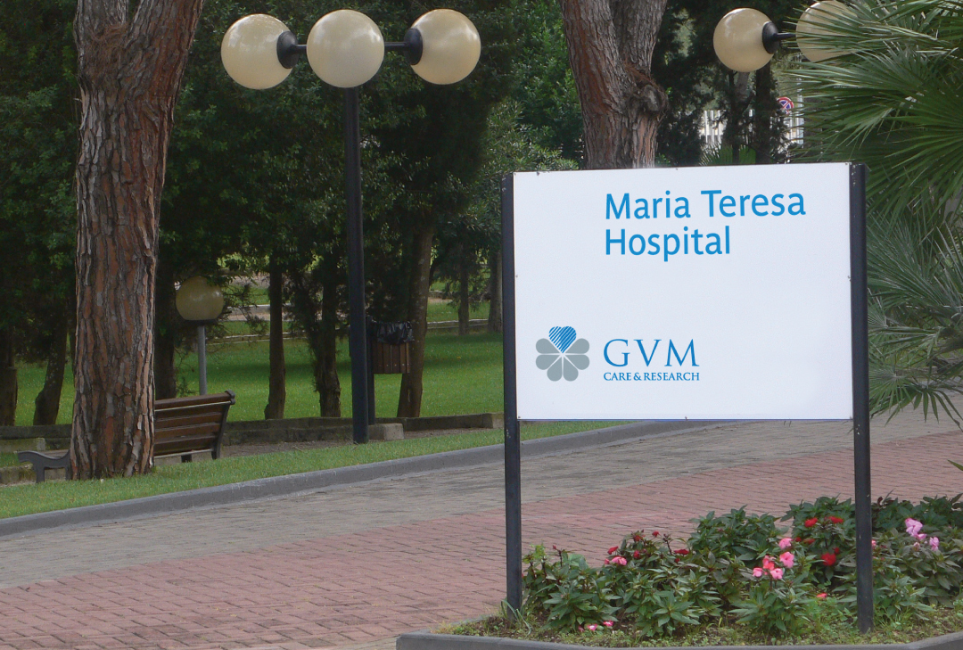
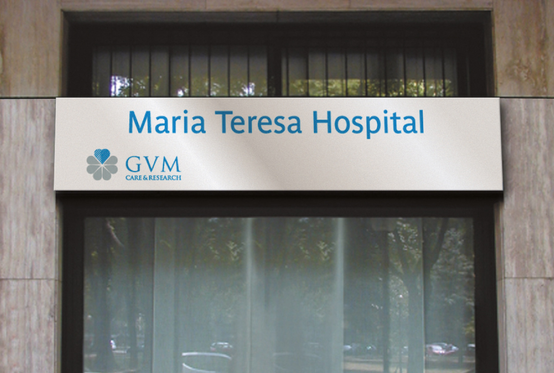
GVM’s visual identity is based on a coherent and modular system that translates the group’s values—professionalism, innovation, trust—into a unified visual language. The main brand, composed of the ‘historic’ flower, logotype and payoff “Care & Research”, represents the heart of the brand system, while the brand architecture graphically organizes the various structures according to precise naming and composition rules. Each hospital adopts the GVM brand accompanied by its name and reference city, with variations depending on the presence of acronyms or geographical names. The use of institutionalcolors and the Parisine font ensures visual continuity between the operational realities and the corporate. The use of institutional colors and the Parisine font ensures visual continuity between the operational realities and the corporate.
Brand design: the visual essence of the brand
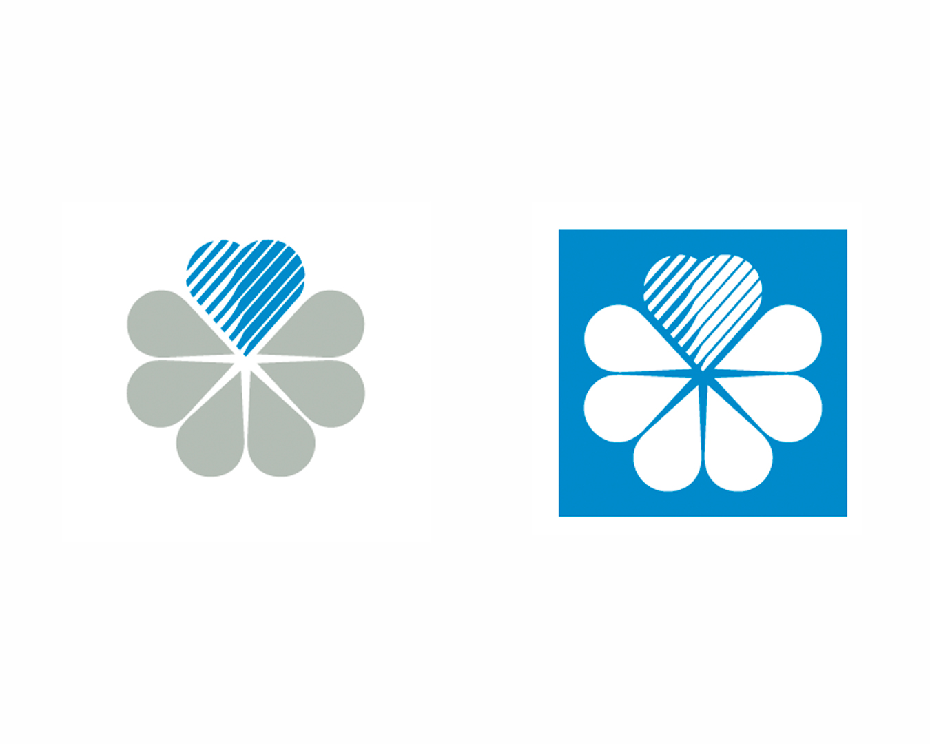
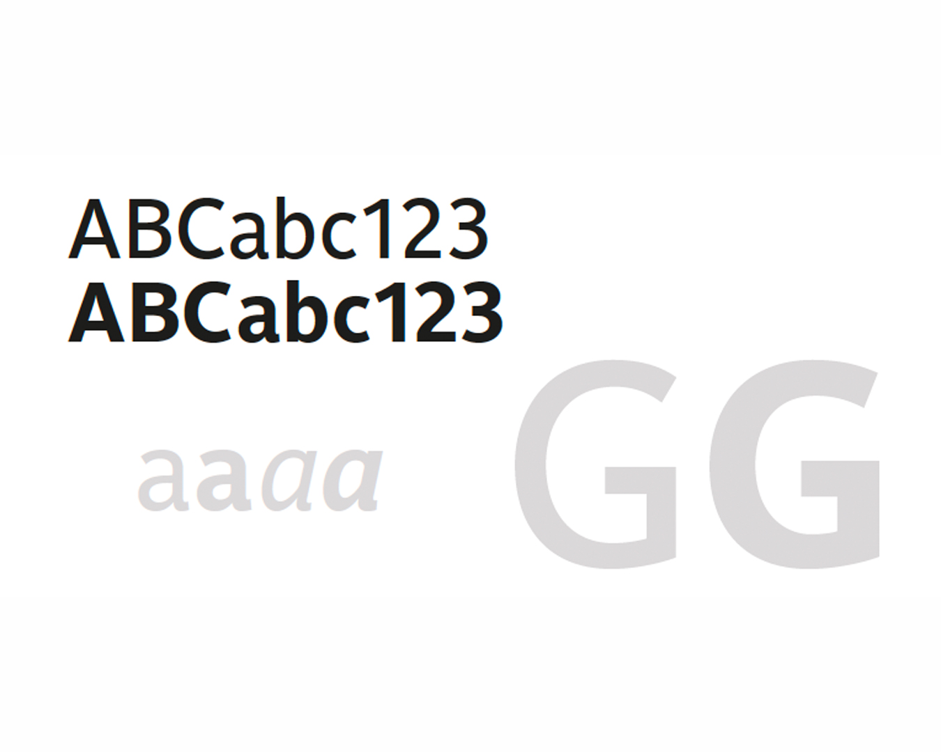
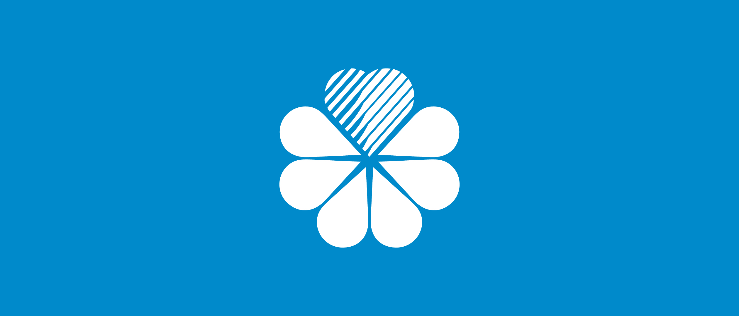
The GVM logo is composed of three distinctive elements: the flower, the Group’s historic symbol, which has remained unchanged; the GVM logotype with its classic typographic style; and the “Care & Research” baseline, which summarizes the mission. The flower is reproduced exclusively in the official version. The corporate colors are gray and light blue, shades that evoke trust, serenity, and technology. The linear and legible Parisine font conveys clarity and modernity. The consistent typography and color scheme, along with the rigorous clear area and construction grid, ensure a stable, clean, and recognizable image in every application.
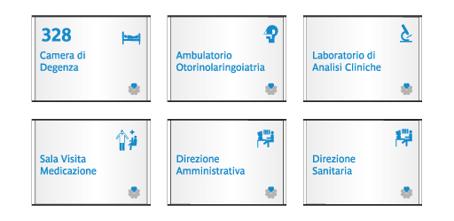
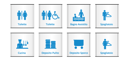
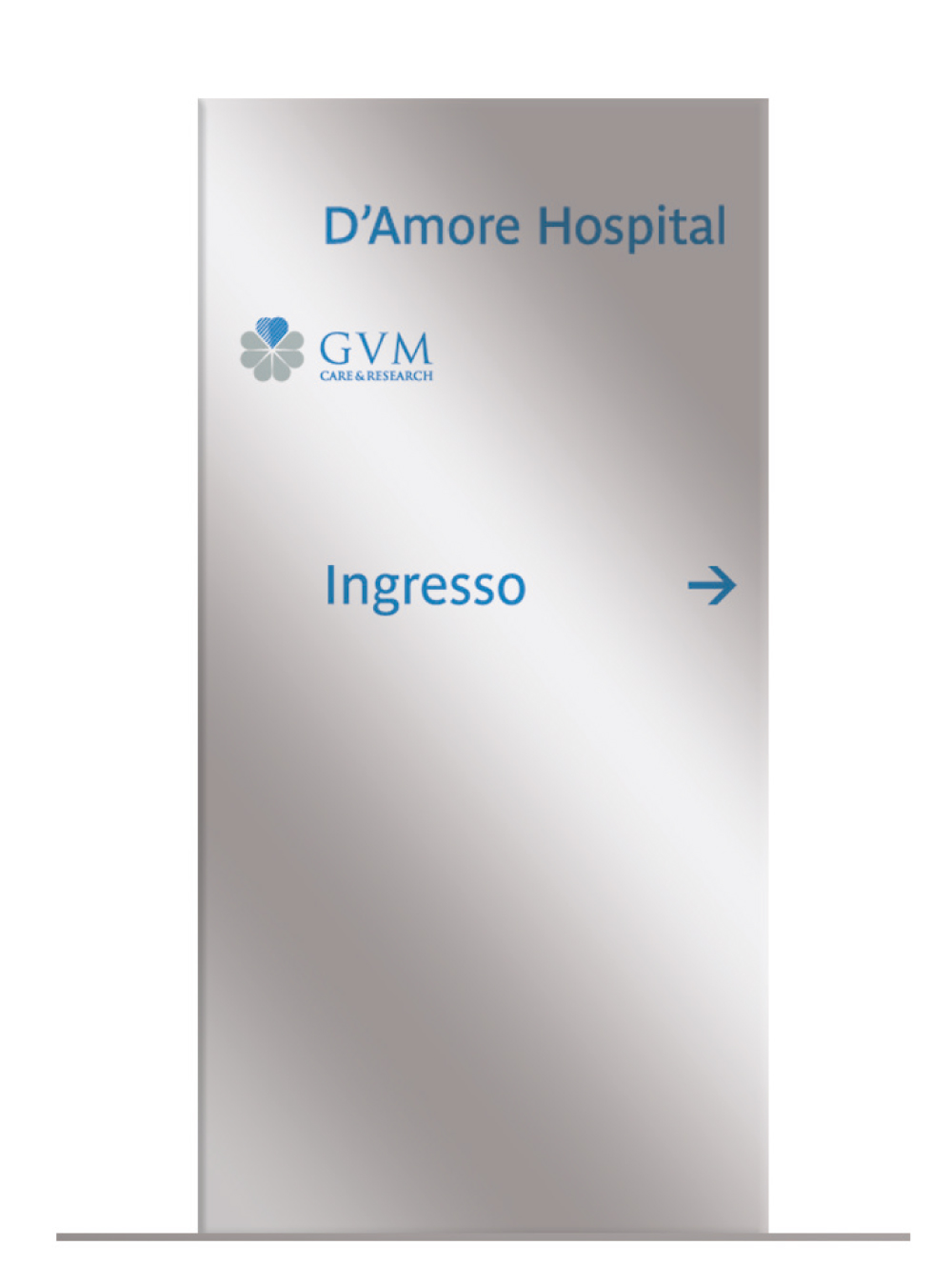
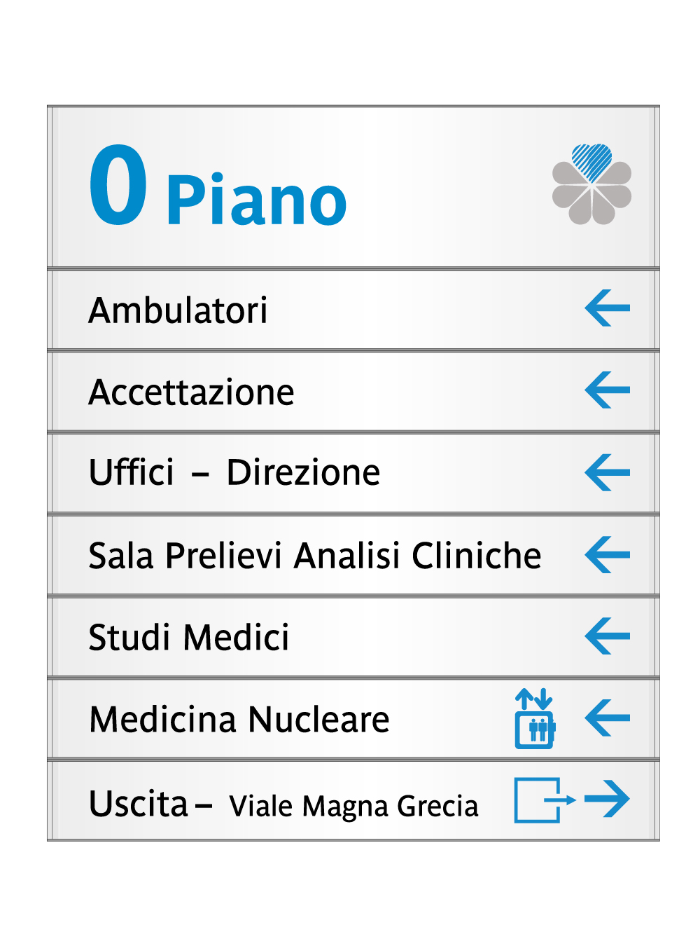
Wayfinding design. For clear orientation.
The wayfinding system for GVM is designed to provide clear and consistent orientation within hospital facilities. Signage, totems, and plaques follow the institutional proportions and colors, integrating the brand with essential text and pictograms. The goal is to ensure accessibility and readability, improving the patient experience and making the spaces consistent with the group’s image.
Communication design. Consistency across touchpoints.
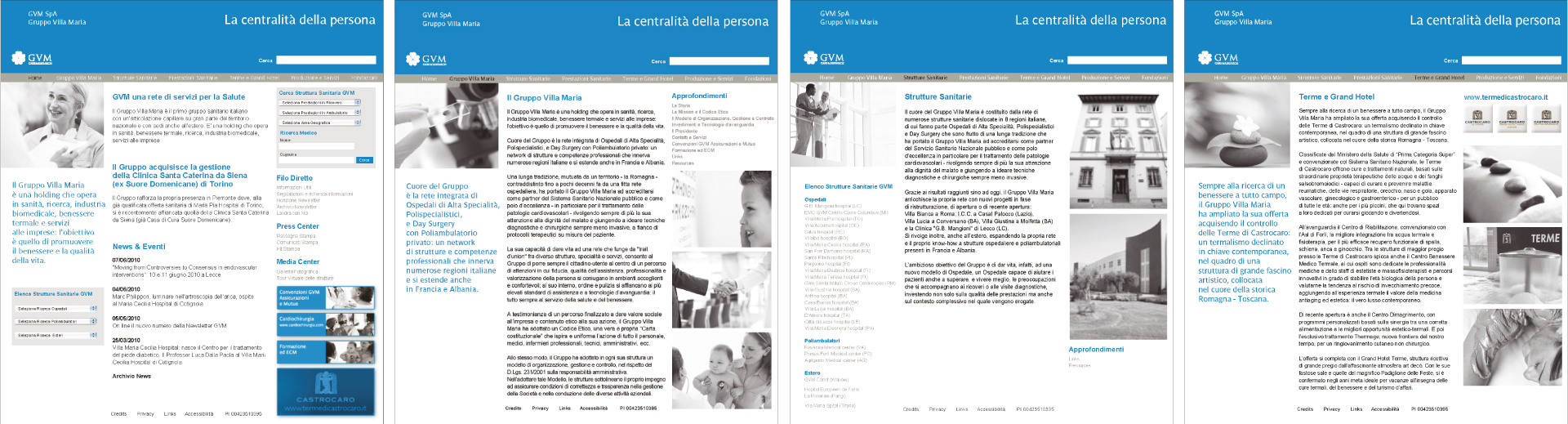
The communication design efforts successfully translated the brand’s values into a coherent and authoritative visual language. The editorial format, the photographic tone, with its emphasis on people and the value of care, and, in general, the corporate communications contribute to guiding and conveying reliability, expertise, and personal care, strengthening GVM’s identity as a healthcare network of excellence.