Gemelli University Hospital

Ethics and clarity of care

Inaugurated in 1964, the Agostino Gemelli University Hospital today stands as one of the foremost hospital and research centres in Europe. Founded by the Franciscan Fathers and the Catholic University of the Sacred Heart, the Gemelli combines care, education, and scientific innovation in line with the vision of its founder: caring for the patient, caring for the person, caring for the spirit. A benchmark for national healthcare, the Gemelli stands out for its clinical excellence and for an approach that places the individual at the heart of every care pathway.

Brand identity. A symbol that unites science, faith, and humanity

The project to redefine the visual identity of the Gemelli University Hospital began in 2013 as part of the strategic plan for the institution’s fiftieth anniversary. The goal was to restore coherence and recognizability to a complex system that balances its religious, scientific, and human dimensions.
The new logotype brings together this plurality of values in a single form: the initial “G” of the name becomes a symbolic matrix from which three graphic elements radiate, simultaneously evoking the Christian cross, the leaves of a tree—an emblem of life and renewal—and the human figure.
The composition is built on a clean typographic structure, based on harmonious lines and balanced proportions, with Gemelli blue as the institutional color. This blue, used in lighter shades for secondary communication, becomes the chromatic axis of the new visual language.
The typography, clear and sans serif, conveys modernity while maintaining a tone of authority. The result is an identity that blends innovation and tradition, making tangible the essence of the Hospital: a place where care, knowledge, and hospitality meet in balance.

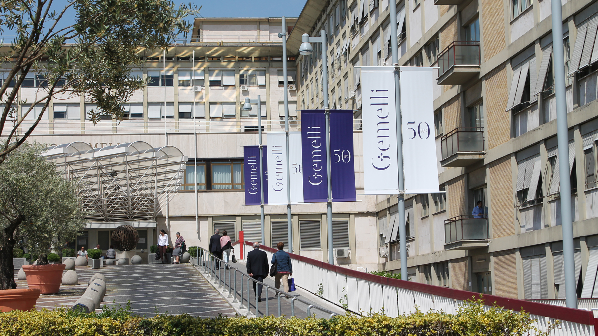
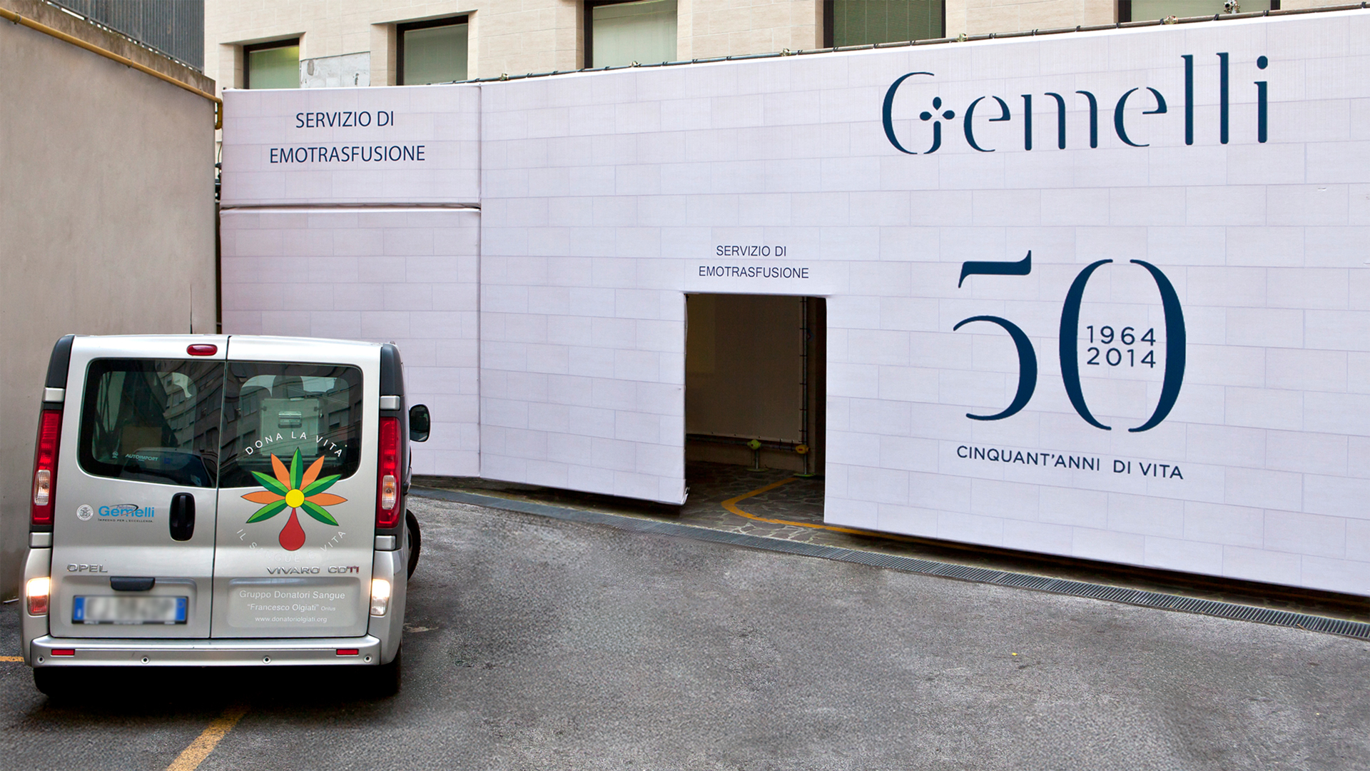
Gemellinsieme. The logo for the fiftieth anniversary

On the occasion of its fiftieth anniversary, a commemorative logo was created. Alongside the historic logotype, a lighter composition was introduced, defined by Gemelli blue and the payoff “Fifty years. Of life.” The number “50” becomes a dynamic graphic element: an open ring symbolizing continuity and community—a concept also expressed in the title “Gemellinsieme,” the name chosen for the event as the beginning of a new narrative portraying Gemelli not only as a place of care, but as a network of relationships.

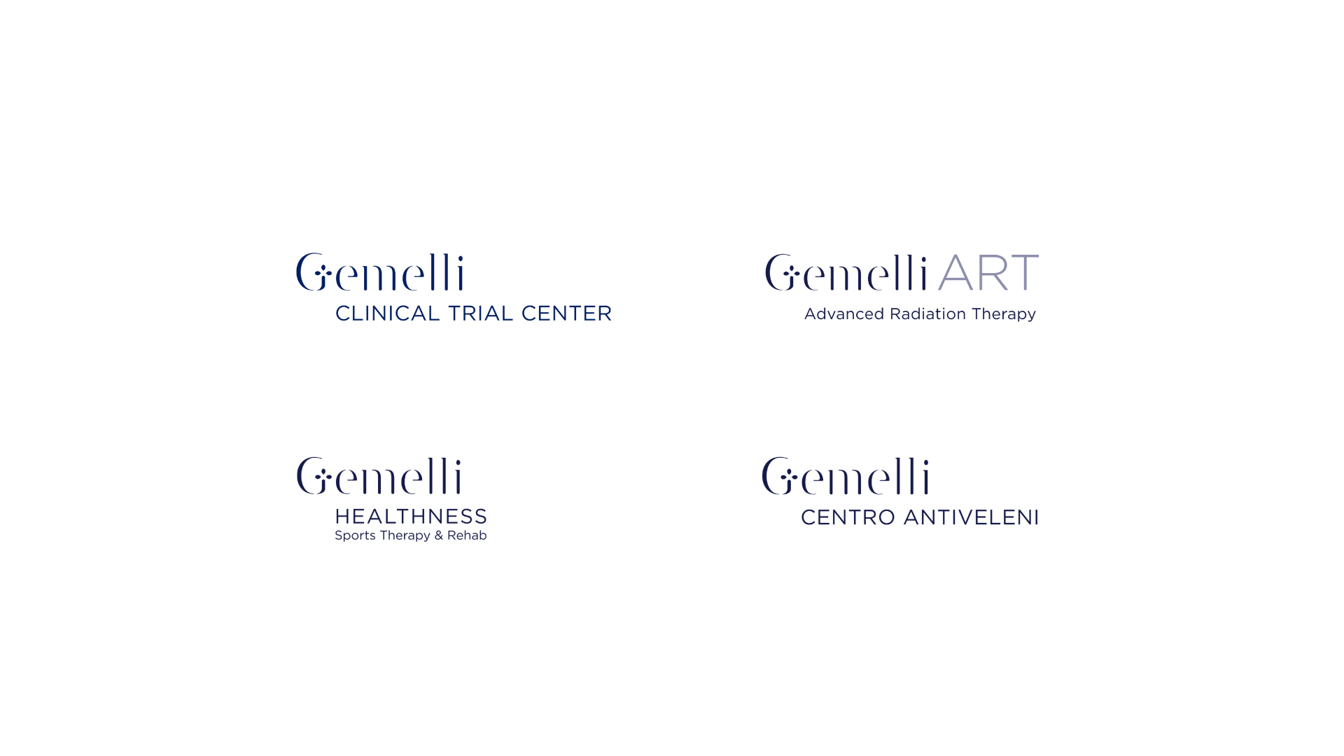
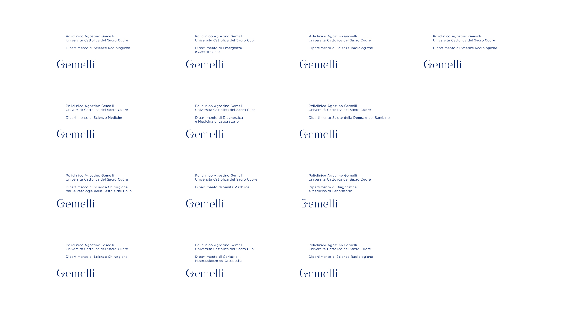
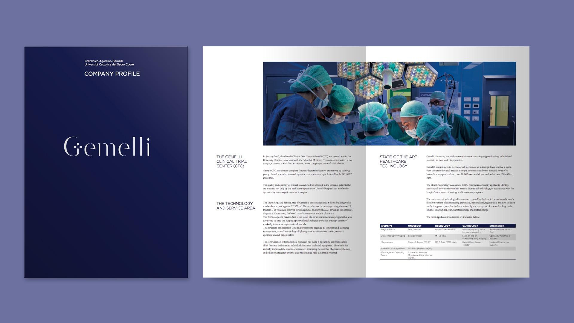
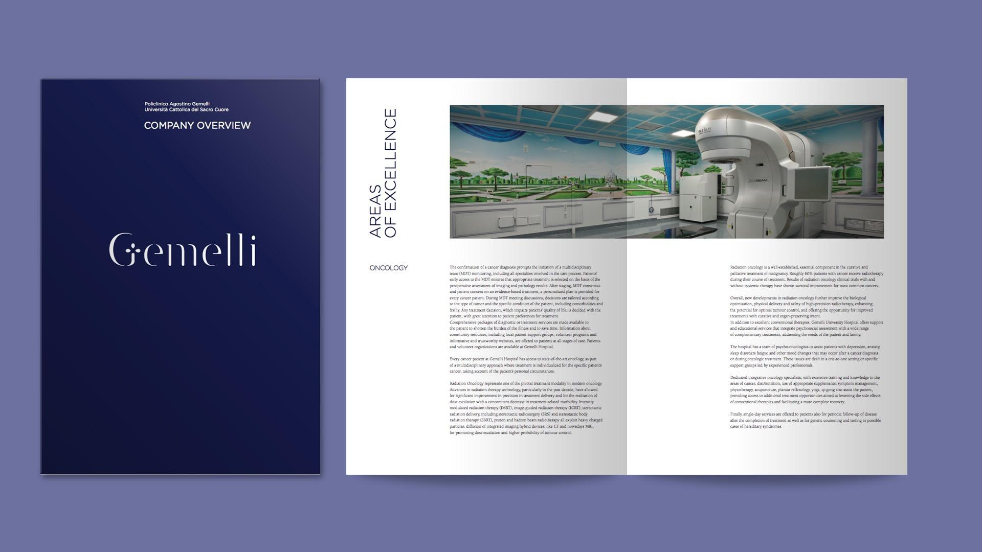
Brand architecture. A coherent system

From the main hospital to the “Poli-clinics,” the brand architecture was designed to enhance the overall system while maintaining a unified identity and highlighting individual distinctiveness. The Gemelli Hospital is thus conceived as a single, cohesive organism made up of several specialized centers—each recognizable yet strongly connected to the master brand.
At the foundation lies the Gemelli mark, a symbol of authority and quality, from which the various branches extend—from thematic clinics to research units and the Foundation. The compositional principle is based on a consistent relationship between the name and the parent identity: the main logotype remains unchanged, while the specific designation—for instance, a clinical area—appears in a subordinate position, emphasized through typographic hierarchy.
Secondary entities are therefore integrated in a modular way, ensuring clarity, recognizability, and coherence across all communication contexts.

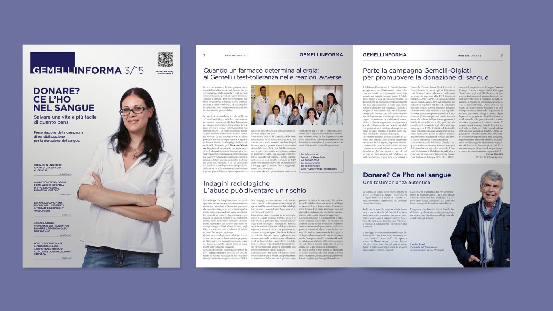
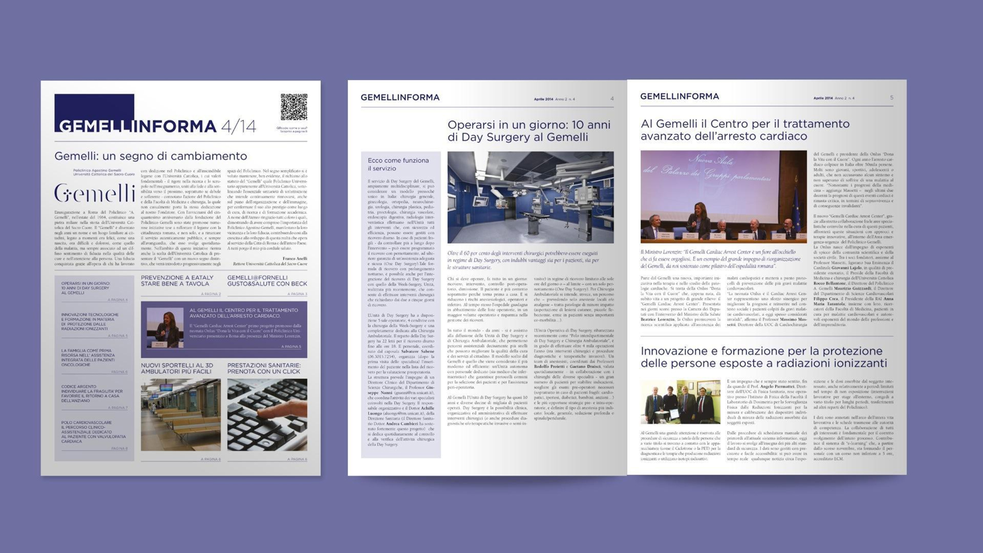
Communication design. From symbol to message

The communication system of the new Gemelli translates its identity into coherent and accessible editorial and digital tools. In printed materials—brochures, newsletters, forms, and posters—the visual language is built on light backgrounds, generous spacing, and a balanced use of the institutional blue, complemented by photographic inserts that highlight the human dimension of care.
In the digital realm, the color palette adapts to interactive and responsive interfaces: blue blends with neutral, bright tones to improve readability, while sans-serif typography ensures consistency with the visual identity. Every medium—from the website to the digital internal signage—conveys the values of welcome, listening, and support: the three pillars of the “form of attention” that define Gemelli’s new communication language.

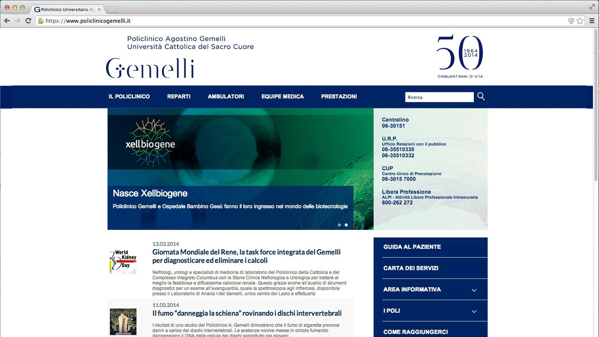
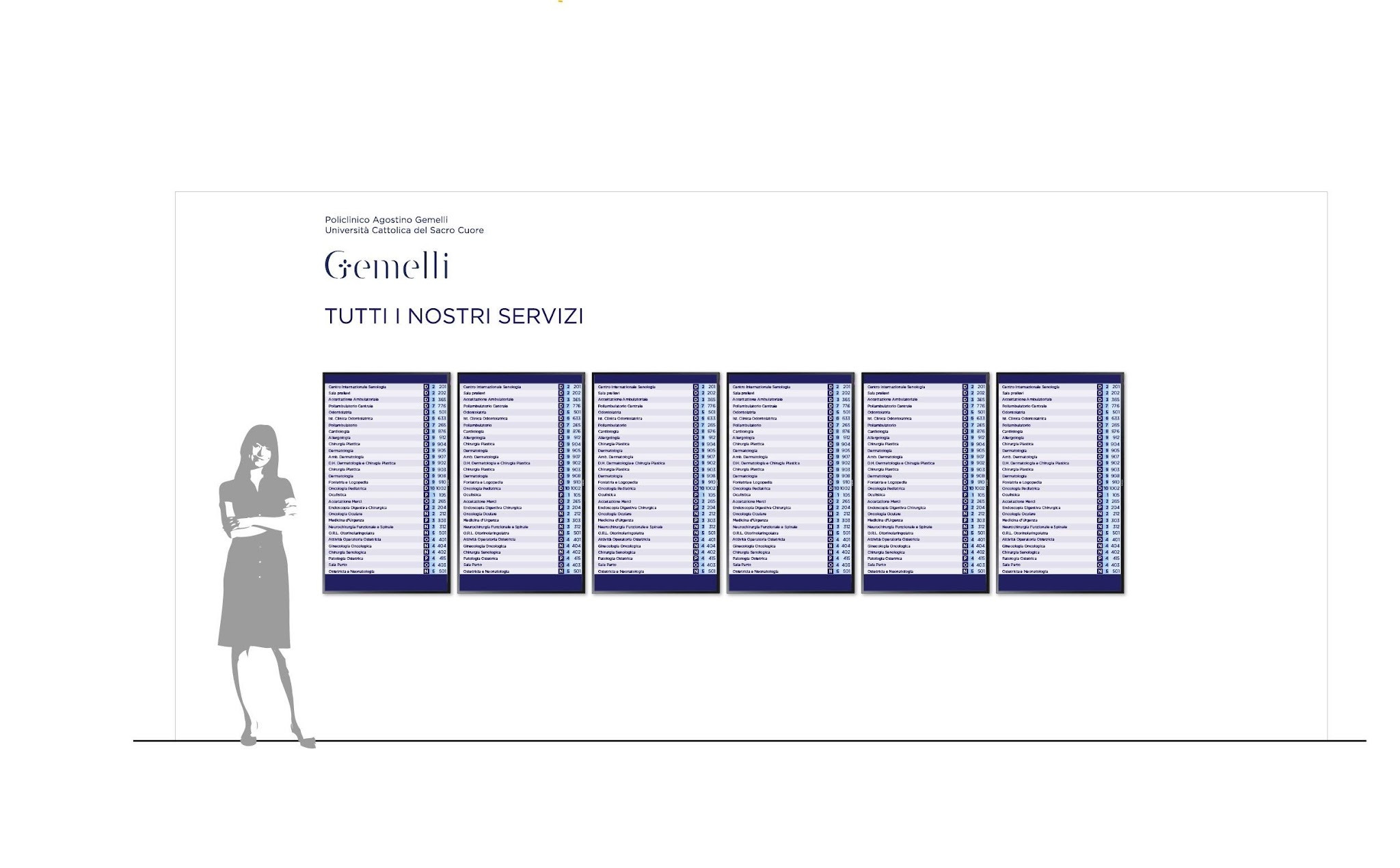
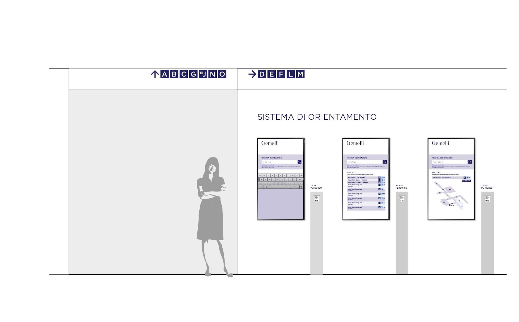
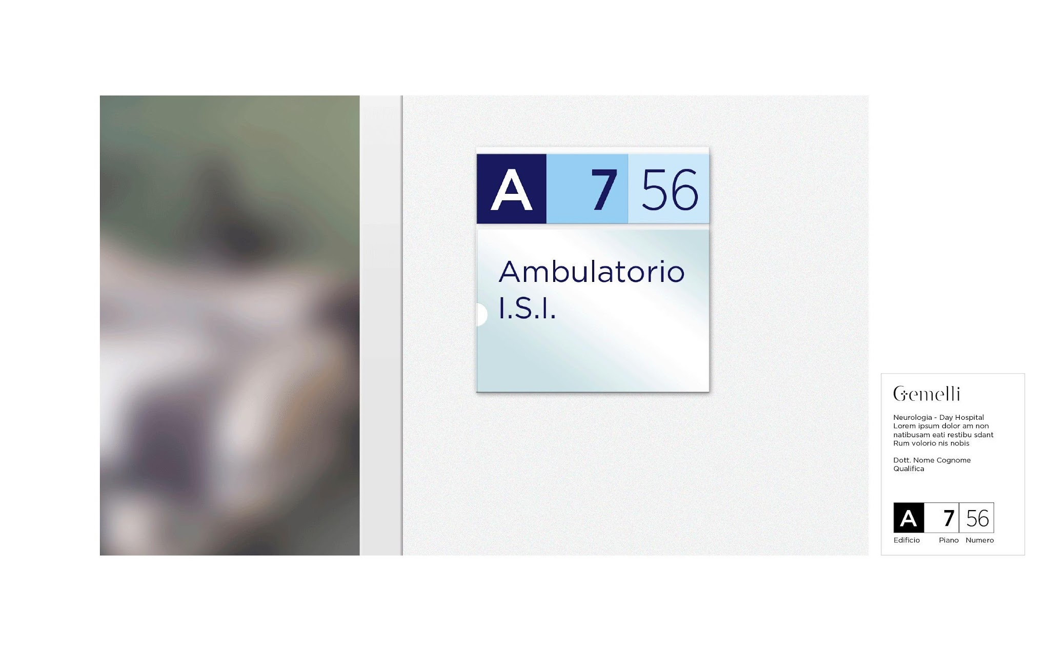
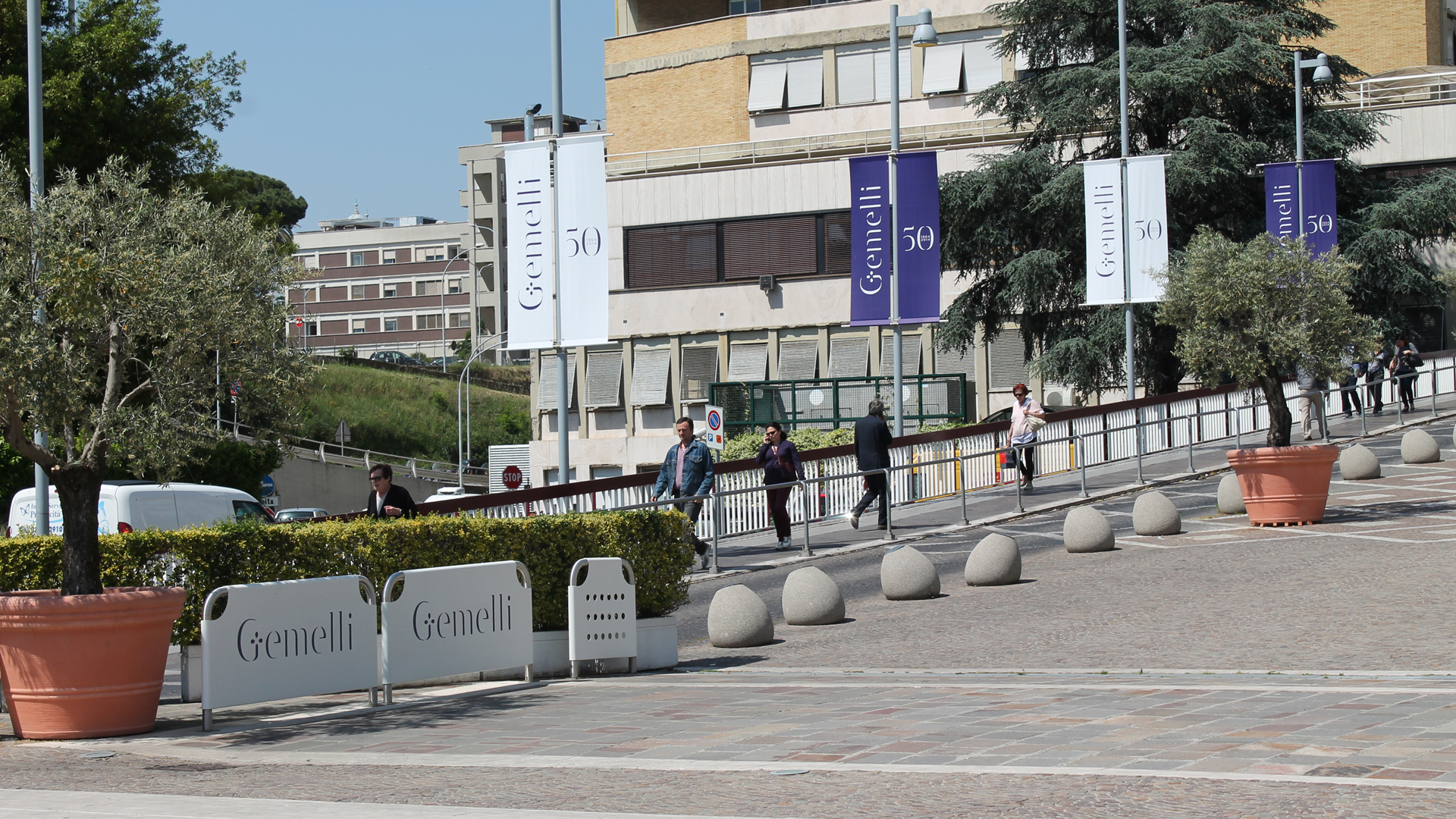
Signage & wayfinding design. Spaces that welcome

The wayfinding system of the Gemelli University Hospital is conceived as a visual extension of its identity. Routes are organized according to color codes consistent with the brand palette: shades of blue for institutional areas, warmer tones for waiting and reception zones, and neutral colors for transition spaces.
The modular signage employs simple, easily readable pictograms designed to guide visitors through a complex yet orderly environment. The wayfinding system draws inspiration from airport signage principles, developed from the user’s perspective to ensure independent navigation within a structured and intricate space.§
In this way, design becomes an integral part of the care experience, helping to create an atmosphere of hospitality and trust—fully aligned with Gemelli’s mission.

Segnaletica_Gemelli-1

Retail design. The renewal of hospital departments

As part of the renewal of the Gemelli University Hospital, several inpatient wards and the new floors for the Gemelli Medical Center outpatient clinics have been reconfigured. The project included the creation of two floors dedicated to specialist clinics and operating rooms for day-hospital procedures—an approach that enhances the recognizability of spaces and departments within the hospital’s overall layout, with distinctive elements that define each environment.