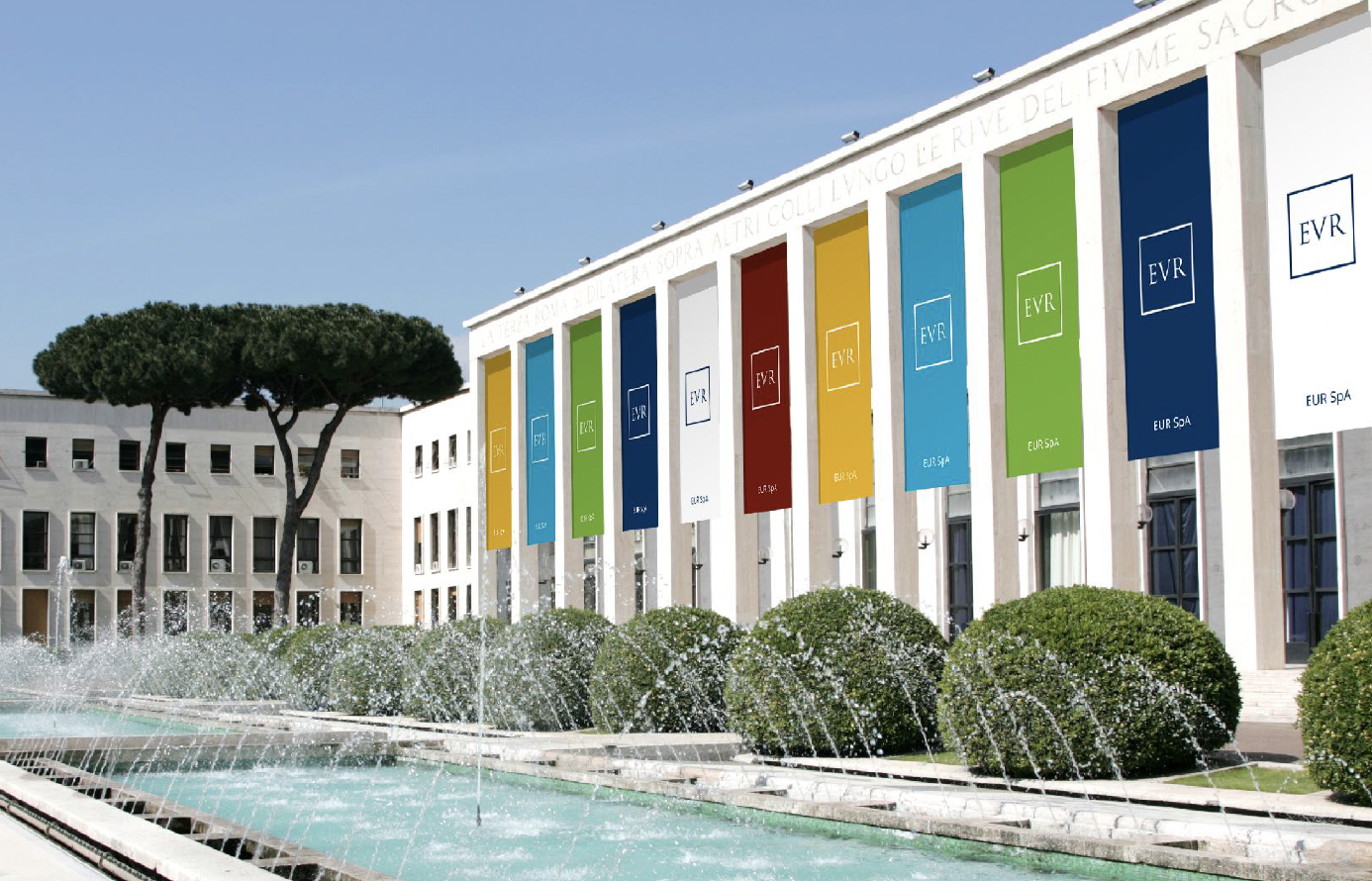
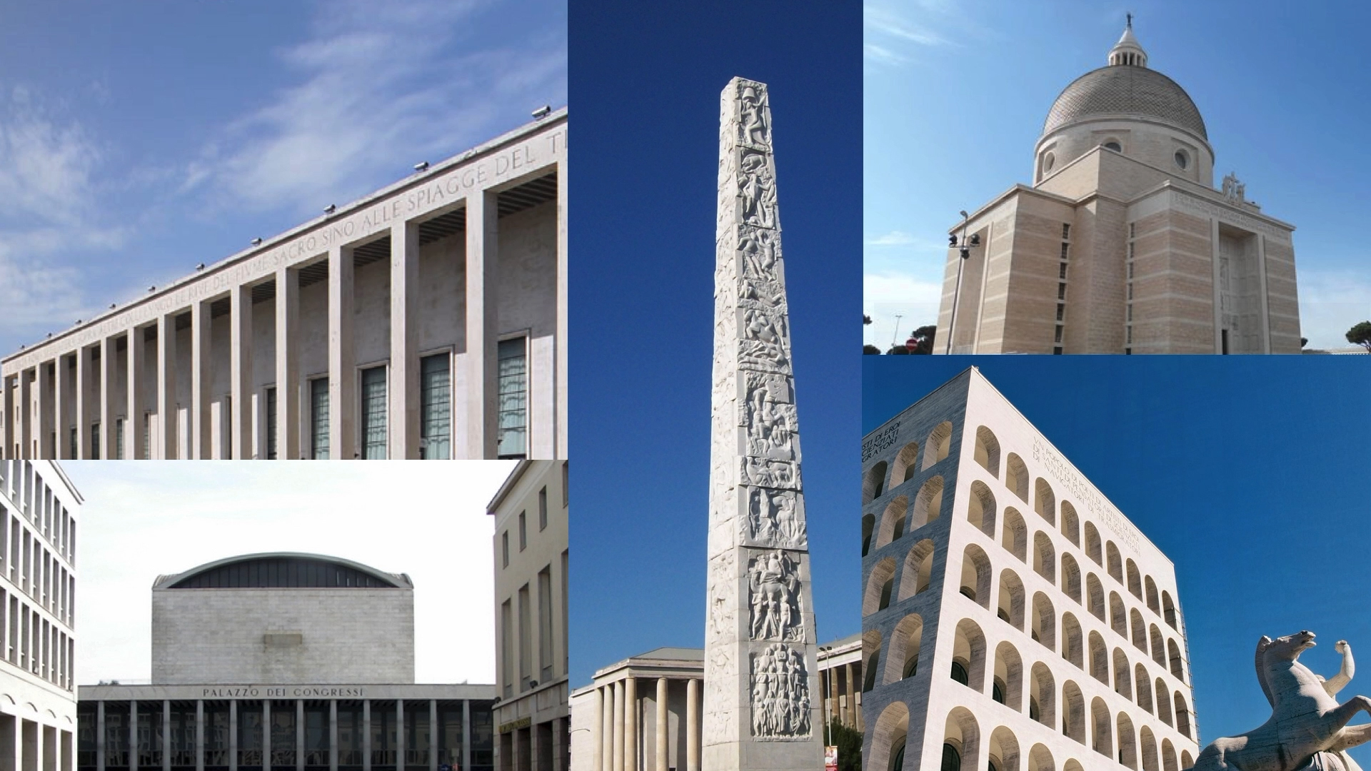
The EUR Spa company owns a significant part of the real estate assets in the eponymous Roman district Rome. Its mission is to manage and enhance this immense urban space, which includes monumental works of Italian Rationalist architecture and approximately 70 hectares of parks and gardens.
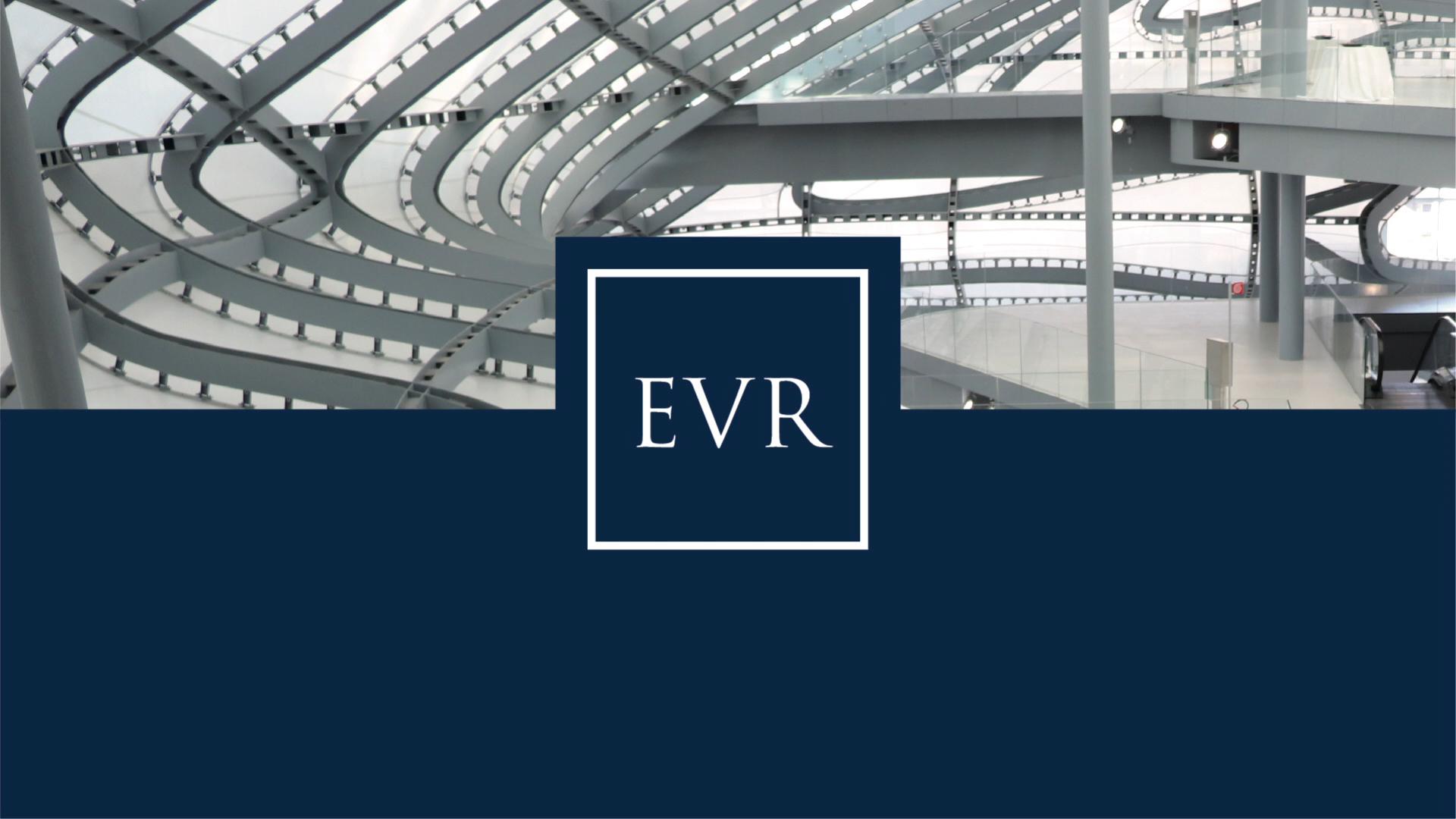
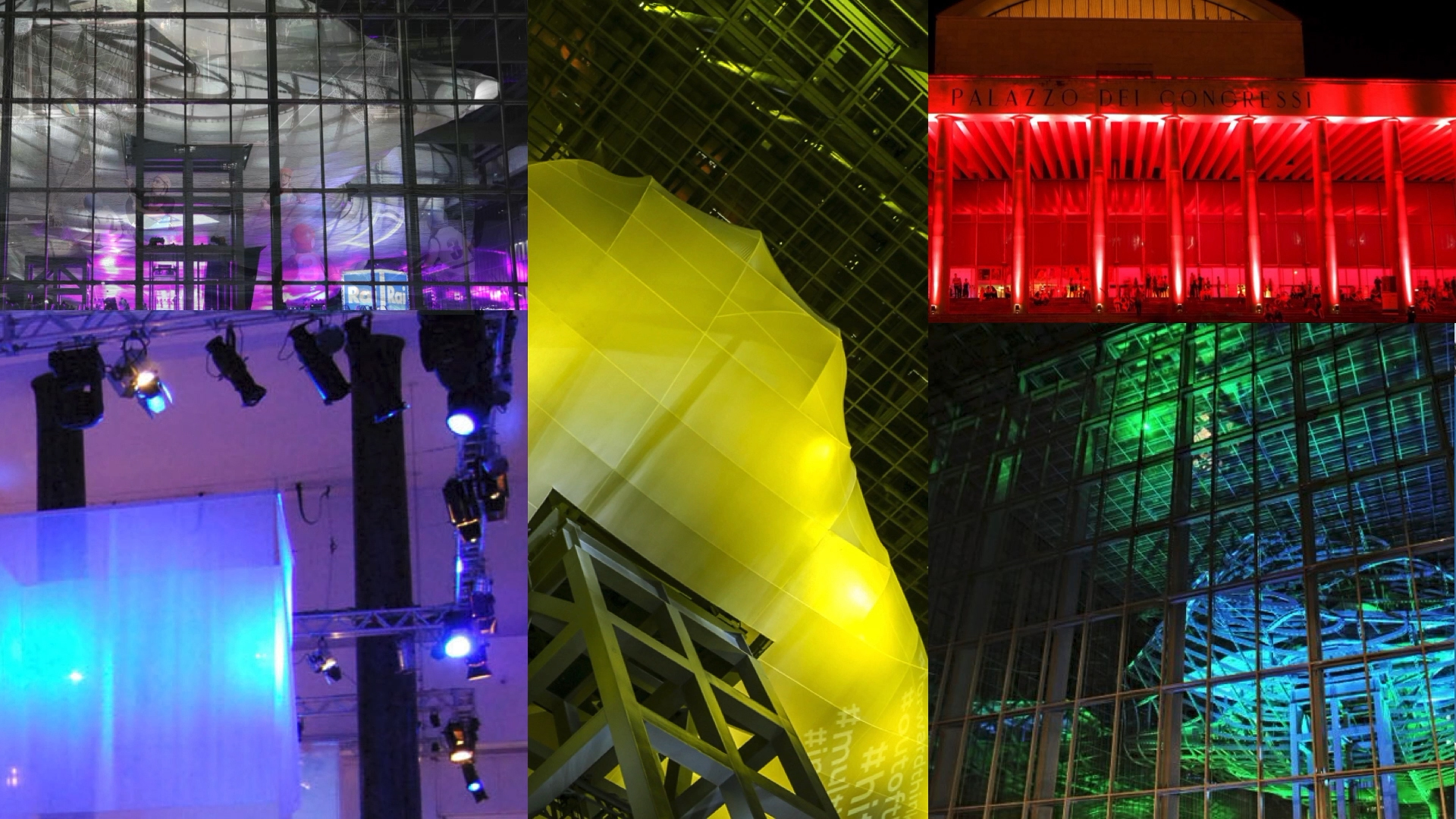
Moreover, international corporate head offices converge in the district, alongside museums, sports centres, and recreational experiences linked to urban greenery. Last but not least, the congress and trade fair business has received new impetus thanks to La Nuvola, the construction that has become a symbolic expression and international attraction.
Brand design A symbol for an iconic territory
The company is therefore an extensive landmark, not unlike the City of London or the Parisian La Défense. For this particular urban configuration, branding was required to be an outright territorial identity project.
Indeed, Inarea’s intervention began with consideration of the value of the site: the strength of EUR is not just about management/conservation of the historical architecture heritage, but also the ability to create new ways of using the place and of the relationship with it. A rediscovered contemporaneity reflects “the ongoing present of Rome”.
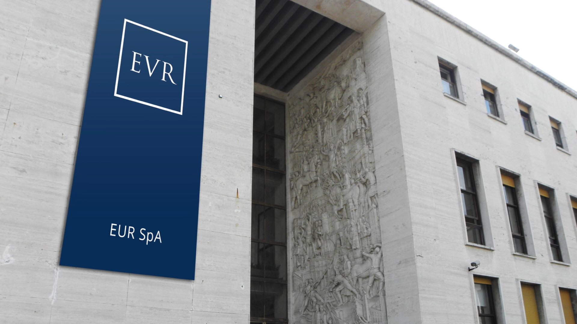
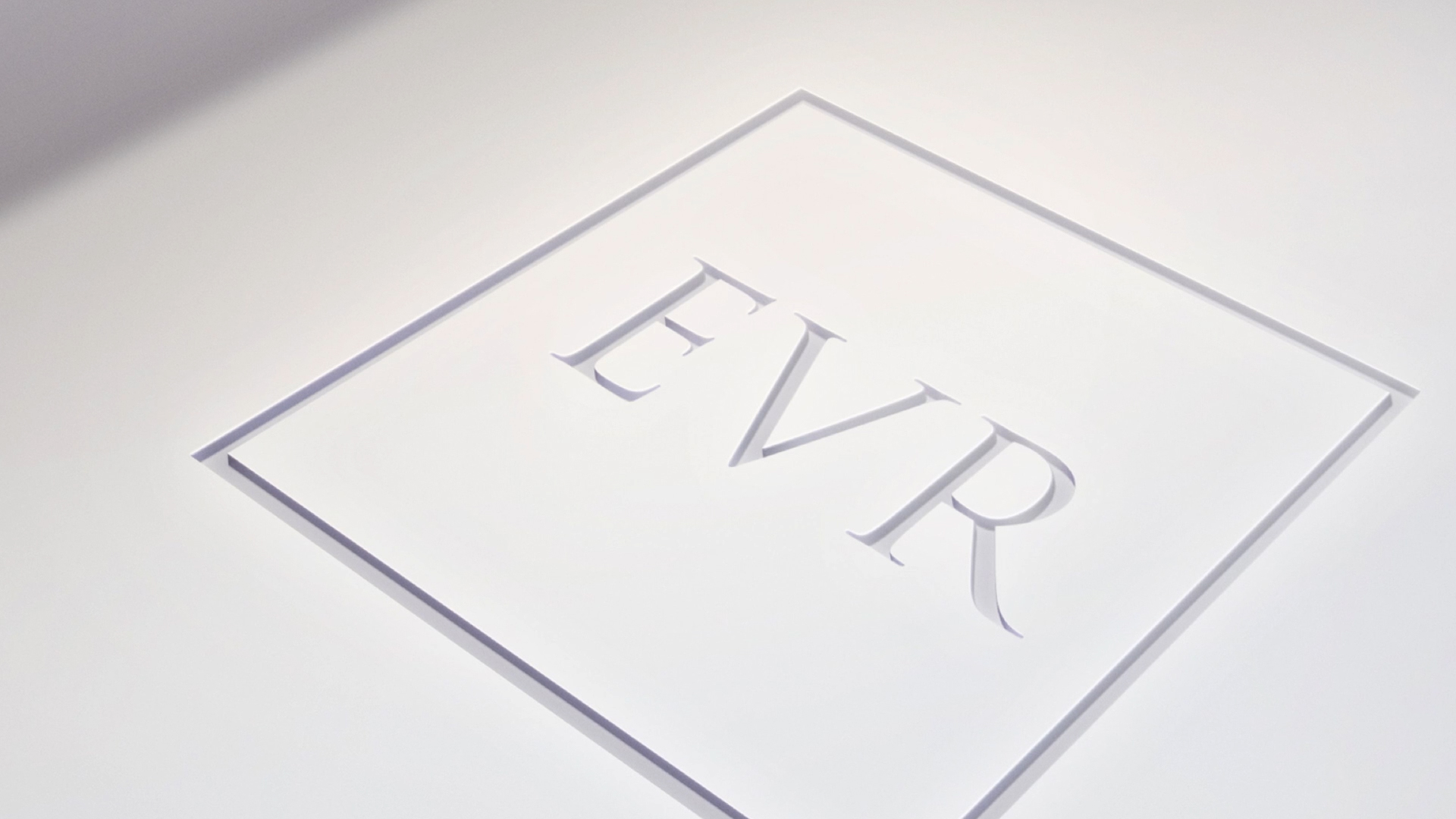
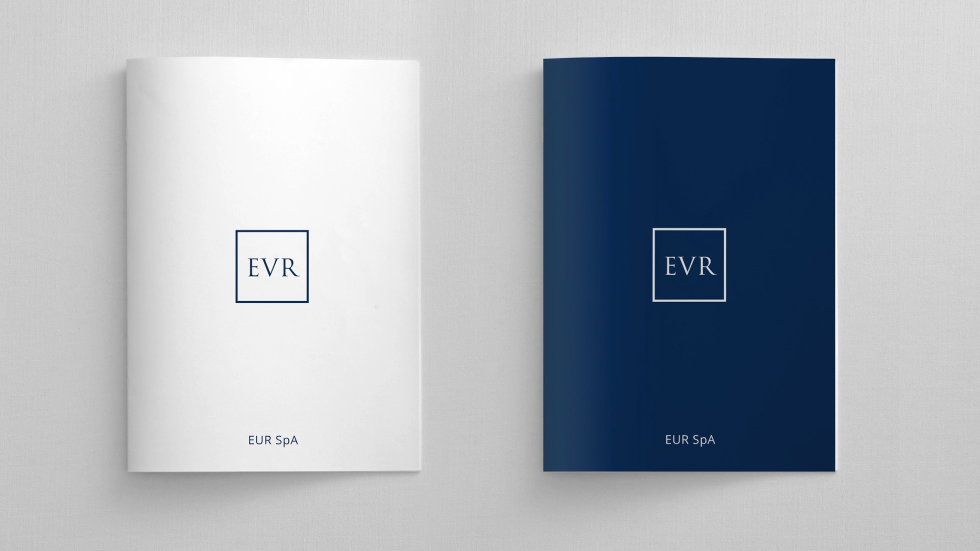
The new brand wanted to bring forth the character and vocation of the area, playing on the shared corporate and neighbourhood name. The brand recovers rationalist style elements, typical of the original architectural layout. Hence an essential sign: a square outlined in blue, from which the acronym EUR emerges, composed with a Trajan font, inspired by Roman stone engravings.