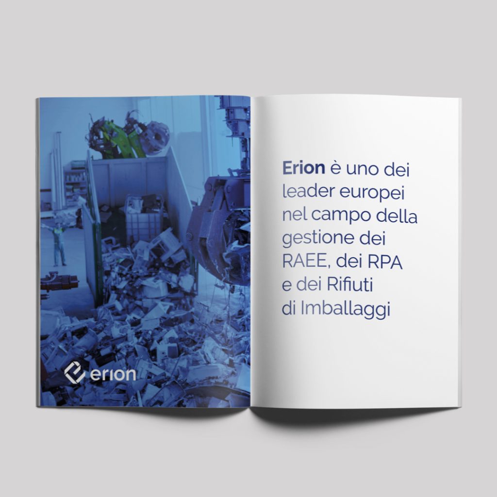
Erion was born from the Ecodom and Remedia consortia, two success stories at work since 2004 in the disposal of Waste from Electrical and Electronic Equipment (WEEE). Together, they interpret the waste management process from a perspective of circular economy and exploitation of raw materials.
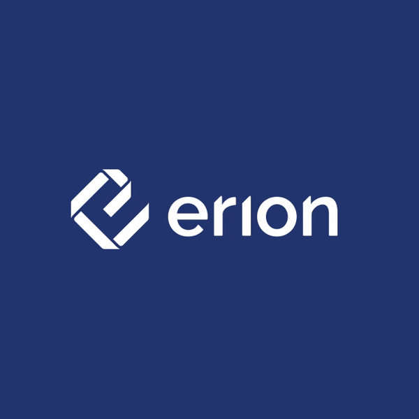
Inarea guided the working group formed by Ecodom and Remedia in the positioning and identity development of the new consortium. The metaphorical reference chosen to craft the new narrative is the ribbon, a symbol of union, a concept that has existed since ancient times when it was tied around the wrists of newlyweds.
Erion’s vision is to combine extended producer responsibility with new consumer awareness, thanks to a virtuous, circular, transparent and sustainable path. Erion is able to re-read and capitalize on the entire life cycle of each product, through recycling and new beginnings: products, processes and people find a different balance with Nature, imitating its cycles. Each beginning is followed by another beginning.
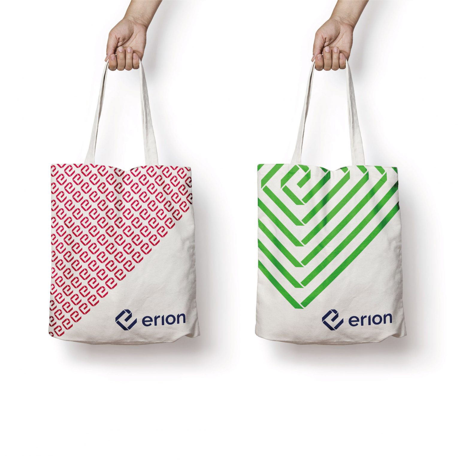
In this perspective, the logo is a ribbon that forms an “E,” which then creates a spiral: a convergence that blends the sense of union, the supply chain, movement, transformation, and rebirth.
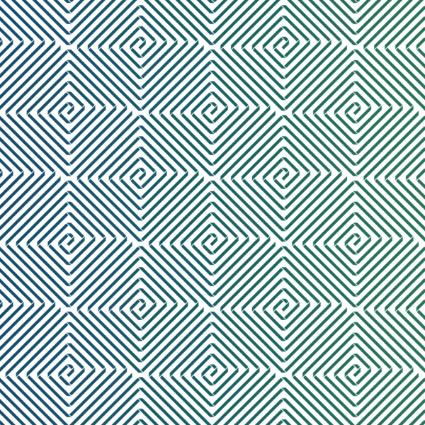
The spiral creates amazing patterns and textures. The colours add liveliness and versatility, the shades personalizing and offering distinctive backgrounds. They are visual elements that help communicate the concepts of cyclical continuity, circular motion, development and evolution.